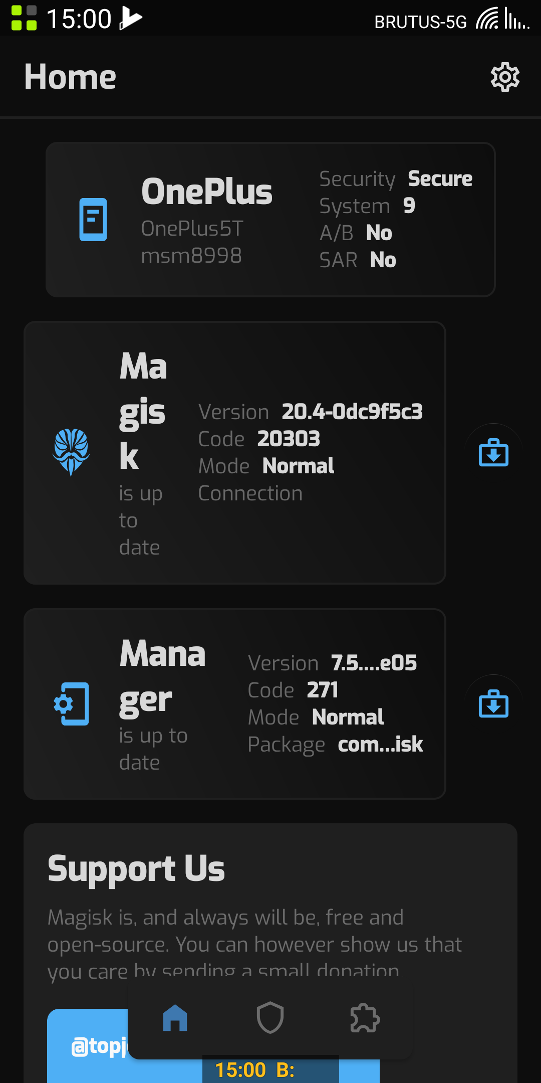
Magisk: Canary Manager design feedback
To make the design overall more familiar to users, I suggest using one column layout on phones by default.
The main screen title should be "Magisk", "Manager", or "Overview", I think "Home" is too vague.
The "Support us" icons have all three dots besides them - why? I suggest removing those.
 Madis0
All 9 comments
Remember this is an early build, so I'm sure some issues seen will be addressed.
I do agree with points 1 and 3, but not sure about 2.
 unixandria-xda
on 26 Jan 2020
unixandria-xda
on 26 Jan 2020
Also falling under this issue:
2300
2301
2327
2309
I'm sure I missed a few. But maybe just use this issue for canary manager feedback, to avoid opening a ton of issues over the new manager?
unixandria-xda
on 26 Jan 2020
Magisk Manager 88920e05 #271
OnePlus 5T 474dp on 2160x1080
The content of an item is a little tight.
Also the dark themes needs a little bit more contrast. The description text more brighter.
@linuxandria you post only issue links with crashing related stuff.
So i'm posting here about the design faults in my opinion.
 Cris--
on 26 Jan 2020
Cris--
on 26 Jan 2020
I agree with @Cris-- that gradient should be removed, as it doesn't fit AMOLED theme. Also here's my suggestion:
In current magisk manager canary version, we have Download and Install buttons next to Magisk and Manager tabs on Home screen, my suggestion is to make them appear after swiping Manager and Magisk tabs to left so we'll have a symmetry comparing to first tab. I don't think this is a good explanation of my suggestion so you might have questions, feel free to ask anything about this idea.
 X1nto
on 26 Jan 2020
X1nto
on 26 Jan 2020
My two cents are that we are trying to display a lot of information horizontally and phones are fairly skinny, perhaps utilizing something like the marquee on long text. Especially for things that the user may be interested in such package name or version numbers.
That and perhaps giving things a bit more vertical room to be able to display more lines would be good.
I also agree with making it be 1 card wide by default on phones. Tablets can be 2 wide by default, or, it would be nice to have an auto mode where you detect the display width and just use that to decide 1, 2, or 3 columns. Then if you switch to landscape on a phone it could do 2 wide but portrait does 1 wide. Of course if users wanted to override the auto mode the could specify 1 size for all the time (or portrait and landscape separately if you're ambitious).
Just my two cents. I know that not all of these things will be implemented, but certainly wanting to provide helpful feedback.
 undermark5
on 26 Jan 2020
undermark5
on 26 Jan 2020
Here are things I've noticed that I would have preferred if they were different:
- Splash screen that fits the app (like iOS where the splash screen is supposed to look like the app itself to simulate instant loading if that's possible)
- 3 dots for PayPal etc. make no sense
- one column by default
- Home Magisk version number is cut off by ...
- I do prefer 2 columns in Superuser tab
- the module search icon is actually the filter icon which made me confused at first
- Pull to refresh instead of refresh icon top right
- Maybe including a photo next to the donation buttons would increase donations? It sure would make the thing feel more personal
- Custom icon that maybe changes with the theme
Other feedback:
- Nice theme in general
- I really like the theme selection
- themes don't seem to reliably update the running app. Forcing a restart fixed this
- Nice icons
Overall, really nice redesign with a bunch of small usability problems. Good job!
 CiriousJoker
on 28 Jan 2020
CiriousJoker
on 28 Jan 2020
And put the "Install from storage" button in the Module list on top of the list please. 😌
Also with a module where an update is possible.
Cris--
on 30 Jan 2020
He's right ya know, it doesn't make cents....
Signed-
Jim Pate 🌼
0801
On Tue, Jan 28, 2020, 06:34 CiriousJoker notifications@github.com wrote:
Here are things I've noticed that I would have preferred if they were
different:
- Splash screen that fits the app (like iOS where the splash screen is
supposed to look like the app itself to simulate instant loading if that's
possible)- 3 dots for PayPal etc. make no sense
- one column by default
- Home Magisk version number is cut off by ...
- I do prefer 2 columns in Superuser tab
- the module search icon is actually the filter icon which made me
confused at first- Pull to refresh instead of refresh icon top right
- Maybe including a photo next to the donation buttons would increase
donations? It sure would make the thing feel more personal- Custom icon that maybe changes with the theme
Other feedback:
- Nice theme in general
- I really like the theme selection
- themes don't seem to reliably update the running app. Forcing a
restart fixed this- Nice icons
Overall, really nice redesign with a bunch of small usability problems.
Good job!—
You are receiving this because you are subscribed to this thread.
Reply to this email directly, view it on GitHub
https://github.com/topjohnwu/Magisk/issues/2317?email_source=notifications&email_token=AH66TK3U3GYQGOEQTWXYWWLRAA67RA5CNFSM4KLMMJ42YY3PNVWWK3TUL52HS4DFVREXG43VMVBW63LNMVXHJKTDN5WW2ZLOORPWSZGOEKDQLDQ#issuecomment-579274126,
or unsubscribe
https://github.com/notifications/unsubscribe-auth/AH66TK4AVAOLZMQERFLNJGTRAA67RANCNFSM4KLMMJ4Q
.
 11lb8oz
on 31 Jan 2020
11lb8oz
on 31 Jan 2020
Thanks for the feedback, we'll improve in future iterations.
 topjohnwu
on 31 Jan 2020
topjohnwu
on 31 Jan 2020
Related issues
 auanasgheps
·
4Comments
auanasgheps
·
4Comments
 KaMyKaSii
·
3Comments
KaMyKaSii
·
3Comments
 guitardedhero
·
3Comments
Madis0
·
3Comments
guitardedhero
·
3Comments
Madis0
·
3Comments
 betaxab
·
4Comments
betaxab
·
4Comments
Most helpful comment
My two cents are that we are trying to display a lot of information horizontally and phones are fairly skinny, perhaps utilizing something like the marquee on long text. Especially for things that the user may be interested in such package name or version numbers.
That and perhaps giving things a bit more vertical room to be able to display more lines would be good.
I also agree with making it be 1 card wide by default on phones. Tablets can be 2 wide by default, or, it would be nice to have an auto mode where you detect the display width and just use that to decide 1, 2, or 3 columns. Then if you switch to landscape on a phone it could do 2 wide but portrait does 1 wide. Of course if users wanted to override the auto mode the could specify 1 size for all the time (or portrait and landscape separately if you're ambitious).
Just my two cents. I know that not all of these things will be implemented, but certainly wanting to provide helpful feedback.