Please do not report security vulnerabilities here. The Responsible Disclosure Program details the procedure for disclosing security issues.
Thank you in advance for helping us to improve this library! Your attention to detail here is greatly appreciated and will help us respond as quickly as possible. For general support or usage questions, use the Auth0 Community or Auth0 Support. Finally, to avoid duplicates, please search existing Issues before submitting one here.
By submitting an Issue to this repository, you agree to the terms within the Auth0 Code of Conduct.
Describe the problem you'd like to have solved
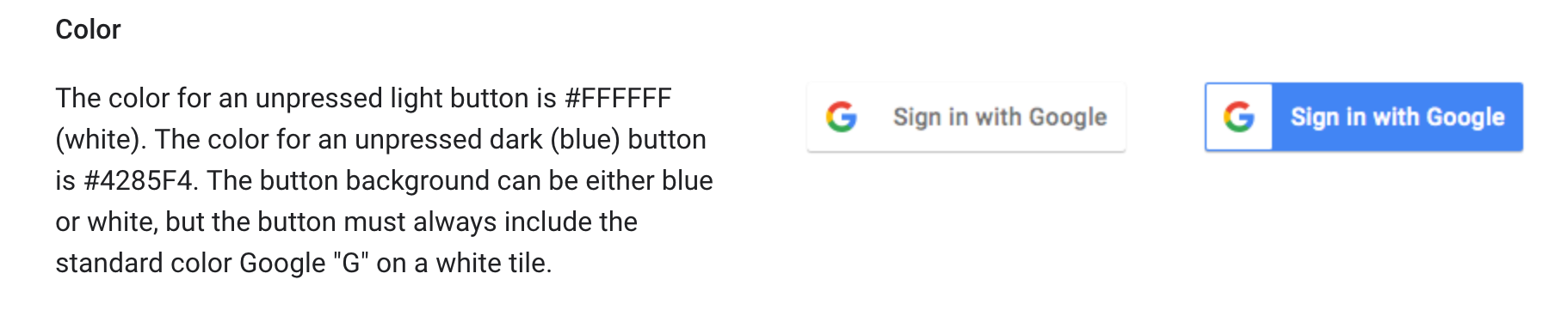
I noticed that a recent commit 57119a992f63b77f27271b77703a4cf4121d2f6f changed the social button for Google to use the light theme. It would be nice to have the option to use the dark theme as shown below on the right. I am also not sure if the light theme button follows the Google branding guidelines, as the whole button including the icon becomes grey on hover, but the guidelines specify the logo should always be on a white tile (though other places seem to do this too so perhaps the Google branding guidelines are not strict).
Describe the ideal solution
An option to use the dark theme for the Google social button.
Alternatives and current work-arounds
I am using a previous version of lock from before the change to the Google social button styles were made (11.21.1)
Additional context
 benmadany
All 4 comments
Thanks for raising this @benmadany. This is an on-going issue that we're discussing internally, I'll report back as soon as I know more.
Whatever the outcome, providing an option to choose between the two is unlikely and we're more likely to choose the best default we can. For context, the changes were made for Apple's guidelines when using the "Sign in with Apple" button, which had a knock-on effect to the design of other social buttons for consistency.
Can you provide more detail about the reasons you're invested in the dark mode button? Is it purely aesthetics or are you having bigger issues (like not being able to submit to an app store, for example)?
 stevehobbsdev
on 6 Mar 2020
stevehobbsdev
on 6 Mar 2020
Thanks for the response. It's not about the aesthetics for me in this case. Originally, using an older version of Lock, Google rejected an OAuth Verification request due to not matching the branding guidelines. After updating to 11.21.1 with the dark theme they approved it.
I'm mostly concerned about whether or not the changes to the light version of the social button in later Lock versions have been confirmed to be allowed by Google's branding guidelines. To me, it would appear that by a strict interpretation they don't quite conform. Though as I mentioned I've seen that at least Stack Overflow uses a similar light themed social button that becomes all grey on hover. Has there been any communication with Google regarding compliance with their guidelines?
benmadany
on 10 Mar 2020
Not confirmed in an official way but we believe we are aligned with the guidelines here, as also mentioned in your report above.
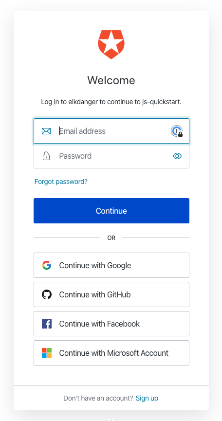
If it puts your mind at ease, our new Universal Login UI already uses a light-themed "Sign in with Google" button and has done for quite some time - so far we have not had any issues raised from people unable to submit apps with this configuration.
stevehobbsdev
on 10 Mar 2020
@benmadany Closing this for now but if you do have problems submitting to the app store with these changes, please let us know!
stevehobbsdev
on 17 Mar 2020
Related issues
 ndelvalle
·
8Comments
ndelvalle
·
8Comments
 fernandomunizz89
·
3Comments
fernandomunizz89
·
3Comments
 ewoess
·
5Comments
ewoess
·
5Comments
 dgreuel
·
5Comments
dgreuel
·
5Comments
 virgil-av
·
5Comments
virgil-av
·
5Comments