Live-share: [VS Code] Sharing icon looks too similar to AirDrop
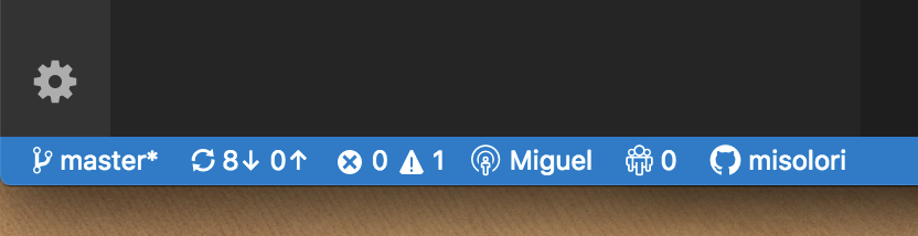
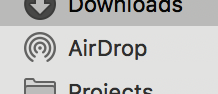
The "Sharing" icon looks too similar to Apple's "AirDrop" icon:
LiveShare
AirDrop
Would be great if there is an alternate, let me know if you need help getting an alternate one.
 misolori
All 13 comments
@misolori I believe we can only use Octicons in the status bar items, which severely limited our options. If that's not the case, then we'd be completely open to another proposal 😄
 lostintangent
on 9 Oct 2018
lostintangent
on 9 Oct 2018
Is that the reason why it's the same icon for VS Code and VS IDE?
misolori
on 9 Oct 2018
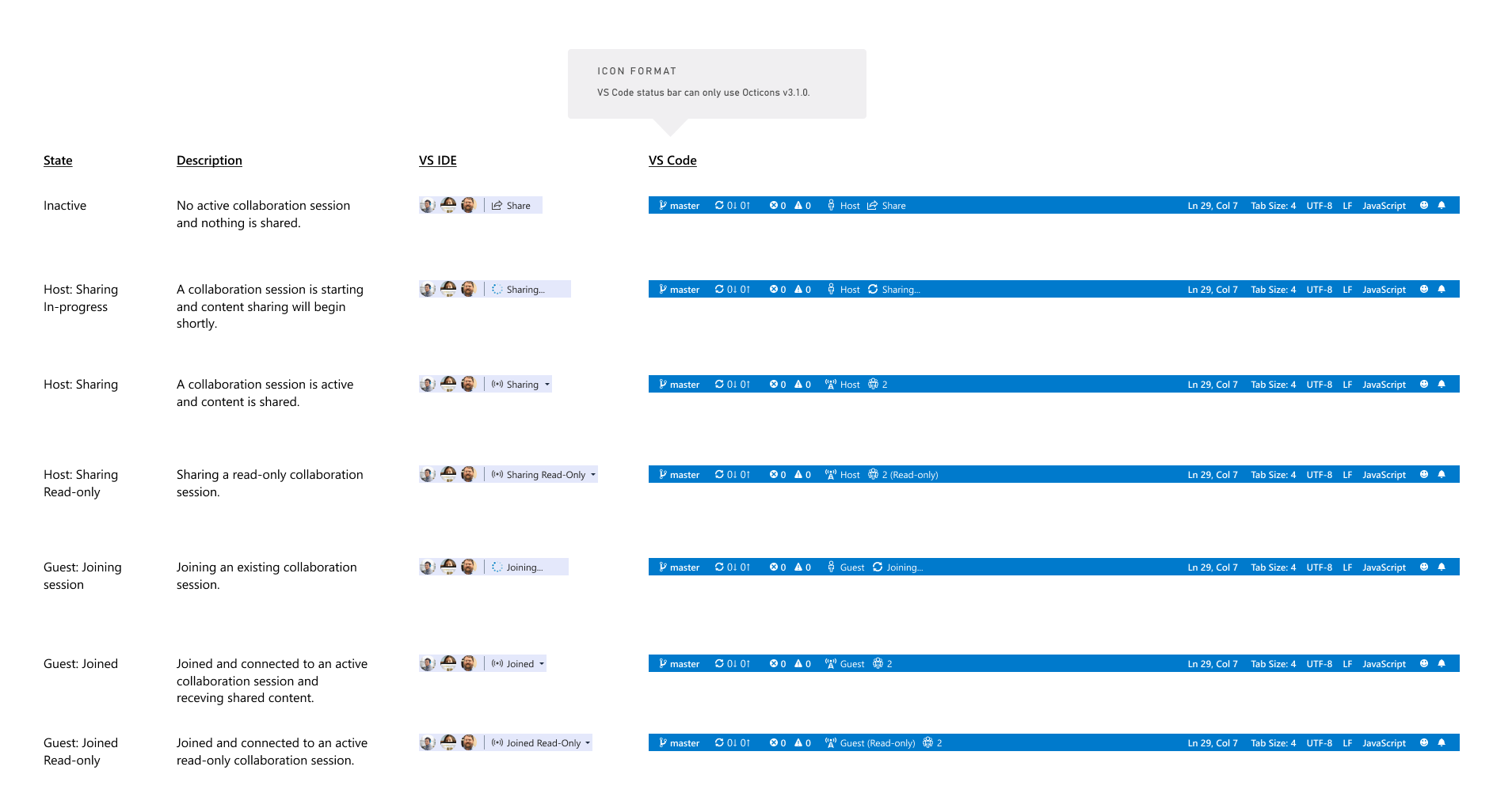
I think one of the confusion parts is how much the icons change from the default state (top) to the Sharing state (bottom):
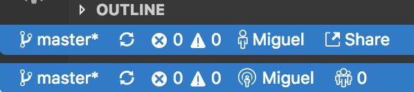
I might suggest keeping the identity icon the same and making the sharing explicit:

misolori
on 9 Oct 2018
@misolori Yes, given we have users in both VS and VS Code, consistency is important. When we worked with Jamie on icons the recommendation was to stick with what was available in VS Code. VS Code's status bar is also getting pretty polluted with text already, and we found that this model actually met the need without taking over the status bar.
The specific icon in question is "broadcast" which is appropriate for what is going on: https://octicons.github.com/icon/broadcast/
IMHO, there's some discussion of unifying some of the sign in experiences across this, the Azure extension, and others so that is probably the time to look into more significant changes since we won't have multiple extensions with sign ins competing for space.
 Chuxel
on 9 Oct 2018
Chuxel
on 9 Oct 2018
So we can look at these again. We aren't stuck to the Octicon set other than we were using it in VS Code at the time. For consistency we used it in VS as well so users understood the same icons across the different products. I think we can look at a new icon set that would be consistent across all LiveShare locations but look less like another familiar icon set. 👍
 jamiedawsonyoung
on 10 Oct 2018
jamiedawsonyoung
on 10 Oct 2018
@misolori @jamiedawsonyoung Yep, let's plan of revisiting this UX very soon. This is great feedback, and we can definitely improve this experience.
lostintangent
on 10 Oct 2018
@jamiedawsonyoung I just chatted with @misolori . Turned out the "Octicon for status bar" limitation is still there. So I guess we'll have to live with it for VS Code?
BTW this is what Shravan and I landed on the Visual Studio end (before we saw this issue). The sharing state still looks like broadcasting but we think it makes sense in this context. We didn't think of AirDrop though. What do you think?
 chryw
on 11 Oct 2018
chryw
on 11 Oct 2018
@lostintangent Looks like it's possible to use custom svg icons in status bar. Just need to add specific styles and use mask to control color. But no matter what the status bar color is the icons (and text) are always white anyways. So this shouldn't be very hard, right? What do you think?
chryw
on 11 Oct 2018
@chryw the custom SVGs are only for the product, not for extension. So since Live Share is an extension there isn't a way for an extension to set that (see this example).
misolori
on 12 Oct 2018
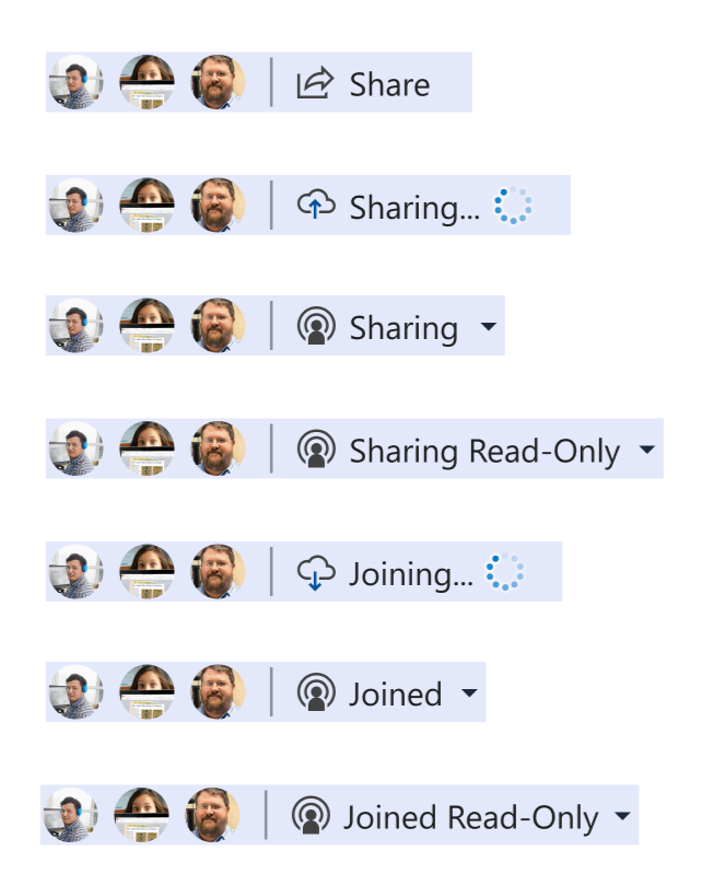
OK here's an updated proposal. For VS Code, replace the radio man that looks like Apple AirDrop with the network tower icon from the Octicons. VS IDE will use just the signal waves (without tower). This way they're still aligned. What do you think?
(Click to see full size)
chryw
on 13 Oct 2018
@chryw That sounds good to me!
@misolori Thoughts?
lostintangent
on 13 Oct 2018
This works for me, thanks for iterating on this so quickly @chryw!
misolori
on 13 Oct 2018
OK cool, we’ll go ahead and make this change.
Long-term, we’re actually considering doing away with the status bar item that displays your logged in state, so that we can reduce a little more clutter. Now that we have the explorer view (and telemetry shows most users are using Live Share via it), we don’t necessarily need to rely on having the status bar item for accessing share commands.
lostintangent
on 13 Oct 2018
Related issues
 evasgit
·
3Comments
evasgit
·
3Comments
 dec0dOS
·
4Comments
dec0dOS
·
4Comments
 YardGnomeNinja
·
3Comments
YardGnomeNinja
·
3Comments
 tamuratak
·
3Comments
tamuratak
·
3Comments
 Luchiwis
·
3Comments
Luchiwis
·
3Comments
Most helpful comment
OK cool, we’ll go ahead and make this change.
Long-term, we’re actually considering doing away with the status bar item that displays your logged in state, so that we can reduce a little more clutter. Now that we have the explorer view (and telemetry shows most users are using Live Share via it), we don’t necessarily need to rely on having the status bar item for accessing share commands.