Hello my friend, I call upon you to remember an old deal that we had.
 ghost
ghost
All 104 comments
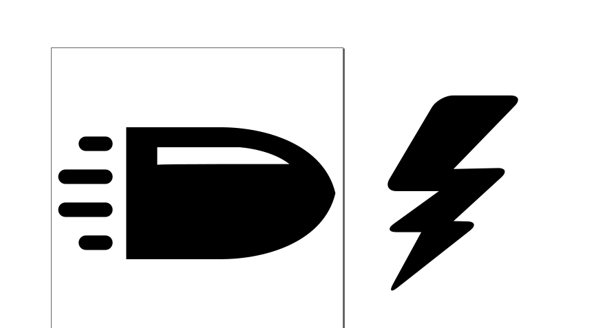
We're ready to change the bullet icon.
Can we try having the bullet point right instead of up, and have a less perfectly round head?
 ornicar
on 23 Aug 2020
ornicar
on 23 Aug 2020
 ghost
on 23 Aug 2020
ghost
on 23 Aug 2020
I like this one. It's on https://lichess.dev for integration preview.
ornicar
on 23 Aug 2020
on lichess.dev the trail of the bullet is too close to the bullet itself, maybe its a conversion issue.
Should I also make an icon for hyperbullet?
ghost
on 23 Aug 2020
The current ultrabullet icon isn't great indeed... let's see what you can come up with
ornicar
on 23 Aug 2020

this is my idea of hyperbullet and made the bullet a bit more elongated
ghost
on 23 Aug 2020
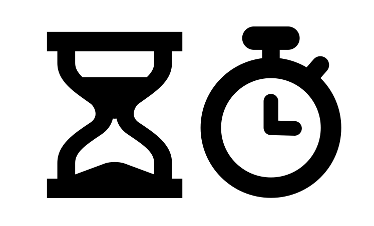
I would also change the rapid and classic icons ( the rabbit/hare in some cultures is taboo)
here is my idea for rapid ( stopwatch) and classic (hourglass)
ghost
on 23 Aug 2020
I'm sending the new bullet and ultra icons to lichess.dev for preview.
I don't like these rapid/classical icons, the current ones are fine imo
ornicar
on 23 Aug 2020
also blitz game mode should have the thunder icon
another idea is to display these icons on the homepage like this

ghost
on 23 Aug 2020

the hyperbullet is missing here, also there is another type named ultrabullet...
ghost
on 23 Aug 2020
We can't give blitz a thunder icon because it has been the bullet icon until now. We must wait a year for users to forget about it, before we can use the thunder icon for something else than bullet.
ornicar
on 23 Aug 2020
hyperbullet is not a Lichess variant, it counts as bullet.
ornicar
on 23 Aug 2020
We can't give blitz a thunder icon because it has been the bullet icon until now. We must wait a year for users to forget about it, before we can use the thunder icon for something else than bullet.
imho, blitz is blitz, i mean is self explanatory, also if you revamp the icons, I dont think it creates confusion, it actually help alleviate that
ghost
on 23 Aug 2020
I also made a new draw icon, imo the current one(hand) is confusing because on chess tournaments when you pull out your hand for a handshake means you want to resign.

vs

ghost
on 23 Aug 2020
 ghost
on 23 Aug 2020
ghost
on 23 Aug 2020
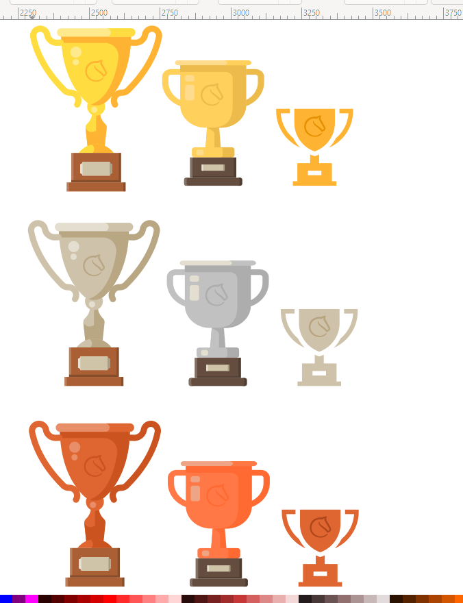
Awesome, we can use that. Do you think you could fit the beautiful lichess logo in these trophies? Make them look less generic
ornicar
on 23 Aug 2020
 ghost
on 23 Aug 2020
ghost
on 23 Aug 2020
 ghost
on 23 Aug 2020
ghost
on 23 Aug 2020
Haha, I like it, thanks. Will look to integrate them soon.
ornicar
on 23 Aug 2020
We can't give blitz a thunder icon because it has been the bullet icon until now. We must wait a year for users to forget about it, before we can use the thunder icon for something else than bullet.
also, on this topic:
https://lichess.org/forum/lichess-feedback/symbol--icon-change-request-for-bullet-and-blitz
https://lichess.org/forum/lichess-feedback/category-symbols
https://lichess.org/forum/lichess-feedback/the-symbols-of-blitz-and-bullet
https://lichess.org/forum/lichess-feedback/icon-for-blitz-games-and-bullet-games
etc.
so, ihmo, revamping all icons would be great!
ghost
on 23 Aug 2020
Also the continue from here icon should be change, because it is the same with the up top challenges

ghost
on 23 Aug 2020
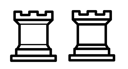
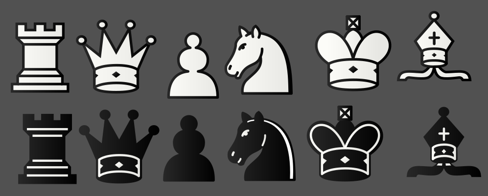
OCD alert: I fixed the white rook from cburnett ( its and old bug and the layers where not in the right order)
before and after
ghost
on 23 Aug 2020
I actually like the first one better. It makes sense that these lines are thinner, being farther from the viewer because of the shape of the rook
ornicar
on 23 Aug 2020
yeah, but the black rook has all the same type of lines
https://commons.wikimedia.org/wiki/Category:SVG_chess_pieces#/media/File:
Chess_rdt45.svg
ghost
on 23 Aug 2020
First off, I love the new icons! However, I think there are some minor things with the bullet icon that should be fixed. The back of the bullet has a slight curve on it that real bullets don't have; this makes it look more like a rocket than a bullet, and overall the proportions somehow don't look right. I really like the ultrabullet icon; it's very fitting for that time control. The new trophies are also very nice. Well done!
 ijhchess
on 24 Aug 2020
ijhchess
on 24 Aug 2020
I like the curve, it makes it more cartoonish and less realistic. Real bullets are not fun, they kill people.
ornicar
on 24 Aug 2020
here is a different bullet icon + a new blitz icon ( different from default one)
I saw that you have shield trophies, I will make new one. Also, what other icons are there and where I can find them to try to make new ones.
ghost
on 24 Aug 2020
This is basically the chess.com bullet icon. Even if their artwork was free (it isn't), we wouldn't want to use it.
As I said before, we'll change the blitz icon to something thunder-like in a year from now.
I'm quite happy of our current shield trophies.
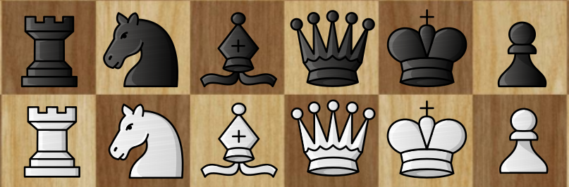
You can find a list of the current lichess icons here: https://lichess1.org/assets/oops/font.html
ornicar
on 24 Aug 2020
This is basically the chess.com bullet icon. Even if their artwork was free (it isn't), we wouldn't want to use it.
https://media.giphy.com/media/fcK30LKXjG6Tm/giphy.gif
ghost
on 24 Aug 2020
Now I have to ask about these trophies, before I integrate them. Did you come up with them from scratch, or maybe did you get inspiration from existing trophies? If so, which ones?
ornicar
on 24 Aug 2020
Jokes aside, I will not get you into any legal trouble. I will not post here anything stupid or trouble related. I like your platform very much, its safe, clean and very very much work has gone into it. I offer my work, free of charge, to extend upon your work, and thats all.
Its all good, all trophies are made by me, but I took inspiration for some body parts from open source icons https://icons8.com/icons/set/open-source
I also made these shields, maybe you will like them.

ghost
on 24 Aug 2020
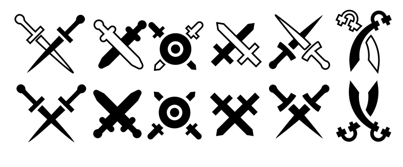
Made new icons for challenges ( imo, rn swords are too skinny for readability)
Maybe you will like these

ghost
on 24 Aug 2020
Yeah that's nice, especially the 2nd one. Can I get the SVGs?
ornicar
on 24 Aug 2020
 ghost
on 24 Aug 2020
ghost
on 24 Aug 2020
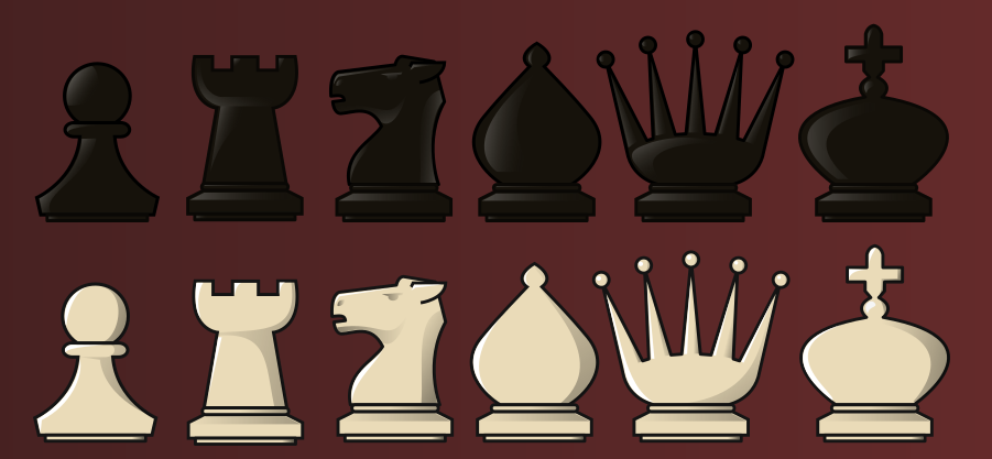
Ornicar, I know you're not interested in adding more piece sets to lichess due to overchoice, especially since the majority of users use the default set, but would you consider adding that governor set from #6556?
They look really good and fit really well with the brown/wood board themes the website offers
 JimiRecard
on 24 Aug 2020
JimiRecard
on 24 Aug 2020
Ornicar, I know you're not interested in adding more piece sets to lichess due to overchoice, especially since the majority of users use the default set, but would you consider adding that governor set from #6556?
They look really good and fit really well with the brown/wood board themes the website offers
I just remade the governor set, to be different and way more cooler. It is more balanced now and more easy to read.
This will be my last work.
I just hope the lichess team likes it.
ghost
on 24 Aug 2020
I personally prefer the original one. Imho every piece was perfect
JimiRecard
on 24 Aug 2020
It was too similar to staunty set, but this new one is the real deal.
Also, Lichess does not have yet a glass set, so I made this one with that in mind.
ghost
on 24 Aug 2020
 ghost
on 24 Aug 2020
ghost
on 24 Aug 2020
Well, it was similar in the sense that Maestro is similar to Merida. I mean, it is, but also different in many ways that justify having the two sets.
In the case of the original Governor, the color of the pieces itself is already a big difference compared to Staunty. And yes, the queen, king and (especially) the bishop look like those of the Staunty set, but the pawn, rook and knight were unique to that set (they are also the pieces you didn't change in the new version).
Just my two cents on this topic, if ornicar changes his mind about adding the piece set
JimiRecard
on 24 Aug 2020
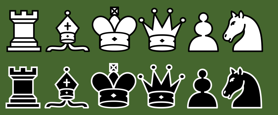
About a year ago I made a set called libra, but it was nothing special, but I recreated it into, imo, the most classy and readable chess set of all time. I really took my time with this one, hope you enjoy.
ghost
on 25 Aug 2020
I've tested governor set on lichess.dev, its super cool, I made the bishops more thinner so that they are more different than the king, also made the rooks cleaner, so now all must be OK!
governor.zip
ghost
on 25 Aug 2020
Well, it's a matter of taste afterall. Since this is the chosen piece, I suggest making the dark pieces a little lighter, right now they look like shadows.
Also I suggest centering the pawns, they are on the bottom of the square
JimiRecard
on 25 Aug 2020
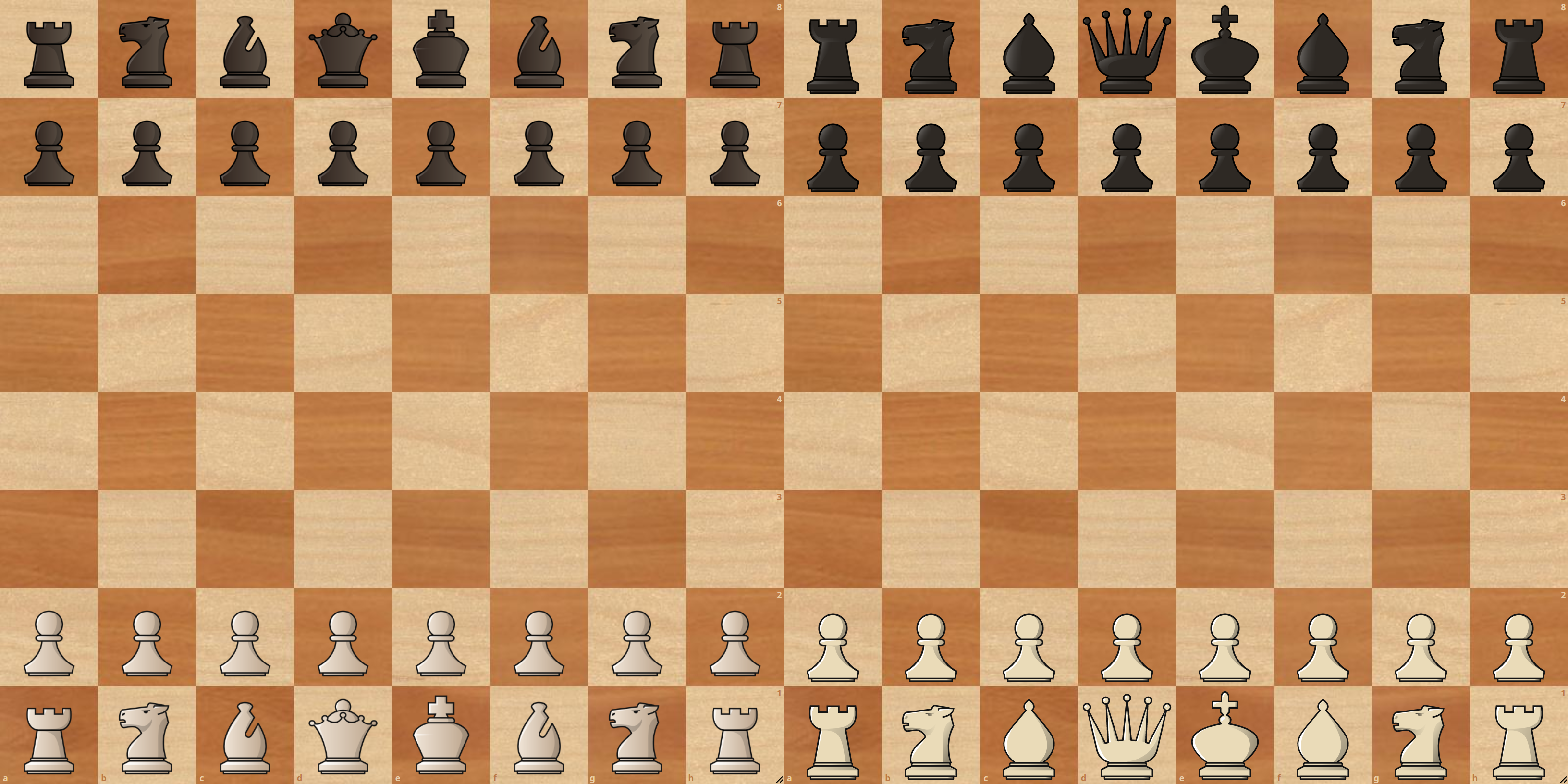
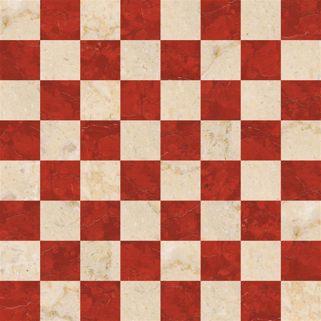
Made 1 green + 1 red board, that are easy on the eyes. Right now there are 7 brown/wood, but only 3 green and 1 red, maybe these will fill in the gaps.

ghost
on 25 Aug 2020
I suggest making the dark pieces a little lighter, right now they look like shadows.
Also I suggest centering the pawns, they are on the bottom of the square
I do agree with these 2 suggestions.
ornicar
on 25 Aug 2020
I now think they are good.
ghost
on 25 Aug 2020
We were talking, I believe, about the governor set. Which can now be tested on https://lichess.dev.
ornicar
on 25 Aug 2020
made the dark pieces lighter, can't center the pawns, because they will be misaligned with the rest of the pieces.
should be all good now
ghost
on 25 Aug 2020
Yes, my suggestions were about the governor set
JimiRecard
on 25 Aug 2020
Just a side by side comparison. I'm still much in favor of the original set.
It's well proportioned, elegant, all the pieces balanced, easy to read a position on a glance... The only thing I could nitpick about it is maybe a thinner (not smaller) cross for the king, but I'm not sure.
I honestly think it would be a valuable addition to Lichess.
JimiRecard
on 26 Aug 2020
I added a little touches to the trophies in the \public\images\trophy to be more "streamlined"

ghost
on 26 Aug 2020
Did you have a look at how I used them? https://lichess.org/tournament/g7t9lPwY
ornicar
on 26 Aug 2020
Very nice! I change the plaques to gold/silver/copper and also the highlights on the trophies to be more consistent.
Maybe a little bit cartoonish for lichess...
ghost
on 26 Aug 2020
Just a side by side comparison. I'm still much in favor of the original set.
It's well proportioned, elegant, all the pieces balanced, easy to read a position on a glance... The only thing I could nitpick about it is maybe a thinner (not smaller) cross for the king, but I'm not sure.
I honestly think it would be a valuable addition to Lichess.
I also like a bit more the old governor set, but I am not the governor here :P
ghost
on 26 Aug 2020
Should I improve more on the governor or libra set? Will they be added?
ghost
on 29 Aug 2020
- Practice with computer - more suggestive
- Puzzles / Tactics - more suggestive
- Marathon - more inline with the other lichess icons
 ghost
on 29 Aug 2020
ghost
on 29 Aug 2020
 ghost
on 29 Aug 2020
ghost
on 29 Aug 2020
 ghost
on 2 Sep 2020
ghost
on 2 Sep 2020
I tweaked very little the maestro piece set ( Q and K optimisation)
Thank you for your support and for your work my friend!
ghost
on 3 Sep 2020
Made the bishop bigger and other small size tweaks and alignment.
Should all be good now.
Thank you again !
And if you have any other icons in mind, let me know so I can propose some ideas.
ghost
on 3 Sep 2020
I’ve been using the Mæstro pieces all year so far, and honestly I preferred the previous version.
Besides the king now looking like a butt (no offense; I mean that literally, though it is subjective), there are some real, objective problems with this version. E.g. the Black pawns, queen & king are all a different shade of brown than the knights, bishops & rooks (the latter appear slightly darker & grayer overall). The colors were more consistent before.
Honestly, there was nothing wrong with Mæstro that would merit changing it IMHO, especially in such a radical manner. I don’t think this is any improvement. 🙁 I liked the shape of the king much better before, and the detail on the queen too. Even the pawns had more pronounced collars before. This looks comparatively cartoony somehow, maybe because of the thicker outlines on some pieces, and the fat king. And because of the inconsistent colors, it almost looks like someone else doodled on your work. Basically for every reason, I miss the old Mæstro!
Also, while the Governor set is lovely (_great_ shading!), the translucency is odd. It not only shows texture from the board through the pieces, but it makes the same piece appear darker on dark squares, and lighter on light squares. So when you have a bunch of pawns in a row (for example), they don’t quite look like one another. Plus board highlights (last move & check) actually show through the pieces, not just around them — which is strange. (Imagine if they had no fills, and were outlines only. That would be the same problem, but more pronounced.)
So FWIW, I’d like to see Mæstro reverted (just leave it alone, please; you tweaked it plenty earlier this year), and Governor solidified. 🤷♂ Just my 2¢.
PS: I didn’t want to post in the forums about this, or to interrupt the dev chat on Discord. Commenting here seemed more direct. But I realize this is the first thing I’ve ever said to you, sadsnake; and so I just want to add that I’m a big fan of your work, and please don’t take this feedback too harshly. It’s intended as constructive criticism. ❤
 artistofmind
on 4 Sep 2020
artistofmind
on 4 Sep 2020
FYI you can open this page https://github.com/ornicar/lila/commit/9395852b03987f79e9a1db74d0ebb9b7d869d9b7?short_path=ed94055#diff-ed94055c8b782f42c67b4d581919fdd3 and click the diff icons to compare the images.

Not sure how the king looks any more like a butt than it did before.
ornicar
on 4 Sep 2020
That’s not the version I’m speaking of. Here is the set I had yesterday (just 24 hours ago) — and every day for the past 6+ months before that:
Apparently this version has already been buried by multiple updates in a row. But as I said, I’ve lived with these pieces for months already. And I trust you can clearly see the difference.
PS: The bishop’s & queen’s pinnacles were also spherical before, whereas now they are elliptical. Indeed, the bishop’s mitre is wider than it used to be, and has pinched “ribbons” (unsure of the correct term) in the bottom center. These are more changes for the worse I might have mentioned before. I could go on. . . . (Struggling to find a single actual improvement in the “update.”)
artistofmind
on 4 Sep 2020
BTW, here are the old-old (-old) pawns:
Notice the platforms on the bottom. I always preferred them that way. (Cf. https://lichess.org/forum/general-chess-discussion/blog-XeRN0BAAACAA7HJu?page=22#219, where I complained about their removal 8 months ago.)
Yes, I have offline copies of everything (including this conversation). What can I say? I’m OCD. You’re welcome. 😉
artistofmind
on 4 Sep 2020
I agree with most of what @artistofmind said. It's not very nice to change the pieces after deployed.
In this case I believe the tweaks were meant to make the piece sizes closer to that of Merida sizes, but somehow it feels off.
I've been using the pieces for a while now as well, so I noticed the change. When I saw the individual piece change in this forum I thought I wouldn't notice on the website, but I did. I figure most of the people who use the piece set daily will notice as well.
I can get used to it, but maestro was perfect as it was
JimiRecard
on 4 Sep 2020
Alright guys, alright, but my OCD is simply....strooonger!

Jokes aside, about maestro, I fine tune it to perfection.
@artistofmind the old-old pawns were good, but they did not fit the set, they were too complex, had too many lines for a pawn, also K and Q were misshaped, not streamlined in anyway.
This new and last update will make everyone happy, because people can be happy in an asymmetrical and imperfect world.
This will be the last update. Thank you for your dedication and passion!
ghost
on 4 Sep 2020
About the translucency in the new governor set, @artistofmind is right. It does look odd in some boards. The biggest example being the newspaper theme
JimiRecard
on 4 Sep 2020
About the translucency in the new governor set, @artistofmind is right. It does look odd in some boards. The biggest example being the newspaper theme
Done.
ghost
on 4 Sep 2020
Just to cool on long summer nights.
Mint board
ghost
on 4 Sep 2020
Took liberty to rearrange the wood4 tiles. Randomized the tiles, because it looked painted on a slab, because the light grain was in continuity of the dark grain, instead of an actual chess board.
ghost
on 4 Sep 2020
While it’s unsettling to know these pieces could be changed at any time, perhaps a year from now — and that the change will most likely be accepted without any critical review, even to the point of allowing objective flaws (like the pawns of a different color) to pass muster — I have to say I sincerely hope that _isn’t_ the “final version” of Mæstro, since it still has all the problems I mentioned before. 😥
I miss the Mæstro we had a few days ago, and for the past several months before that. 😕 I lament its disfigurement; and while I’m sure it was well intended, this honestly feels more like vandalism or sabotage than an update.
I guess it’s time to make a UserStyle.
artistofmind
on 4 Sep 2020
Here are some medals, if you think the trophies are too corny.
 ghost
on 4 Sep 2020
ghost
on 4 Sep 2020
I believe the color difference was addressed on the last update (https://github.com/ornicar/lila/commit/da2d8d2e771033b83e289fab773741e6cce6b003)
I think some shapes as well? Not quite the version from the past 6 months, but something in-between
But they're not live on the site for now.
Also, I think @veloce should get notified about the piece updates, since it's not automatic to the mobile app
I can open the issue at lichobile after the "final version" is decided
JimiRecard
on 4 Sep 2020
While it’s unsettling to know these pieces could be changed at any time, perhaps a year from now — and that the change will most likely be accepted without any critical review, even to the point of allowing objective flaws (like the pawns of a different color) to pass muster — I have to say I sincerely hope that _isn’t_ the “final version” of Mæstro, since it still has all the problems I mentioned before. 😥
I miss the Mæstro we had a few days ago, and for the past several months before that. 😕 I lament its disfigurement; and while I’m sure it was well intended, this honestly feels more like vandalism or sabotage than an update.
I guess it’s time to make a UserStyle.
How in the world is this disfigurement, sabotage, vandalism?
You know what, I like your fire @artistofmind !
Draw me some sketches of your perfect piece set and I will try to make your perfect set and maybe if ornicar likes it too it will go to lichess.
I think its a win-win-win situation.
ghost
on 4 Sep 2020
Oh, boy. Now that I see them side to side, I can't unsee the new one as a butt with a deuce coming out (or something else entirely).
Please don't be mad, I also think the previous version is better, but it's totally subjective.
I think he was most upset withe the color differences, which were indeed troublesome
JimiRecard
on 5 Sep 2020

you know, you can always help @artistofmind on those sketches...
ghost
on 5 Sep 2020
Why draw something else? I liked your old drawings just fine. (What’s wrong with the version of Mæstro we had before? Nothing I can see. Hard to improve on perfection.) Whereas I’ve observed several flaws in its intended replacement. And as Mʳ Recard notes, replacing long-established artwork is inherently problematic, since it’s bound to bother some users (like the two of us). …
Re. the picture: That’s a very philosophical question, but I’ll try to answer. I am the way I am (in this context) because I feared that, if I didn’t say something, no one ever would. And my fears were validated, since apparently not even our gracious host noticed the flaws in the version he recently approved, nor could he find the old one in the backlog of recent updates; I had to go dig up my offline copy (which I am now very glad I made). Were it not for my compulsively saving everything, these pieces (as we know them) might not exist, anymore. ☹️ And that’s a heartbreaking thought. (FWIW, I was depressed all day yesterday searching for a replacement set. Alas, nothing is as good as Mæstro once was. R.I.P., Golden Days.)
As for your proposal: Please be reasonable. When you change an established piece set suddenly, and in seemingly arbitrary ways (in fact in every way: the size, shape, color, position and outline of every piece is worse now, IMHO), and receive a few complaints from devoted users of your work, who may not like it anymore but _loved_ it the way it used to be (hence we care enough to comment) — your response is to tell us to draw our own? … That’s not constructive; it just adds insult to injury. 😕
I don’t pretend to any rivalry with you — I never claimed I could draw better — I came here simply to say I prefer your old drawings to the new ones, and I honestly don’t think the latter are any improvement. That’s all. Your “draw it yourself” proposal also doesn’t address the basic problem, which is that users came to this site expecting the graphics they know & love to still be there — only to find they had been radically altered overnight in basically every way. Have some sympathy, and modesty, and return the respect that was shown to you in choosing to use your work in the first place, and in caring enough to give honest feedback. Please listen to your fans, don’t mock us; we’re on your side, whether you know it or not.
Perhaps, rather than draw some third set entirely, as you propose, we might simply make the replacement set Mæstro II. Some of us — I would wager most of us who were already using the set — would like it to just stay the way it was for all this time.
Thanks.
artistofmind
on 5 Sep 2020
I read every word and although I may sound a bit harsh and I must say, sir, that you have a very manipulative, bit narcissistic tendencies that really made your life hard, I know that, because I suffered from and for that,
but playing the "we" and the " good old pity me" cards...
Why draw something else? I liked your old drawings just fine. (What’s wrong with the version of Mæstro we had before? Nothing I can see. Hard to improve on perfection.) Whereas I’ve observed several flaws in its intended replacement. And as Mʳ Recard notes, replacing long-established artwork is inherently problematic, since it’s bound to bother some users (like the two of us). …
It is not about what flaws that you can see in them, its about what flaws I see and wanted to adress once and for all, because I made them for all of you. Is not your design, its not even mine, its kinda merida and more and less, but I tinkered them to suit a need, not mine, but a need of simplicity and "symmetricality", sizes and much more, at least for me.
"Mʳ Recard" also said that "the new one as a butt with a deuce coming out".
Re. the picture: That’s a very philosophical question, but I’ll try to answer. I am the way I am (in this context) because I feared that, if I didn’t say something, no one ever would. And my fears were validated, since apparently not even our gracious host noticed the flaws in the version he recently approved, nor could he find the old one in the backlog of recent updates; I had to go dig up my offline copy (which I am now very glad I made). Were it not for my compulsively saving everything, these pieces (as we know them) might not exist, anymore. ☹️ And that’s a heartbreaking thought. (FWIW, I was depressed all day yesterday searching for a replacement set. Alas, nothing is as good as Mæstro once was. R.I.P., Golden Days.)
I imagine you being in your late 50s, well aware and well read, family, company, mistress, the whole package,
but youre not that guy, right?, and you took my office joke, that was for "Mʳ Recard" that saw an ass in every king, and you self inflicted that upon you and then you say that I mock you? it's too far to go that way for 2d figurines that, realistically means nothing.
But you went further and furter down the line, saying "we'' and saying you were depressed an entire day searching. I mean...
As for your proposal: Please be reasonable. When you change an established piece set suddenly, and in seemingly arbitrary ways (in fact in every way: the size, shape, color, position and outline of every piece is worse now, IMHO), and receive a few complaints from devoted users of your work, who may not like it anymore but _loved_ it the way it used to be (hence we care enough to comment) — your response is to tell us to draw our own? … That’s not constructive; it just adds insult to injury. 😕
No, I said to I can try to make you your perfect set, but now I see that your perfect set is the old-old-X100-old Maestro.
For who must this be constructive, because we are on the github/lichess, for you?
If I injured you with me moving the ear of the horse 3 pixels, then I am very sorry and I want to ask @ornicar to remove maestro set completly, because it did more harm then good, and if I cant have it the way that I intended too look and achieved then its kinda poopoo to me, and that applies to any work done for everyone.
I don’t pretend to any rivalry with you — I never claimed I could draw better — I came here simply to say I prefer your old drawings to the new ones, and I honestly don’t think the latter are any improvement. That’s all. Your “draw it yourself” proposal also doesn’t address the basic problem, which is that users came to this site expecting the graphics they know & love to still be there — only to find they had been radically altered overnight in basically every way. Have some sympathy, and modesty, and return the respect that was shown to you in choosing to use your work in the first place, and in caring enough to give honest feedback. Please listen to your fans, don’t mock us; we’re on your side, whether you know it or not.
I have sympathy for lichess and also for you that I actually took 20 min of my life to adress issues that really I cant even explain to you, because it's not even remotely appropriate and maybe I dont understand them fully. But who I am to judge you?
Also, modesty does not exist, because the moment when you know you are modest you stop being modest.
Also, you are not caring you're yelling. You basically said "that good, this bad" where are the arguments?, because graphics change, horsey changes, people change, everything changes, all the time.
Perhaps, rather than draw some third set entirely, as you propose, we might simply make the replacement set Mæstro II. Some of us — I would wager most of us who were already using the set — would like it to just stay the way it was for all this time.
Thanks.
That again, is for ornicar to decide, based on statistics, juju voodoo or what else he thinks is good for him and his site.
And all this useless spinning and collision for a thing that can be made in stylish or whatnot.
ghost
on 5 Sep 2020
You did this “for everyone”? And who is Everyone? Clearly that doesn’t include anyone present here. … Wouldn’t it be more accurate / honest to say you did it for yourself? No shame in admitting that. I readily confess I had _both_ selfless & selfish reasons for the few contributions I’ve made to this project.
I _could_ respond in kind, waxing pedantic about your ego instead of your work (to which I have hitherto confined myself) — although I don’t know you, and would only be talking out my rear — but I can already see there is no point. So _this_ is how you take criticism? … Well! That’s revealing.
You guessed my age at 50. (In fact I’m 36. Not that this matters for any reason. Ad hominem, and all that.) What are you, still in your teens? No, I don’t suppose you are; I’m just going off my experience of various age groups and their respective maturity levels. All I can say in earnest is that I’m severely disappointed. For a long time, I dreamed of conversing with you. I expected it would be at least a mildly stimulating & encouraging conversation, yielding mutual insights into the creative process, and all that good stuff. But now I’ve seen the reality … all I can say is I regret ever attempting to get in touch.
Well, you’ve had your feedback, and it’s plain what it means to you. Accordingly, I have nothing further to say. Good day.
artistofmind
on 5 Sep 2020
I just want to say: This latest (post-final?) version of Mæstro is acceptable. I’ll even go further, and admit it’s improved in some ways. For example, the shading on the bishop’s ribbons and queen’s jewels is a very nice touch. Well done, sir!
I have (almost) always held your work in the highest regard. And when I give feedback, I endeavor to be impartial. Certainly I believe in giving credit where it’s due. For all these reasons — despite my personal feelings at this time (I am honestly somewhat hurt, though I’ll get over it) — I thought it only fair to say this. I want you to know that your compromise is greatly appreciated. And be assured, I mean what I say, or I would never have said anything.
I am very sorry this conversation took the course it did. I regret that extremely, and cannot help thinking it’s my fault. (I do not know how else I might have expressed my thoughts, and still meant them. I only wish I could have found a purer way to convey them.) But I thank you for your work here. Which not only demonstrates a complete comprehension of my feedback, but continues to inspire me, and enhance my experience of this site, and this game. Not only were you true to the original piece set; you improved it in ways I had never envisioned, till you revealed your own vision to me.
For that I thank you, and wish you all the best.
Sincerely,
JAK
artistofmind
on 6 Sep 2020
Here are some medals, if you think the trophies are too corny.
I find "II" too light and "1", "III", "3" and "2" too dark.
 Pablo-No
on 7 Sep 2020
Pablo-No
on 7 Sep 2020
@artistofmind Glad to be here! Thanks for feedback! 👍
@Pablo-No if the lichess team aproves them, I can further optimize them, right now I throw here random stuff, because I want to make the site purrty.
ghost
on 7 Sep 2020
 ghost
on 17 Sep 2020
ghost
on 17 Sep 2020
1ˢᵗ reaction (playful): Using the Wood theme on Chess.com for a reference now, are we? agadmator fans will be thrilled.
2ⁿᵈ reaction (critical): IMHO, the Black pieces are now too dark. As their outlines are pure black, and the pieces are darker overall, the details are harder to see than before, despite the new highlights. On some screens (esp. late at night), they might appear as solid silhouettes. In other words: While the absolute contrast is higher, the relative contrast is lower. It’s hard to make the case that that’s an improvement. Certainly there’s very little room to fiddle with these particular values, without changing the fundamental character of the set even more profoundly than by redrawing it.
IMHO, one of the most appealing things about Mæstro has always been that the pieces _aren’t_ pure black & white. I find a slightly lower contrast easier on the eyes; and I’m sure most other users of this set must feel the same way, or they’d have already picked something starker — n’est-ce pas?
1ˢᵗ suggestion: Keep the highlights & texture, but restore the previous color values. In and of themselves, these tweaks are subtle, and you did a good job on them.
2ⁿᵈ suggestion: Alternatively, file this set as Mæstro 2. I think a color + texture change warrants that. (FWIW, Chess.com has an alternate version of its Wood pieces with a different texture, called Water or Ice or something like that; I honestly forget.)
Peace
artistofmind
on 17 Sep 2020
thanks @artistofmind for your feedback. I lightened the pieces and removed the texture because it did not add anything to the set, I also smoothed out the colors, made them more warm for better visibility.
I think the set is all good now with this last update
- super small tweak for cardinal ( made the hole of the hats equal and smaller)
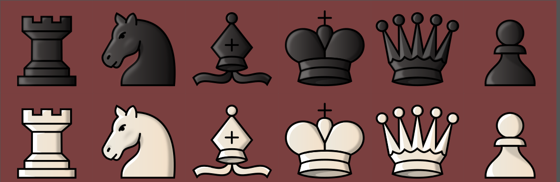
- a must have set from Mr Marroquin - Condal (converted from tff to svgs)
ghost
on 18 Sep 2020
I also can create textures on classic sets. But the files become quite large, but I can save them in pgn at a good res and make them svg.
If the lichess team approves I can create a texturise version of alpha with any texture ( marble, wood, glass, galaxy, cardboard, etc. ); maybe we can squeeze in some reskins of classic sets like merida, alpha, cburnett.
here is an example

ghost
on 19 Sep 2020
@ornicar Please update the plastic green board with this one, I reduced, that yellowish tint which made it look dirty.

ghost
on 20 Sep 2020
Also here are 3 new HD boards made by remixing some @artistofmind candidate boards. Hope you like them.
Redstone
Cherry Maple

High contrast blue

ghost
on 20 Sep 2020
Another nice to have board
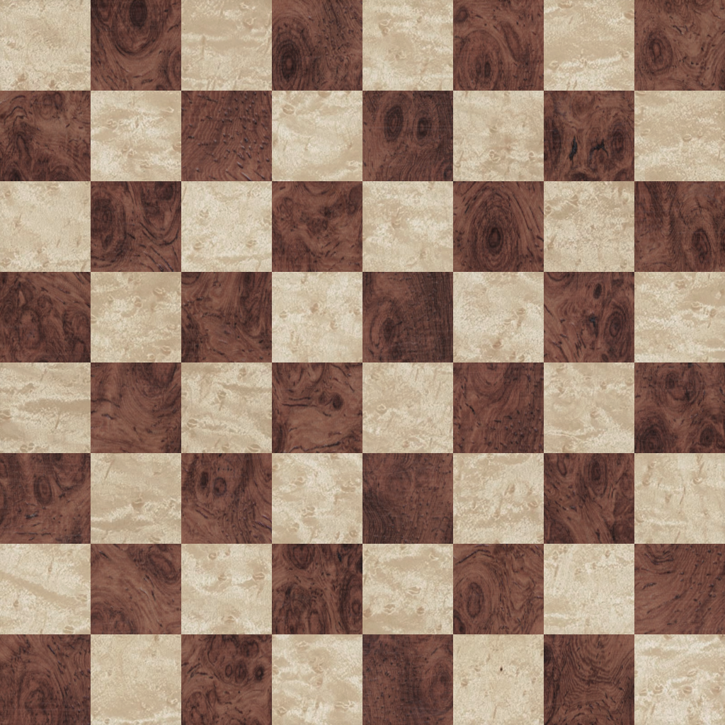
Burled walnut + Birdseye maple


ghost
on 20 Sep 2020
Re. Cherry Maple: This retains some of the flaws which put me off those particular sample images, in the first place. E.g., b4 is lighter than any of the other dark squares, and a8 is darker than any other light squares. 😕 I liked the overall tone / amount of detail in the original, is the only reason I submitted it (hoping for feedback), but I knew some squares would need to be touched up, or similar-but-better images found.
Also, I’m fairly confident in saying that for all of these, the contrast is too high. (“Redstone” was on the high side to begin with; why increase it?) The worst offender in this regard is the last one (which is otherwise quite nice). None of the Black pieces in any of the sets currently on the site will show up well on those walnut squares, both because they are so dark to begin with, and because their details are even darker. They will obscure parts of the pieces, making it hard to see what’s where. If you play with low brightness, you simply won’t be able to comfortably “read” the board. Whereas, ideally, it should be low-contrast enough that you can tell immediately, at a glance.
That said, if you lightened the dark squares by two or three tones, that might be a very nice board.
PS: FYI, there’s an old oil painter’s technique called the squint test. Just squint at your work, and ensure that you can still see everything clearly, even when you’re squinting. Then you can be confident it’ll still look good under most ordinary conditions.
PPS: Also, if you really wish to remaster (or “remix”) my boards, I can provide you with the actual samples I used (which are higher quality than the JPEGs I submitted here back in the day). It’s always better to work from the source than from a downsampled and lossily compressed copy. 😉 Let me know, and I’ll hunt them down for you.
artistofmind
on 20 Sep 2020
Hello, @artistofmind, I always try some pieces on the candidate boards to see if they can be well read, not to be a tiresome on the eyes.
Here is an example of the last board with lower contrast.
Lowering the contrast does not help the board, it makes it look a bit cheap, also it also does not help visually, especially with very detailed wooden boards, and also because the wood is burled and high detailed and highly irregular it makes the whole scene hard to digest at first, but that is why burled wood is one of the highest priced wood.
And I also think that for the contrast and light and other filters, if ornicar choses these boards, we can further improve on them in the dev environment, before launching them.
Also, I would be very grateful if you can find HQ quality photos or textures of unique materials to create some out-of-this world boards. Right now I am proposing these boards because lichess does not really have nothing like these ones.
ghost
on 20 Sep 2020
Well, in that example the wood is grayed out now. Naturally, you will need to compensate by adding saturation. I also notice you applied this change to the light squares, too. Whereas they were OK before. (Indeed, since the relationship between the squares is precisely what’s in question, changing them both uniformly merely preserves the status quo at a different overall brightness, and in this case saturation level.)
artistofmind
on 20 Sep 2020
@artistofmind it is just a quick example, but best is to wait for ornicar to review this work first and then I can fine tune the boards based on feedback.
Cheers!
ghost
on 21 Sep 2020
I want to express my gratitude towards ornicar and all the lichess team and to say a big thank you because they tolerated my obnoxious style. I know that I tend to wear people down with my unforgiving and beat down personality, but in my defense I tell myself that is for the greater good, whether in my professional carrer or designing stuff for lichess.
Thank you again guys and also thank you ornicar for taking me under your wing and that you gave me free hand and resources to develop myself in a nice enviroment.
I hope you will make lichess the most awesome chess site ever, far above all the others.
ghost
on 21 Sep 2020
TL;DR
I complied here the boards +thumbs:
- redstone
- green-plastic
- walnut
- blue4
pieces:
- the new alpha-wood
- maestro highlights update
- cardinal - small fix
- condal - historic set by Marroquin

ghost
on 24 Sep 2020
Sorry but we already have more than enough piece sets and boards. And we can't change the existing ones because it infuriates the players using them.
ornicar
on 24 Sep 2020
Sorry for this, but rn dark pieces are too dark so I lighten them up.
ghost
on 25 Sep 2020
[W]e can't change the existing ones because it infuriates the players using them.
So why did you? Mæstro was just updated — again. (Mind you, I’m not really “infuriated,” just disappointed & confused.)
It’s 11 PM here, so my monitor is relatively dim, but it looks like there are simply holes where the Black pieces used to be. An hour ago they were normal, but now (after the latest deploy) they are literally flat black on my screen. Just silhouettes. (This effect is even more pronounced in game thumbnails. With those small pieces, you can definitely only see the outline, no matter how close you look.) Oddly, the pawns are also fat — they seem to have some extra girth around the neck below the collar, relative to above it (not something I noticed in any of the pictures posted here previously [I now see the last Mæstro-related comment was edited a week after the fact {sneaky, sneaky!}]). And the White knights appear to have dimples in their cheeks, as though they’re sucking on straws. Hum. Plus there’s a new blur effect around the edges of highlights; is the texture now intended to mimic plastic, rather than wood?
Interestingly, if I squint at the pieces on the default brown board (an ideal contrast, and the best board to assess pieces on, by nature [please don’t change it, too]), the Black ones show up much more readily than the White. Not the details on them, mind you, just their presence. This despite the fact that the White pieces are also somewhat paler than before. That pure Black is distracting. I would say this piece set is now unusable — whereas it _was_ still my favorite, an hour ago. (I was living with the “post-final” compromise update.)
In a previous comment, I offered what I thought was a most reasonable suggestion: When the color, texture and shape have all changed from the established version, it’s time to just make a separate set called Mæstro 2 (and leave the original alone). Literally _nothing_ about these pieces is the same as it once was; naturally, long-time users can only scratch our heads and ask, “Where did Mæstro go?” That was actually my first reaction tonight: I thought the pieces had been deleted! It’s not immediately intuitive what happened.
Of course I’ve voiced some of these concerns already. The reason I’m bothering to comment again is that _you just said,_ “we can’t change the existing ones” — and then you did it, anyway. The same day you said that. For nothing less than _the_ piece set some of us have been the most vocal about, at the beginning of this year in the Lichess forums, and recently right here in the very thread where you said this. 🤔 So I’m confused, is all. Help me out here. . . .
I would very much like to simply continue using the _old_ Mæstro. And I know for a fact I’m not the only person who feels this way. So will you oblige your users by uploading two different versions? (Since they really are nothing alike.) Or shall we be forced to make a UserStyle just to get Lichess to look the way it used to? (A strange thing to have to do.) I simply want to know what my options are here. Because this kind of radical change overnight (literally) is disconcerting. It makes one begin to have doubts about the stability & longevity of this entire project. Like I could set things up a certain way, take a vacation for a couple of weeks, and return to the site . . . only to find it doesn’t look the way I set it up, anymore.
Which makes me wonder why I even bothered.
Sincerely,
A Concerned User
artistofmind
on 25 Sep 2020
Yes, make a userstyle with your preferred piece set version.
ornicar
on 25 Sep 2020
Dark pieces still to dark (facepalm).
Well, Hundredth Times a Charm.
Very sorry about this...
ghost
on 25 Sep 2020
I really don't understand the reasoning behind changing the pieces after they've been active for so long. It was the only dark brown piece set (other than gioco, I guess), and now it's just another black and white like all the others.
I know my opinion is probably just annoying to the devs (specially knowing any change is received with a lot of nitpickers), but I'm one of the ~10,000 people who use this set, and I think these changes 'just because' or 'you wouldn't understand' are very disrespectful.
Sigh
JimiRecard
on 25 Sep 2020
I'm very embarrassed. The pieces were misaligned and had different gradients, etc. I'm very sorry to waste everyone time like this. I am overworked a bit and this hobby keeps me at bay.
Here is the final update.
ghost
on 26 Sep 2020
yup...i kno
ghost
on 26 Sep 2020
The pieces are gray now. As such they no longer resemble wood _or_ plastic, but appear to be made of rubber or silicone. And they look washed out — as if you took something with no real color to begin with, then brightened / faded it. 🤦
Do you _really_ prefer gray to brown? 😕 What was wrong with the color they were all year so far? The color they’d been from the beginning? … If you kept all the other changes, but simply restored the old color values, surely this would be an improvement from both our perspectives? There’s no need to continually vacillate among shades of gray; these pieces were already the perfect hue & tone before. Not only easy on the eyes, but pleasant to look at. Warm & natural, instead of cold & artificial.
In fact, when I first saw Mæstro back in the day, I thought the colors were so much better than B&W, I contemplated re-submitting my Leipzig pieces with tan & brown fills, instead. (BTW, notice the inverse highlights on that set. That’s the key when dealing with pure black fills: the outlines & details need to be a contrasting tone. 😉) I even thought about just copying your same color values, to be consistent across sets. In the end, I felt it was already too late to modify Leipzig again. (I did once, when I improved the fill method / optimization. I re-upped the Maple 2 board once, too, just to reposition one square. I’m no stranger to an artist’s need to tweak things. The difference is my adjustments are always subtle, never complete reworkings. After the first official submission, I wouldn’t dare to change the whole thing — and if I did, I’d be shocked if they accepted it. You don’t know how lucky / spoiled you are!) But if I ever do change my mind and release a colored Leipzig, I will _insist_ it be called Leipzig 2, purely out of respect for anyone who still prefers B&W. Nothing wrong with having that option, right?
Indeed. Maybe every set should have a monochrome version, _and_ a colored version, selectable via a checkbox below the list of pieces (so we needn’t double the number of thumbnails that display at one time). There’s an idea for you:
Monochrome ☐ | Colored 🗹
Granted this _would_ technically double the number of pieces, but only behind the scenes. The same number of images would be requested by a user at any given time; there’d be the same number of actual piece sets (just two different versions of each); and the menu would be the same size — so it wouldn’t overwhelm users; really it would just give them one more option, in practice: simply the choice between playing with colored pieces or monochrome pieces. 🤷
If you find such a task daunting, I volunteer to provide colored versions of every set myself. (Without shading, though. Just the fills, ’cause that part’s easy — when you know what you’re doing. 😉) What do you think?
The boss taketh, and the boss giveth away. Respected be the name of the boss. (🥂 T-Bo!)
artistofmind
on 28 Sep 2020
Related issues
 niklasf
·
4Comments
niklasf
·
4Comments
 Cristian-A
·
3Comments
Cristian-A
·
3Comments
 Assios
·
3Comments
niklasf
·
3Comments
Assios
·
3Comments
niklasf
·
3Comments
 goggle
·
4Comments
goggle
·
4Comments
Most helpful comment
I really don't understand the reasoning behind changing the pieces after they've been active for so long. It was the only dark brown piece set (other than gioco, I guess), and now it's just another black and white like all the others.
I know my opinion is probably just annoying to the devs (specially knowing any change is received with a lot of nitpickers), but I'm one of the ~10,000 people who use this set, and I think these changes 'just because' or 'you wouldn't understand' are very disrespectful.
Sigh