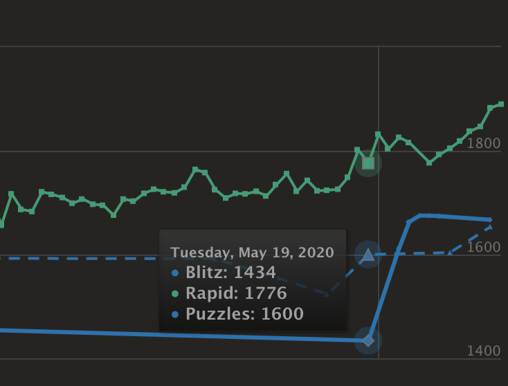
There are a couple of things that could be improved about this graph
- Using similar colors for different lines, makes it hard to read.
- Using symbols (circle, triangle, square) that don't correspond to the legend, or anything, for that matter.
 guidezpl
All 6 comments
To add, I'd say that if my rating on January 1 is 2000 and I don't play until May 5, when I drop 50 points to 1950, I would expect the graph to be a straight line at 2000 from January 1 till May 4, and then a one-day steep drop to 1950. As that's what happened: my rating was still 2000 on May 4, and dropped to 1950 on May 5.
(Right now the plot would draw a straight line from 2000 on January 1 to 1950 on May 5, as if I gradually lost my rating over time. It's incorrect and inelegant.)
 tmmlaarhoven
on 12 Jun 2020
tmmlaarhoven
on 12 Jun 2020
@tmmlaarhoven your idea is live!
If anyone is interested in changing the colors and dash styles, it's part of the same file: https://github.com/ornicar/lila/blob/master/public/javascripts/chart/ratingHistory.js#L41-L67
 greg-finley
on 1 Jul 2020
greg-finley
on 1 Jul 2020
Great, thanks! Now I guess it's just a matter of finding the most convenient way to color and highlight the lines.
Would it be an option to only show markers near rating changes? Say if I play on January 1 and reach 1500, then don't play until February 1 where I drop to 1400, maybe show a marker of 1500 on January 1, then no markers until finally a marker of 1500 on January 31 and a marker at 1400 on February 1?
And ideally I guess the color/dash style would be different for days when the player did or did not play (making curves less prominent when the player didn't play), but I'm not sure how difficult all this would be to implement.
tmmlaarhoven
on 1 Jul 2020
(And arguably one could ask whether the markers are necessary at all. Have you ever tried to see what the graphs would look like if there were no plot markers at all?)
tmmlaarhoven
on 1 Jul 2020
It's definitely not possible to put markers only for dates where games were played. I dropped a PR https://github.com/ornicar/lila/pull/6912 to remove markers. In that PR also left some comments about an idea to make them all solid lines and replace the colors from a list of accessible-friendly colors.
greg-finley
on 1 Jul 2020
I just wanted to say I think it looks great now, thanks!
tmmlaarhoven
on 3 Jul 2020
Related issues
 marmistrz
·
3Comments
marmistrz
·
3Comments
 AdmiralA
·
3Comments
AdmiralA
·
3Comments
 ShRyDeR
·
3Comments
ShRyDeR
·
3Comments
 nikolatzotchev
·
3Comments
nikolatzotchev
·
3Comments
 DVRazor
·
3Comments
DVRazor
·
3Comments
Most helpful comment
I just wanted to say I think it looks great now, thanks!