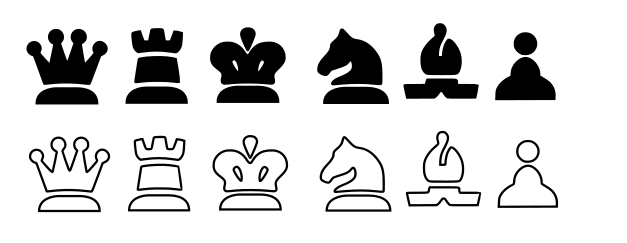
Hello ornicar, i'm a fan of your website so i've created a new set of pieces. This one is exclusively for lichess. I think it will beat merida in terms of popularity overall. Please have a look.

Here are the files:
maestro by sadsnake.zip
Hope you enjoy it!
 ghost
ghost
All 58 comments
They look misaligned on that screenshot, and I think the black pieces won't be visible on dark boards without an outline.
 ornicar
on 5 Sep 2019
ornicar
on 5 Sep 2019
Even after I minimize them with svgo, the files remain 4x larger than the current larger files (leipzig) and 60x larger than the default set (cburnett).
They also seeem to contain the cburnett pieces 
ornicar
on 5 Sep 2019
sorry, let me check them again.
ghost
on 5 Sep 2019
I'm willing to include it to lichess, it will find its public. But we need these format/size issues to be sorted first.
ornicar
on 5 Sep 2019
I like that. Nice outlines too. Still bottom alignment and piece size issues. The pawn at least is too big.
ornicar
on 5 Sep 2019
v5-maestro.by.sadsnake.zip
last version.
ghost
on 5 Sep 2019
That "v5" archive only contains a directory called "v4". Are you sure it's correct?
ornicar
on 6 Sep 2019

ornicar
on 6 Sep 2019
this is final, sorry for spamming you with svgs
ghost
on 6 Sep 2019

kings now match with the queens
please tell me when will these new sets be live
ghost
on 8 Sep 2019
If I may comment as a user - while it lost a bit of its identity without the fat look after your v5, with this _final_ update, I love it. This is probably my favourite set and the first time I'll be switching from Merida in years. Congrats.
Along with this, I would definitely encourage you to iterate on your versions 1-5 for a while, see the best possible set you can make with that style. It's different and stylish enough to be worth having as a set.
 superuser-does
on 8 Sep 2019
superuser-does
on 8 Sep 2019
i went a bit overboard and added them a tad bit of bony gradient + fine fine details

- ultimate
ghost
on 8 Sep 2019
@superuser-does thank you! right now this is the best i can do!
i just hope that the other chess sites will do this
https://gfycat.com/harmfulinbornarmadillo
ghost
on 8 Sep 2019
Not bad - if I may say I thought the beige shade in the Final version was very elegant and just fine, as was the more muted shade for black. It was a near-perfect minimalist set. I personally prefer it to the Ultimate edition just after, though that's a good set too.
The sole weakness in Final was that the black bishop was a bit 'flat', which the gradient fixed but I think the simplicity and elegance was lost in the Ultimate edition by adding gradients and making the pieces yellow.
If it would be possible to address that for the bishop (without a gradient) but keep the colouring you had for the final edition, it would be perfect - though I honestly reckon the final version is already good enough as it is and humbly propose you had already achieved near-perfection with it. :)
superuser-does
on 8 Sep 2019
@superuser-does this is the last version so I hope you like them

ghost
on 8 Sep 2019
"last" version ;)
ornicar
on 8 Sep 2019
Last! I have wife and Kids :))
ghost
on 8 Sep 2019
They'll be online next time I update lichess, which might take a few days.
But you can already see them in action on the test site: https://lichess.dev/study/1DWOonDj
ornicar
on 8 Sep 2019
i tried them and
.... i dont like them :)))
ghost
on 8 Sep 2019
i've got many complaints that i've changed the desing of the pieces so drastically so here are the original works + fixes and such + my last-last set - cardinal
i hope you will be pleased!

ghost
on 9 Sep 2019
 ghost
on 10 Sep 2019
ghost
on 10 Sep 2019
I thank God every day that im an engineer where in my field is only one best solution, where in the arts there an infinity of solution.
I think I grinded this pieces to the absolute best of my knowledge, i just hope i will see them being used on your site.
Best of luck with your work!
ghost
on 11 Sep 2019
Sorry for bothering you, but when will these be available? Im just dying to try them out :))
ghost
on 13 Sep 2019
They're all on https://lichess.dev now.
For some reason your piece sets are the most complex and heavy:
 31k alpha.css
111k california.css
217k cardinal.css
 11k cburnett.css
 55k chess7.css
 40k chessnut.css
 87k companion.css
 55k fantasy.css
232k fresca.css
173k gioco.css
 32k kosal.css
165k leipzig.css
 17k letter.css
197k maestro.css
 46k merida.css
 17k pirouetti.css
 12k pixel.css
 53k reillycraig.css
 24k riohacha.css
 11k shapes.css
 26k spatial.css
There might be some room for optimization. Heavy files mean longer time to download for the user, but even more important more time to display.
ornicar
on 13 Sep 2019
I will try to optimise them. Also some of them are displaing very badly, meaning the lines are not smooth but pixelated...
ghost
on 13 Sep 2019
Which ones?
ornicar
on 13 Sep 2019
the ones in the gioco and cardinal.
ghost
on 13 Sep 2019
also the alpha set now has a problem with the white rooks, the bottom line is transparent...
ghost
on 13 Sep 2019
fixed file size and the jagged lines
ghost
on 14 Sep 2019
thanks, they're up on lichess.org! Unfortunately the gioco white rooks are black!
ornicar
on 14 Sep 2019
fixes for gioco, maestro and cardinal + optimisation
ghost
on 14 Sep 2019
Thanks, it's online.
ornicar
on 14 Sep 2019
gioco and fresca looks solid now, but the other 2 dont show up...
ghost
on 14 Sep 2019
Indeed this renders https://lichess1.org/assets/_30ayd2/piece/fresca/wN.svg
But not this https://lichess1.org/assets/_30ayd2/piece/maestro/wN.svg
Why?
ornicar
on 14 Sep 2019
BTW we use discord for realtime communications, join us if you like https://discord.gg/pw6Efvk
ornicar
on 14 Sep 2019
ghost
on 14 Sep 2019
online.
ornicar
on 14 Sep 2019
gradient fix.zip
fixed gradient issues for M and C, apparently you need to ungroup everything to render...
ghost
on 14 Sep 2019
thank you for your support!!! i just hope you like them!
ghost
on 14 Sep 2019
I do! Thanks for the updates
ornicar
on 14 Sep 2019
i compressed them to the bone! + some fixes...
ghost
on 14 Sep 2019
that compression blew some pieces...
here is the fix
fixes.zip
ghost
on 15 Sep 2019
i know this is getting ridiculous, but i changed the knights to match the set better
cardinal-knights.zip
....
ghost
on 15 Sep 2019
i promise this is the last "fix" . :))
cardinal-q+K.zip
ghost
on 15 Sep 2019
Chess set - regular/usual / cheq by Alastair Scott and/or Armando H. Marroquin (link: http://www.enpassant.dk/chess/fonteng.html)
, apparently is a font and it is freeware, so i vectorised it, nice to have for lichess.
ghost
on 15 Sep 2019
Nice, but do we know what the license is on that set?
BTW I've been licensing yours as CC BY-NC-SA 4.0 https://github.com/ornicar/lila/blob/39201da685a0aaf89c9fad3bc1167ef9d1fb6030/COPYING.md#exceptions-free
ornicar
on 16 Sep 2019
I cant find anything on it. But if i change just 1 pixel it becomes my font, unique 🤣. Adobe has on font based on it that has a license, its called cheq, but its not the original font made by alastair.
So it is your call. I can change them a little bit if you want. If it was me i would have put all fonts, all sets and boards available on the internet.
Right now im looking at those chess24 pieces and my cardinal set and they look very much alike... 🤣
There are probably 100 chess fonts, maybe 10 of them are unique, but they all are based on the same stuff.
Adidas != Abibas
ghost
on 16 Sep 2019
I can even make a cness.com set 🤣if you want
ghost
on 16 Sep 2019
No, that's not how licenses work. If you take a song and change a note, or a book and change a word, it's still plagiarism.
ornicar
on 16 Sep 2019
Look https://www.google.com/url?sa=t&source=web&rct=j&url=http://www.chessdiagrammer.com/download/zip/chessfonts_samples.pdf&ved=2ahUKEwjjq8q4-dPkAhVpiIsKHcAED58QFjAPegQIBBAB&usg=AOvVaw02owCrkczPUhBmD6L568AP
ghost
on 16 Sep 2019
Were talkin 50*50 pixels here, they are not trademarks but icons. Ornicar you are the man, your call, add them or dont.
ghost
on 16 Sep 2019
new chess set - futuro, is based on cheq and on chess.com pieces, i hope you like it!

cardinal-fix Q+N.zip - ... more fixes to that damned set.
ghost
on 16 Sep 2019
That is clearly an imitation of the chess.com set

We won't include it.
ornicar
on 16 Sep 2019
How about these. More bubbly...

ghost
on 16 Sep 2019

or smth like these with the points....maybe
ghost
on 16 Sep 2019
But if i change just 1 pixel it becomes my font, unique...
Here is a very brief explanation of U.S. copyright law. I assume other copyright laws are similar and even supposing plagiarism weren't illegal, stealing others' artwork is terribly rude to the artists and their patrons. We don't want art which imitates chess.com or other sites' pieces unless those sites/artists expressly license their art in the public domain and inform their players to that effect so the players aren't surprised.
 ddugovic
on 16 Sep 2019
ddugovic
on 16 Sep 2019

All chess sets are based on smth http://www.enpassant.dk/chess/fonteng.htm
This is based on chess regular. At least consider it an update to the gioco set.
ghost
on 16 Sep 2019

How about these?
ghost
on 16 Sep 2019
Related issues
 marmistrz
·
3Comments
marmistrz
·
3Comments
 thomas-daniels
·
4Comments
thomas-daniels
·
4Comments
 serversideapps
·
3Comments
serversideapps
·
3Comments
 nikolatzotchev
·
3Comments
nikolatzotchev
·
3Comments
 isaacl
·
4Comments
isaacl
·
4Comments
Most helpful comment
Here is a very brief explanation of U.S. copyright law. I assume other copyright laws are similar and even supposing plagiarism weren't illegal, stealing others' artwork is terribly rude to the artists and their patrons. We don't want art which imitates chess.com or other sites' pieces unless those sites/artists expressly license their art in the public domain and inform their players to that effect so the players aren't surprised.