Libertinus: Link Uni A789, Modifier letter colon to Uni 003A, Colon
There's a Unicode slot for ꞉ (Unicode A789), which is exactly the same glyph as the regular colon. It's purpose is purely technical, particularly in linguistic texts. It is thus sufficient for A789 to resemble 003A, the usual colon.
I'd be happy to create a PR for this fix, but I'm unsure how to link to Unicode characters in FontForge (or any other software), so that future changes to 003A would take effect on A789 as well.
 kopeckyf
All 6 comments
I'm pretty sure one way is to make a new glyph and copy the shape from the old one and paste by reference. The shape but not other properties should be linked. However I'm not sure that's the best way, it might make more sense to copy the glyph as part of the build process. I'll have to look into which approach is better for this.
By the way do you have any docs you can point me towards for how this codepoint is actually used? Are there any special spacing considerations that differ from the regular colon (i.e. should it by assigned to the same kerning category)?
 alerque
on 1 Oct 2020
alerque
on 1 Oct 2020
In the SIL Doulos and Charis fonts, kerning the modifier letter colon is exactly the same as the regular colon. However, they have reduced the vertical skip between the upper and lower dot, and both dots seem to have a slightly reduced diameter. I don't know if it is necessary to follow SIL here. Even in the SIL fonts, the two colons can be distinguished only when they are printed right next to each other, or when there's a large zoom on the output.
The reasoning behind introducing the modified letter is reported in this PDF, in the section Case study 3: https://www.sil.org/sites/default/files/best_practice_for_non-alphabetic_characters_v2_0.pdf
kopeckyf
on 2 Oct 2020
You can either use references, or map the same glyph from different code points (IIRC, space and nbspace do this, as an example).
 khaledhosny
on 3 Oct 2020
khaledhosny
on 3 Oct 2020
U+A789 is supposed to visibly smaller than colon. The proposal (L2/05-097) to add it to Unicode has the following note:
Compared with a typical colon glyph, the dots of the MODIFIER LETTER COLON should be closer together, and the side bearings should be narrower. (Note that the sample in Figure 15 is not as good an examplar in this regard as the other samples.)
Charis SIL, Doulos SIL but also Noto Sans, Noto Serif and Times New Roman do distinguish the two this way.
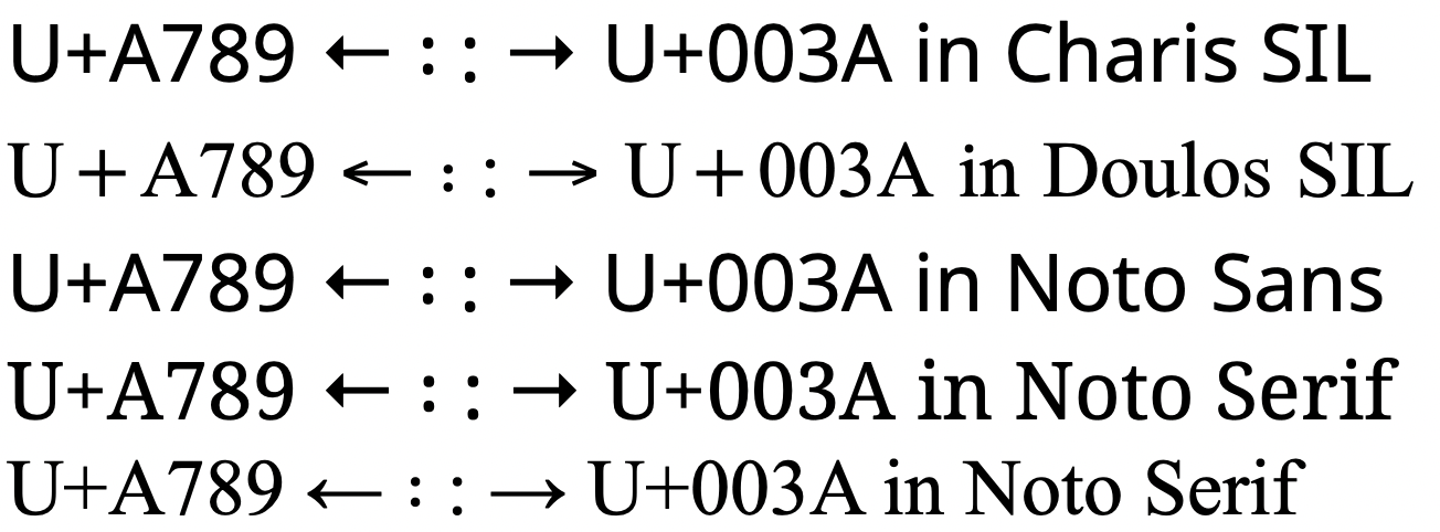
I would not recommend using the same glyph for both U+003A and U+A789, nor using a composite glyph of the first for the second.
 moyogo
on 3 Oct 2020
moyogo
on 3 Oct 2020
I was just this minute half way through adding these as composites! Thanks for the heads up.
alerque
on 3 Oct 2020
So here's the rundown of fonts I happen to have installed that support this (not including weight and other variants):
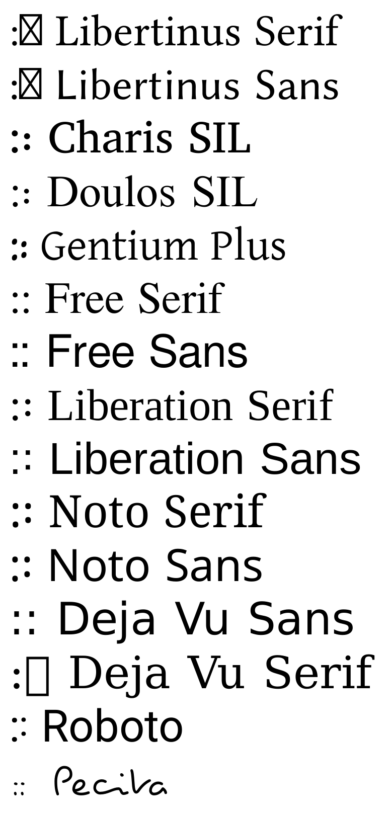
SILE sources
\begin{document}
\neverindent
\nofolios
\language[main=und]
\font[size=40pt]
\begin{script}
SILE.registerCommand("sample", function(options, content)
SU.dump(content[1])
    SILE.call("font", { style = "Book", family = content[1] }, {":꞉ "..content[1]} )
    SILE.call("hfill")
    SILE.call("break")
end)
\end{script}
\sample{Libertinus Serif}
\sample{Libertinus Sans}
\sample{Charis SIL}
\sample{Doulos SIL}
\sample{Gentium Plus}
\sample{Free Serif}
\sample{Free Sans}
\sample{Liberation Serif}
\sample{Liberation Sans}
\sample{Noto Serif}
\sample{Noto Sans}
\sample{Deja Vu Sans}
\sample{Deja Vu Serif}
\sample{Roboto}
\sample{Pecita}
\end{document}
Pecita is a bit of a surprise here, but hey. Roboto seems to be the only one that also makes the dots smaller as well as bringing them together.
alerque
on 4 Oct 2020
Related issues
 Crissov
·
7Comments
Crissov
·
7Comments
 Doc73
·
6Comments
Doc73
·
6Comments
 KrasnayaPloshchad
·
5Comments
KrasnayaPloshchad
·
4Comments
KrasnayaPloshchad
·
6Comments
KrasnayaPloshchad
·
5Comments
KrasnayaPloshchad
·
4Comments
KrasnayaPloshchad
·
6Comments
Most helpful comment
U+A789 is supposed to visibly smaller than colon. The proposal (L2/05-097) to add it to Unicode has the following note:
Charis SIL, Doulos SIL but also Noto Sans, Noto Serif and Times New Roman do distinguish the two this way.

I would not recommend using the same glyph for both U+003A and U+A789, nor using a composite glyph of the first for the second.