Libertinus: Eng looks different in Libertinus Serif
The shape of Latin Eng looks different in Libertinus Serif while switching different font weight and styles.

See: https://sourceforge.net/p/linuxlibertine/bugs/328/
 KrasnayaPloshchad
All 4 comments
Consistency is overrated. Related: http://typedrawers.com/discussion/2406/capital-eng.
 khaledhosny
on 30 Oct 2017
khaledhosny
on 30 Oct 2017
For what it is worth, Gentium Plus encodes:
- in the U+014A BMP slot the 'n + j' (the one used by Libertinus Regular),
- in an unencoded variant ("Eng.UCStyle") the 'N + J' (the one used by Libertinus Semi-bold)
- in an unencoded variant ("Eng.BaselineHook") the 'n + j with base line hook' in (currently not used in Libertinus)
- in an unencoded variant ("Eng.Kom") the 'n + j shortened' form.
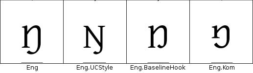
The last three are probably access via some feature or localisation, but I could not find which.
I suppose a reasonable solution could be to follow Gentium example for 1. and 2. and ignore 3. and 4. (at least for the time being).
Comments?
(And, well, yes, consistency is overrated! :) )
 mgavioli
on 20 Feb 2018
mgavioli
on 20 Feb 2018
I think @moyogo might have some input here, but I think we need to have either the N or n form as default for all style, and provide the other one as alternate (stylistic set, but I think there is also some preference for one or the other depending on the locale so we might want to hock it up in a locl feature as well).
khaledhosny
on 20 Feb 2018
One strategy is to have the Eng LC style as the default since there are several African languages that have it as a preferred form and some don’t have OT language tags and set the Eng.UCStyle as locl form for Sami languages (and maybe neighbouring Nordic languages) since those do have OT languages tags and as a stylistic set.
The users I’ve met are unfamiliar with the Baseline hook form and I guess we can trust the SIL with the Kom form.
 moyogo
on 28 Feb 2018
moyogo
on 28 Feb 2018
Related issues
KrasnayaPloshchad
·
6Comments
 tukusejssirs
·
5Comments
tukusejssirs
·
6Comments
tukusejssirs
·
5Comments
tukusejssirs
·
6Comments
 iandoug
·
8Comments
KrasnayaPloshchad
·
5Comments
iandoug
·
8Comments
KrasnayaPloshchad
·
5Comments
Most helpful comment
One strategy is to have the Eng LC style as the default since there are several African languages that have it as a preferred form and some don’t have OT language tags and set the Eng.UCStyle as locl form for Sami languages (and maybe neighbouring Nordic languages) since those do have OT languages tags and as a stylistic set.
The users I’ve met are unfamiliar with the Baseline hook form and I guess we can trust the SIL with the Kom form.