Libertinus: In Libertinus Serif, J looks different in bold italic face.

 KrasnayaPloshchad
All 6 comments
To my taste, it is the Italic and the Semi-bold italic 'J' which look out of context, with their swash appearance, not shared by any other Latin upper case glyph.
My suggestion would be to 'straighten' the first two and leave the third as it is. Possibly, the current Italic and Semi-bold italic form could be moved to a stylistic set (or feature) of some sort (just not to loose them).
 mgavioli
on 20 Feb 2018
mgavioli
on 20 Feb 2018
I’d rather have the swashy one in all the serif italic fonts by default, and provide the other form as stylistic alternate.
 khaledhosny
on 20 Feb 2018
khaledhosny
on 20 Feb 2018
@khaledhosny I agree with you. 🤝 And I suggest using ssXX feature would be a nice choice.
KrasnayaPloshchad
on 20 Feb 2018
Current status:
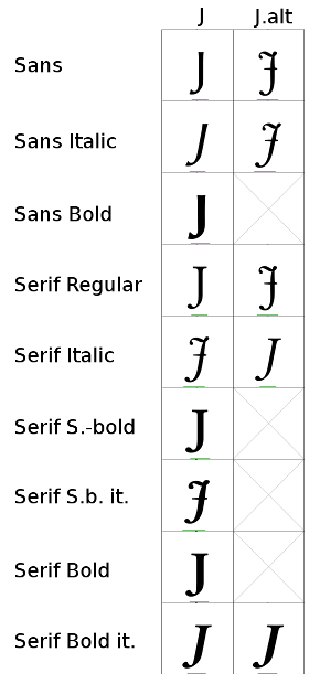
- the swashy shape is the same in Sans and in Serif;
- In all variants, except Serif Italic and Serif Semi-bold italic, the 'straight' shape is the default;
- In Sans Regular and Italic and in Serif Regular and Italic, the 'other' shape (3 of of 4, the swashy one) is in
J.alt - Sans Bold, both Serif Semi-bold and both Serif Bold lack the 'other' shape.
Four glyphs need to be drawn from scratch:
- 'swashy' bold (for Sans and for Serif)
- 'swashy' semi-bold
- 'straight' semi-bold italic
- 'swashy' bold italic
From the over-all picture, I am still convinced that the 'straight' should be the default everywhere and the 'swashy' can go in salt, but this is relatively easy to fix even as a second step.
mgavioli
on 8 Mar 2018
- The swash form in sans make no sense (and the existing glyphs are just copies of serif ones), so we should just drop them.
- Serif regular should continue to have the straight form as default.
- Swash form should be default in serif italic, and I'm OK with serif roman not having an alternate form (but it is OK to have one).
In general I don’t think we should change the defaults too much and try to maintain the existing feel of the fonts as much as possible, unless we are fixing real bugs.
khaledhosny
on 9 Mar 2018
IMHO, I agree with @mgavioli that it would be more consistent to have the "swashy" shape always be the alt glyph. I don't think it would be deviating too much from the original font, but rather resolving a styling inconsistency already present in it. So I'd consider this a minor, reasonable specific deviation from the general principle "we should change the defaults too much", which which I agree as well.
 waldyrious
on 9 Mar 2018
waldyrious
on 9 Mar 2018
Related issues
 Crissov
·
7Comments
KrasnayaPloshchad
·
5Comments
Crissov
·
7Comments
KrasnayaPloshchad
·
5Comments
 philosaurus
·
5Comments
philosaurus
·
5Comments
 Doc73
·
6Comments
Doc73
·
6Comments
 tukusejssirs
·
5Comments
tukusejssirs
·
5Comments
Most helpful comment
I’d rather have the swashy one in all the serif italic fonts by default, and provide the other form as stylistic alternate.