Libertinus: Some operators have wrong sizing and alignment
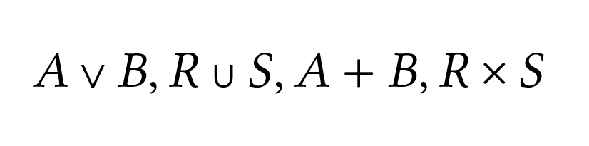
U+221F, U+2227–U+222A and U+228C–U+228E are placed on the baseline rather than being centered on the math axis. They also seem to be a bit small. The U+2229 and U+222A should probably be more similar in appearance to a rotated U+2282.
The + and × are only included in the image for reference.
 philosaurus
All 5 comments
It is always good idea to check what other math fonts are doing here and what happens when the math font is used by a math layout engine (*TeX math mode, for example).
 khaledhosny
on 18 Aug 2020
khaledhosny
on 18 Aug 2020
It's the same in XeTeX and Word. All other maths fonts I have are correctly aligned, so are other symbols in Libertinus.
philosaurus
on 18 Aug 2020
Note to self or anybody else that works on this: while checking math symbol alignment also review whether +lnum vs. +onum features do/should affect what center line is used. See example this comment on Elstob.
 alerque
on 25 Aug 2020
alerque
on 25 Aug 2020
Clearly @thlinard is somebody to ping to review alignment when a PR is ready for this :wink:!
alerque
on 25 Aug 2020
Hey @philosaurus, see #454 for dicussion about resolving this issue. I am also pinging @thlinard concerning the alignment discussion in the same place.
 ivo-s
on 7 Mar 2021
ivo-s
on 7 Mar 2021
Related issues
 kauesena
·
6Comments
kauesena
·
6Comments
 CampanIgnis
·
3Comments
CampanIgnis
·
3Comments
 KrasnayaPloshchad
·
6Comments
alerque
·
6Comments
KrasnayaPloshchad
·
4Comments
KrasnayaPloshchad
·
6Comments
alerque
·
6Comments
KrasnayaPloshchad
·
4Comments