Libertinus: Standardize shape of CYRILLIC SMALL LETTER EF
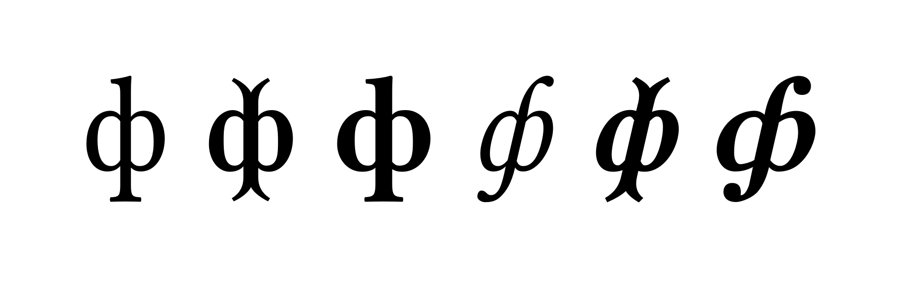
There's the need to standardize the shape of CYRILLIC SMALL LETTER EF (U+444) in the Libertinus font.
In the attached image you can see respectively the upright, semi-bold, bold, italic, italic semi-bold an italic bold glyphs. To be honest I prefer the semi-bold, italic semi-bold glyph, I feel it's more in tune with the "retro" look of the font, and I guess this used to be the standard glyph in Libertine. In any case, a choice has to be made out of consistency.
 aleslavista
All 5 comments
I was told in https://github.com/alif-type/libertinus/issues/145 that the bifurcated version is undesired, so based on that the fix here would to change the Semibold not the other fonts.
 khaledhosny
on 2 Sep 2019
khaledhosny
on 2 Sep 2019
Consistency is overrated.
khaledhosny
on 2 Sep 2019
Overrated??? This way the font isn't suitable for serious typesetting, you must choose one form or the other.
aleslavista
on 2 Sep 2019
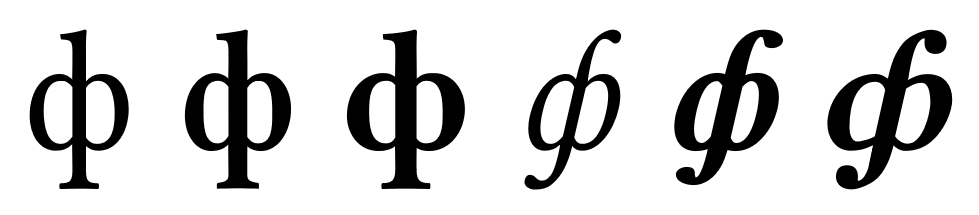
Thanks @SirPL for fixing this in #280! For convenience, here are the new shapes:
 waldyrious
on 20 Sep 2019
waldyrious
on 20 Sep 2019
@waldyrious I am glad I could help. I will check the issues closed with wontfix label -- maybe there's something I can help with.
@khaledhosny I think you can remove wontfix label from this issue :)
 SirPL
on 20 Sep 2019
SirPL
on 20 Sep 2019
Related issues
 philosaurus
·
5Comments
philosaurus
·
5Comments
 Doc73
·
6Comments
Doc73
·
6Comments
 KrasnayaPloshchad
·
5Comments
KrasnayaPloshchad
·
6Comments
KrasnayaPloshchad
·
5Comments
KrasnayaPloshchad
·
6Comments
 aksr
·
6Comments
aksr
·
6Comments
Most helpful comment
@waldyrious I am glad I could help. I will check the issues closed with
wontfixlabel -- maybe there's something I can help with.@khaledhosny I think you can remove
wontfixlabel from this issue :)