Libertinus: Reducing the serif in the number two
I find the serif in the number two too big:
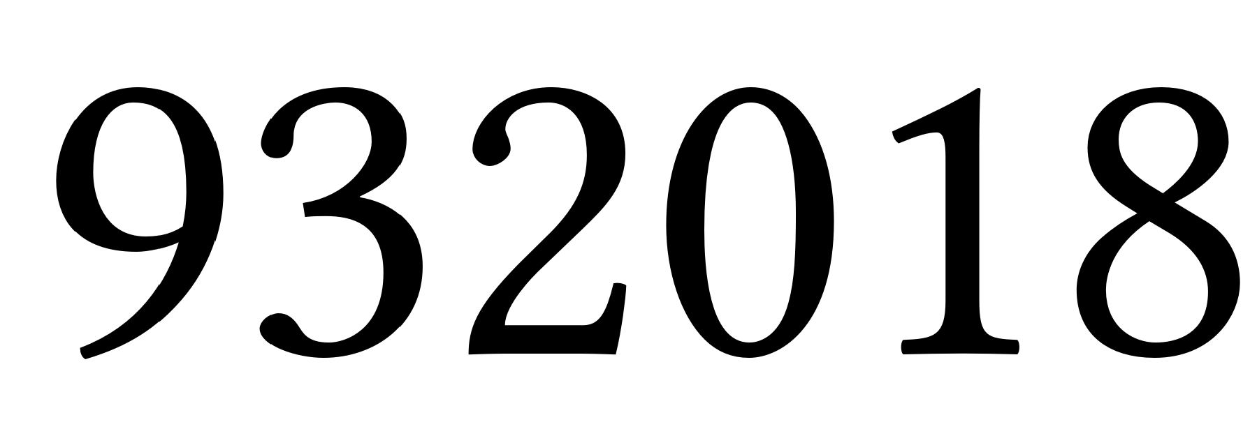
Here is an attempt at reducing this serif:
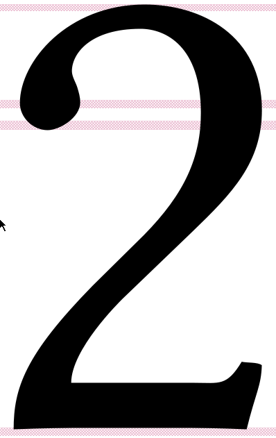
What do you think of this proposal ?
 ghost
ghost
All 2 comments
I don’t think the current serif is too big or out of ordinary.
 khaledhosny
on 26 Mar 2018
khaledhosny
on 26 Mar 2018
👍2
In retrospect I agree with you: the serif is not that big and gives character to the font.
ghost
on 28 Mar 2018
Was this page helpful?
0 / 5 - 0 ratings
Related issues
 aleslavista
·
5Comments
aleslavista
·
5Comments
 kopeckyf
·
6Comments
kopeckyf
·
6Comments
 rolfn
·
5Comments
rolfn
·
5Comments
 Crissov
·
7Comments
Crissov
·
7Comments
 redtrumpet
·
3Comments
redtrumpet
·
3Comments
Most helpful comment
I don’t think the current serif is too big or out of ordinary.