Libertinus: Greek lowercase italic is not a real italic
Lowercase Greek italic (regular, semibold, bold) in Libertinus Serif only slanted instead of real italic: compare italic μ with italic u for example and see that italic μ simply automatically slanted regular μ (actually all greek lowercase italic poorly designed). Because of that it looks worse than Computer Modern or GFS Porson. I wish this font to be better that CM so this should be fixed someday.
As a solution:
Adapt GFS Porson (OFL) and MathJax Computer Modern (OFL) - use Porson's "curls". CM Greek lowercase letters look ideal for math (also worth taking regular and italic Υ and Ω from CM). But I think it's better to stick closer to GFS Porson design to have a distinct look from CM (but it's a harder way).
I also suggest to fix:
- regular μ, ν, γ - adapt from Noto Serif (OFL),
- regular semibold μ - adapt from Noto Serif,
- regular bold μ, ν - adapt from Noto Serif,
- regular ψ - adapt from Gentum Basic/Gentum Plus (OFL).
So more info is here.
 kiwi0fruit
All 13 comments
I think people unfamiliar with intrinsic details of these fonts (like me) will need some visual comparisons to make any sense of this.
 khaledhosny
on 23 Feb 2018
khaledhosny
on 23 Feb 2018
Hmm. I guess the best way is to read for some time this article. Then compare regular and italic sections in:
- Libertinus Serif. It's only oblique. It also seems to be automatically slanted - it's even worse.
- Gentium Plus. It's also only oblique. But the glyphs were adaped to slant so they look nice.
- PFS Porson. Using it together with Libertinus Serif can be considered to be a real italics because greek lowercase would have changed letterforms not simply oblique.
Latin in Libertinus Serif has italics not simply oblique. But I guess it's not necessary that Libertinus would have italic Greek instead of proper oblique. But at least flawed oblique should be fixed.
UPD
I don't know how to fix flaws of oblique letters - something should be fixed but what to do in particular I know only about μ. But I know how to adapt GFS Porson. And I think that real italic would be nice to have. If you note that Porson has another style - I guess the Greek letters are not necessary to be in the same style as latin - I've checked some popular Greek fonts by GFS - in general Greek letters are different from Latin and they like to have even less latinized letters that Porson's.
kiwi0fruit
on 24 Feb 2018
I know the difference between oblique and italic, I’m asking for a comparison between the Greek glyphs in the fonts you mention.
khaledhosny
on 24 Feb 2018
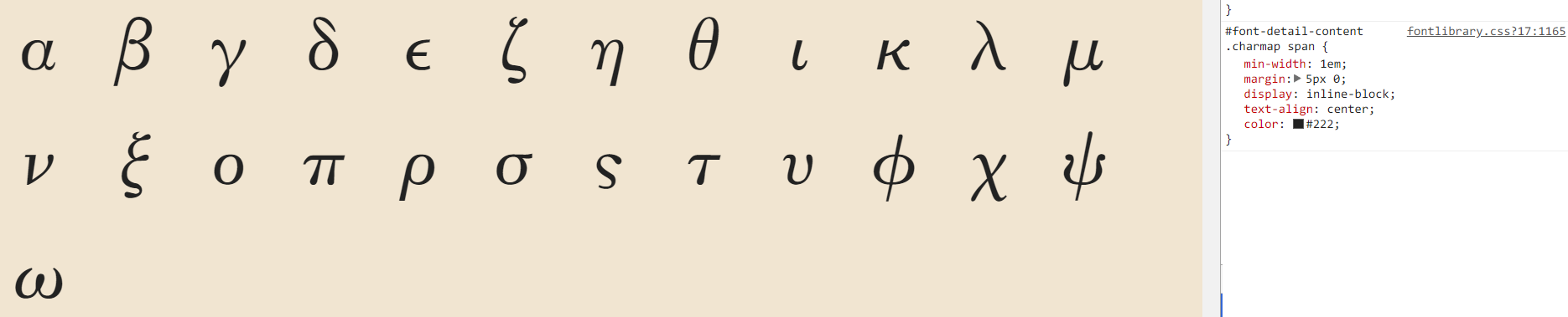
Here are screenshots:
gentium-regular-auto-slanted:

gentium-oblique:

libertinus-regular-auto-slanted:
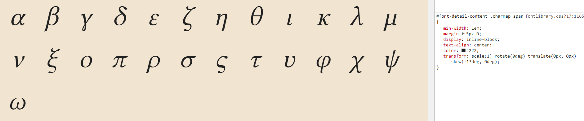
libertinus-oblique:

UPD
porson:
kiwi0fruit
on 24 Feb 2018
For the banter (and hopefully some help seeing what might be at stake), here are three comparisons: Cambria and Brill both have "true" italics; SBL Greek does not. (Both Brill and SBL Greek were designed by John Hudson, btw.) Also potentially useful: Gerry Leonidas's Greek type design resources.
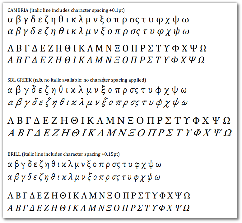
As noted, the "true" italic lines some character spacing applied to align more closely with the upright versions. This was not done in the SBL Greek "slanted" lines.
 dajare
on 20 Mar 2018
dajare
on 20 Mar 2018
I'm also curious which characters are preferable by Greek People. For example this font has specific Greek regular and latin-like italics. I guess such letterforms might be better for Greek people.
Actually there should be two OpenType styles: for Greek texts and for math texts (default is math and English variant, Greek variant is applied via https://helpx.adobe.com/typekit/using/open-type-syntax.html#locl )
kiwi0fruit
on 20 Mar 2018
I'm also curious which characters are preferable by Greek People.
@kiwi0fruit - This question came up in an epic Typophile forum thread. It's actually worth a read through, if you haven't seen it before.
dajare
on 20 Mar 2018
@dajare Do you know some contacts in GFS so they can be pointed here and asked if they are interested in helping?
kiwi0fruit
on 20 Mar 2018
Nice example of true italics are Lingua Franca / Linguistics Pro.
Linguistics Pro has regular preview. Italic preview can be found in this math font review on Fig.23.
kiwi0fruit
on 20 Mar 2018
As the OP suggests a rather deep re-drawing or modification of the current Greek 'italic', I think it worth to attempt to understand what 'true italic' may mean for the a Greek typeface and, possibly, for a Latin typeface too.
Italic as we now know it, was a deliberate invention of the Aldo Manuzio milieu at the end of the XV / beginning of XVI century (I think a precise date can be dug out, but it is not so important). Of course, it was not a creation totally _ex nihilo_, but rather it relied on (some of) the cursive hands in use at the time, with an additional process of stylisation; the whole goal was a typeface allowing a more compact setting of the text (less paper!) without jeopardising legibility (as, for instance, a smaller pitch would have done). Given its origin, the main characteristic of the italic was and still is its cursiveness (for what is worth, here in Italy, where the italic was born, the term for it is still "corsivo"), the slant being a rather automatic consequence of the writing _currenti calamo_.
It is important to remember that it was not intended as a stylistic variant of another, upright, typeface but as a typeface in its own; in fact it was not intended to go together with an upright typeface at all, but it was used to set entire books, and so remained for some centuries. The idea that the same typeface may have an upright and an italic variant is, I believe, relatively recent. And IMHO it is a process not yet completed. By comparing the upright and italic shapes of almost any (serif) font, the differences are evident:
- the ductus of many letters is different and requires much less pen lifts to write each letter
- the serif system is completely different
- the distribution of the contrast is often different (in some case more than in other)
- some letter forms are structurally different.
I'll make only two examples, a rather traditional design, like Bitstream American Garamond (sorry for the poor screen shot!) and a quite recent and very eclectic design like Huerta Tipográfica's Alegreya:

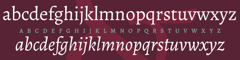
Compare, in the first (Garamond), the contrast distribution of the 'a', the 'e' and the 'z'; the ductus of 'e', 'h', 'm', 'n', 'r', 'u'; the letter forms of 'a' and 'k'.
In the second (Alegreya), the contrast distribution of the 'c', the 'e' and the 'z' and the different solution for most of the stems; the ductus of the same letters as above plus 'b', 'd', 'p', 'q' and 'w'; the letter form of 'a', 'g', 'k'.
The difference in the serif systems is obvious.
Upright and italic are (still?) two different typefaces, in some cases more and in other less, which we 'pack' together more because we are used to this rather than for instrinsic qualities. Of course, this does not exclude that they can nicely go together, but this happens also with 'officially' different typefaces.
These are some thoughts about what "true italic" may mean for the Latin typography. The Greek typographic evolution had nothing of this kind; there was no Manuzio, no italic at all, The Greek italic seems to be a rather recent 'innovation' on the wave of what Hudson, in the Typophile's thread quoted above, calls the 'Romanisation' of the Greek typefaces. In fact, as Hudson again repeats several times, the basis of the most widely used and 'accepted' Greek typefaces lies in the Byzantine hands, quite cursive in comparison to the textual hands used in 'Latin' Europe, in use when Greek typography begun.
The tradition of the Greek typography is inherently cursive; so to speak, it is already italic in itself. The only -- or the most obvious -- device left to differentiate another style is the slant. In fact, in practically all the Greek examples quoted above the "italic" is only recognizable for its slant (a few details a part).
Or, paradoxically, the real Romanisation could be to keep the current Greek shapes as italic and add an upright style; which has been in fact attempted, usually with poor results. Because the Greek writing system, its tradition and the way it developed letter forms over the centuries is different from their Latin counterparts (for historical reasons, the Greek typography also had less opportunities to flourish and develop).
So, what "true italic" means in the Greek context? Or even: does Greek need an italic at all? Just because Latin typefaces have a (as we saw, not always very correlated) italic, also Greek typefaces need one? Why not Arabic typefaces then, or Devanagari, or Korean...
Of course, all the above does not exclude that the current Libertinus Greek "italic" can be improved; but the direction and the goal of this improvement in order to arrive at a more consistent and convincing system remains to my eyes rather obscure.
 mgavioli
on 5 Apr 2018
mgavioli
on 5 Apr 2018
Another thought: most of the Greek typefaces we are accustomed to see (and all the examples above) are:
- sans serif
- cursive
- with strong contrast (usually with very high pen angles).
Possibly, something of this kind may be found among the endless array of Latin fonts, but it is definitely not a common occurrence and would almost surely look peculiar. This systemic difference has to be kept in mind while transposing ideas and devices form the Latin writing system (of today!) to the Greek writing system.
mgavioli
on 5 Apr 2018
The more I think about it the more I think that nice slant would be OK.
The original idea of redrawing italic (readapting actually) was proposed
also because it's clear for me what to do. But I feel that fixing current
italic in a small way would be better (I can't help but feel that some
italic letters like phi and some others need fixing). But in this case it's
not obvious for me what to fix (except for mu and psi)...
kiwi0fruit
on 5 Apr 2018
Feel free to send a pull request if you think any action is needed here.
khaledhosny
on 3 Apr 2019
Related issues
 KrasnayaPloshchad
·
5Comments
KrasnayaPloshchad
·
5Comments
 aleslavista
·
5Comments
aleslavista
·
5Comments
 MarcusHKST
·
3Comments
MarcusHKST
·
3Comments
 philosaurus
·
5Comments
philosaurus
·
5Comments
 cssobral2013
·
7Comments
cssobral2013
·
7Comments
Most helpful comment
As the OP suggests a rather deep re-drawing or modification of the current Greek 'italic', I think it worth to attempt to understand what 'true italic' may mean for the a Greek typeface and, possibly, for a Latin typeface too.
Italic as we now know it, was a deliberate invention of the Aldo Manuzio milieu at the end of the XV / beginning of XVI century (I think a precise date can be dug out, but it is not so important). Of course, it was not a creation totally _ex nihilo_, but rather it relied on (some of) the cursive hands in use at the time, with an additional process of stylisation; the whole goal was a typeface allowing a more compact setting of the text (less paper!) without jeopardising legibility (as, for instance, a smaller pitch would have done). Given its origin, the main characteristic of the italic was and still is its cursiveness (for what is worth, here in Italy, where the italic was born, the term for it is still "corsivo"), the slant being a rather automatic consequence of the writing _currenti calamo_.
It is important to remember that it was not intended as a stylistic variant of another, upright, typeface but as a typeface in its own; in fact it was not intended to go together with an upright typeface at all, but it was used to set entire books, and so remained for some centuries. The idea that the same typeface may have an upright and an italic variant is, I believe, relatively recent. And IMHO it is a process not yet completed. By comparing the upright and italic shapes of almost any (serif) font, the differences are evident:
I'll make only two examples, a rather traditional design, like Bitstream American Garamond (sorry for the poor screen shot!) and a quite recent and very eclectic design like Huerta Tipográfica's Alegreya:
Compare, in the first (Garamond), the contrast distribution of the 'a', the 'e' and the 'z'; the ductus of 'e', 'h', 'm', 'n', 'r', 'u'; the letter forms of 'a' and 'k'.
In the second (Alegreya), the contrast distribution of the 'c', the 'e' and the 'z' and the different solution for most of the stems; the ductus of the same letters as above plus 'b', 'd', 'p', 'q' and 'w'; the letter form of 'a', 'g', 'k'.
The difference in the serif systems is obvious.
Upright and italic are (still?) two different typefaces, in some cases more and in other less, which we 'pack' together more because we are used to this rather than for instrinsic qualities. Of course, this does not exclude that they can nicely go together, but this happens also with 'officially' different typefaces.
These are some thoughts about what "true italic" may mean for the Latin typography. The Greek typographic evolution had nothing of this kind; there was no Manuzio, no italic at all, The Greek italic seems to be a rather recent 'innovation' on the wave of what Hudson, in the Typophile's thread quoted above, calls the 'Romanisation' of the Greek typefaces. In fact, as Hudson again repeats several times, the basis of the most widely used and 'accepted' Greek typefaces lies in the Byzantine hands, quite cursive in comparison to the textual hands used in 'Latin' Europe, in use when Greek typography begun.
The tradition of the Greek typography is inherently cursive; so to speak, it is already italic in itself. The only -- or the most obvious -- device left to differentiate another style is the slant. In fact, in practically all the Greek examples quoted above the "italic" is only recognizable for its slant (a few details a part).
Or, paradoxically, the real Romanisation could be to keep the current Greek shapes as italic and add an upright style; which has been in fact attempted, usually with poor results. Because the Greek writing system, its tradition and the way it developed letter forms over the centuries is different from their Latin counterparts (for historical reasons, the Greek typography also had less opportunities to flourish and develop).
So, what "true italic" means in the Greek context? Or even: does Greek need an italic at all? Just because Latin typefaces have a (as we saw, not always very correlated) italic, also Greek typefaces need one? Why not Arabic typefaces then, or Devanagari, or Korean...
Of course, all the above does not exclude that the current Libertinus Greek "italic" can be improved; but the direction and the goal of this improvement in order to arrive at a more consistent and convincing system remains to my eyes rather obscure.