Kiwix-android: Enhancement: Convert app to use a navigation drawer based workflow
Most apps with multiple top-level actions use a navigation drawer which shows up on startup & allows easy navigation for the users (Medium, gmail, reddit, etc). In my GSoC proposal, I suggested something like this:
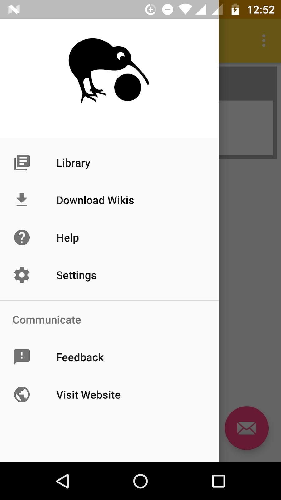
Differences from current setup:
- List of offline/downloaded zims (_Library_) is separated from the tabs for downloading zims (_Download Wikis_)
- 'Settings' shows up in the nav-drawer
- _Feedback_ is an additional activity that I have proposed. (_Help_ already exists, while _Visit Website_ is simply an implicit intent or an explicit to a webview).
(The MainActivity with the kiwix webview will open up on tapping on a zim in the _Library_, like how it works now)
Why I feel it is useful:
Most apps follow this structure, so kiwix will be following the uniform UX pattern and become more intuitive for the new users. Even for existing users, it will be simpler to navigate to other actions through this instead of using the drop-down menu.
Scope for additional features:
If implemented, we can easily add new features to the nav-drawer without complicating access to them. I've planned one to complement the note keeper, through which the user can directly access all notes (for reading or managing them). Something similar can be done for bookmarks & history, allowing users to directly open any bookmarked or history article across zims.
Implementation details:
Once the final list of actions to be listed in the nav-drawer has been decided, some of them would have to be converted from activities to fragments.
- Currently the list of downloaded zims and list for online zims is already in the form of fragments; I'll have to just separate them.
- Settings and Help are activities and would need to be converted
- Feedback & Visit Website will be created as fragments. (Same for the _View Notes_ feature that I'm planning)
- Overall app code structure and flow will undergo some change
Since I'll be changing how existing files are structured and respond, I'll have to work out how the changes are to be implemented on the develop branch with @macgills to keep from breaking his code
 Aditya-Sood
All 25 comments
@mhutti1 @macgills @kelson42 your thoughts on this?
Aditya-Sood
on 30 Jun 2019
Nowadays the bottom navigation bar is the preferred navigation but it is limited to 5 items so we would have to give serious thought into our "primary destinations" to pursue it.
As mentioned here the nav drawer can coexist with the bottom navigation drawer if we still can't map it so well.
It also feeds into a potentially double bottom bar on screen when reading a zim and the toolbar is enabled, which it will be by default soon.
 macgills
on 1 Jul 2019
macgills
on 1 Jul 2019
@Aditya-Sood I don't really see or understand the value of this proposal. Just saying "Most apps follow this structure" is not enough to justify massive UI changes IMO. To me, after a first sight, it makes the app more complex and to the contrary I want to simplify it.
 kelson42
on 8 Jul 2019
kelson42
on 8 Jul 2019
@kelson42 I personally have found the navigation in the app very confusing and think it could be rethought somewhat. The fact that when I press back while reading a zim that it exits the app is not the most desirable behaviour I would think.
Navigation is always a very complex thing but I think our overflow menu and navigation drawer are overworked and inconsistent. We should do our best to adhere to the material guidelines on the topic
macgills
on 8 Jul 2019
@macgills Then I would like to see the problems clearly exposed first before talking about the solution.
kelson42
on 8 Jul 2019
The fact that when I press back while reading a zim that it exits the app is not the most desirable behaviour I would think
This to me is a problem.
Another is that once I started reading a zim I couldn't figure out how to get back to downloads, I felt trapped in the zim reader. Obviously I figured it out but if in our bottom bar we had a download icon that brought us to that location from anywhere in the app then that would speed navigation immensely.
This navigation is popular across all the largest apps on the market, Spotify, Instagram, Facebook, WhatsApp, Revolut.
If we need clearer exposure then a UX designer could be approached? I don't know about kiwix's history or status of UX designers.
macgills
on 8 Jul 2019
@macgills I don't see any relationship between the behaviour of the hardware button "back" (one time we have reached the first item of the navigation history) and a navigation drawer. What is it?
kelson42
on 8 Jul 2019
I was talking on the overarching topic of navigation and how to improve it, which is the intention of this ticket I believe.
We currently are not adhering to the material guidelines to which I have linked.
macgills
on 8 Jul 2019
@kelson42 my aim with proposing this was that since the way of navigating through the app isn't similar to the general trend, it is not as intuitive for new users, and may even be a deal-breaker for some of them (This user review also asks for something similar). Existing users too stand to benefit from a generic navigation pattern.
I think @macgills's idea of approaching a UX designer would provide us all with more clarity on the matter, but at the same time I am worried about my phase deadlines
Aditya-Sood
on 8 Jul 2019
@Aditya-Sood @macgills My concern here is that the problem we try to fix is not fully understood/written and therefore won't be properly fixed. Not only the problem is not really written but the uses case (step-by-step workflows) implied by the new design are not clear/written either. How would that interact with the current menu? We will have duplicates!? What kind of gesture will make this appearing? We have rewritten the app first page displayed at launched... and now we talk about masking it with a navigation drawer, that does not sound logic to me! What about alternative to such a navigation drawer (pros/cons)? Etc...
This is only my feedback as I have been asked for it. The GsoC program is handled by @mhutti1 here and I trust him to make the right decision to have at the end of the GSoC something which is stable and works better.
kelson42
on 8 Jul 2019
@kelson42 I was planning to finalise how navigation between screens will take place once a drawer UI was agreed upon, but I'll do that now if you feel it should be discussed before?
If so, then @macgills @mhutti1 also need to decide whether we're using a nav-drawer or bottom drawer
Aditya-Sood
on 8 Jul 2019
uses case (step-by-step workflows) implied by the new design
Upon launching the app, the Library will be opened. From there:
- To read a zim -> Tap on the zim
- To open settings -> Open nav drawer and tap on 'Settings'
- To download zims -> Open nav drawer and tap on 'Download Wikis'
- Similarly for other actions displayed in the mock
How would that interact with the current menu?
Those menu items which are not specifically related to reading articles ('Get Content', 'Support Kiwix') are being taken out. Rest will remain there - We'll continue using MainActivity for reading zims
We will have duplicates!?
Only for 'Settings' and maybe 'Help', since they are both generic enough to be accessible from the top hierarchical level of the app
What kind of gesture will make this appearing?
There's the overflow icon at top right, or simply swiping right across the screen
We have rewritten the app first page displayed at launched... and now we talk about masking it with a navigation drawer, that does not sound logic to me!
IMO a nav-drawer should have been used instead of adding a special webpage which shows all the downloaded zims in the first place. But as you pointed out, would require significant change to the code base.
What about alternative to such a navigation drawer (pros/cons)? Etc...
As @ macgills has pointed out that a bottom navigation bar might be a more up-to-date option, which is doable as well since there are only 5-6 top level hierarchical actions. But the advantage with navigation drawer is that we can add more top-level actions in the future without being restricted to a fixed display area (since the nav-drawer menu is vertically scrollable, and I haven't yet come across a bottom bar which is horizontally scrollable)
@kelson42 @mhutti1 should we discusss about this on slack?
Aditya-Sood
on 9 Jul 2019
I would prefer not to launch into the library as I think a homepage would be nicer like we currently have.
The plan I imagine is to have a bottom nave bar too? We already have a pr trying to make this the default.
 mhutti1
on 10 Jul 2019
mhutti1
on 10 Jul 2019
I would prefer not to launch into the library as I think a homepage would be nicer like we currently have.
I think the 'Library' is identical to the homepage in terms of functionality - both show a list of downloaded zims
Also, since multiple tabs can be opened only for a single zim, showing the list of zims in a webpage might give a false impression that different zims can be opened in different tabs (as the 'add new tab' icon is visible on top)?
The plan I imagine is to have a bottom nave bar too? We already have a pr trying to make this the default.
I think we should have only one of the two (bottom bar & nav-drawer), so as to not overwhelm the user with options
My issue with using the bottom bar instead of nav-drawer is that there can only be a limited number of icons (2-5) on it, so there isn't scope to expand options on it in the future
Aditya-Sood
on 10 Jul 2019
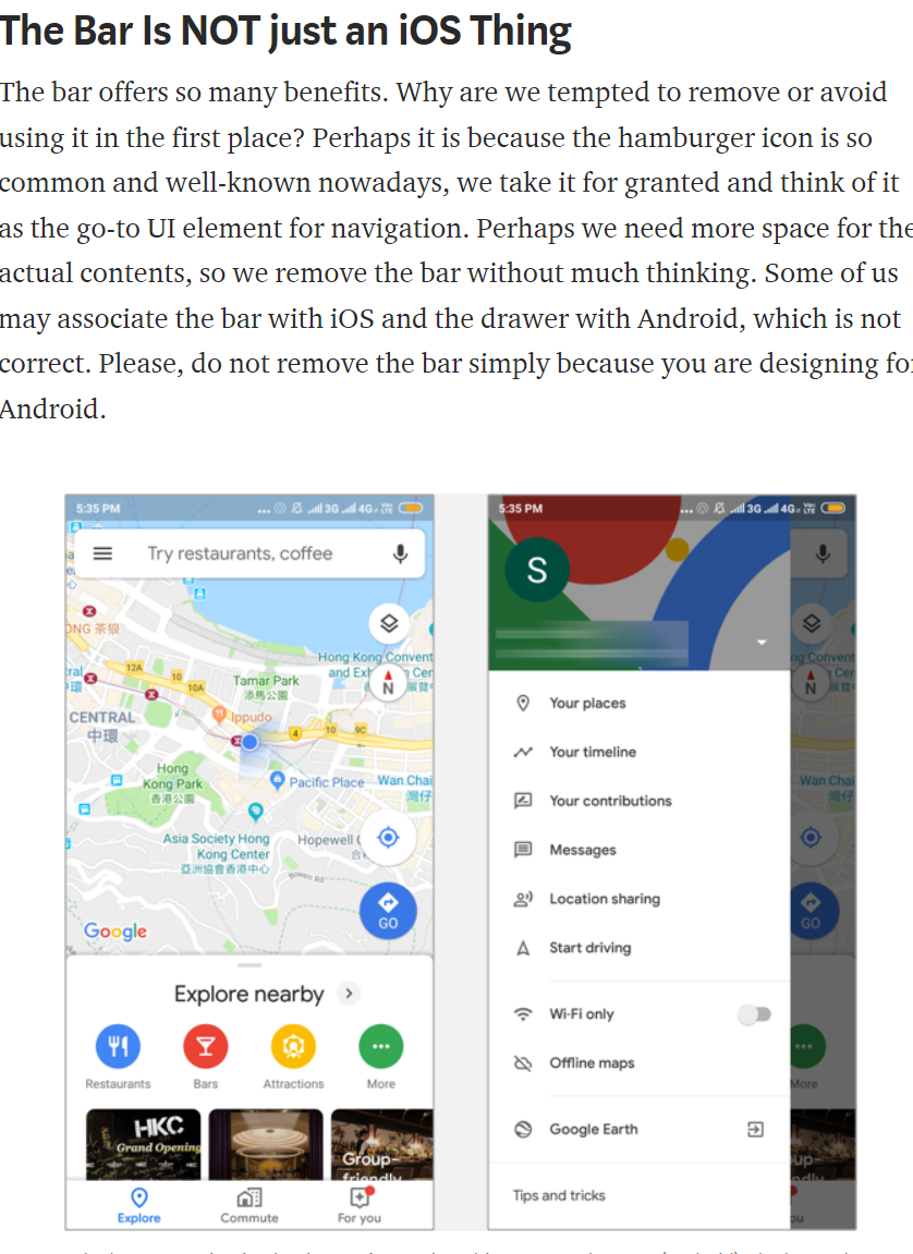
As mentioned here the nav drawer can coexist with the bottom navigation drawer if we still can't map it so well.
We can have both, the most important in nav bar and the less important screens in the nav drawer.
The nav drawer is about absolutely crucial locations, I doubt we even need 5. Like why is one of whatsapp's the camera? And status as one of your top destinations, could so much more easily be accessed from anywhere. Utterly ridiculous, they just padded it out.
macgills
on 10 Jul 2019
Is that on iOS? Because its still the the same 4 tabs (camera, chats, status, calls) at the top in my android
So for kiwix, should we have both or just the bottom drawer?
Aditya-Sood
on 10 Jul 2019
BottomNavBar is just non swipeable tabs at the bottom, I was just talking about prominence.
I think both is not the worst idea in the world, it is used in google maps as that article I linked says
but this is just my 2 cents, @mhutti1 gets say here
macgills
on 10 Jul 2019
@macgills so we can go with Library, Download Wikis, Help on the bottom bar, and rest in the nav-drawer?
Subsequently, I was thinking of having a 'View Notes' fragment to view and manage all available notes, and that can replace 'Help' on the bottom bar?
Aditya-Sood
on 11 Jul 2019
I think Settings would also want to be a nav bar destination? Really I think once we have it somewhat implemented we can improve and iterate
macgills
on 11 Jul 2019
@mhutti1 @kelson42 what else should we focus on ironing out?
Aditya-Sood
on 11 Jul 2019
I am against having such options on the bottom bar for the default browsing session. If you look at how the official wikipedia app does it they have a bottom bar for general stuff and a bottom bar for browsing articles. I think that that might be the way to go because Bookmarks, find in page and others are more useful when browsing.
mhutti1
on 15 Jul 2019
From what I understood the bottom-bar will be separate from the bottom toolbar in the zim-reader.
I think we can even avoid keeping the bottom-bar inside the zim-reader MainActivity, only the side nav-drawer. Rest of the places will have both.
Aditya-Sood
on 15 Jul 2019
Sounds good to me
macgills
on 15 Jul 2019
This issue has been automatically marked as stale because it has not had recent activity. It will be now be reviewed manually. Thank you for your contributions.
![stale[bot] picture](https://avatars.githubusercontent.com/in/1724?v=4&s=40) stale[bot]
on 30 Oct 2019
stale[bot]
on 30 Oct 2019
We did this, hooray
macgills
on 20 Nov 2020
Related issues
 RohanBh
·
5Comments
RohanBh
·
5Comments
 yashk2000
·
5Comments
yashk2000
·
5Comments
 RaiLokesh
·
4Comments
RaiLokesh
·
4Comments
 Frans-Lukas
·
3Comments
Frans-Lukas
·
3Comments
 abdulwd
·
4Comments
abdulwd
·
4Comments
Most helpful comment
We did this, hooray