Kiwix-android: Make clear all notes dialog similar to clear history dialog
Is your feature request related to a problem? Please describe.
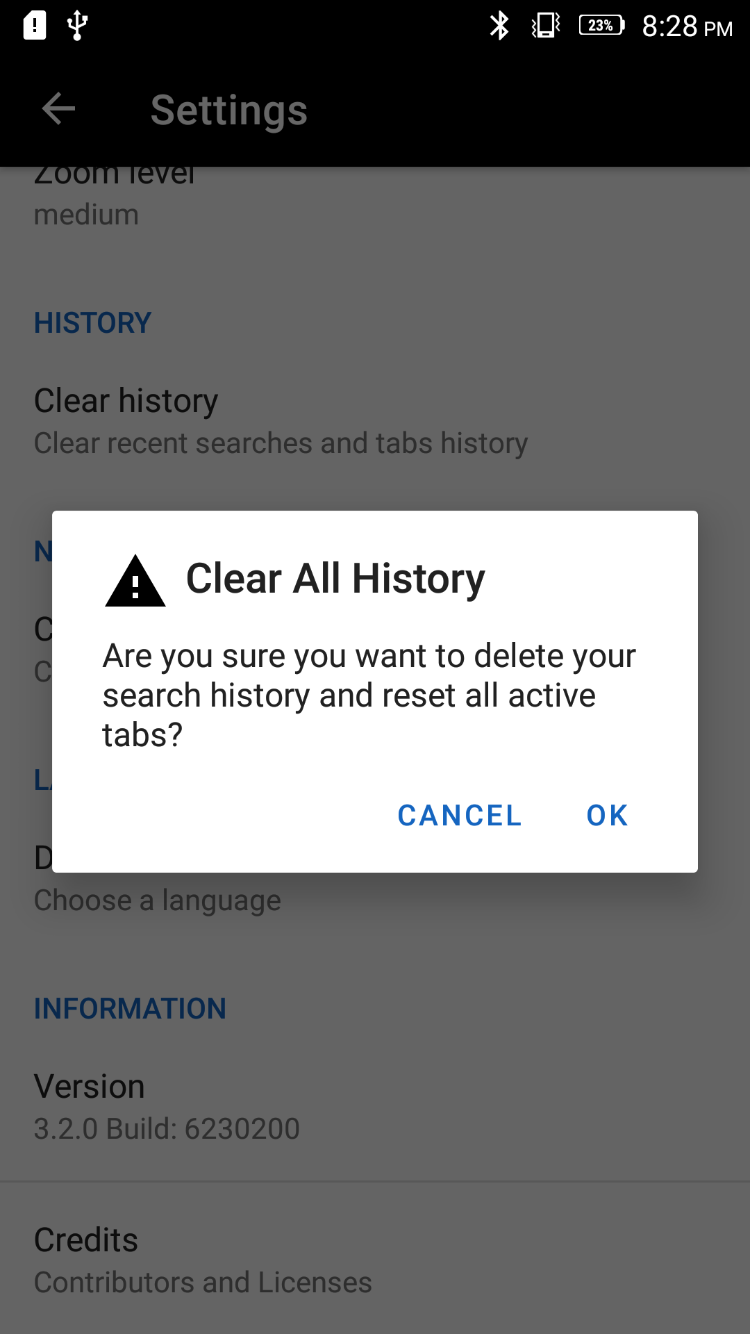
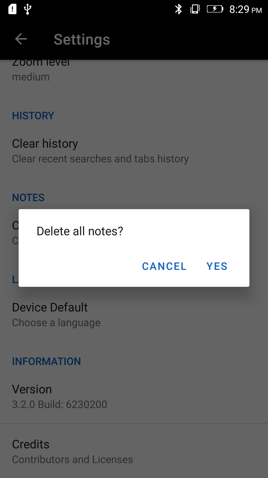
The dialogs of clear history and clear all notes in the setting section of the app vary a lot even though both of them involve clearing data important to the user. Hence the dialogs should also look similar.
Describe the solution you'd like
The clear history dialog looks good as it provides the appearance of an alert with an exclamation mark so that the user clearly knows what he is doing. The appearance of the clear all notes option dialog is a bit plain on the other. I plan to make the same UI for both, following the style of the clear history dialog.
Additional context
If this is a valid issue, I would like to work on it.
 yashk2000
All 5 comments
I would wait until #1443 is completed as that will have an api to easily support this.
This dialog might look goofy with an icon as it just has a message, no title and You run the risk of repeating yourself if you have a title and a message. I am unconvinced it is a value add right now but I could be proven wrong.
 macgills
on 25 Feb 2020
macgills
on 25 Feb 2020
@kelson42 @macgills Can i work on this ?
 rohanprasadofficial
on 27 Feb 2020
rohanprasadofficial
on 27 Feb 2020
@rohanprasadofficial this issue is currently on hold. If we need it to be solved, we'll do it once #1443 is completed.
yashk2000
on 27 Feb 2020
@yashk2000 thanks for the clarification
rohanprasadofficial
on 27 Feb 2020
@kelson42 #1443 has been merged. I will fix this issue now.
In order to prevent the message from being repeated, in the title and message, I will just give the title along with an icon.
This will provide the message, and at the same time, it will look like an alert too in order to make the user properly aware of what they're doing.
yashk2000
on 9 Mar 2020
Related issues
 Popolechien
·
4Comments
Popolechien
·
4Comments
 RohanBh
·
5Comments
RohanBh
·
5Comments
 RaiLokesh
·
4Comments
RaiLokesh
·
4Comments
 danielzgtg
·
4Comments
danielzgtg
·
4Comments
 sonusourav
·
5Comments
sonusourav
·
5Comments
Most helpful comment
I would wait until #1443 is completed as that will have an api to easily support this.
This dialog might look goofy with an icon as it just has a
message, no title and You run the risk of repeating yourself if you have a title and a message. I am unconvinced it is a value add right now but I could be proven wrong.