In my opinion theming distracts from the purpose of the launcher. I'm sure the issue of the launcher obfuscating the wallpaper has been mentioned before, and I'm sure some have complained about the text being obfuscated by the wallpaper.
I propose a removal of the theming for all but the search bar and app drawer. The text should then be changed to have a small drop shadow like most other launchers to make it easier to read.
This in my opinion would fix some design disadvantages I see with KISS, and reduce the setup time that it takes to try out which theme works. I also see this achieving KISS's goals more then what its like now.
 zayuim
All 8 comments
Could you make a mockup of how this would look?
 licaon-kter
on 28 Feb 2018
licaon-kter
on 28 Feb 2018
@licaon-kter
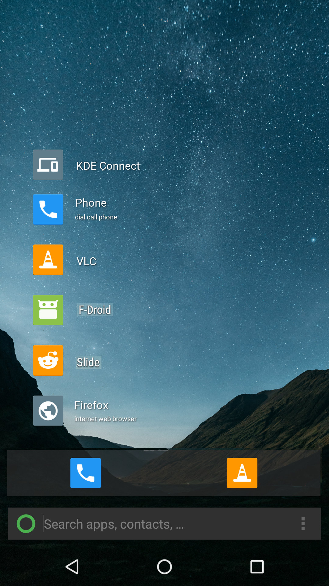
This is pretty much exactly how I would want the home screen to look like. The mockup is far from perfect and I'm sure some thing will have to be altered in practice.
zayuim
on 28 Feb 2018
And with the current theming option you can't get that?
licaon-kter
on 28 Feb 2018
@licaon-kter You could, but since the text doesn't have the drop shadowing that launchers such as the one in Lineage OS's stock has, therefore the text sometimes is hard to read depending on theme and wallpaper.
What I'm asking for is instead of a light/dark theme with three different transparency settings. Just have a single light/dark/colour theme that only skin those bottom two bars. This results in a clear view of the wallpaper and much less fiddling around for a first time setup, keeping it even more simple.
This is what I currently get when I change it to the dark transparent theme:
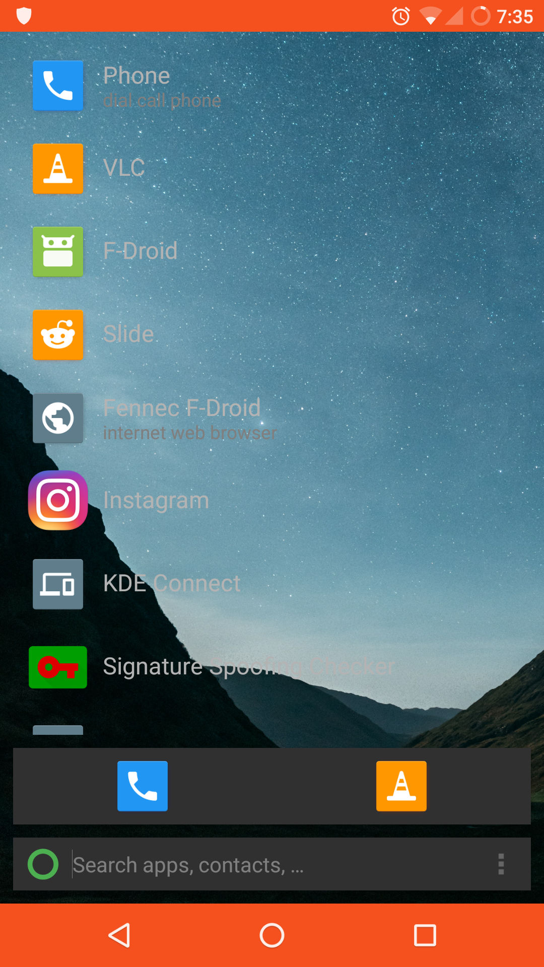
It doesn't look as nice as my mockup, where changing the theme only affected the bottom two bars and left the contents alone. I do have a less radical design change, But I think my current proposal solves all issues I would have with this as a launcher.
zayuim
on 28 Feb 2018
You're taking away the choices, that might me a problem.
Albeit, I do like a more contrasting text, the shadow is nice.
licaon-kter
on 28 Feb 2018
@licaon-kter
I guess my idea of keeping it simple is a little more destructive, but if it makes you feel any better I think the colour theme should be kept on the app drawer.
zayuim
on 28 Feb 2018
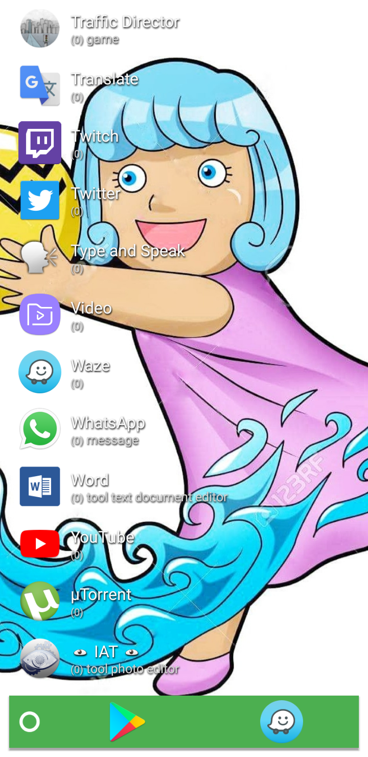
Can you take a look at PR #866 ? I added text shadow.
 TBog
on 28 Feb 2018
TBog
on 28 Feb 2018
Merged @TBog's request, expect to see this in upcoming releases ;)
 Neamar
on 28 Feb 2018
Neamar
on 28 Feb 2018
Related issues
 emersion
·
5Comments
TBog
·
7Comments
emersion
·
5Comments
TBog
·
7Comments
 cfytrok
·
7Comments
cfytrok
·
7Comments
 abhijithvijayan
·
4Comments
abhijithvijayan
·
4Comments
 lil5
·
4Comments
lil5
·
4Comments
Most helpful comment
Can you take a look at PR #866 ? I added text shadow.
