Kibana: Indicate in the UI when an app or feature is in beta
As a user, I want to know when an app or feature is in beta so that I can properly set my expectations on it's current state and future development prospects.
As a product owner, I want to communicate to users when an app or feature is in beta so that I can properly set their expectations on it's current state and future development prospects.
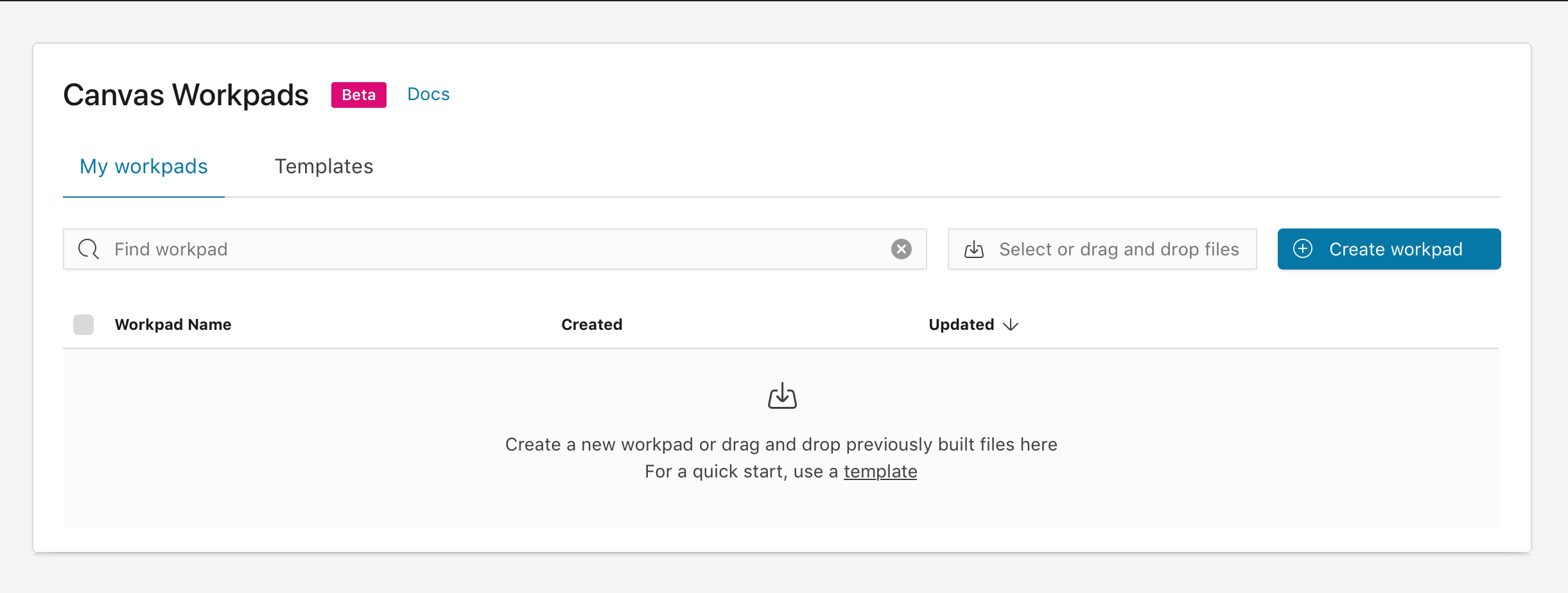
For Canvas, we are proposing adding an EUI badge component to the Canvas home page (screenshot below) in addition to the Kibana home page.

 ryankeairns
All 23 comments
LGTM @ryankeairns !
@tbragin @ruflin we're beginning to use this tag for beta / experimental features everywhere. Thoughts on keeping this consistent and doing something similar for InfraUI/Log Viewer until it is GA?


 alexfrancoeur
on 31 Oct 2018
alexfrancoeur
on 31 Oct 2018
cc @elastic/kibana-management as an FYI
 rayafratkina
on 31 Oct 2018
rayafratkina
on 31 Oct 2018
@ryankeairns can you check the color contrast on that label? Bill had trouble reading it, so I am concerned if it's passing accessibility...
rayafratkina
on 31 Oct 2018
@rayafratkina yes, this color combination passes the AA level. The result is posted here as well - https://elastic.github.io/eui/#/guidelines/colors
ryankeairns
on 31 Oct 2018
Thank you for confirming!
rayafratkina
on 31 Oct 2018
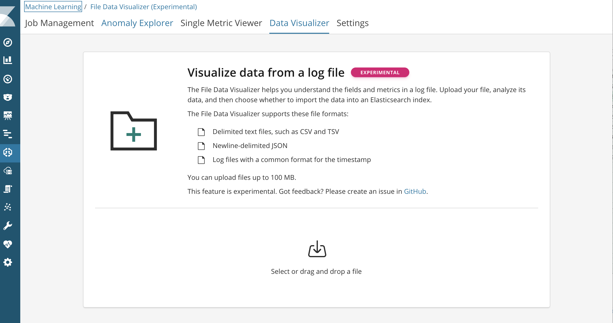
This is quite a bright beta label. I worry will indicate something bad. We want users to engage with these features. Is there any way to have a label that is a bit more neutral?
I personally like the approach the APM team takes here in highlighting that KQL bar in that UI is in beta. Though I don't know if it passes the accessibility test.

 tbragin
on 31 Oct 2018
tbragin
on 31 Oct 2018
Unfortunately, the lighter gray text in the APM screenshot does not provide enough contrast to pass WCAG AA.
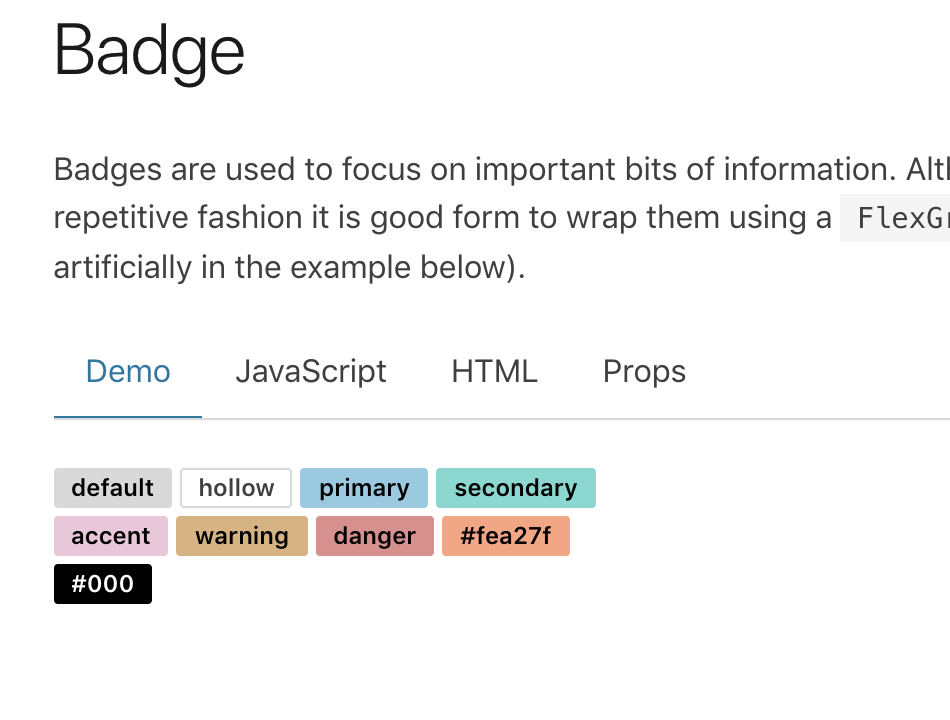
As for the badge, we can use any of the color safe EUI colors including 'hollow' which is a bordered (vs filled) design that uses an accessibility-friendly dark gray for the text:
cc:/ @snide @cchaos
ryankeairns
on 31 Oct 2018
Cool! I would personally prefer the hollow badge for indicating beta. Somehow it feels less off-putting and more informational to me. I could also be okay with "default" and "accent" badge. Perhaps there are others as well. I would have to see it in a mockup.
How do others feel?
Btw, so great to have all of this already defined by EUI :)
tbragin
on 31 Oct 2018
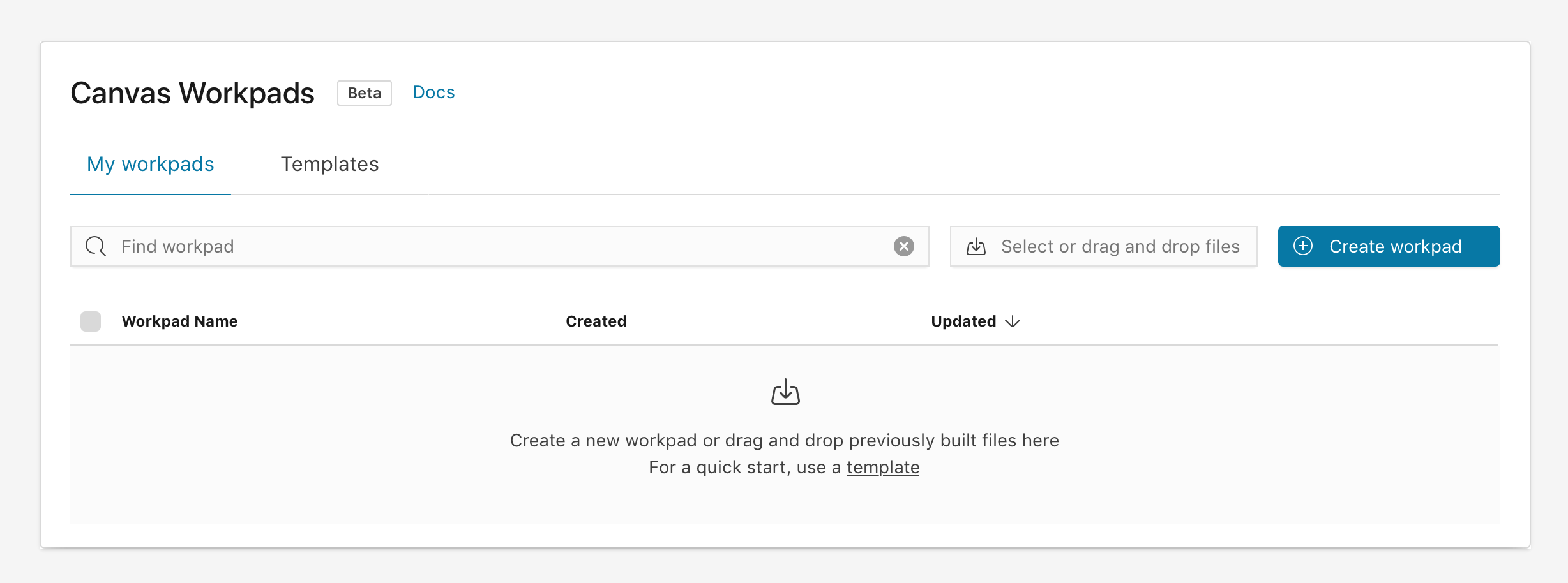
@tbragin here you go! I agree that it feels less alarming while still being plainly visible.
ryankeairns
on 31 Oct 2018
I think we've tried to find a place for that magenta color in many different ways and so far the only place I've seen it really work has been as a progress bar. I love your suggestion @ryankeairns !
 cjcenizal
on 31 Oct 2018
cjcenizal
on 31 Oct 2018
Are you planning on updating the EuiBetaBadge component? That way rollups could also benefit from this improvement since we're using that component.
cjcenizal
on 31 Oct 2018
I think that's essentially what we're discussing here... what do we want the default style to be? A major design concern here is consistency, as always, so if we change course we'd need to check that things are in alignment (some use badge, some use beta badge, some use plain text, etc.).
I sense (and personally agree) that the hot pink might be calling a bit too much attention to the Beta status which could potentially lead to some unintended reluctance or slight fear of using a thing. I'm sure others have opinions too, so let's hear them and decide the best path forward :)
ryankeairns
on 31 Oct 2018
Dave, Caroline, and I just talked about this from the design consistency/EUI perspective and our preference would be for people to continue using either the EuiBetaBadge or the smaller EuiBadge but retain the pink color. Coincidentally, this situation came up yesterday for Rollups and we also arrived at the same conclusion.
It's a trickier thing than one might suspect in that some feel a beta badge should be prominent ("check this out, it's new and awesome!") while others feel it should be more subtle ("FYI, this is a beta feature, be forewarned stuff my break."). Using the smaller badge feels like a good middle ground, from our point of view, in that it reduces the size (and thus amount) of pink color while dropping the 'glow' as well.
If anybody still feels strongly this is not going to work, then let's chat further.
Thanks!
ryankeairns
on 31 Oct 2018
I like that a lot @ryankeairns
@alexfrancoeur Should I open a different issue to track adding this label to InfraOps and Logging UI, or is this a meta-issue?
Also any advice on where to place the label in the UI? I can see a couple of options:
(1) on the far right in the title bar
(2) next to the name label in the title bar
Personally, I like (1), because the second feels like it crowds the label. Perhaps there are other placements as well I haven't thought of.


tbragin
on 31 Oct 2018
We'll need to evaluate placement on a case-by-case basis since the layouts can vary quite a lot from app to app. In the screenshots above, option (1) - far right - would keep it from moving around and cluttering up the breadcrumb navigation.
ryankeairns
on 1 Nov 2018
@tbragin I think it makes sense to open a separate issue for this but maybe we can address in the same PR. @ryankeairns did you plan on implementing this or would the expectation be the Canvas / InfraOps team do so?
alexfrancoeur
on 1 Nov 2018
I did not plan on doing so. @clintandrewhall brought it up and was preparing to work on it for Canvas, which started this conversation :)
ryankeairns
on 1 Nov 2018
++ on a different issue for Infra!
It would be great to get this done and merged since we are getting close to the deadline for 6.5
rayafratkina
on 1 Nov 2018
I opened a separate issue for InfraOps and Logs UI Beta label, recommending the far-right placement. https://github.com/elastic/kibana/issues/25008
tbragin
on 1 Nov 2018
@rayafratkina @clintandrewhall is there a PR for this? InfraOps is calling this a blocker, we'll need to treat this as one as well.
alexfrancoeur
on 5 Nov 2018
I agree it should be a blocker
rayafratkina
on 5 Nov 2018
@alexfrancoeur As I understand it, @snide recommended teams use the existing EuiBetaBadge so that we're consistent. Relatedly, the result of design changes discussed above would be made to that EUI component if, for example, we want to provide an alternative color or design. Do I have that correct?
Also, I am currently working on what said alternative color/design might be.
ryankeairns
on 5 Nov 2018
Use EuiBetaBadge. We'll update EUI to address styling concerns, but that's the correct component for the job.
 snide
on 5 Nov 2018
snide
on 5 Nov 2018
Related issues
 LukeMathWalker
·
3Comments
LukeMathWalker
·
3Comments
 MaartenUreel
·
3Comments
MaartenUreel
·
3Comments
 socialmineruser1
·
3Comments
socialmineruser1
·
3Comments
 celesteking
·
3Comments
celesteking
·
3Comments
 ctindel
·
3Comments
ctindel
·
3Comments
Most helpful comment
Use
EuiBetaBadge. We'll update EUI to address styling concerns, but that's the correct component for the job.