Not sure but breadcrumbs and title styles seems unbalanced:

It's not critical, but it seems in some of previous work some style has been modified impacting this.
My point is that when moving from list pages, it looks like not consistent:
It sounds a pure CSS problem, nothing seems broken in that sense, but the effect is not good I think.
 lucasponce
All 19 comments
Sounds different but perhaps related to https://github.com/kiali/kiali/issues/2635
 jshaughn
on 9 Apr 2020
jshaughn
on 9 Apr 2020
It's not directly related to #2635.
Basically there is a technical debt with a component UI component RenderHeader.
It's is used in several locations on different pages assuming that style in all of them should be the same.
This has created that everytime that the componet has been adjusted it modifies the style.
I'm going to work on this, not urgent but it's impacting in current details pages.
lucasponce
on 27 Apr 2020
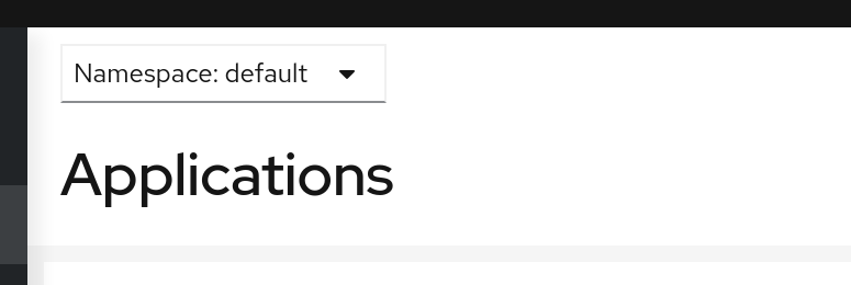
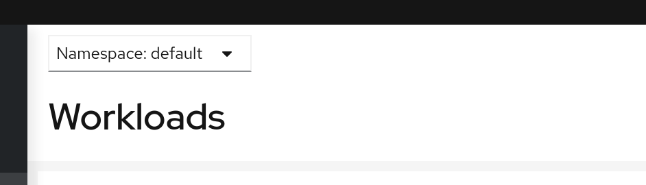
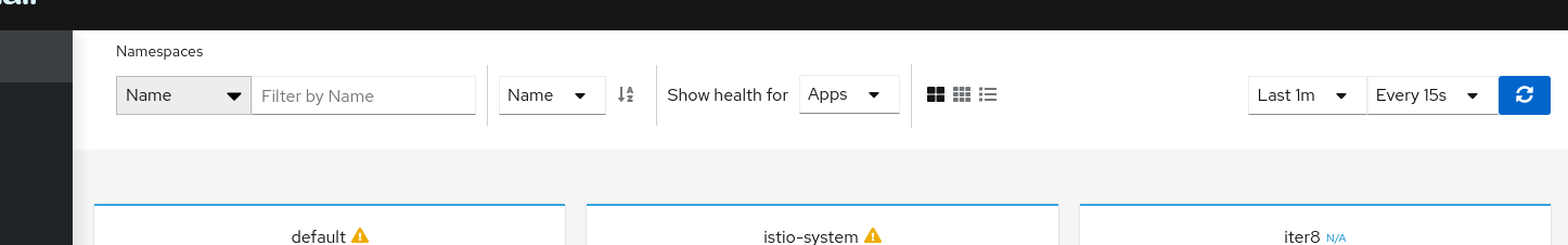
For overview page I propose to adjust this.
Before:
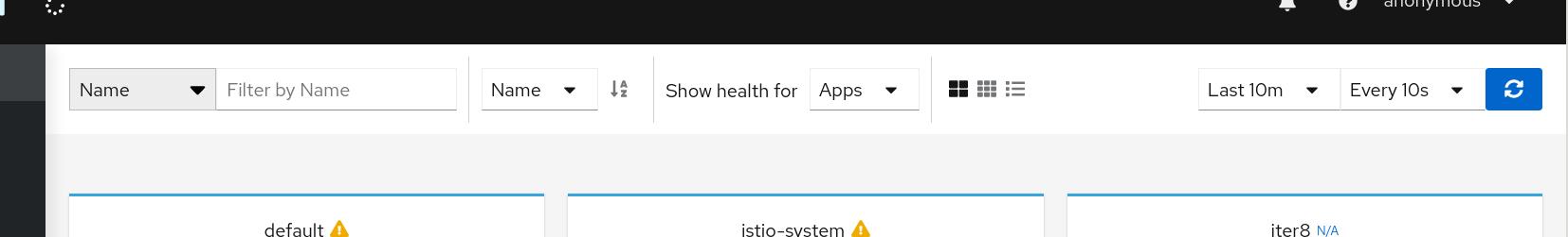
After:
Let me know what do you think @aljesusg @jotak.
As Graph page has removed the "title" (no more "this is a graph") I think it can be understood and we can remove the "namespaces" as well, I don't know. I have a PoC with these changes to see.
Also cc @kiali/ux-reviewers @lwrigh too, perhaps a quick suggestion here may help.
Can we eliminate the "Namespaces" and adjust the padding with the left for better visual adjustments ?
Note, I will add more suggestion in following comments.
lucasponce
on 27 Apr 2020
as far as I know ux team proposed keep the titles. the user can see where he is in the menu but if user has the menu collapsed not...the point here from my side is that graph and namespaces overview page are clear, user know where he is. The apps, services, workloads...lists is another thing...
 aljesusg
on 27 Apr 2020
aljesusg
on 27 Apr 2020
Yes, this suggestion is only to fix the overview page.
Other pages will have minor fixes proposals that I will list here before to send a PR.
lucasponce
on 28 Apr 2020
I like how the proposal would optimize the space, leaving more space for the important things. The only issue IMO is that (in your "after" screenshot) there's two combos showing "Name", so they would need somehow to be contextualized to disambiguate. Perhaps just change the first "Name" to "Namespace".
 jotak
on 28 Apr 2020
jotak
on 28 Apr 2020
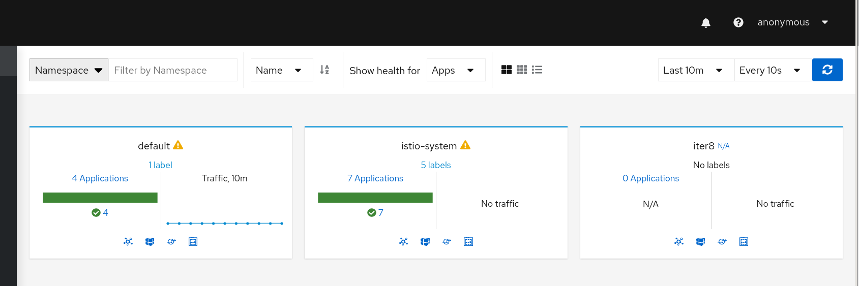
Perhaps just change the first "Name" to "Namespace".
I like this, it makes all sense and it helps to put user in the context in the first two view.
In the table one, it's not necessary as "namespace" is in the header.
lucasponce
on 28 Apr 2020
After:
As the "Sort" component (with "Name") is conditional, as only is rendered in the compact/expanded views but not in table, I think it's good and I don't think this page needs a formal title.
lucasponce
on 28 Apr 2020
One minor thing that we can fix on this is to align the max height used in the pages.
So, Graph and List pages may have same height, list pages title is too "big" and perhaps it can be adapted to make impression that when user navigates across pages, it preserves the same ratio.
Note: perhaps I'm over-documenting this, but I want to make sure that everyone is aware of these changes and we avoid in the future out-of-sync on CSS styles.
lucasponce
on 28 Apr 2020
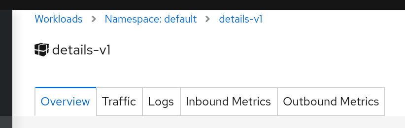
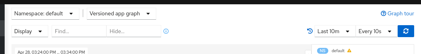
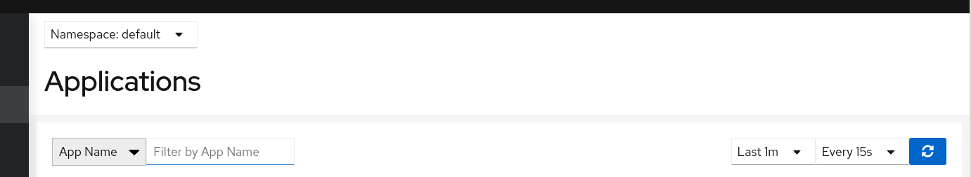
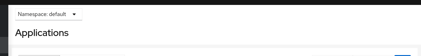
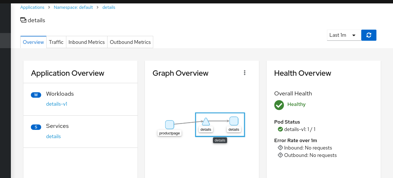
Ok, this is the proposal to align height in Graph, List and Details.
Graph:
Before for List:
After for List:
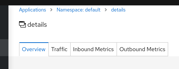
Before for Details:
After for Details:
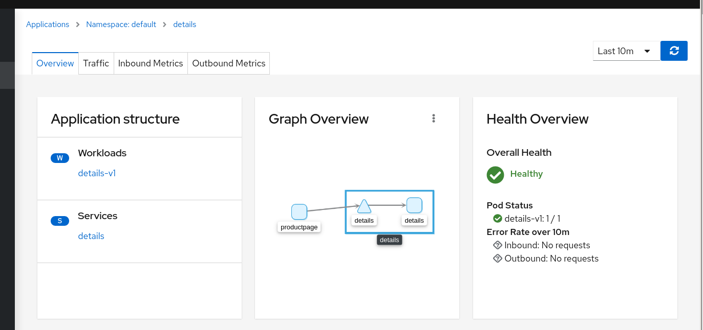
Then user will have same header height aspect/ratio when navigates between these pages.
To implement this we can't maintain the title in the details page.
I see a minor side effect as the title can go to in the "application structure" card and similar in other pages where it can be placed the missing sidecars icon.
Thoughts ?
lucasponce
on 28 Apr 2020
In the after for details screenshot you removed the titles of the details. Is it that intended?
 xeviknal
on 28 Apr 2020
xeviknal
on 28 Apr 2020
In the after for details screenshot you removed the titles of the details. Is it that intended?
Correct, the goal is to align aspect ratio between navigations, title adds extra height, and it doesn't add too much information to the details page.
It's a tradeoff, but I guess it helps to navigate in a consistency way, but it's a proposal to have a final style. I'll update it in the other details pages as well to see how it's seen there.
lucasponce
on 28 Apr 2020
This is the proposal for the Service Details.
Before:
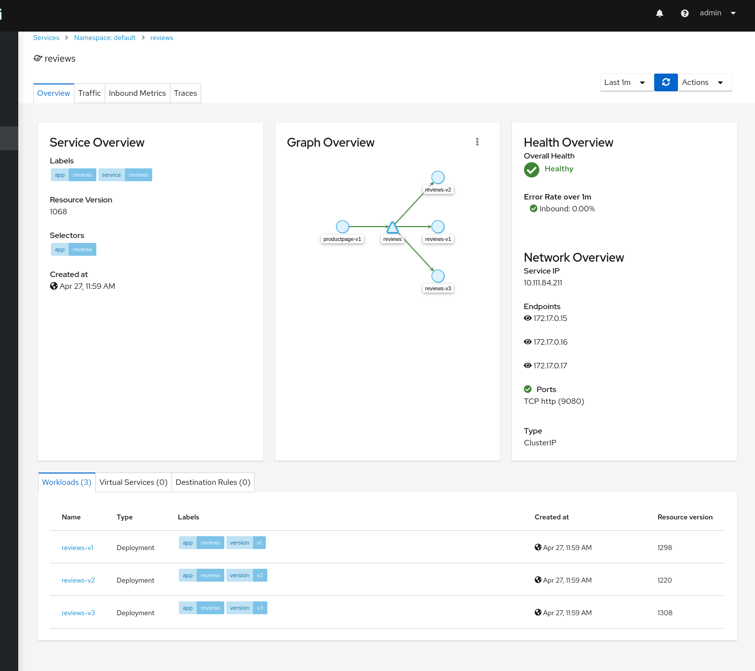
After:
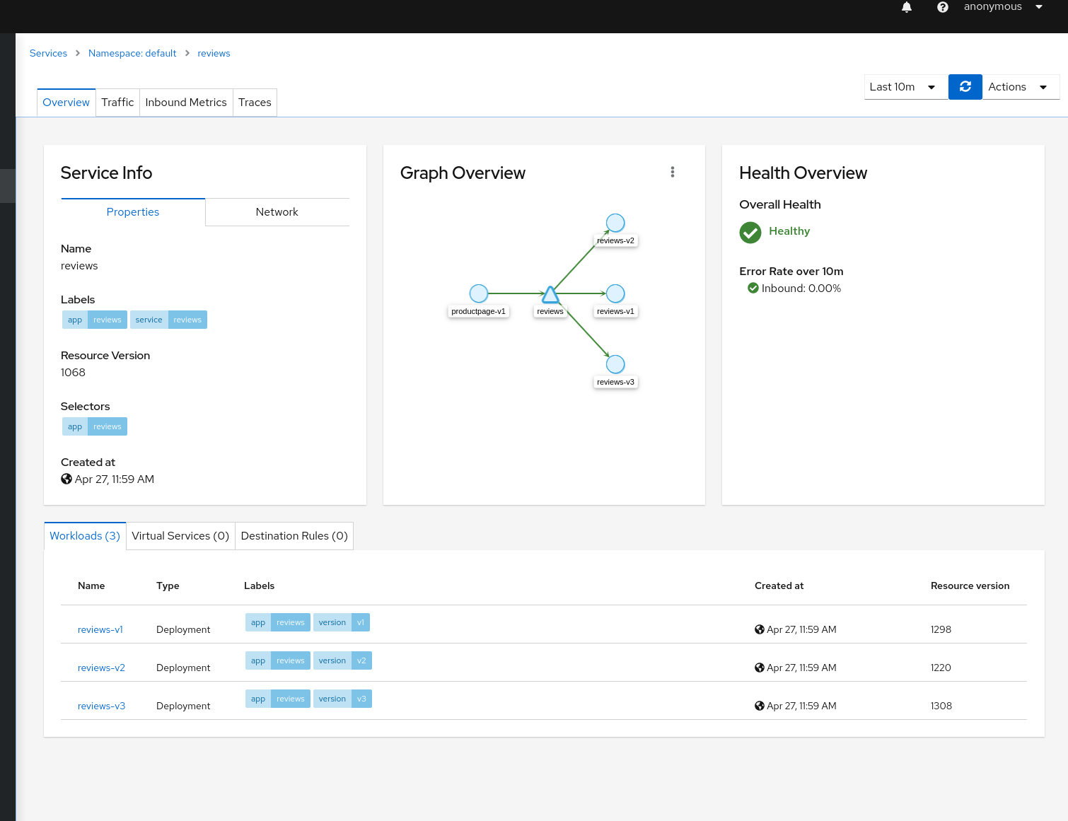
Note: Goal is to align with the other pages. To have a more clean approach, I think that "Network overview" can also be part of the "Service Info". Also, to not populate the card unnecessarily, I think we can group "Properties" / "Network" as part of "Service Info". In that way, all pages will remain similar in App/Workload/Service details and as a side effect, the table for workloads/virtualservices/destinationrules will have more space before populated it.
Let me know your thoughts on this.
Again, this is a proposal to align all of this CSS we have completely out of sync and it was growing individually.
Note, this is related to https://github.com/kiali/kiali/issues/2648 as well, but I think it makes sense to be incorporated as part of this CSS sync/review.
lucasponce
on 28 Apr 2020
This proposal looks good to me, especially making sure all of the elements are left aligned. If we end up getting user feedback about not showing the page title we can always revisit adding the title back to the pages but for the time being this is good with me.
 lwrigh
on 28 Apr 2020
lwrigh
on 28 Apr 2020
Thanks @lwrigh for the feedback.
I'm going to consolidate latest pages to check feedback of the team related CSS aspects and prepare a PR around it.
lucasponce
on 28 Apr 2020
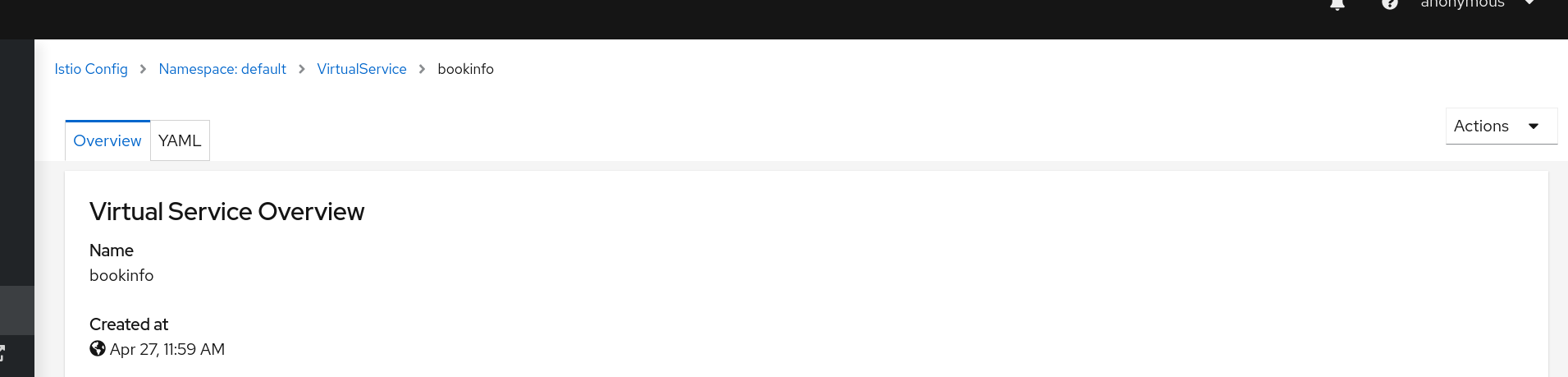
This is the fix for the IstioConfig details.
Before:
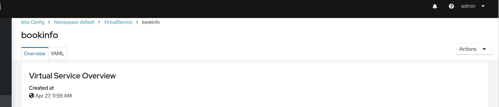
After:
lucasponce
on 28 Apr 2020
Extensions have some special cases.
These pages don't reuse/share some components and need to special styles.
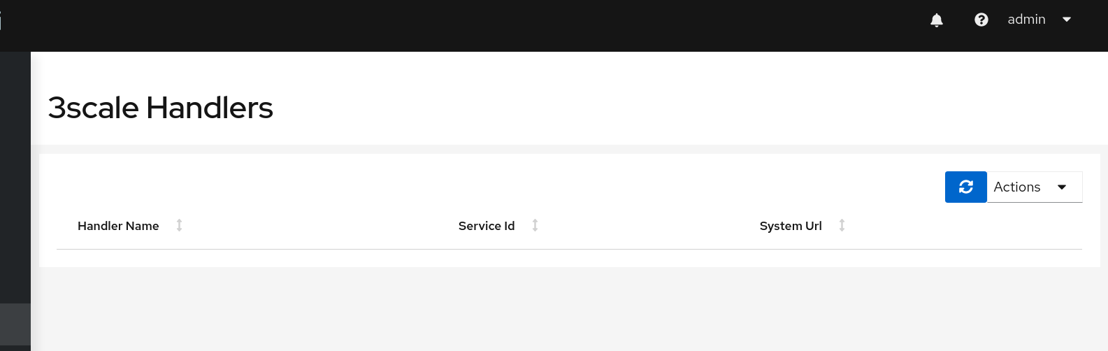
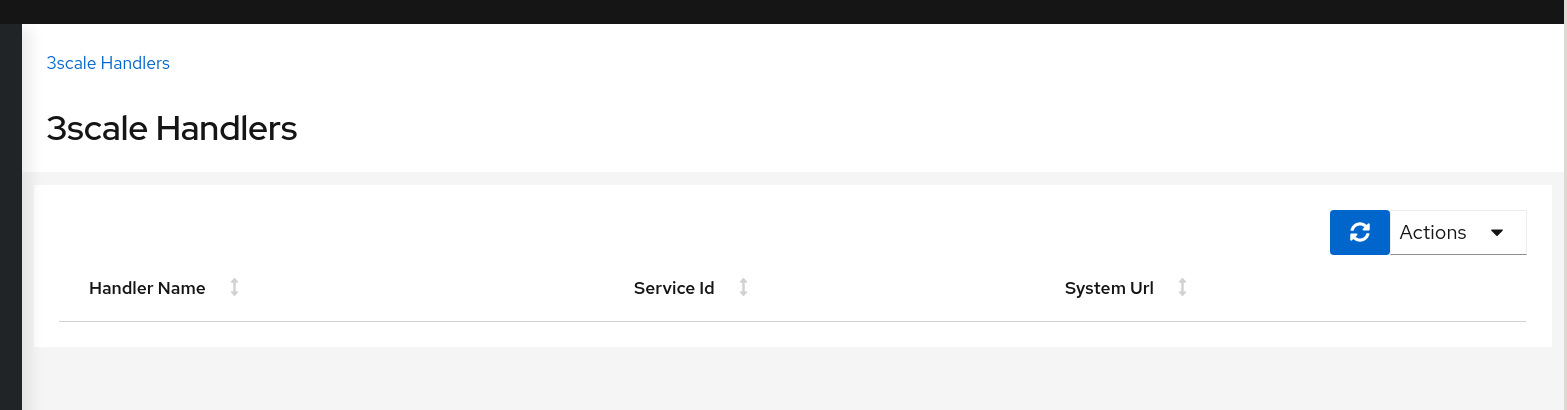
In case of 3scale extension, list page doesn't provide a namespace selector, so, for this case, to maintain same aspect/ratio we will introduce a redundant breadcrumb. It's not providing more info, but it will maintain the height and will continue the format used in the 3scale details page.
Before:
After:
lucasponce
on 29 Apr 2020
3scale new handler.
Before:
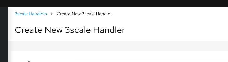
After:
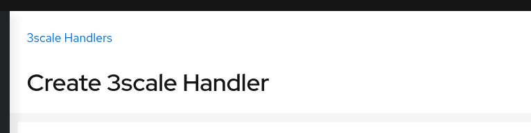
Aligned with Istio Config Create New Config. Sync-ed heights and aspect with rest of pages.
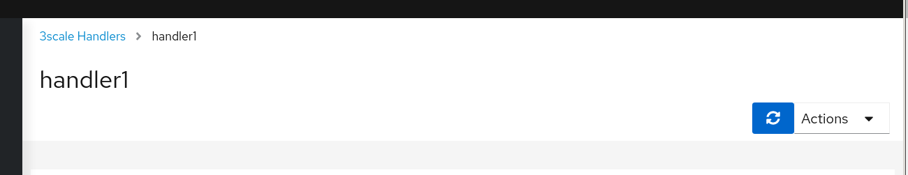
Edit existing handler.
Before:
After:
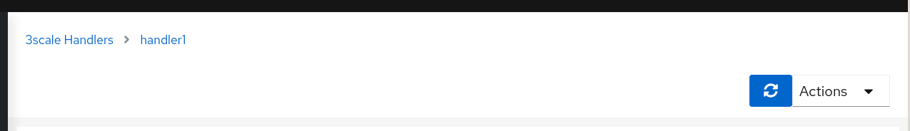
Aligend also with IstioConfig. Removed title. Height and actions synced with rest of pages. Breadcrumb properly updated.
lucasponce
on 29 Apr 2020
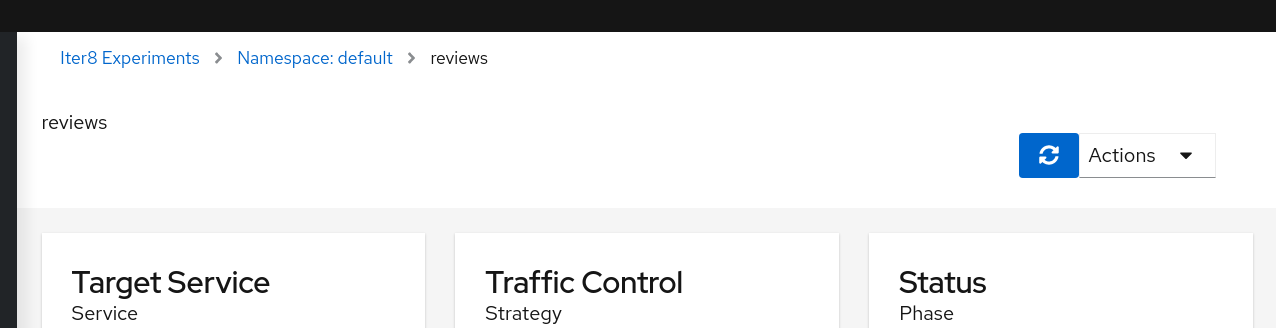
Iter8 details page.
Before:
After:
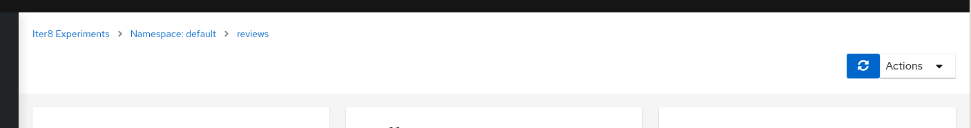
Header aligned with other details pages. Breadcrumb and actions adjusted.
lucasponce
on 29 Apr 2020
Related issues
 denniseffing
·
3Comments
denniseffing
·
3Comments
 clebs
·
6Comments
clebs
·
6Comments
 abonas
·
4Comments
abonas
·
3Comments
abonas
·
4Comments
abonas
·
3Comments
 erSitzt
·
3Comments
erSitzt
·
3Comments
Most helpful comment
Ok, this is the proposal to align height in Graph, List and Details.
Graph:
Before for List:
After for List:
Before for Details:
After for Details:
Then user will have same header height aspect/ratio when navigates between these pages.
To implement this we can't maintain the title in the details page.
I see a minor side effect as the title can go to in the "application structure" card and similar in other pages where it can be placed the missing sidecars icon.
Thoughts ?