Jetpack: Subscriptions block: Provide a compact block style
The current style — the input field and the button are on its own line works well when it's in a narrower area like a sidebar. But when the width isn't a concern, it'd be nice for the users to be able to put the input field and the button on the same line to save the height.
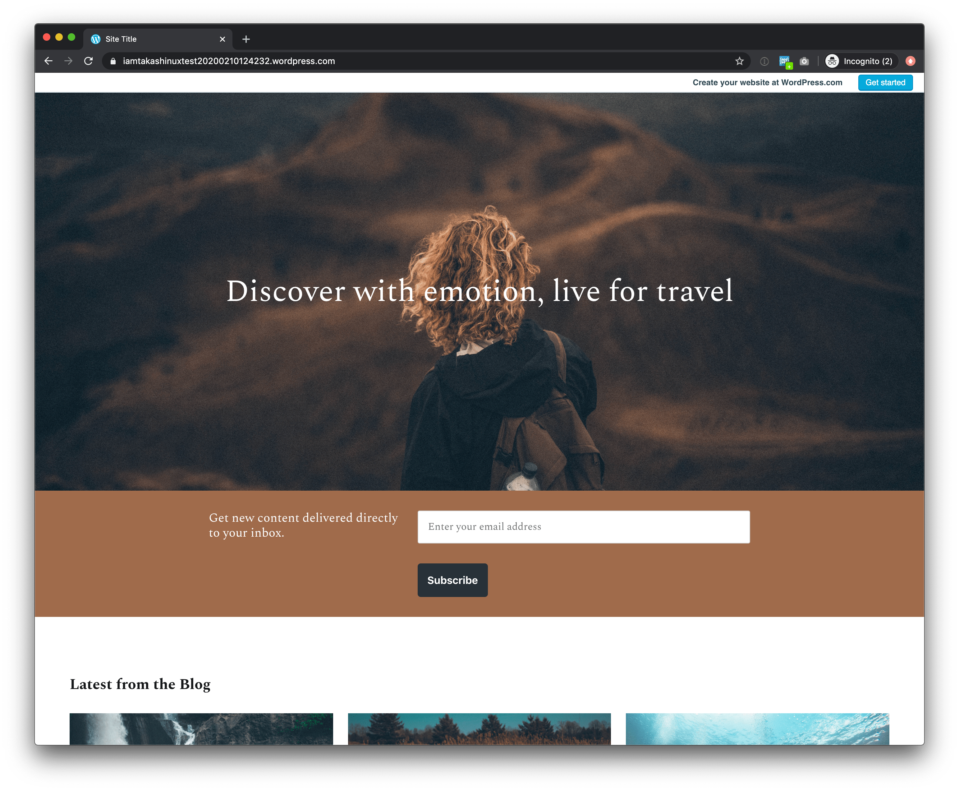
For example, this is the current default.
In the case like above, it'd be much better if the user can choose an alternate block style that appears like:

What do you think?
 iamtakashi
👍2
All 2 comments
This has now been added as a new option to the block.
 jeherve
on 29 Jul 2020
jeherve
on 29 Jul 2020
Thank you @apeatling and all who made this reality 🙇
iamtakashi
on 29 Jul 2020
❤2
🎉2
👍2
Was this page helpful?
0 / 5 - 0 ratings
Related issues
 kevinlisota
·
3Comments
kevinlisota
·
3Comments
 NicktheGeek
·
3Comments
NicktheGeek
·
3Comments
 BinaryMoon
·
3Comments
BinaryMoon
·
3Comments
 tyxla
·
3Comments
tyxla
·
3Comments
 ockham
·
3Comments
ockham
·
3Comments
Most helpful comment
Thank you @apeatling and all who made this reality 🙇