Jetpack: Contact Form: color contrast ratio accessibility issue with "required" text
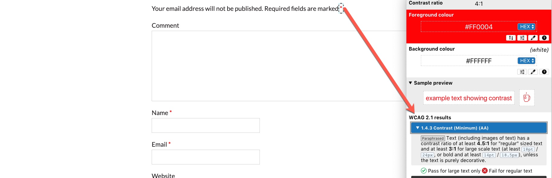
The "required" label appearing next to contact form fields does not pass the color contrast ratio with most light themes, like Twenty Fifteen.
The color contrast ratio between for the text (#aaaaaa) and its background (#F8F8F8 for Twenty Fifteen) is not at least 4.5 to 1.
 jeherve
All 3 comments
This issue has been marked as stale. This happened because:
- It has been inactive in the past 6 months.
- It hasn’t been labeled `[Pri] Blocker`, `[Pri] High`.
No further action is needed. But it's worth checking if this ticket has clear reproduction steps and it is still reproducible. Feel free to close this issue if you think it's not valid anymore — if you do, please add a brief explanation.
![stale[bot] picture](https://avatars.githubusercontent.com/in/1724?v=4&s=40) stale[bot]
on 6 Jul 2018
stale[bot]
on 6 Jul 2018
Hello, this issue is not stale it is still an issue on our site https://equalentry.com
An example page when adding a comment that shows the issue
https://equalentry.com/the-vessel-is-nycs-newest-landmark-accessible-for-all/
 TechThomas
on 29 Oct 2019
TechThomas
on 29 Oct 2019
Hey @TechThomas, the screenshot in your comment is part of WordPress core, and issues are tracked on WordPress Trac. I did a quick search but couldn't find a report on the specific issue you referenced, but reporting accessibility issues is highly encouraged.
 crunnells
on 11 Mar 2020
crunnells
on 11 Mar 2020
Related issues
 Viper007Bond
·
3Comments
Viper007Bond
·
3Comments
 kevinlisota
·
3Comments
kevinlisota
·
3Comments
 mzakariya
·
3Comments
mzakariya
·
3Comments
 NicktheGeek
·
3Comments
NicktheGeek
·
3Comments
 beaulebens
·
3Comments
beaulebens
·
3Comments
Most helpful comment
Hello, this issue is not stale it is still an issue on our site https://equalentry.com
An example page when adding a comment that shows the issue
https://equalentry.com/the-vessel-is-nycs-newest-landmark-accessible-for-all/