Jetpack: Map Block: marker content style overwritten by theme design
Steps to reproduce the issue
- Start on a site running a theme like Twenty Twenty.
- Under Appearance > Customize, pick a black background color.
- Go to Pages > Add New and add a Map block. Add a basic marker, no custom colours.
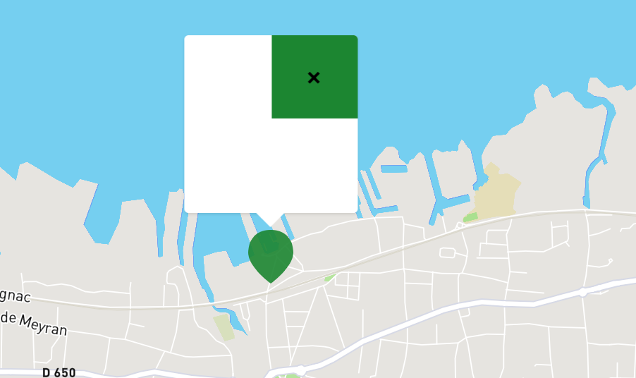
- When you view the page, you'll see that the marker popup has quite a few layout issues:
- The marker heading margins are overwritten by Twenty Twenty styles, adding a lot of margin.
- The marker close button is impacted by Twenty Twenty styles.
- You can't actually see the marker's content because its color is set to white.
Maybe we should add super specific styles for that popup so it does not get broken by themes?
Another approach would be not to change anything if we want themes to be in full control, but maybe in this case we should add some custom rules to our Twenty Twenty compat CSS file?
https://github.com/Automattic/jetpack/blob/eefec2085242c33c490d0da3fda82d86d1f06bc7/modules/theme-tools/compat/twentytwenty.css
 jeherve
All 3 comments
This is a tricky one and it happens with a few blocks, not just the Map block, as @scottsweb can attest to. It seems the issue stems from the fact that Twenty Twenty is very prescriptive when it comes to editor styles and this is bound to happen for any other theme that behaves the same way.
We can't control what a theme is doing and maintaining a compatibility file for each of them doesn't sound scalable, so I'd go for this:
Maybe we should add super specific styles for that popup so it does not get broken by themes?
After looking at the styles for the map and marker components, I'm assuming this means going from a "minimum amount of styles" approach to one where we try to override every single parameter on each selector?
 keoshi
on 20 Nov 2019
keoshi
on 20 Nov 2019
This is one of those instances where the layout styles in the block are more important than what the theme, or editor is doing to customise them. The markers need to be exactly where they should be regardless of where the block lives. I think we can very opinionated on the markers when it comes to CSS layout.
Any layout related CSS that we deem important should probably be added to the block directly and we should be very specific with selectors in this instance too.
The colour clash is more tricky, if the theme/customizer was able to pass us some CSS variables we could probably look to respond to those choices a little better. This will need a bit more consideration.
 scottsweb
on 20 Nov 2019
scottsweb
on 20 Nov 2019
This issue has been marked as stale. This happened because:
- It has been inactive in the past 6 months.
- It hasn’t been labeled `[Pri] Blocker`, `[Pri] High`.
No further action is needed. But it's worth checking if this ticket has clear reproduction steps and it is still reproducible. Feel free to close this issue if you think it's not valid anymore — if you do, please add a brief explanation.
![stale[bot] picture](https://avatars.githubusercontent.com/in/1724?v=4&s=40) stale[bot]
on 19 May 2020
stale[bot]
on 19 May 2020
Related issues
 kevinlisota
·
3Comments
kevinlisota
·
3Comments
 beaulebens
·
3Comments
beaulebens
·
3Comments
 crunnells
·
3Comments
crunnells
·
3Comments
 tyxla
·
3Comments
tyxla
·
3Comments
 NicktheGeek
·
3Comments
NicktheGeek
·
3Comments