Jetpack: Search: add optional Powered by logo
There are some cases (especially internal sites) where we should display the Jetpack logo, and we have added config to the new customization controls.
Here are designs:
There is a logo and display available in https://github.com/Automattic/wp-calypso/tree/master/client/components/jetpack-colophon and https://wpcalypso.wordpress.com/devdocs/design/jetpack-colophon
These should link to https://jetpack.com/support/search/ for now.
- [x] Add "powered by Jetpack" colophon
- [x] Add Jetpack magnifying glass to search input
 gibrown
All 15 comments
This issue has been marked as stale. This happened because:
- It has been inactive in the past 6 months.
- It hasn’t been labeled `[Pri] Blocker`, `[Pri] High`.
No further action is needed. But it's worth checking if this ticket has clear reproduction steps and it is still reproducible. Feel free to close this issue if you think it's not valid anymore — if you do, please add a brief explanation.
![stale[bot] picture](https://avatars.githubusercontent.com/in/1724?v=4&s=40) stale[bot]
on 30 Nov 2019
stale[bot]
on 30 Nov 2019
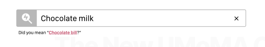
Can we drop the icon in the search input at smaller breakpoints?
 bluefuton
on 24 Jan 2020
bluefuton
on 24 Jan 2020
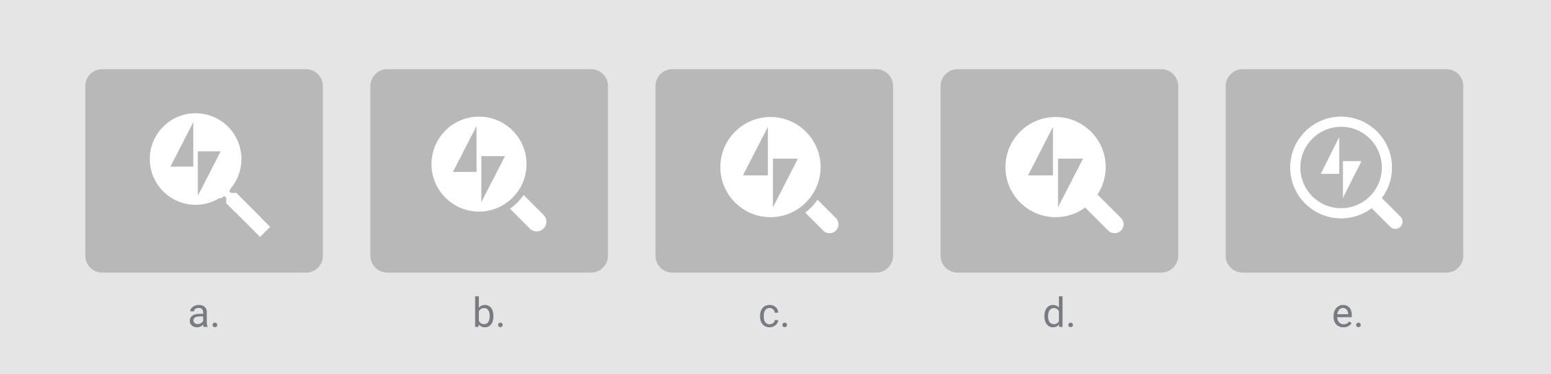
Adding a few more options for the input icon here:
Can we drop the icon in the search input at smaller breakpoints?
I think we should, yes.
 keoshi
on 24 Jan 2020
keoshi
on 24 Jan 2020
@keoshi my 2 cents... I like (e) the most for the inverted colors which feel lighter weight and subtle. I like (a) the most for the longer handle. (e) looks too much like the logo inside of a Q. If I was only picking between these five I would choose (a).
gibrown
on 24 Jan 2020
Maybe we can also create a button with the icon that a user can easily add to their site (code snippet I guess) that will activate the search overlay. For instance, on jetpack.com it would be good to just add a button to the header.
gibrown
on 24 Jan 2020
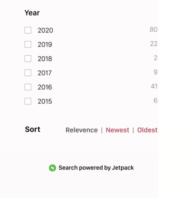
Added the "Search powered by Jetpack" colophon in #14519.
bluefuton
on 31 Jan 2020
@keoshi Could you upload the SVG for icon A? I'm currently working with a vectorized version of your screenshot, which probably isn't ideal 😉.
 jsnmoon
on 8 Feb 2020
jsnmoon
on 8 Feb 2020
@jsnmoon My bad — was at the JP GM last week and just saw your comment above. Should I adjust it directly on https://github.com/Automattic/jetpack/pull/14629/ ?
keoshi
on 11 Feb 2020
@keoshi Yup, that sounds great. There are some rough edges in #14629 that would benefit from your guidance. Thanks!
jsnmoon
on 12 Feb 2020
Fixed by #14519 and #14629.
jsnmoon
on 13 Feb 2020
A couple of comments on the icon here, sorry if I didn't catch it before.
Note: we should be very careful in using branding in a UI component. There are exceptions, but as a rule of thumb, _be wary of using the logo in a UI element._
In this case, to me it doesn't just break that rule of thumb, but also doesn't seem to fit properly visually. The filled one isn't really a lens, and the diagonal 45° angle of it makes the logo feel "turned" off its axis (i.e. if you had a logo on the magnifying class, it would be aligned with the magnifying class axis).
My advice here is either:
- Go for a simple icon that is JUST search icon (the classic magnifying glass). We can maybe make it more memorable if we want, but this paired with the footer added in #14519 should be enough.
- If we really really really really want to have the logo there, then let's use icon (e) which doesn't break the mental model of a magnifying glass — and then I agree with Greg, let's make the handle longer tho.
 folletto
on 14 Feb 2020
folletto
on 14 Feb 2020
I've been struggling with the idea of the magnifying glass but also didn't think too much of it. While I disagree on this point:
if you had a logo on the magnifying class, it would be aligned with the magnifying class axis
Because I believe the idea here is that the magnifying glass is hovering on the logo itself (which doesn't make much sense either way), but other that that nitpick I appreciate the feedback here @folletto — you've put into words what I couldn't quite put my finger on, and done it so clearly. 🌟
I agree that we should reduce the amount of branding, especially since we already offer the option of adding the credit on the footer, which feels way classier to me. If we get rid of the complex icon, the search UI is allowed to breathe much more too, like so:

I'll get a PR started.
keoshi
on 17 Feb 2020
Because I believe the idea here is that the magnifying glass is hovering on the logo itself
Yes: that is why option (e) works, as it's hollow and feels like hovering, but if it's full it doesn't as it feels like being part of it ;)
like so
It feels way lighter. :)
folletto
on 17 Feb 2020
but if it's full it doesn't as it feels like being part of it ;)
Ha yes, of course — ignore me, still waking up. Thanks a ton for this piece of feedback!
keoshi
on 17 Feb 2020
Addressed @folletto's feedback on https://github.com/Automattic/jetpack/pull/14664/
keoshi
on 17 Feb 2020
Related issues
 ockham
·
3Comments
ockham
·
3Comments
 crunnells
·
3Comments
crunnells
·
3Comments
 beaulebens
·
3Comments
beaulebens
·
3Comments
 BinaryMoon
·
3Comments
BinaryMoon
·
3Comments
 kraftbj
·
3Comments
kraftbj
·
3Comments
Most helpful comment
A couple of comments on the icon here, sorry if I didn't catch it before.
Note: we should be very careful in using branding in a UI component. There are exceptions, but as a rule of thumb, _be wary of using the logo in a UI element._
In this case, to me it doesn't just break that rule of thumb, but also doesn't seem to fit properly visually. The filled one isn't really a lens, and the diagonal 45° angle of it makes the logo feel "turned" off its axis (i.e. if you had a logo on the magnifying class, it would be aligned with the magnifying class axis).
My advice here is either: