Jetpack: Elaborate on what's included in Jump Start
Currently the Jump Start card doesn't elaborate on the Recommended Features (instead, it links to a support page on Jetpack.com). See screenshot:
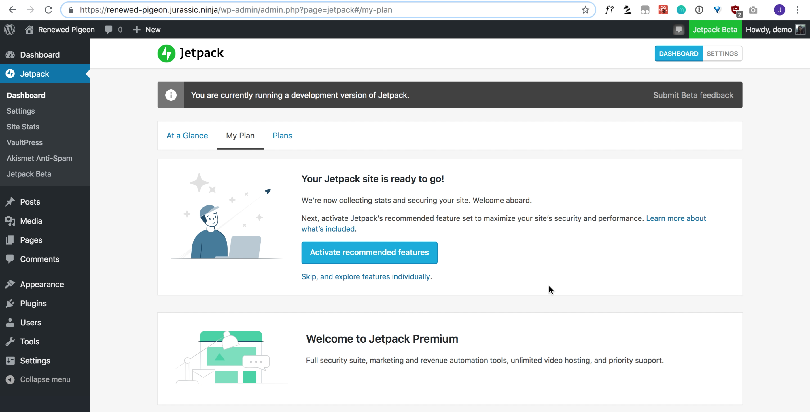
Ideally we should inform our users about what we're doing before asking them to perform an action.
Proposed MVP for letting users know what features are activated:

The links in the paragraph go out to the appropriate JP.com support pages.
 crunnells
All 4 comments
Some notes for the proposed mockup:
I don't think the linked items need to also be bold because the link color stands out already (dual purpose!)
Our skip/cancel buttons are usually to the left of (or above) the submit/continue buttons. In this case, I would make a borderless button that only says "Skip" and move it to the left of the primary button.
Copy suggestions:
"feature set" to "features"
Perhaps something like this:
Next, activate Jetpack's recommended features to maximize your site's security and performance. The secure authentication and downtime monitoring features will immediately help secure your website and inform you if your site goes down. Image hosting, static file hosting, and lazy loading images are all features that will speed up the loading of your site.
Clearly we will need Editorial's help on this.
 MichaelArestad
on 15 Apr 2019
MichaelArestad
on 15 Apr 2019
I've updated the mockup with your feedback. PR coming soon.
crunnells
on 18 Apr 2019
I feel like linking to each thing individually is a bit overwhelming; I'd probably stick to a single "Learn more about these features" at the end of the para. Then I'd simplify just a smidge, to end up somewhere in between the original and the mockup above:
_Next, activate Jetpack's recommended features. We've picked the features most useful for maximizing your site's security and performance, like secure authentication, downtime monitoring, image hosting, and lazy loading image. Activate them all with a click, and they'll make sure your site is safe and speedy. Learn more about our recommended features._
 michelleweber
on 18 Apr 2019
michelleweber
on 18 Apr 2019
Updated copy, should be ready for review/merge.
crunnells
on 23 Apr 2019
Related issues
 beaulebens
·
3Comments
beaulebens
·
3Comments
 Viper007Bond
·
3Comments
Viper007Bond
·
3Comments
 htdat
·
3Comments
htdat
·
3Comments
 ockham
·
3Comments
ockham
·
3Comments
 jeherve
·
3Comments
jeherve
·
3Comments