Jellyfin-web: [Suggestion] Redesign items in list to improve display on mobile
Describe the bug
When viewing the list of episodes in a season of a TV show, the title does not use all available space on mobile app/ browser with mobile dimensions. I did a little rearranging in the inspect mode of chrome and came to this suggestion
Right now the elements of each episode item in the season page for TV shows are in this format
Episode
| Top part
| | Preview image
| | Title + Time/Rating
| | | Title
| | | Time/Rating
| | | Description (visible on desktop)
| | User Data Buttons
| Bottom text
I suggest changing this to
Episode
| Top part
| | Preview image
| | Title + Time/Rating
| | | Title
| | | Time/Rating
| | | User Data Buttons
| | | Description (visible on desktop)
| Bottom text
To Reproduce
- Go to any TV show
- Click on one of the seasons available
- Scroll down to list of episodes
- Resize browser window to mobile dimensions (or follow on mobile browser/app)
- See error
Expected behavior
Title should expand to use remaining space
Logs
N.A.
Screenshots
Made the change for Episode 1 in the demo using the Chrome's inspect tool
360x640

1024x768

1600x900

System (please complete the following information):
- OS: Windows
- Browser: Chrome
- Jellyfin Version: Demo
Additional context
This isn't exactly my issue but reported to me by @hyPnOtICDo0g . I've only tried to look for a way to fix this
 riskycase
All 7 comments
Thanks for bringing this up. The season and episode detail pages need the love.
On Mobile, I'd like to see these buttons fall into the overflow/context menu. There's a lot of precious space wasted by all of these buttons currently and moving them doesn't free up this space but just changes _which_ precious space is being wasted. Ultimately, I'd put that context menu on the bottom right corner of each of these thumbnails similar to what is done on other non-itemdetail pages.
 hamburglar2160
on 5 May 2020
hamburglar2160
on 5 May 2020
On Mobile, I'd like to see these buttons fall into the overflow/context menu.
Definitely something that could be added to the suggestion. I tried looking for the files which generated the item-detail pages so I could start off a PR but didn't get it, only reached till the list part
riskycase
on 5 May 2020
I had always assumed that the info button next to the menu led to "media info" but it actually just points to the episode details page, which should be accessible by clicking the episode title name.
A simple PR doing just that would at the very least slightly remedy this until a more sweeping redesign is made.
- Turn the episode title into a hyperlink that leads to the episode item details page.
- Remove the info button between the overflow menu and watched buttons.
hamburglar2160
on 5 May 2020
Here's my proposal for a list design (Only the list matters here):
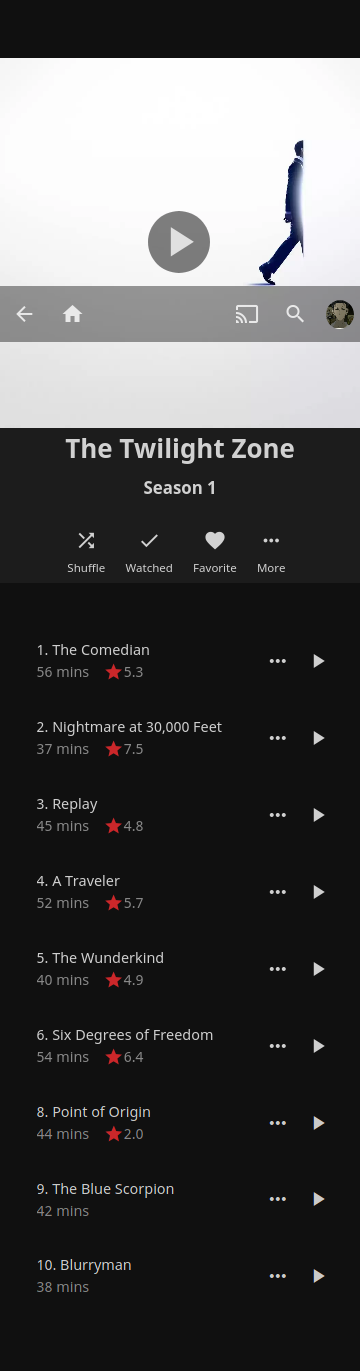
The idea is to make it look cleaner and more targeted towards a look and feel that fits a mobile UI.
Only the most important action is kept as a primary UI element (The play button). The rest is hidden away in the context menu.
Tapping the list item brings you to the episode's details, which contains the screenshot and synopsis.
 MrTimscampi
on 5 May 2020
MrTimscampi
on 5 May 2020
@MrTimscampi Well the design looks good, but we need to consider the Web client as well as other clients because they have more space to utilize, I don't know whether the app is using a web view but making changes in the Web client automatically changes in the app, so probably we've to implement the same design to other clients. Therefore the design might look good on a mobile but it may break in the desktop/tv clients.
 hyPnOtICDo0g
on 5 May 2020
hyPnOtICDo0g
on 5 May 2020
@MrTimscampi Well the design looks good, but we need to consider the Web client as well as other clients because they have more space to utilize, I don't know whether the app is using a web view but making changes in the Web client automatically changes in the app, so probably we've to implement the same design to other clients. Therefore the design might look good on a mobile but it may break in the desktop/tv clients.
I know all that ;)
We have three different layouts which you can check for with layoutManager in JS and a few utility classes in CSS (layout-desktop, layout-mobile, and layout-tv).
The general road we've been taking is to have different designs depending on the layout, due to the different requirements for each type of platform (Take a look at the horizontal home PR for a wildly different design in the TV layout, for example).
The Android app is basically a wrapper around this client, which sets the default layout to Mobile and does a few other links to native Android APIs using Cordova.
This list is so minimal to account for some mobile usage:
- Images would be, at their maximum, the size of a postage stamp, so they're not really useful in this situation
- The episode's description is available by tapping on the episode's row, thus making it non-vital in this case where space is limited and where most people would likely want quick navigation
MrTimscampi
on 7 May 2020
This has been largely addressed in 10.6.
Please redirect further feature requests and suggestions to https://features.jellyfin.org/
MrTimscampi
on 30 Jul 2020
Related issues
 therhenals
·
5Comments
hamburglar2160
·
5Comments
hamburglar2160
·
4Comments
therhenals
·
5Comments
hamburglar2160
·
5Comments
hamburglar2160
·
4Comments
 Steve0w3n
·
6Comments
Steve0w3n
·
6Comments
 chnaski
·
3Comments
chnaski
·
3Comments
Most helpful comment
Here's my proposal for a list design (Only the list matters here):
The idea is to make it look cleaner and more targeted towards a look and feel that fits a mobile UI.
Only the most important action is kept as a primary UI element (The play button). The rest is hidden away in the context menu.
Tapping the list item brings you to the episode's details, which contains the screenshot and synopsis.