Ironos: New graphics needed for licensing the new codebase
So as discussed in #83, the new codebase will have a proper license, and since the licensing of the original firmware files are unclear, we need a new set of graphics not derived from the old project files. This issue exists for that.
You can assign this issue to me.
 tigert
All 31 comments
GPL ?
 EricJanVanDenBogaard
on 10 Sep 2017
EricJanVanDenBogaard
on 10 Sep 2017
maybe just two ovals like buttons instead of whole iron picture? (POWER) (SETTINGS)
 mikromCZ
on 10 Sep 2017
mikromCZ
on 10 Sep 2017
V2.0 with advanced screen is perfect imo ;)
Anyway i can make all the graphics that you need.
 Vidalcris
on 13 Sep 2017
Vidalcris
on 13 Sep 2017
@EricJanVanDenBogaard Lets discuss the licensing on #83 -
The graphics will be part of the codebase anyway, with the same license. I'm fine with any open source license, GPL or MIT style, as long as it is free to share and modify.
@Vidalcris yeah, it's a few pieces anyway, fun excercise in pixel art, so we can even both give it a go and see how it goes.
tigert
on 14 Sep 2017
so from the top of my head I remember:
- The "POWER/SETTINGS" image
- "Heating" icon
- "Cooling" icon
- "Correct temperature" icon (?)
- Battery icons
- Warning for missingt tip?
Looks like workspace/ts100/inc/Font.h contains some more too, but I think these would be good for starters.
@Ralim The display is 96x16 pixels, would most icons be 16x16 (apart from the fullscreen graphics) - how much memory does the device have for graphics and stuff, does one need to be conservative with flash size?
tigert
on 14 Sep 2017
@tigert
You are correct in that the following need replacement:
- Power/Settings prompt (I call it idle screen)
- Heating icon / image
- Cooling icon
- Correct temperature if one works (or just blank)
I made the current battery icon so I'm not worried about it, and the warning logo has actually already been made in concept form by @Vidalcris (attached)
I try to make images a multiple of 16x12 (12 wide) to match the larger fonts spacing so they slot in well with the font spacing
Dont stress really about the flash, since we have ~50% left atm in the 2.0 branch
 Ralim
on 14 Sep 2017
Ralim
on 14 Sep 2017
Is the 2.0 branch usable by the way?
(I suddenly realize that I plan to run an unstable branch of firmware on my soldering iron ... :) )
But well, people spend their free time and energy on all kinds of things :-)
@Vidalcris images look great! If you have time and energy and good ideas, go for it, I will ponder this too and will give feedback and contribute to this.
By the way, did you know you can just copy an image from your drawing program and paste it right here on the text field, it uploads it to github and creates you a markdown snippet to include it here on the comment? Pretty slick.
tigert
on 14 Sep 2017
It's mostly usable (see the note at the top of the readme in that branch).
With the soldering iron there is only two failure modes:
- No Heating (iron doesn't heat)
- Runaway (heater doesn't turn off)
Only the latter is a bad issue, I think there is no risk of this in the new branch, but generally I would just keep an eye on the system. I've put in a safety timer for this in the code branch but its untested atm (the compiled code attached is taken just before that modification).
The problem with the inline pictures is that github doesn't let you do bitmaps, which is the ideal format for this 😁
Ralim
on 15 Sep 2017
Ok, so .bmp is the preferred format?
I found a plugin for GIMP that exports as a header file in 1 bit: http://gimpscripts.com/2016/08/1bit-bitmap-exporter-to-c-header/ - it makes an output like this: https://pastebin.com/f5FwsM6x
That should be useful for testing, once we get the makefile stuff going.
tigert
on 15 Sep 2017
So, I played with the graphics a bit. Some thoughts related to layout:
Maybe we should always put the battery icon on the back end of the screen where the power plug is when you run off a LiPo. Similarly the heating / cooling symbols should be towards the hot end.
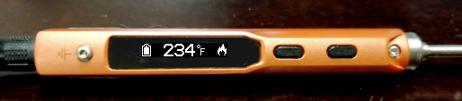
I am left handed so the above mockup image is also in that orientation.
I'd think if we reserved the plug-end 12 pixels for the battery icon, it would be useful also on "sleep" screen for example, as well as the "off" screen, because it is useful to always see the battery status.
I guess likewise the "hot end" could have a 12 pixel icon area for the heating / cooling icons.
Yeah, that flame icon might not make sense, it was just a test that turned out kinda cool :-)
It's fun to do tiny pixel icons :-)
(Check out GIMP and https://github.com/tigert/ts100/blob/icon-drawing/icons-in-progress/screen-simulator.xcf if you want to play with the pixels)
tigert
on 15 Sep 2017
Ok, battery icons and heating and cooling icon are in my fork, in "icon-drawing" branch: https://github.com/tigert/ts100/tree/icon-drawing/icons-in-progress
- battery-*.bmp are well, battery levels. I think we should just not show any power symbol when no lipo-cell-setting is selected in settings. I mean, one could do a "plug" icon, but I think less is more here.
- temperature-*.bmp - °C and °F symbols in bmp
- cooling.bmp and heating.bmp - for the tip heat / cool status.
Let's see how these work out in practice,
Heating, on battery:
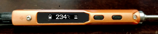
Not heating, on power supply. I would say the state of "exactly correct temperature" is so short that it's not really worth it to have a separate symbol for it. I think "heating" and "not heating" is less flickery in practice.
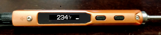
Adjusting temperature arrows
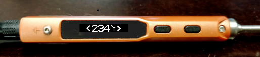
tigert
on 23 Sep 2017
Looks awesome,
I have included these icons in the 2.x alpha release that I have pushed up.
Would love any suggestions on a new image for the idle screen :)
Ralim
on 27 Sep 2017
Idle screen being the one when the iron is "off" and on power supply power?
tigert
on 27 Sep 2017
Yeah sorry, the one that was the soldering iron logo :)
Ralim
on 27 Sep 2017
Right. Would this work?
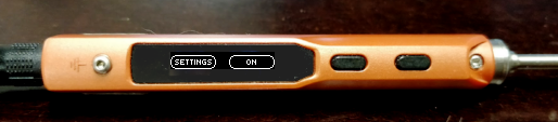
I know translation is tricky, but if we made sure strings were short enough, and the small font was 5 pixels tall (was it?) we could do ( + TEXT + ) and then draw the lines above and below to complete the button?
I think it needs to be composed of pieces anyway, since we need to account for left and right orientation, The buttons should not change their functionality depending on the orientation of the iron :-)
tigert
on 27 Sep 2017
Actually, we should reserve the 16px on left for the possible battery icon, but that can be taken into account by the string lengths if that otherwise is a workable idea.
tigert
on 27 Sep 2017
So I tested it out, and the graphics look nice in action. I expected the "cooling/heating/steady" pid loop to update the heating / not heating graphic though? Shouldn't it blink it when it re-heats after it reaches set temperature, stops heating (this works) and then heats again when it has cooled enough. This re-heat does not seem to show up in the icon.
How fast is the pid loop? I mean, it wouldnt be very nice to have super fast blinking there, but if it was reasonable, just show re-heats too.
tigert
on 27 Sep 2017
@tigert
Currently, there isn't support for drawing text not aligned to the two 8 bit high strips. I can add it later on if we need though. Would it be possible to do a variation that is pictoral (ie symbols so no text?) which would avoid the need for translation :)
Ah, the current way I'm implementing this is the picture changes to heating if the heat drive is > 25%, this may not trigger on some batteries easily. I'll lower this threshold and see how it performs during reheating.
The PID runs at 11Hz ( its sync'd to the ADC sampling, which is sync'd to the upper timer that does PWM**). The GUI draws at around 20Hz (they are completely decoupled).
** For more details on how this is done: read here
Ralim
on 28 Sep 2017
yeah, I can think of picture symbols.
I was running on power supply. now, and it showed "heat" until it reached the target temp, then the "not heating" only.
tigert
on 28 Sep 2017
Lets try this - I will have to see it on the iron to determine whether it is readable or not. I fear it might be a bit too tiny.
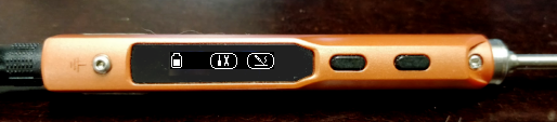
Pushed idlescreen.bmp to my branch.
It's also a bit tricky because you have to have those buttons there to make the connection to buttons, but that eats a lot of pixels for the actual icon. But let's see.
tigert
on 28 Sep 2017
I added this idlescreen to the v2 alpha if you would like to try it ?
Ralim
on 1 Oct 2017
@tigert Let me know what you think 😄
I like it, though I was thinking about if it's worth trying to figure out wider symbols to fill the leftover space?
Ralim
on 3 Oct 2017
It seems to work OK
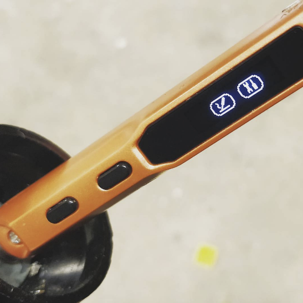
https://www.instagram.com/p/BZyX7wCl88W/
I had the same idea of wider buttons, but I will also make the icons bigger, otherwise it's kind of silly with empty space.
Thanks for implementing this far. :-)
tigert
on 3 Oct 2017
I quite like the icons, and its nicer in its simplicity :) I was just thinking we could try and widen them so they are longer shaped like the physical buttons?
Ralim
on 5 Oct 2017
Yeah, lets try these.
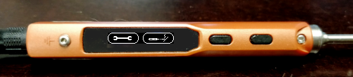
Updated the idlescreen.bmp on my branch accordingly - I realized this does not leave space for the battery icon though, which is a bummer - I will work on a version that is 12 pixels shorter.
tigert
on 5 Oct 2017
They look good, but yeah cut off the battery icon :/
If you can make both fit it would be awesome :D
Ralim
on 5 Oct 2017
Actually yeah, I think it fits.
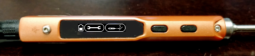
Updated the idlescreen.bmp once more to be 12 pixels smaller horizontally.
tigert
on 5 Oct 2017
@tigert: I really like the look of these new, wider icons. I found the previous ones in 2.0alpha2 to be way too small -- I didn't know it was a wrench in the settings icon, looked like the letter "X" to me.
Never underestimate the ability of a user to misunderstand things. :) Thanks for all your work on the graphics.
 thanks4opensource
on 5 Oct 2017
thanks4opensource
on 5 Oct 2017
Yeah, the hard part is the vertical lack of pixels, the wrench is sort of OK but the "soldering iron with smoking tip" is a bit sketchy, not least because I don't want it to look like a smoking cigarette :-)
tigert
on 5 Oct 2017
@tigert
Alpha 3 up with new graphics. Muuch nicer :D
Ralim
on 6 Oct 2017
Sweet, need to try!
tigert
on 13 Oct 2017
Related issues
 epigramx
·
5Comments
epigramx
·
5Comments
 Nazosan
·
4Comments
Nazosan
·
4Comments
 HanaO00
·
5Comments
HanaO00
·
5Comments
 NeoVerter
·
6Comments
NeoVerter
·
6Comments
 MR-Zon
·
3Comments
MR-Zon
·
3Comments
Most helpful comment
So, I played with the graphics a bit. Some thoughts related to layout:
Maybe we should always put the battery icon on the back end of the screen where the power plug is when you run off a LiPo. Similarly the heating / cooling symbols should be towards the hot end.
I am left handed so the above mockup image is also in that orientation.
I'd think if we reserved the plug-end 12 pixels for the battery icon, it would be useful also on "sleep" screen for example, as well as the "off" screen, because it is useful to always see the battery status.
I guess likewise the "hot end" could have a 12 pixel icon area for the heating / cooling icons.
Yeah, that flame icon might not make sense, it was just a test that turned out kinda cool :-)
It's fun to do tiny pixel icons :-)
(Check out GIMP and https://github.com/tigert/ts100/blob/icon-drawing/icons-in-progress/screen-simulator.xcf if you want to play with the pixels)