Igniteui-angular: IgxTab color doesn't follow the material design colors.
Description
IgxTab color doesn't follow the material design colors.
- igniteui-angular version: 6.2.0 and 7.0.0
- browser: Chrome
Steps to reproduce
- Go to your demo page and look the tab background color.
Result
The background tab color is always white.
Also elevation is wrong.
Expected result
The background color should be the primary color,
The main reason to use the same color is consistency when using for example a banner, according to material documentation a bannercomponent needs to go at the same elevation that the application bar, white tabsbreak that behaviour.
 luiscla27
All 8 comments
Hello @luiscla27 and thanks for pointing this out. What you have shown in the image is a behavior we are familiar with and it is a specific usage of the tabs within the navbar, or to be more precise extending the navbar vertically to contain a set of tabs below the usual content.
I would treat your suggestion as an idea for new functionality, rather than a bug of how the tabs work.
 StefanIvanov
on 3 Dec 2018
StefanIvanov
on 3 Dec 2018
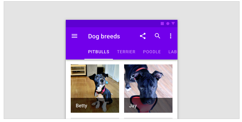
@luiscla27 We tend to follow the material design guidelines very closely. In this case, the tabs follow the material design guidelines for default tabs. If you examine the spec closely, the default text and active indicator colors are both the primary color from the default material color palette.
I understand the material guidelines can get confusing, especially if you isolate specific themed samples on the component guidelines page. In the 'Dog breeds' sample, they are showing tabs in composition with the app bar(navbar in our framework). We believe that this is an application specific scenario, which can be achieved easily via theming.
I've prepared an app sample, showcasing how you can achieve the desired result via theming.
 simeonoff
on 3 Dec 2018
simeonoff
on 3 Dec 2018
Thank you @StefanIvanov, @simeonoff, the theming approach is enough to fulfill the desired result so it's ok :)
Certainly you should consider adding a feature to directly modify the component theming.
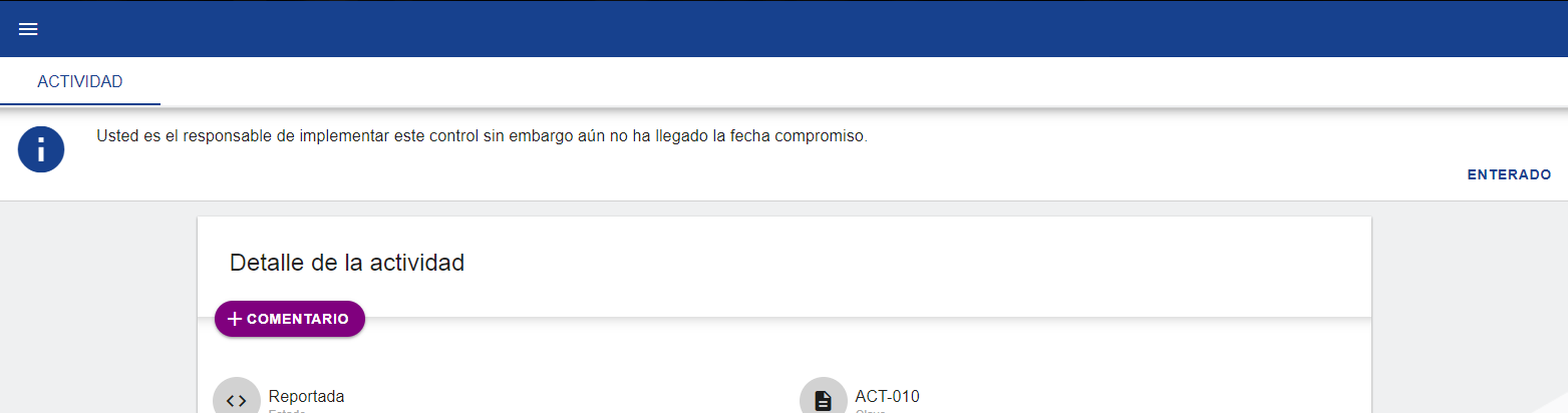
Actually i prefer the white background with primary-color font... (i think it looks better) but some people may think it looks especially wrong when used together with a banner component, see by yourself:
And this is how it looks using a primary-color background:
luiscla27
on 3 Dec 2018
Related issue #3269
@luiscla27 From your first screenshot, if the nav-bar shadow is removed and only the tabs shadow remains, then wouldn't it look better?
 kdinev
on 3 Dec 2018
kdinev
on 3 Dec 2018
@kdinev yup better :)
but stills looks weird:
I'll stay with the theming fix :)
luiscla27
on 3 Dec 2018
For your app, using the primary color as tabs background seems like the best choice, since the tabs are placed directly below the nav-bar. So just stick with the theming change and keep the background at the primary color.
I'm working on an app which has tabs inside large cards and they would look weird, if the background is different than the surface color. It would be impossible from a theming perspective to detect if tabs are below a nav-bar, which means to me that having the tabs background be, by default, the surface color is a correct guideline.
kdinev
on 3 Dec 2018
Thank you @kdinev, i'll stick to theme change and keep the background at the primary color,
btw! you don't need to detect if the tabs are below a nav-bar... :D
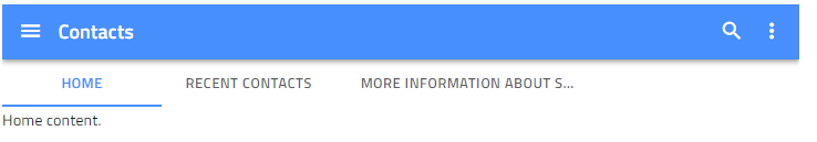
Implementation for this should be similar to this:
<div class="items-wrapper__item items-wrapper__item-small items-wrapper__item--blue">
    <h5 class="sample-title">FIXED TABS</h5>
    <igx-navbar title="Contacts" actionButtonIcon="menu">
        <igx-icon>search</igx-icon>
        <igx-icon>more_vert</igx-icon>
        <igx-tabs tabsType="fixed">
            <igx-tabs-group label="HOME">Home content.</igx-tabs-group>
            <igx-tabs-group label="RECENT CONTACTS">Recent contacts list.</igx-tabs-group>
            <igx-tabs-group label="MORE INFORMATION ABOUT SELECTED CONTACT">More detailed contact information.</igx-tabs-group>
        </igx-tabs>
    </igx-navbar>
</div>
As a justification for this maybe it could be that this behavior is already implemented by many other material-libraries depending on the use case (vuetify, material-ui, reac-toolbox).
Edit:
Also! the suggested feature will open doors to add auto-hiding features to the navbar:
luiscla27
on 4 Dec 2018
@luiscla27 We can actually add this as an enhancement to the existing project template, or a new project template in the igniteui-cli, so you can get it out of the box when running ig new.
kdinev
on 4 Dec 2018
Related issues
 Eralmidia
·
3Comments
Eralmidia
·
3Comments
 ViktorSlavov
·
3Comments
ViktorSlavov
·
3Comments
 ChronosSF
·
3Comments
ChronosSF
·
3Comments
 brianlagunas
·
3Comments
ChronosSF
·
3Comments
brianlagunas
·
3Comments
ChronosSF
·
3Comments
Most helpful comment
@luiscla27 We tend to follow the material design guidelines very closely. In this case, the tabs follow the material design guidelines for default tabs. If you examine the spec closely, the default text and active indicator colors are both the primary color from the default material color palette.
I understand the material guidelines can get confusing, especially if you isolate specific themed samples on the component guidelines page. In the 'Dog breeds' sample, they are showing tabs in composition with the app bar(navbar in our framework). We believe that this is an application specific scenario, which can be achieved easily via theming.
I've prepared an app sample, showcasing how you can achieve the desired result via theming.