Igniteui-angular: igxDrawerItem should style buttons and anchors
Is your feature request related to a problem? Please describe.
When using the igxDrawerItem directive on elements such as button and anchors, the styling does not match the styling for a span/div.
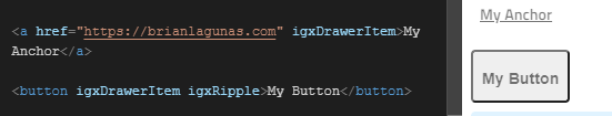
Looking at the image above, you can see how the styling does not match the styling of the samples found here: https://www.infragistics.com/products/ignite-ui-angular/angular/components/navdrawer.html
Besides the styling not matching, using spans/divs is non-semantic and not accessible.
Describe the solution you'd like
I would like the button and anchor elements to be styled the same when the igxDrawerItem directive is applied.
Describe alternatives you've considered
For anchor, you can provide an inline-style to remove the underline, but this is more code that I have to write and maintain.

For the button, I can apply the igxButton directive, but the highlighting does not span the width of the drawer menu

 brianlagunas
All 3 comments
@brianlagunas The button element, by default, does not span the width of the container it's placed in. If the choice for the nav elements is buttons, then additional styling needs to be applied to them, which are application specific, not theme specific.
Semantically, the most suitable <nav> decedents are list items in a list: https://developer.mozilla.org/en-US/docs/Web/HTML/Element/nav
Using a ul>li, or ol>li structure will result in visually the same appearance, if the minirest.css has not been removed from the default sass, otherwise there will be padding on the list items, which is browser default.
Anchors can be used as well and the styling matches the styling of any other container element:
<igx-nav-drawer id="navigation" [isOpen]="drawerState.open" [(pin)]="drawerState.pin">
    <ng-template igxDrawer>
      <nav>
        <span igxDrawerItem [isHeader]="true">Components</span>

        <a *ngFor="let item of navItems" igxDrawerItem [active]="item.text === selected" igxRipple (click)="navigate(item)">
          <igx-icon fontSet="material">{{ item.name }}</igx-icon>
          <span>{{ item.text }}</span>
        </a>
      </nav>
    </ng-template>

    <ng-template igxDrawerMini *ngIf="drawerState.miniTemplate">
      <nav>
        <a *ngFor="let item of navItems" igxDrawerItem [active]="item.text === selected" igxRipple (click)="navigate(item)">
          <igx-icon fontSet="material">{{ item.name }}</igx-icon>
        </a>
      </nav>
    </ng-template>
  </igx-nav-drawer>
Stackblitz: https://stackblitz.com/edit/angular-72kmwl
Result:

 kdinev
on 12 Nov 2019
kdinev
on 12 Nov 2019
@brianlagunas We can improve the default styles of the button and anchor elements in a future release. To use a button as a drawer item, you will have to do something like:
<button igxButton igxDrawerItem>item</button>
In the meantime, you can still use any element as your drawer item. You still have full access to the element, hence modifying the styles to your heart's content is not an issue.
 simeonoff
on 12 Nov 2019
simeonoff
on 12 Nov 2019
@kdinev Okay, it looks like the underline is only added to the anchor tag if setting the href.
The goal is that anytime we use the igxDrawerItem directive, the element should automatically be styled to be a seamless integration without requiring additional styling code.
Thanks everyone for the information
brianlagunas
on 12 Nov 2019
Related issues
 nikunjgajera
·
3Comments
nikunjgajera
·
3Comments
 Hypenate
·
3Comments
nikunjgajera
·
3Comments
Hypenate
·
3Comments
nikunjgajera
·
3Comments
 SAndreeva
·
3Comments
SAndreeva
·
3Comments
 lorenzo-iovino
·
3Comments
lorenzo-iovino
·
3Comments
Most helpful comment
@brianlagunas We can improve the default styles of the button and anchor elements in a future release. To use a button as a drawer item, you will have to do something like:
In the meantime, you can still use any element as your drawer item. You still have full access to the element, hence modifying the styles to your heart's content is not an issue.