Group-income-simple: Error, success and app error banners [Discussion]
Problem
At the moment, the app does not communicate any errors or success messages with the users.
_Note: This issue does not address notifications. For notifications, see #663_
Solution
Create a component to be used to inform users of the state of the app.
What types of messages are we displaying?
There are 3 types of messages we want to display to the user:
- Form error - these errors are displayed whenever the user makes a mistake when filling out a text / number / textarea / password input. These errors have already been designed and can be found in our design system and for this reason, I won't write a lot about these errors.
- User action feedback - these banners let the user know that a certain action was completed successfully OR that an error occurred, and what they can do about it. These errors are more general than form errors, because they concern the action as a whole (not an error in one specific input) or errors with other elements that are not inputs (e.g.: avatar upload);
- App Error - informs the user that there's something going on with the app itself, or with something that is not related with a user action.
User action feedback (success and error banners)

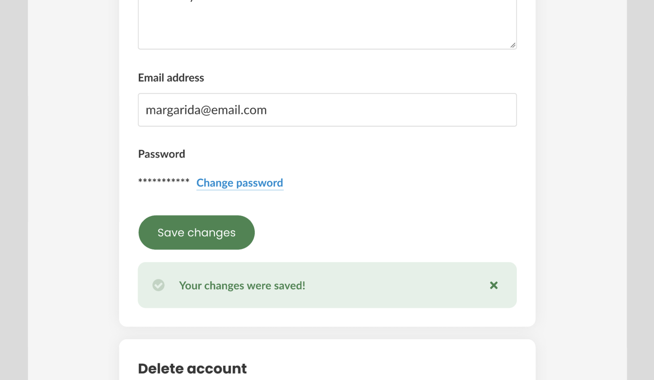
- The user can dismiss them, by clicking on the X button;
- Navigating to a different page automatically removes them;
- The errors are displayed in-context, immediately below the component where the error / success occured;
- There cannot be 2 banners for the same context - however, there can be more than one banner in a page (as long as they are not in the same group of information);
App Error
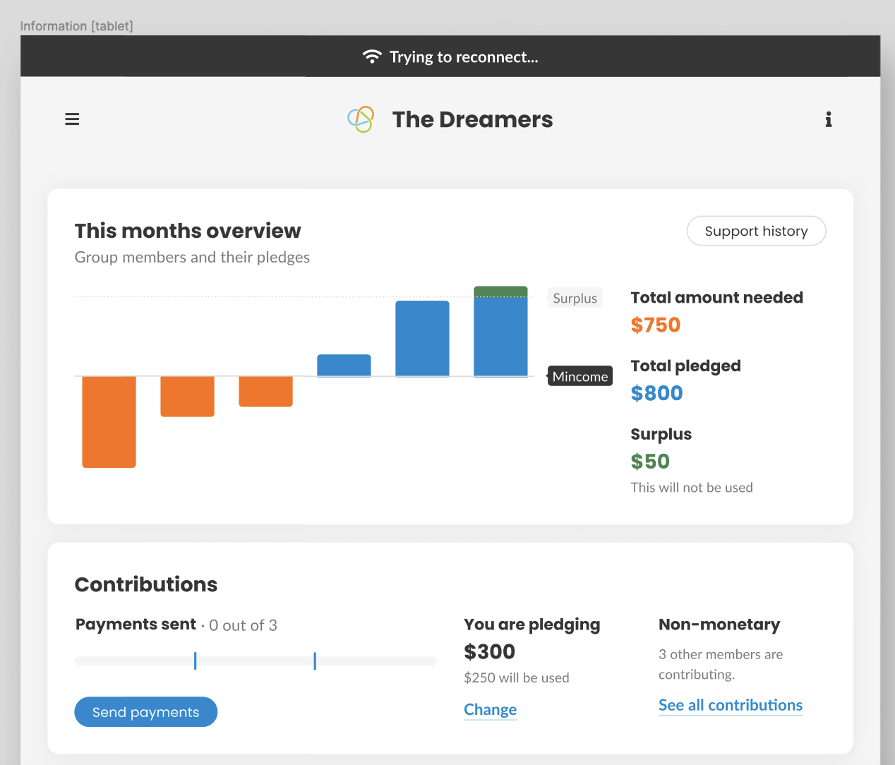
- The user cannot dismiss them;
- They remain visible until the problem is solved;
- These errors are global, and remain visible even when the user changes pages / opens modals, etc.
- Only one of these can be displayed at a time - if there's the necessity for the app to output more than one mistake, this just means that we are not creating the right errors;
- Because this error is global and needs to be displayed in all pages, it is fixed at the top of the page, and does not overlap content.
https://www.figma.com/file/mxGadAHfkWH6qApebQvcdN/Group-Income-2.0?node-id=5128%3A2448
 mmbotelho
All 29 comments
This is definitely a marked improvement over the other 3 options, great job!
I like how these are context-specific. Here's the only potential issue I see: doing errors this way will put greater pressure on developers to make sure that every section where something can be uploaded or saved has corresponding code and markup for displaying the error or success message in the right place. There could potentially be 3 such sections per page. This feels a bit close to being a DRY violation...
It would be nicer still if there was a more generalized way of displaying such information, that did not require developers to add special sections/markup/code for each error or success message.
Instead, from a developer POV, it is nicer if there's a single function call they can make to display errors, and without having to add markup, i.e. something like a notification center. This would have the downside of placing all errors and success messages in the "same place" visually speaking, but it would also have the upside of respecting DRY, being much much easier on developers, reducing the probability of bugs, being much easier to test, and making it much easier to add features to all error or success messages, like telling screen readers to read the messages when they appear, and adding them to a centralized log (#595).
 taoeffect
on 27 Sep 2019
taoeffect
on 27 Sep 2019
Well, I don't think it violates DRY. We are not repeating ourselves if there are 2 different errors in 2 different sections. They would be repeated anyway, even if they appeared in a more "global" position.
As for it being more difficult for developers... Well, I think technology needs to work for humans and not the other way around. We shouldn't make decisions because it's easier to code. If this was the case we would do plain markup with no JS whatsoever and that would take a fraction of the time to develop (at the expense of the user's sanity). Of course, it's always a matter of balance - a compromise between technology and design must be met or else nothing happens. With that being said, I will wait for @sandrina-p and @pieer to give us their opinions.
For screen readers, this is not a problem as well - they are read as they appear, exactly in the same way as they would if the interface showed them grouped together.
As for issue #595 - we are not talking about the same errors here. Console errors are not, necessarily, the errors that are displayed to users. We don't show one of these banners when an image is not loaded, for example.
With that being said, let's wait for @sandrina-p and @pieer to tell us if the extra amount of work is worth it or not 😄
mmbotelho
on 27 Sep 2019
Well, I don't think it violates DRY. We are not repeating ourselves if there are 2 different errors in 2 different sections. They would be repeated anyway, even if they appeared in a more "global" position.
What I mean is, it's a DRY violation from a code perspective (the same code is being written multiple times).
As for it being more difficult for developers... Well, I think technology needs to work for humans and not the other way around.
I agree, I just also extend the definition of "humans" to developers. :)
There will be real consequences to users of the app as well if we make life difficult for developers, in the form of bugs and slow turnaround time.
As for issue #595 - we are not talking about the same errors here. Console errors are not, necessarily, the errors that are displayed to users. We don't show one of these banners when an image is not loaded, for example.
It's important to log all errors, including these.
Can you give some thought to how a more generalized implementation might look?
taoeffect
on 27 Sep 2019
It's important to log all errors, including these.
I agree that logging errors is important, but it is a different thing and should be addressed somewhere else. That is not the problem we are solving here. I think we are having a miscommunication. It's important that we don't mix these 2 types of errors.
Can you give some thought to how a more generalized implementation might look?
I have 3 other options on Figma that have a more generalized implementation already. Sorry but I am not understanding what you mean. Can you explain @taoeffect ?
mmbotelho
on 27 Sep 2019
That is not the problem we are solving here. I think we are having a miscommunication. It's important that we don't mix these 2 types of errors.
I'm just thinking about how this will look in the code. I think the notification center approach would be easier to adapt for #595 compatibility.
I have 3 other options on Figma that have a more generalized implementation already. Sorry but I am not understanding what you mean. Can you explain @taoeffect ?
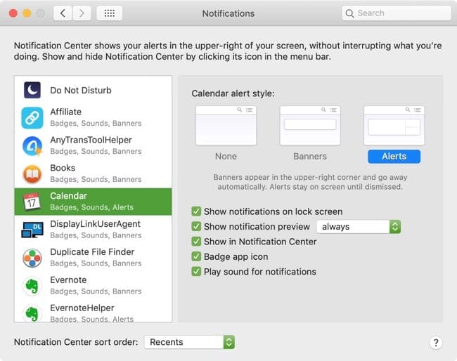
I'm referring to the idea of combining the form errors and the user action feedback into one system under a notification center. This is what many apps do. For example, have a look at Growl, and maybe play around with Espionage. This approach handles both kinds of feedback and also doesn't have a problem with displaying multiple errors/feedback at the same time, and it's very easy to use from a developer perspective, does not result in DRY violations, etc.
EDIT: this approach is also able to handle informative notifications that have actions, i.e. they can have a button that can be clicked on to cause some sort of action. In macOS notification center, for example, these are called alerts, and they support buttons:
taoeffect
on 27 Sep 2019
Hi everyone 👋
Let me start by saying that this new solution makes much more sense to my eyes as a user. Having different types of feedback to each error type makes all the sense. As you did before, showing a "global banner" about a "specific image upload error" was a little confusing.. (although you mentioned the copy could be different)
I'm totally fine with this solution and have nothing to point out at first sight! Maybe the only thing that I don't see being that useful is the ability to close an error/success message.
Just to confirm, @mmbotelho those "scoped banners" are the component "feedback indicators -> banners" on the Design System, right?
- @taoeffect
This feels a bit close to being a DRY violation...
I don't see how this can be DRY for us developers. We already have a "message" (aka "feedback Indicator" on our DS), we just need to start using it properly. Form errors are already implemented too. It's just missing the new "global banner" component. I'm trying to imagine a more centralized solution (design and developed) and the only thing it comes to my mind is this idea/file that tries to handle all the cases with a bunch of conditions. It can be chaotic and we might fall in a hasty abstraction. _"I prefer duplication over the wrong abstraction"_ And the reality is, this isn't truly a duplication problem. Each component solves a very specific problem and does it well. It's intuitive and we didn't have any problem so far in maintaining it. Let's just keep things simple as they are and avoid pre-optimizations. Let's just keep a AHA mindset and we'll be fine
 sandrina-p
on 27 Sep 2019
sandrina-p
on 27 Sep 2019
We are not talking about the same thing @taoeffect . These banners I designed are NOT notifications. Our notification system was discussed on issue #663 .
What we are designing here is a way for the app to communicate to the user that something is not working as expected OR that things are working as expected.
mmbotelho
on 27 Sep 2019
those "scoped banners" are the component "feedback indicators -> banners" on the Design System, right?
Yes @sandrina-p
mmbotelho
on 27 Sep 2019
What we are designing here is a way for the app to communicate to the user that something is not working as expected OR that things are working as expected.
We are talking about the same thing. I'm not talking about #663. Did you try out the links I gave you?
taoeffect
on 27 Sep 2019
Did you try out the links I gave you?
Of course I did @taoeffect , from what I can see Growl is a notification aggregator, and this is not the same thing as we are designing here.
mmbotelho
on 27 Sep 2019
Same thing as the image you uploaded - it has the option to display notifications as banners, and we are in fact designing banners in this issue, but it's not the same thing
mmbotelho
on 27 Sep 2019
I don't see how this can be DRY for us developers. We already have a "message" (aka "feedback Indicator" on our DS), we just need to start using it properly. Form errors are already implemented too.
It's a DRY violation because you are repeating yourself, you are writing the same code in a bunch of different places. And yes, we are committing a DRY violation right now with the way we're writing the form errors. From a code POV, it's downright ugly and bug-prone. From a design POV, it might look pretty, but there is a cost to be paid here.
taoeffect
on 27 Sep 2019
Same thing as the image you uploaded - it has the option to display notifications as banners, and we are in fact designing banners in this issue, but it's not the same thing
The difference between #663 and this issue is that #663 is meant to display notifications of events that happen in the group.
This issue is not about that.
This issue is about displaying information about the success or failure of a user-generating action. Therefore, you are right, it is completely different.
For displaying information about the success or failure of user-generated actions, we need a generic solution. Notifications are a great way to solve this problem in a generic way. These are not the same notifications that are mentioned in #663. They are completely different, and so they need a different design.
Can you give it a try? Can you design another way to display these other types of notifications? It will make the code much nicer.
taoeffect
on 27 Sep 2019
I want to be clear and re-iterate: I do not think that what you came up with here is bad. I think it looks great, and we might even end up going with it. However, if we go this route, we will be paying a non-trivial cost. We will be committing a DRY violation, the code will be longer and more unwieldy, and therefore it will be more bug prone.
A decision will have to be made each time a success or error message can happen, about where it should be displayed.
Code will have to be written each time for each success/error scenario. This code will be littered throughout the codebase, and it will result in bugs, because it will not always be the same code.
If there were a way to implement this solution without the DRY violation, perhaps via some Vue.js mixin or some magic component, then perhaps it's worth doing it. However, here I am not an expert. I do not see a clean, DRY-free way of doing this, but maybe you @sandrina-p or @pieer know how.
I do see a DRY-free way of doing this via error/success alert notifications, however. That is how Espionage handles it, and that is how other apps handle it.
taoeffect
on 27 Sep 2019
right now with the way we're writing the form errors
In practice, I can't see where we are doing that...
_Pardon_ @mmbotelho, code ahead 🙈
Inline feedback: (ex: login form)
label.field
  .label Username
  input.input(type='text' required)
  span.error(v-if='hasError') Name already taken
Scoped feedback: (ex: contributions)
  message(
    v-if='success'
    severity='success'
  ) You are now pledging 500$!
Global Feedback: (ex: net connections)
  banner(
    v-if='hasConnectionProblem'
    severity='info'
  ) Trying to reconnect...
So, based on all of this... we could build a single component feedback-indication that can handle all of it:
  feedback-indicator(
    type="inline|block|banner"
    severity"danger|warning|success|info"
  ) Something went wrong, but I can handle it all.
So, now we don't have DRY, as you wanted. But this component API will be much more complex because it needs to handle all the cases. Imagine all the conditions that feeds this component: the styling, the icons, the title, js logic to handle fixed position on scroll (banners), more styling, and so on... A small refactor here would be a nightmare. You don't want that. It's a tricky place. I've been there and I don't want to do it again. If we have different UIs, and if those help our users in a significant way, let's do our best, as developers, to accomplish it and write our code in the best way possible.
sandrina-p
on 27 Sep 2019
@sandrina-p Margarida's message types 1 and 2 would be grouped together (EDIT: maybe, or maybe we'd let vuelidate handle type 1 for us) in this component. This component would not handle type 3 ("App errors", i.e. global top-banners). That would be a completely separate component.
However, in the example you gave, it is still not enough to address DRY violations. All you've accomplished is creating a component that handles the styling. I am talking about the logic. All of these v-ifs all over the place, with corresponding variables that must be defined and set and reset appropriately.
None of that would be necessary if we handled this using a generalized error/success alert notification design. They would simply appear. Some of them would disappear automatically after 5 seconds. Others (like errors) would hang around until the user acknowledged them. However, this would be hard to design for mobile, where screen realestate is limited. Margarida's designs above would look better on mobile.
So maybe there is a way to fix the DRY violation of the logic itself...
taoeffect
on 27 Sep 2019
One of your design ‘principles/values/wishes’ is to have related information as close as possible to its context... that’s what margarida suggested. And now you want a notification center for all types of ’app feedback‘. (Scopes and global). That doesn’t seem coherent :thinking:
sandrina-p
on 27 Sep 2019
And now you want a notification center for all types of ’app feedback‘. (Scopes and global)
No, global refers to Type 3, as I wrote above:
This component would not handle type 3 ("App errors", i.e. global top-banners). That would be a completely separate component.
So I'm only talking about scoped errors/success messages. I have no problem with the way the global errors are designed, as there is no DRY violation there.
One of your design ‘principles/values/wishes’ is to have related information as close as possible to its context... that’s what margarida suggested.
I also agree with this. What I am saying is very coherent (I think/hope... 😅). I am not contradicting myself, as shown here:
I want to be clear and re-iterate: I do not think that what you came up with here is bad. I think it looks great, and we might even end up going with it.
I am only pointing out that we have to deal with the DRY violation that is implied by the design of the Type 2 messages. See my comment above.
taoeffect
on 27 Sep 2019
@sandrina-p @pieer Is the following possible/simple to do in Vue.js: in one line, without defining any variables, to insert a component into a specific location on the page?
I.e. something like this:
insertError(<target ref>, {message: 'error message', icon: 'cross'})
And for that to insert a component into <target ref>, that itself contains all the logic necessary for automatically removing itself from the parent component?
If so, then the DRY violation implied by this design can be solved, and we can proceed with this, and also remove all of the v-ifs that we have littered throughout our code.
taoeffect
on 27 Sep 2019
Type 2 = user feedback = scoped banners = existing message.vue component, right? (Jezzz, 4 names for the same thing)
Hum.. so to see if I understand... you would like to have another central notification for that type of feedback. A DRY solution would be use sbp with emit selectors and then a single component that would catch those emits and show the messages to the user?
sandrina-p
on 27 Sep 2019
@sandrina-p I see we posted at the same exact time. So if you can figure out a way to do what I'm talking about in that comment above, then there is no DRY violation implied by this design, and we can proceed with it, without creating another type of notification center.
taoeffect
on 27 Sep 2019
I’ll search about your Vue question @greg. I know the answer with React. (Yes). I’ll check if it’s possible with Vue too
sandrina-p
on 27 Sep 2019
@sandrina-p @mmbotelho OK, I just created an implementation issue for this:
- #689 — Create self-removing component for scoped banner messages
Provided that is possible to do, then we can proceed with this design as-is! :)
taoeffect
on 28 Sep 2019
Just had a call with @sandrina-p, and we came up with a list of places where the 2nd type of notifications (user action feedback) should appear:
Errors
The only errors we identified so far are:
- Something went wrong, please try again - for now, we are grouping all server errors here. TBD: break these errors down and create more human errors;
- You are offline. Please reconnect and try again. - even though this error is going to be displayed as a type 3 message (app error), we can use type 2 messages to remind the user, in context, that they can't perform the action because of their internet connection.
These errors should be displayed in the following scenarios:
- Signup, on submit;
- Login, on submit;
- Create group avatar upload;
- Create group, when finishing the flow;
- Income Details modal, on submit;
- Create proposals, on submit:
- User Settings, my account, when saving changes;
- User Settings, avatar upload modal;
- Change password, on submit;
- Delete account, on submit;
- User Settings, when changing the theme;
- User Settings, when changing the font size;
- Group Settings, avatar upload modal;
- Group Settings, when saving changes;
- Group Settings leave group modal, on submit;
- Group Settings delete group modal, on submit;
- Join a group signup, on submit;
- Join a group login, on submit;
- Contributions, when adding, editing or removing a non-monetary contribution;
- Invite link management, when revoking a link;
- Proposals dashboard widget, when voting or canceling a proposal;
- Chat TBD;
- Pay group TBD
Other errors:
- Invalid username or email on the log in modal.
Success
- "Your changes were saved!"
These success messages should be displayed in the following scenarios:
- User Settings, my account, when saving changes;
- Group Settings, when saving changes;
There are a few of these scenarios where it is not clear yet where the messages should be displayed. We agreed in the call that I would be adding the missing mockups and then notify @sandrina-p when they are done.
Notes:
- Our HTML already specifies which image types we support for avatar images, so we don't need to show any errors concerning that. In other words, users can only upload the file types we specified in the HTML;
- There's no need to limit the size of uploaded images, because we will generate smaller images anyway (according to what @taoeffect wrote on issue #658 )
mmbotelho
on 13 Nov 2019
Updated the screens with all the scenarios described in the comment above on Figma.
https://www.figma.com/file/mxGadAHfkWH6qApebQvcdN/Group-Income-2.0?node-id=426%3A6
cc @sandrina-p @taoeffect @dotmacro @pieer
mmbotelho
on 13 Nov 2019
@sandrina-p This issue depends on #689 being closed - we need a self-removing scoped banner component for this "user action feedback" stuff. @SebinSong previously said he'd work on it, but that was a month ago and no PR submitted, so I've assigned that issue to you as well
taoeffect
on 14 Nov 2019
@taoeffect Sorry, I've been busy and haven't got around to catching up on the progress of the project for a while. Like you mentioned in the above comment, I do have a branch where I took some time to work on it but it's not completed yet. I would love to share it with you and @sandrina-p though if you need.
 SebinSong
on 19 Nov 2019
SebinSong
on 19 Nov 2019
@SebinSong I'm already working on this, you can see it on #779
sandrina-p
on 19 Nov 2019
@sandrina-p Thank you.
SebinSong
on 19 Nov 2019
Related issues
sandrina-p
·
8Comments
taoeffect
·
5Comments
taoeffect
·
3Comments
mmbotelho
·
6Comments
taoeffect
·
5Comments
Most helpful comment
I’ll search about your Vue question @greg. I know the answer with React. (Yes). I’ll check if it’s possible with Vue too