Group-income-simple: Iterate "Add members" UX
Problem
When a user clicks on the "Add more" link, the modal is pushed up (as expected), and the content moves. This makes this interaction a bit awkward.
Solution
As discussed offline in the Hackathon, we would like to have a similar behaviour to what we had previously, where you can use 1 input to add all members.
_Note: This is a low priority task and can be done after the prototype is live_
 mmbotelho
All 6 comments
What we will do:
- Margarida will re-design this UX now (hackathon);
- @sandrina-p will wait for the design;
- When Margarida is done, Sandrina is going to implement it
cc @taoeffect
mmbotelho
on 19 Oct 2019
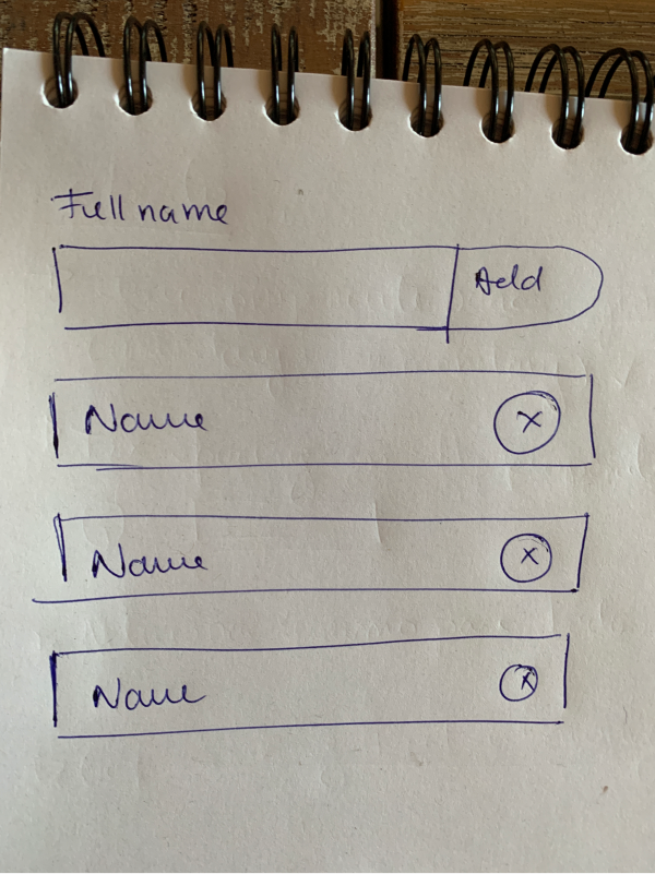
mmbotelho
on 19 Oct 2019
Yes, but just to be clear, that list of names does not represent input fields but text fields, and the final design may or may not need the 'x' to be inside of the border
 taoeffect
on 19 Oct 2019
taoeffect
on 19 Oct 2019
@taoeffect @sandrina-p :
After looking at this with more attention, I realized that it doesn't fix our problem at all:
When a user clicks on the "Add more" link, the modal is pushed up (as expected), and the content moves. This makes this interaction a bit awkward.
The new layout (see the image posted on my previous comment) has exactly the same issue. So I think we need to find a new solution.
mmbotelho
on 19 Oct 2019
@sandrina-p how difficult would it be to keep the modal static - I mean, making it only grow downwards? Instead of upwards and downwards
mmbotelho
on 19 Oct 2019
Change of plans - we are going to stick with the previously designed version:
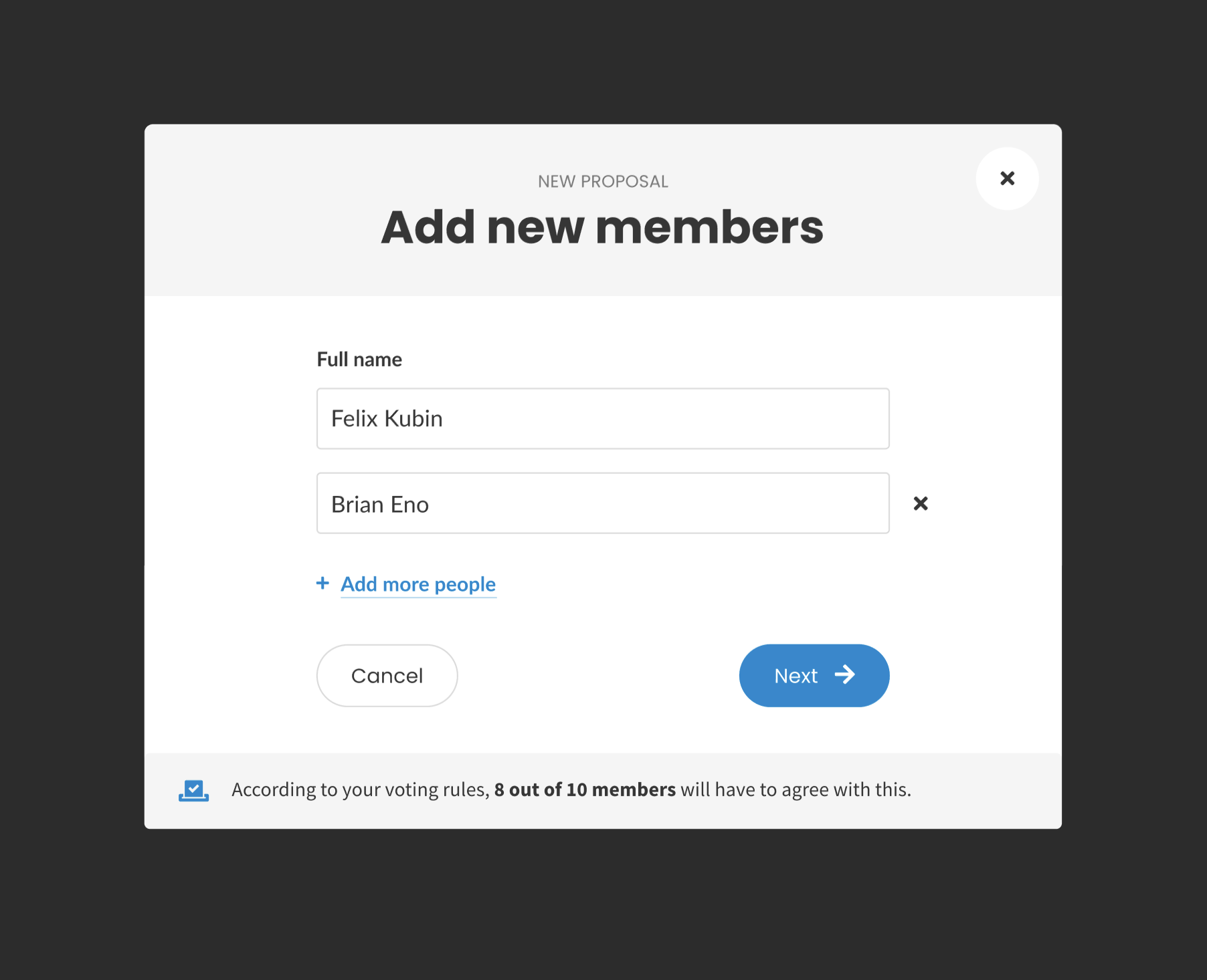
cc @taoeffect @sandrina-p
mmbotelho
on 20 Oct 2019
Related issues
 sandrina-p
·
6Comments
taoeffect
·
4Comments
taoeffect
·
8Comments
taoeffect
·
8Comments
taoeffect
·
5Comments
sandrina-p
·
6Comments
taoeffect
·
4Comments
taoeffect
·
8Comments
taoeffect
·
8Comments
taoeffect
·
5Comments
Most helpful comment
Change of plans - we are going to stick with the previously designed version:
cc @taoeffect @sandrina-p