Group-income-simple: Fix links style
Problem
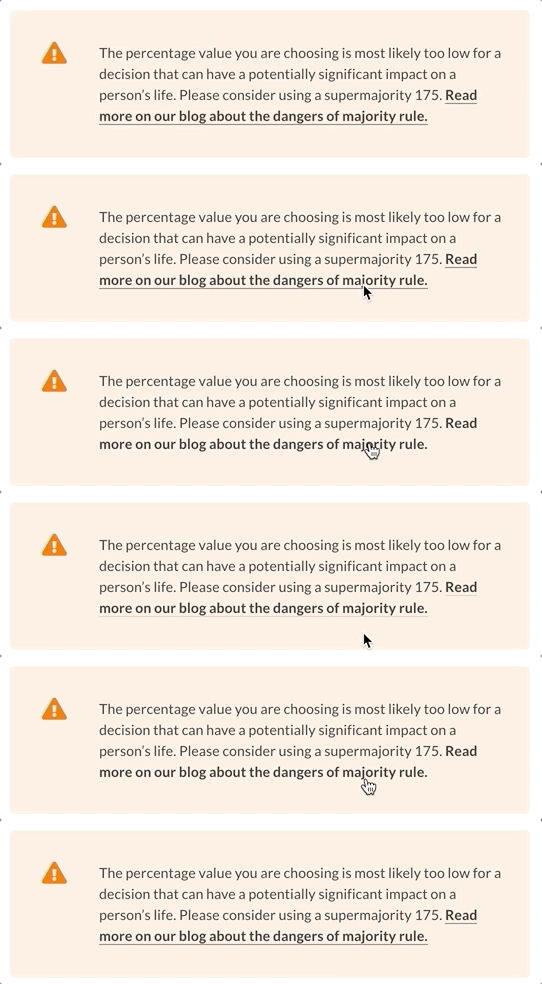
The current link style is done with a custom border to simulate a "fancy underline". Because of its nature, the style breaks when the link has two lines.
Solution
@mmbotelho I noticed that on Figma we use a default underline. Which behavior is the correct here?
cc @pieer @taoeffect
 sandrina-p
All 10 comments
I used a border on Figma as well. What do you mean by the "style breaks"? It's not clear from the GIF @sandrina-p
 mmbotelho
on 29 Aug 2019
mmbotelho
on 29 Aug 2019
When we hover/focus a link, the underline effect disappears... and it shouldn't
sandrina-p
on 29 Aug 2019
Ahhh I see... It doesn't show the animation, right?
Well, if it makes things inconsistent, I would say that we can keep it simple and remove the animation. If we do this, then what your gif shows should be the expected behavior in all links (including the blue ones).
What do you think @pieer @taoeffect @sandrina-p ?
mmbotelho
on 29 Aug 2019
For me it's fine. Maybe @pieer has another suggestion
sandrina-p
on 29 Aug 2019
Sorry @sandrina-p I'm not following, what do you mean by "it's fine", that this issue should be closed, or something else?
I'm fixated on the fact that the text reads "supermajority 175", that's the real issue here 😆 .
As far as links go, personally I like it when links are simple, without fancy animations, but do have some kind of simple :hover effect. That's just my opinion of course, and I'll defer to @mmbotelho's judgement here.
 taoeffect
on 29 Aug 2019
taoeffect
on 29 Aug 2019
I agree @taoeffect. If it keeps things more manageable then I'm 100% for removing the animation.
mmbotelho
on 29 Aug 2019
Ups @taoeffect. What I want to say it's I agree with the suggestion of removing the current link animation and keep it with the simple default underline.
sandrina-p
on 29 Aug 2019
@sandrina-p let's not use text-underline. Let's keep using border, please - text underline can have some weird visual effects
mmbotelho
on 29 Aug 2019
Ah okay, then, border without animations, it's fine as well. @pieer what do you think?
sandrina-p
on 29 Aug 2019
Remove the fancy link animation.
 pieer
on 29 Aug 2019
pieer
on 29 Aug 2019
Related issues
sandrina-p
·
8Comments
mmbotelho
·
7Comments
taoeffect
·
5Comments
taoeffect
·
8Comments
sandrina-p
·
6Comments