Group-income-simple: Minor Design system fixes
Problem
I found some minor discrepancies between the design system on Figma and what was actually implemented. This list of changes was made after reviewing the app/design-system page in master (August 19, 2019).
Solution
- [x] H1 and H2 should be responsive (figma);
- [x] Fix small typo, on the subtitle typography atom. "This is an subtitle" should be "This is a subtitle";
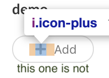
- [x] Buttons that have icons as a prefix or sufix should not have a margin on the left or a margin on the right side:
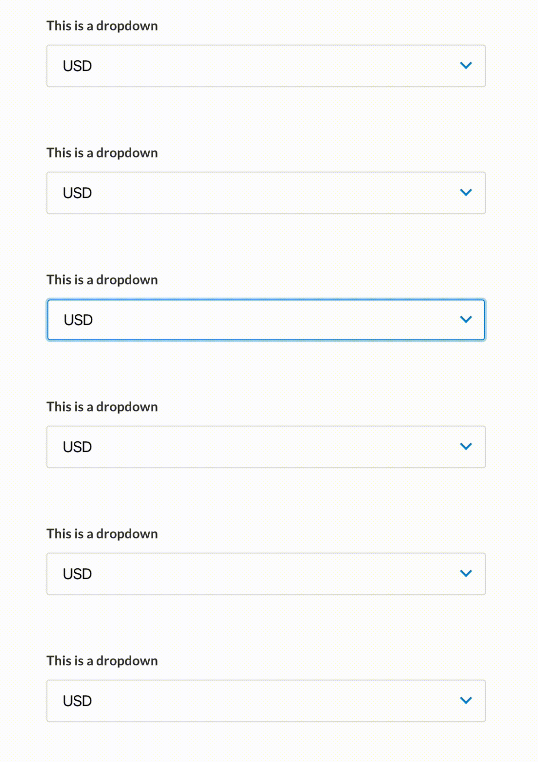
- [x] Fix small text movement in some inputs (dropdown, text + dropdown combo, text + button, text with icon prefix), when they change from their normal state to focus (see gif below - it takes a while to show the change):
- [x] Remove hover CSS changes from the text input with icon prefix:

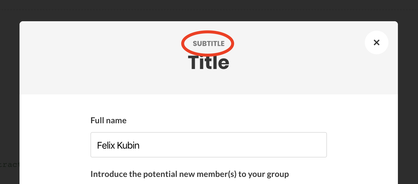
- [x] The subtitle on modals does not have the correct CSS - the subtitle component in the typography section is correct:
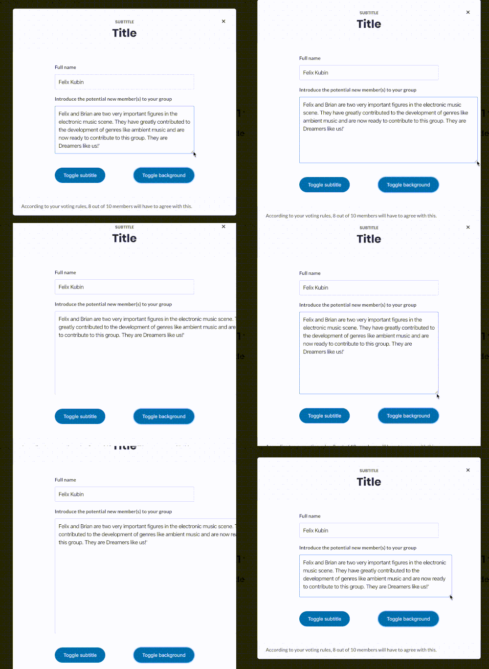
- [x] At the moment, it's possible to resize textareas horizontally. I understand that this is the default behaviour of textareas. The vertical resize is useful, but the horizontal one can be problematic. Is there a way to limit this movement? Bonus question, for 1000€ - how difficult is it to make a textarea increase its vertical size as the content needs it (aka, dynamically)? I found this codepen example
- [x] Update selectbox icon (chevron)
 mmbotelho
All 12 comments
I'll pick this stuff today, you should expect a PR later today ;)
 sandrina-p
on 20 Aug 2019
sandrina-p
on 20 Aug 2019
I started to fix those already @sandrina-p
 pieer
on 20 Aug 2019
pieer
on 20 Aug 2019
Oh okay, no problem! Next time @pieer let us know when you pick this, so we avoid doing the same thing twice :)
sandrina-p
on 20 Aug 2019
Let me know if you have any questions. By the way @pieer, I am using google chrome
mmbotelho
on 20 Aug 2019
That was mainly fix about my previous commit, so I assume I was going to fix it and you would focus on the sidebar, but yes, I will tell you next time
pieer
on 20 Aug 2019
@pieer this is the issue being solved in PR #636 right?
mmbotelho
on 28 Aug 2019
Just reviewed this in master - most of these are solved with the exception of:
H1 and H2 should be responsive
Buttons that have icons as a prefix or suffix should NOT have a margin on the left or a margin on the right side
The first one (H1 and H2) are working as expected in desktop and tablet, but are missing the smaller breakpoint:

cc @pieer
mmbotelho
on 7 Sep 2019
Also noted that the dropdown input has the wrong icon. See below:
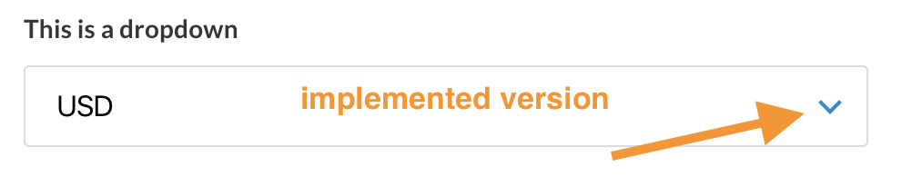
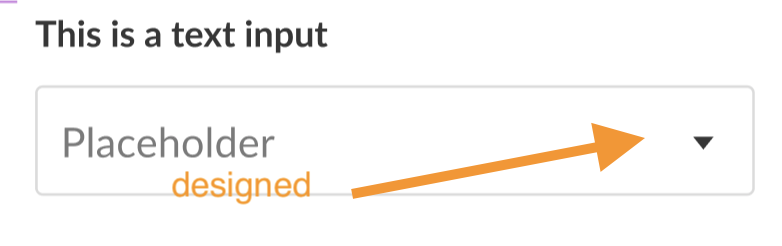
Added this one as a task as well
mmbotelho
on 7 Sep 2019
@mmbotelho which icon from fontawesome is that little triangle? (I'm realising I'm terrible looking for icons there)
sandrina-p
on 7 Sep 2019
Sorry for making you look there, it's not an icon - it's just a div shaped into a triangle (I believe this can be done with the :after pseudo-element or something similar). Here are the dimensions:
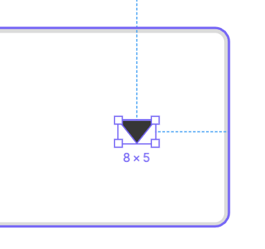
It is also placed slightly off-center (1 px closer to the bottom) or else it looks misaligned (because of the upper weight of the shape).
cc @sandrina-p
mmbotelho
on 8 Sep 2019
@pieer are you working on these?
sandrina-p
on 19 Sep 2019
I forgot the to change the icon ya
pieer
on 20 Sep 2019
Related issues
mmbotelho
·
7Comments
 taoeffect
·
5Comments
taoeffect
·
3Comments
sandrina-p
·
6Comments
taoeffect
·
7Comments
taoeffect
·
5Comments
taoeffect
·
3Comments
sandrina-p
·
6Comments
taoeffect
·
7Comments