Group-income-simple: Improve UX of inviting members, aka `new-group/invitees`
Problem
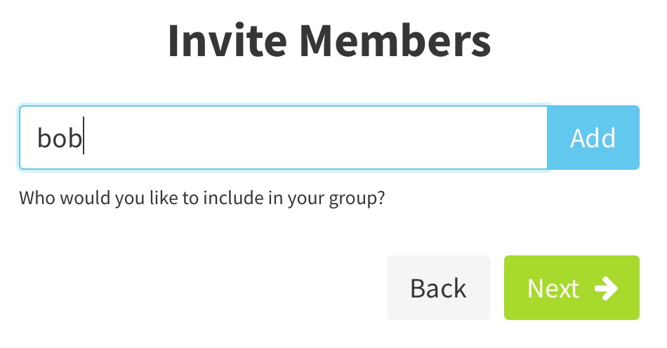
When you get to this screen, if the user types in a username without clicking "add", the "next" button can still be pressed. This is confusing.
Solution
I welcome @sandrina-p's input here, but my suggestion would be to remove the blue add button in the input field, and instead change the green "Next ->" button to a blue "Add" button anytime the input field has text in it.
Also add a circle with an x to the input field that when clicked/tapped clears the input field.
When the input field is clear of any username, the green button should return.
Also, if there are any spaces in the username, or any other invalid username characters, the vuelidate thing should kick in put a red (really: $is-danger) highlight around the field and shake it if "Add" is clicked, and let the user know that usernames cannot have spaces in them.
Remember to always use variables instead of actual raw colors for the colors of the labels so that theming and internationalization works.
These changes should also be applied to the simple/invite widget. Both widgets in fact should be merged into one (if they aren't already) under the components/ directory.
 taoeffect
All 7 comments
@taoeffect do you think it would be a good idea to also allow users to invite others to a group using a direct access link, like Discord does?

I think this would help make this step more user friendly, but I'm not sure about how secure this method is.
 mmbotelho
on 12 Dec 2018
mmbotelho
on 12 Dec 2018
@mmbotelho Yes, I think that's a great idea! 😄 👍
taoeffect
on 12 Dec 2018
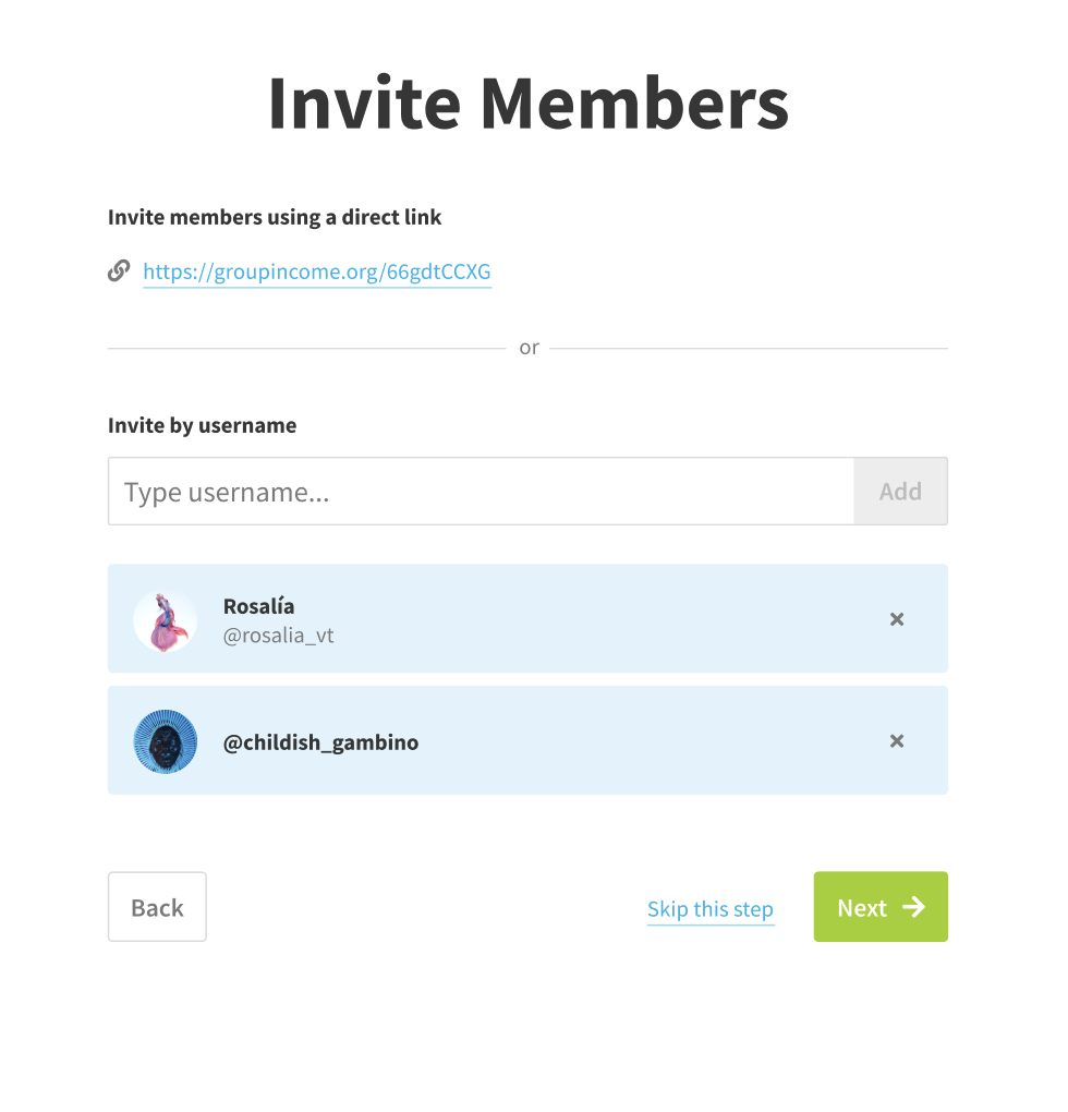
Finished working on a solution for this issue. As mentioned on Slack, the main changes I am suggesting are:
- Add a
skip this stepbutton. It is already possible to skip the step today (by simply clicking next), but I believe that this way it's clearer; - Add the possibility to invite members through a direct link;
- Make the overall UI more consistent with newer pages as we discussed on one of our first calls;
- Create error prevention mechanisms, so the user does not click next if they have a username typed in the input;
- Re-order the
backandnextbuttons", by placing the "back" on the far left and the "next" on the far right. I believe this disposition makes more sense for people that write using the left-to-right orientation, because left usually is associated automatically with back and right associated with moving forward.
Mockups:
Small preview of how it looks like:
If everyone agrees (@taoeffect , @dotmacro ), I'm ready to close this issue!
mmbotelho
on 15 Jan 2019
Let's leave it open so that it doesn't get lost, and to be closed with an "implement this" issue (or re-assigned).
taoeffect
on 15 Jan 2019
Also, great work! 🥇 💯 👍
taoeffect
on 15 Jan 2019
OK, makes sense.
Thank you! 😄
mmbotelho
on 15 Jan 2019
Closing this issue because we're completely changing how we invite people.
taoeffect
on 13 Apr 2019
Related issues
 sandrina-p
·
8Comments
sandrina-p
·
8Comments
mmbotelho
·
8Comments
taoeffect
·
8Comments
taoeffect
·
9Comments
sandrina-p
·
8Comments
sandrina-p
·
8Comments
mmbotelho
·
8Comments
taoeffect
·
8Comments
taoeffect
·
9Comments
Most helpful comment
Finished working on a solution for this issue. As mentioned on Slack, the main changes I am suggesting are:
skip this stepbutton. It is already possible to skip the step today (by simply clicking next), but I believe that this way it's clearer;backandnextbuttons", by placing the "back" on the far left and the "next" on the far right. I believe this disposition makes more sense for people that write using the left-to-right orientation, because left usually is associated automatically with back and right associated with moving forward.Mockups:
Small preview of how it looks like:

If everyone agrees (@taoeffect , @dotmacro ), I'm ready to close this issue!