Group-income-simple: Improve Voting Rules UX
Problem
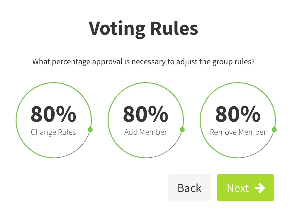
- The circle/handle/nob is too small
- The nob doesn't visually indicate it's selected when clicked / dragged
- The nob is not adjustable via the keyboard tab-selection
- (BUG) The settings allow 1% to be selected, potentially letting anyone change any setting. This is confusing and probably wrong in all cases.
Solution
- Make the circle/handle/nob bigger, along with the circle line width itself
- The nob needs to "depress" itself (perhaps by making itself a darker shade) to indicate it's selected
- When
<tab>is pressed, the knob should be highlightable so that the visually impaired can use screen readers to select it and adjust it (via the up/down arrows) - We should probably not allow the percentage to go below a certain amount, or we should say + show in the UI that a minimum of 2 votes is required no matter the threshold amount
Please note, (1), (2), and (3) all require forking the widget, which is good, because we need to remove all dependencies (#372).
 taoeffect
All 13 comments
Hey! As mentioned in the issue #343 I've made a few changes to this component. I followed @taoeffect 's solution proposal and also added some ideas of my own:
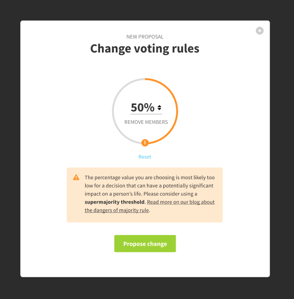
- The handler is now bigger, and added a "drag" icon to it;
- Added an actual number input to the center of the circle. The focus / active states are no longer a problem, and the user can input a fixed amount directly, if they prefer to do so;
- Made it start from the top center, like a clock.
- Added a reset link, that should only be visible after the user changed the value, in case they want to return to the recommended percentage.
I am not sure if this will take a lot of effort to implement, but I believe it will significantly help the usability. I would love to hear @sandrina-p and Simon's input!
 mmbotelho
on 19 Nov 2018
mmbotelho
on 19 Nov 2018
I really like the accessibility-friendly warning icon 👍
(Likewise with the other mockups in #343)
I also really like the warning text.
Because users will still be able to propose simple majority (and even minority) voting thresholds, I think we should keep the "at least x members need to agree" text. We could word it as "only x members need to agree", so it still reads as a warning.
Added a reset link, that should only be visible after the user changed the value, in case they want to return to the recommended percentage.
Will it return to the recommended percentage (80% in the current mockups) or the group's current percentage?
 dotmacro
on 21 Nov 2018
dotmacro
on 21 Nov 2018
@dotmacro
I really like the accessibility-friendly warning icon 👍
Awesome! I will create an issue for it, so we can update the component across the platform.
Because users will still be able to propose simple majority (and even minority) voting thresholds, I think we should keep the "at least x members need to agree" text. We could word it as "only x members need to agree", so it still reads as a warning.
Agreed! What about something like this:
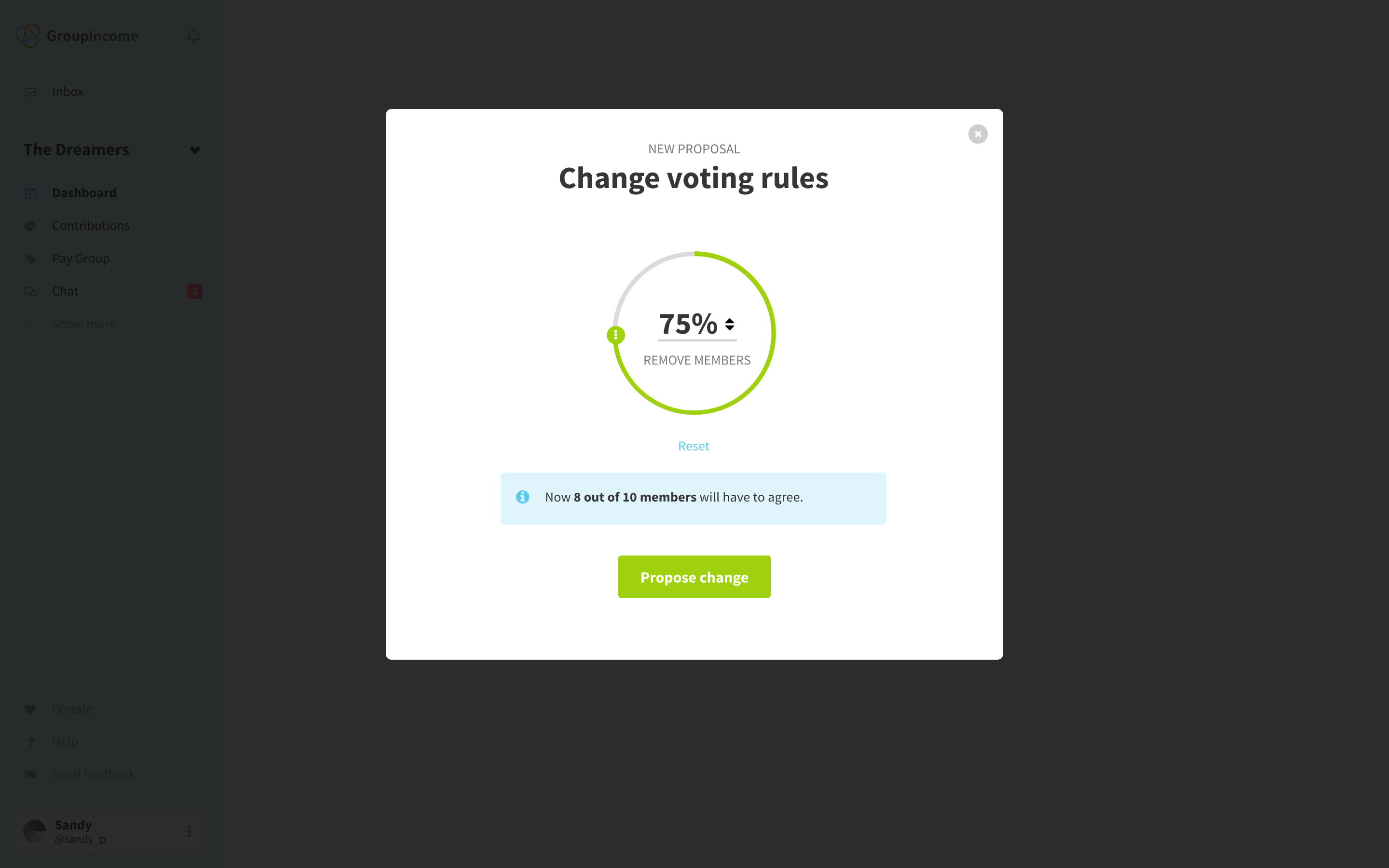
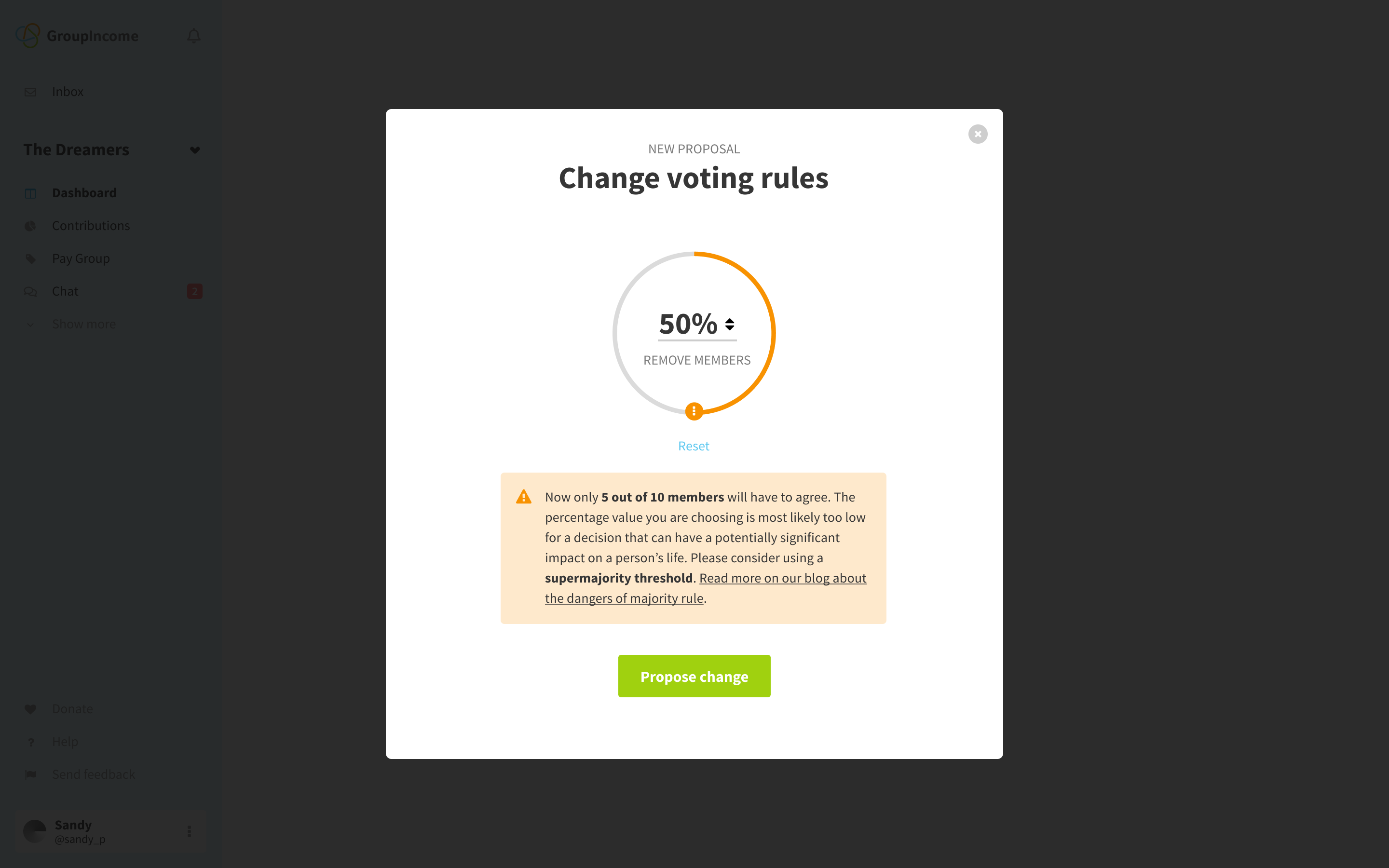
The idea is to de-escalate or escalate the warning according to what the user has selected.
Will it return to the recommended percentage (80% in the current mockups) or the group's current percentage?
If you are proposing a change, it should return to the previously agreed value. When creating the group, I would say that it should go back to the 80% (which seems to be the default in group creation).
I also made a mockup for the onboarding, so there are no doubts about how the component behaves there as well:
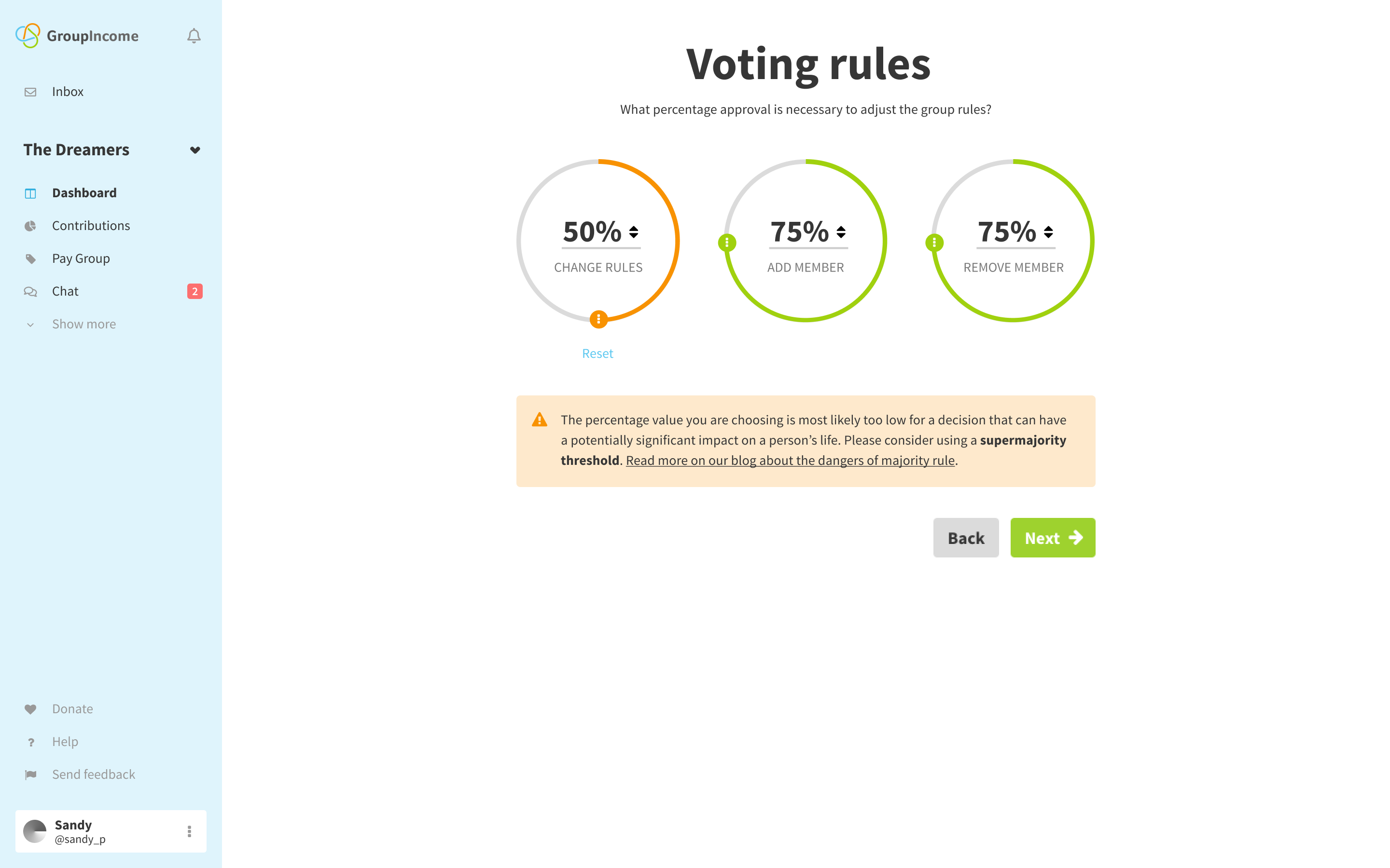
Notice that here I didn't leave the "Only X out of X members will have to approve" for 2 reasons:
- There's 3 voting rules displayed at the same time;
- The group only has 1 person at the moment (the user creating it).
What do you think?
mmbotelho
on 21 Nov 2018
Updated the component, as discussed in the issue #343 .
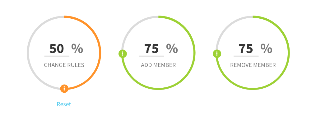
The input now only accepts numbers and the percentage sign (%) is only a label. Screens updated on Figma
mmbotelho
on 23 Nov 2018
Agreed! What about something like this:
The idea is to de-escalate or escalate the warning according to what the user has selected.
Yes, looks good. We could also prepend "If this proposal is accepted, then...", but I think that might add too much text.
Will it return to the recommended percentage (80% in the current mockups) or the group's current percentage?
If you are proposing a change, it should return to the previously agreed value. When creating the group, I would say that it should go back to the 80% (which seems to be the default in group creation).
👍
I also made a mockup for the onboarding, so there are no doubts about how the component behaves there as well:
One issue I see is that the warning seems to rely on color to convey which voting rule is being warned about. If the user only changes one rule, they can infer that's what the warning is about. They may also infer that the "too low" warning is about the lowest %. Or alternatively, they may think "significant impact on a person's life" doesn't refer to that rule, and end up confused about which of the other two it references. So, I think it's best to be explicit so there's no confusion or doubt. In addition to color, how can we tie the rule to the warning here?
Also, if there multiple rules below the warning threshold, do we show a custom warning for each, multiple identical warnings, or one warning that persists until and unless both thresholds are raised above the warning threshold?
Notice that here I didn't leave the "Only X out of X members will have to approve" for 2 reasons:
* There's 3 voting rules displayed at the same time;

* The group only has 1 person at the moment (the user creating it).
What do you think?
It makes sense to exclude it in this case. If the group creation process is changed to allow/require multiple members during group creation, we can add it then.
dotmacro
on 23 Nov 2018
One issue I see is that the warning seems to rely on color to convey which voting rule is being warned about. If the user only changes one rule, they can infer that's what the warning is about. They may also infer that the "too low" warning is about the lowest %. Or alternatively, they may think "significant impact on a person's life" doesn't refer to that rule, and end up confused about which of the other two it references. So, I think it's best to be explicit so there's no confusion or doubt. In addition to color, how can we tie the rule to the warning here?
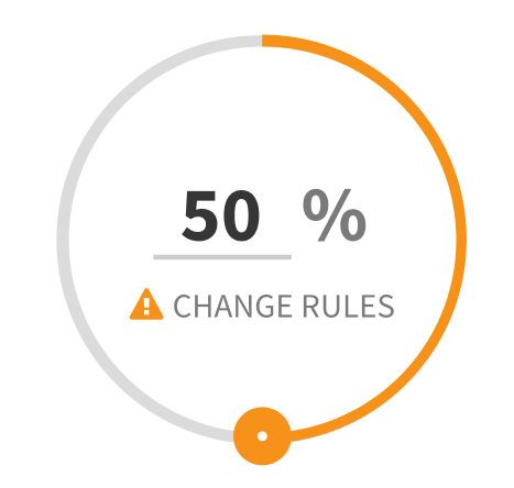
Good point @dotmacro ! I designed 2 possible solutions for this:
- Adding a warning to the circle itself, so that the user connects the 2 components together (warning and the threshold they're being warned about);
- Adding the name of the "circle" to the warning itself
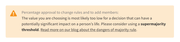
You can see this in more detail on Figma
Also, if there multiple rules below the warning threshold, do we show a custom warning for each, multiple identical warnings, or one warning that persists until and unless both thresholds are raised above the warning threshold?
I would say one warning that persists until and unless both thresholds are raised above the warning threshold, for simplicity's sake and to avoid having very similar messages repeated.
mmbotelho
on 26 Nov 2018
I designed 2 possible solutions for this:
1. Adding a warning to the circle itself, so that the user connects the 2 components together (warning and the threshold they're being warned about);
1. Adding the name of the "circle" to the warning itself
Both good solutions. I think the second (adding rule name to warning message) looks cleaner because the circles seem more balanced.
I would say one warning that persists until and unless both thresholds are raised above the warning threshold, for simplicity's sake and to avoid having very similar messages repeated.
👍
Design # 2 above also seems to work well when multiple rules have the same warning because the warning message will clearly state which rules it's referring to.
dotmacro
on 28 Nov 2018
Awesome! Updated on Figma
mmbotelho
on 28 Nov 2018
@mmbotelho looks fantastic! 🥇 👍
taoeffect
on 28 Nov 2018
@mmbotelho I noticed you designed the proposal itself (see Design Specs on Figma), but the UI to trigger this modal is missing (or I didn't find it again).
 sandrina-p
on 8 Jan 2020
sandrina-p
on 8 Jan 2020
Yes you are right @sandrina-p. It's on my to-dos. I believe it will be added to the Group Settings page.
mmbotelho
on 8 Jan 2020
I believe this issue is outdated now. What do you think @taoeffect ? Can we close it?
mmbotelho
on 15 Apr 2020
Sure 👍
taoeffect
on 15 Apr 2020
Related issues
mmbotelho
·
6Comments
taoeffect
·
5Comments
taoeffect
·
5Comments
sandrina-p
·
6Comments
mmbotelho
·
6Comments
Most helpful comment
Awesome! Updated on Figma