Group-income-simple: Update Dashboard design
Problem
currently the prototype UI isn't very intuitive. the basis of all group operations, the dashboard, has a somewhat disorganized and unprofessional feel.
Solution
Update dashboard design based on the new mockup @willstanley came up with as part of #327 , following the conversation captured below.
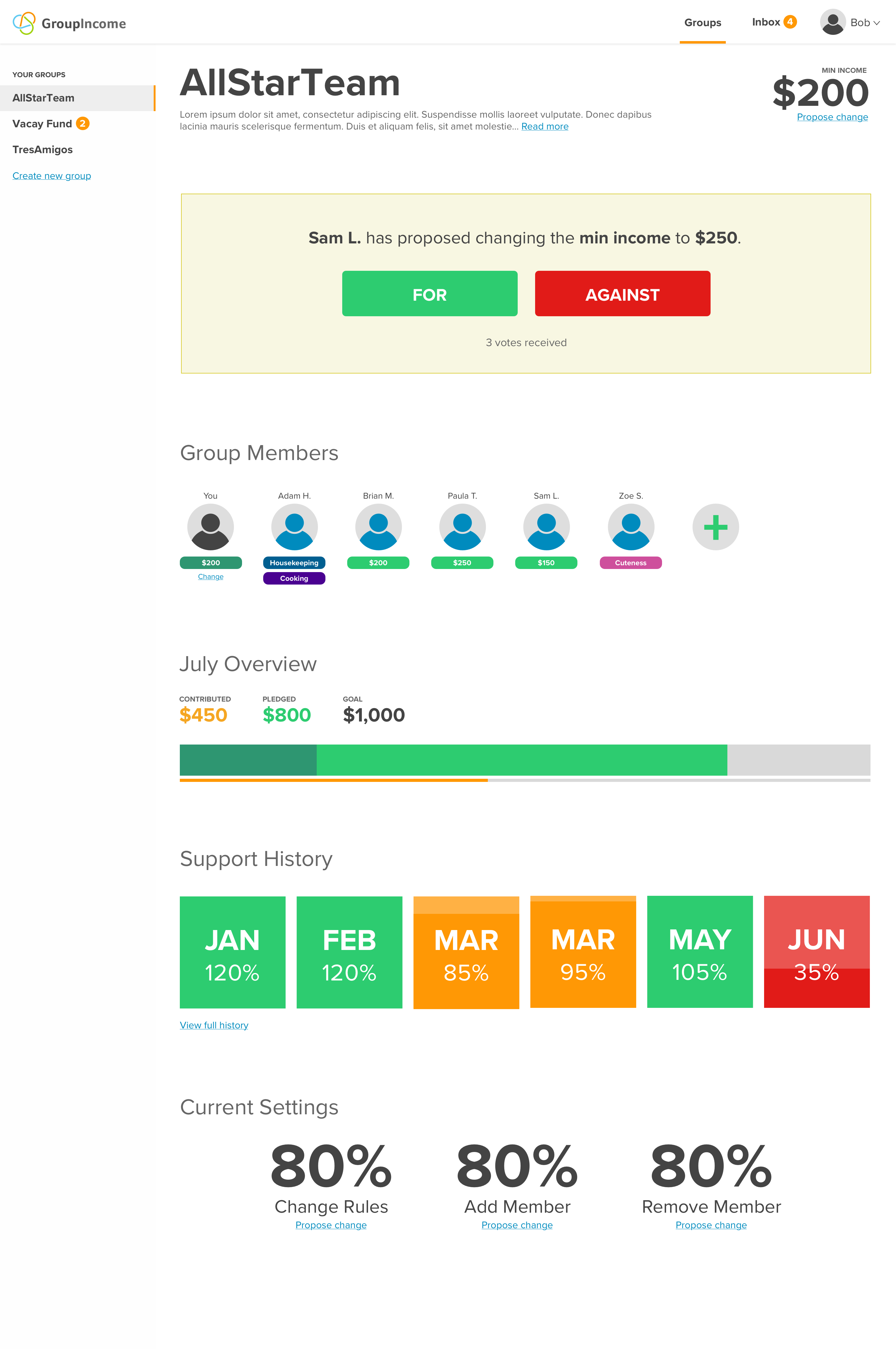
Latest designs:
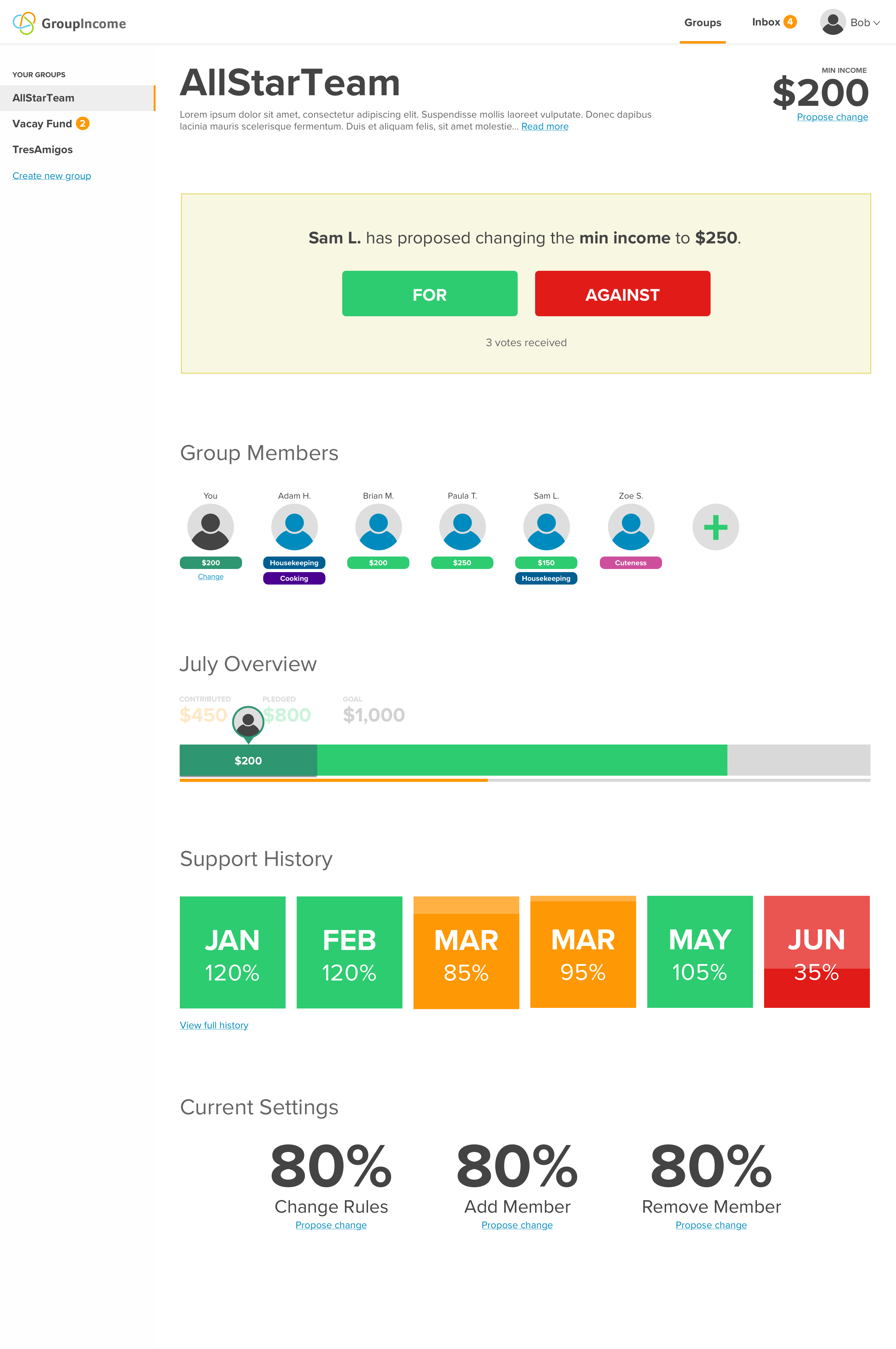
progress bar hover state:
Comments so far, to give context to current design:
- groupIncome brand colors should be kept
- default widget setup should be kept:
- basic group info: name, description, mincome
- voting announcement area
- customizable area: members, contributions, history, settings
the feel should be inviting and friendly but also professional
aka “kindergarten professional” themeThe word "Contributions" changed to "Pledges", both to indicate that there is a time during the month when people have yet to distributing their pledged amount (indicated in the "progress bar"), and also because there are different kinds of contributions (non-monetary ones as well)
- The "Group Members" section in the dashboard will not show $0 for people who aren't contributing monetary value, instead there are different colored pill boxes underneath their profile picture that indicate the kind of value they're providing to the group. There will be various categories of value when the user signs up for a group, and so a user's "primary value" to the group can be monetary contributions (green pill box, with dollar amount), or it could be "housekeeping", or even something as nebulous as "cuteness" (perhaps it's a kid)
- let users pick what their primary category is, even if they contribute monetary value
- the "progress bar" shows the percentage of the monetary value pledged that you're responsible for (if you pledged any)
Last comments, design todos:
- make the category pills stand out less, by making the colors lighter or whatever, and only allowing one primary category to be shown
- make the progress bar, and especially the display of the amount contributed so far, less "busy" by taking inspiration from the "Support History" boxes below (just making it horizontal instead of vertical)
 hubudibu
All 8 comments
groupIncome brand colors should be kept
Where can I check Group Income brand design guidelines? (with colors / typography / icons / logo, etc...) ? If we don't have one, I suggest we do one before continue iterating on GIS layouts so it's easier to create consistency across the app
 sandrina-p
on 31 Mar 2018
sandrina-p
on 31 Mar 2018
Where can I check Group Income brand design guidelines? (with colors / typography / icons / logo, etc...) ? If we don't have one, I suggest we do one before continue iterating on GIS layouts so it's easier to create consistency across the app
Go to groupincome.org. See the 3 color "trefoil" (?) logo that we have. Those 3 colors are basically the brand design guidelines right now.
See the comments in the issue above for other guidelines. Quoting from above, the name for the default theme we came up with is:
the feel should be inviting and friendly but also professional
aka “kindergarten professional” theme
I want to spend very little time writing up "guideline documents" while we're in this early stage. Take what we have and iterate on it. Produce something first. Then once we have an actual UI stable-ized and approved, we can write documentation — when the dust has settled, but not before.
 taoeffect
on 31 Mar 2018
taoeffect
on 31 Mar 2018
A guideline document, aka, Design Style Guide, doesn't need to be complex. It shows what we already have. For us, can be as simple as only showing the "3 color trefoil logo that we have". (something like this). And as we iterate and decide new stuff, the Style Guide is updated.
I want to spend very little time writing up "guideline documents" while we're in this early stage. Take what we have and iterate on it. Produce something first. Then once we have an actual UI stable-ized and approved, we can write documentation — when the dust has settled, but not before.
I think I didn't explain myself correctly. We only can have "an actual UI stable-ized" when we also have a Style Guide. Both will grow together. Almost like the chicken and the egg. It's really important to have a Style Guide with our rules (starting with the 3 main colors) so it's easy for us to reuse those and start having consistency across elements (voting system / dashboard / etc...). You can see a Style Guide as a "linter for design".
sandrina-p
on 31 Mar 2018
I think I didn't explain myself correctly. We only can have "an actual UI stable-ized" when we also have a Style Guide. Both will grow together. Almost like the chicken and the egg. It's really important to have a Style Guide with our rules (starting with the 3 main colors) so it's easy for us to reuse those and start having consistency across elements (voting system / dashboard / etc...). You can see a Style Guide as a "linter for design".
Ah, I see. OK, that sounds good. Feel free to create such a Style Guide as you work in either:
- a new section in the existing style guide we have in the
docs/folder - a new document in the
docs/folder - a wiki on gitlab (or github); but I think it's probably best to keep this in the
docs/folder
taoeffect
on 31 Mar 2018
BTW, I know that creating a merge request for every tiny documentation edit that you do can be a pain, so here's what I recommend from my personal experience:
- If you're editing a document you didn't create yourself, submit a PR out of respect for the original author(s) to review
- If you're editing a document that you created yourself (as could be the case here), feel free to directly edit the document using Github's built-in editor (click the edit icon and edit it in-browser). This form of editing is instant as it creates a commit directly on top of
master. And if no one else is messing with that same document it shouldn't be a problem. But try not to do too many small edits in a row as that can clutter the commit history
taoeffect
on 31 Mar 2018
That's why I prefer using wiki pages instead of repo files. For a "starting phase" I would create only one MR with /docs/design-style-guide.md with a link to wiki pages and update it necessary. When a major updates happens I inform everyone on the Slack or wtv. Once we have a "an actual UI stable-ized" we move the wiki to docs/ file. What do you think?
sandrina-p
on 31 Mar 2018
make the progress bar, and especially the display of the amount contributed so far, less "busy" by taking inspiration from the "Support History" boxes below (just making it horizontal instead of vertical)
I agree, I'll have than in mind and suggest an iteration over the current one. I have a few questions:
- Should that progress bar show the contributed amount from other members as well? On the design, that amount it's shown on each "member badge" and the user's contribution is also shown on progress bar "cursor hover" state. Maybe this kind of info is a little overlapped/redundant between both components. We could think about a solution in a way both members list + contributions are more connected between each other....
- What's the difference between the orange bar (contributed) and the darken green area?
- When clicking "change" below the user "members badge", what happens?
sandrina-p
on 5 Apr 2018
That's why I prefer using wiki pages instead of repo files. For a "starting phase" I would create only one MR with
/docs/design-style-guide.mdwith a link to wiki pages and update it necessary. When a major updates happens I inform everyone on the Slack or wtv. Once we have a "an actual UI stable-ized" we move the wiki to docs/ file. What do you think?
Sure, whatever you prefer, this is mostly your area/domain-of-responsibility so after discussion I mostly defer to you. :)
I agree, I'll have than in mind and suggest an iteration over the current one. I have a few questions:
Since we discussed/covered the answers over Monday's call, if you still have any remaining questions let us know (over Slack/gitter preferably to keep the emails down).
taoeffect
on 10 Apr 2018
Related issues
 mmbotelho
·
8Comments
taoeffect
·
3Comments
taoeffect
·
5Comments
mmbotelho
·
6Comments
taoeffect
·
5Comments
mmbotelho
·
8Comments
taoeffect
·
3Comments
taoeffect
·
5Comments
mmbotelho
·
6Comments
taoeffect
·
5Comments