Givewp: fix(admin-form): Make Range-slider more practical when setting the minimum amount
User Story
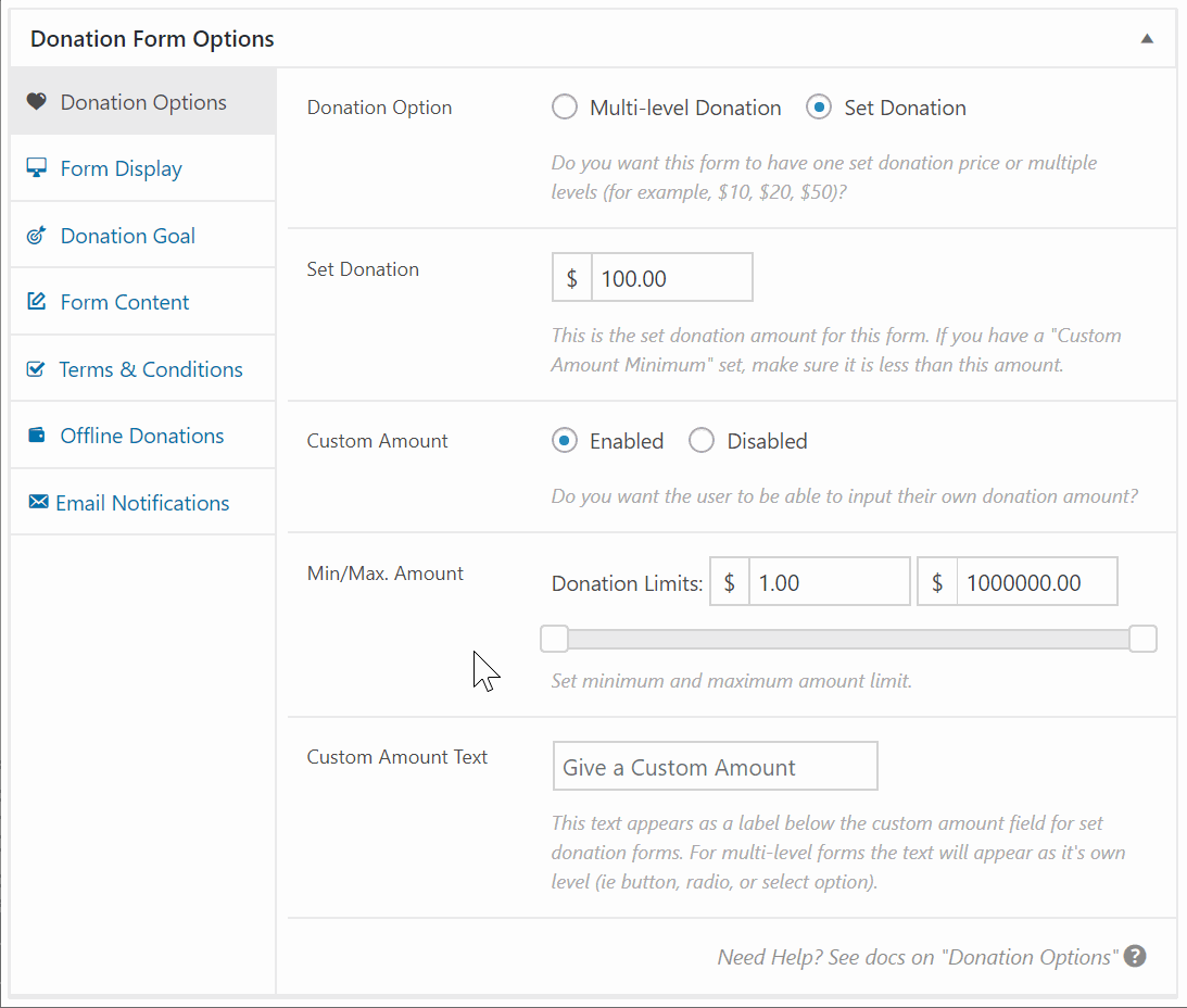
As a Give Admin, I want to be able to use the new min-max range slider in Give 2.1 so I can set my range effectively.
Current Behavior
I currently cannot set a reasonable minimum amount. As soon as I slide from the left, the amount jumps by thousands. It's very impractical. See GIF below.
Secondly, it's not clear what happens with the max side of the range. Is it possible to NOT have a max amount at all?
Expected Behavior
I expect the user experience of this new feature to be intuitive and easy to use and understand.
Visuals
Related
https://github.com/WordImpress/Give/issues/1920
Tasks
- [x] Format the amount like the other amount fields
- [x] Add right padding to both labels and make sure both fields line up.
- [x] The field Minimum Amount and Maximum Amount should not be a larger size than the Donation Limits font size.
- [x] Update description to
Set the minimum and maximum amount for all gateways.
 mathetos
All 4 comments
I've tested this as well and came to the same conclusion as @mathetos. I don't believe the slider improves the experience.
- It is much faster to type the minimum and maximum amounts into the fields.
- Most users will have specific amounts in mind, and trying to slide to that specific amount is frustrating/impossible.
- Realistically, the minimum amount will be something like
$10or$100, but even if you enter$1000into the text box, the slider barely moves. For amounts that low, you have to type it because you can't possibly slide to it.
Recommended Solution
Remove the slider and make Minimum Amount and Maximum Amount two different number fields with their own labels for better accessibility.
I see part of the motivation for the slider in #1920 was to indicate the max allowed per gateway. I think this can be handled with either dynamic descriptions or front-end validation of number fields.
 kevinwhoffman
on 1 May 2018
kevinwhoffman
on 1 May 2018
Direction Decision
I agree the slider is frustrating and not a good user experience. Let's remove it and go with @kevinwhoffman's suggestion above.
 DevinWalker
on 1 May 2018
DevinWalker
on 1 May 2018
@DevinWalker Let me know your view on new UI.

 ravinderk
on 1 May 2018
ravinderk
on 1 May 2018
@ravinderk a few things
- Format the amount like the other amount fields
- Add right padding to both labels and make sure both fields line up.
- The field
Minimum AmountandMaximum Amountshould not be a larger size than theDonation Limitsfont size. - Update description:
Set the minimum and maximum amount for all gateways.
DevinWalker
on 1 May 2018
Related issues
ravinderk
·
4Comments
mathetos
·
3Comments
 samsmith89
·
3Comments
DevinWalker
·
4Comments
mathetos
·
4Comments
samsmith89
·
3Comments
DevinWalker
·
4Comments
mathetos
·
4Comments
Most helpful comment
I've tested this as well and came to the same conclusion as @mathetos. I don't believe the slider improves the experience.
$10or$100, but even if you enter$1000into the text box, the slider barely moves. For amounts that low, you have to type it because you can't possibly slide to it.Recommended Solution
Remove the slider and make
Minimum AmountandMaximum Amounttwo different number fields with their own labels for better accessibility.I see part of the motivation for the slider in #1920 was to indicate the max allowed per gateway. I think this can be handled with either dynamic descriptions or front-end validation of number fields.