Givewp: design(admin-report): gather examples of useful reports
Issue Overview
The reports for Give can be improved greatly. They can display information more intuitively and have a better user experience overall. The code for the current reports is also difficult to read and understand.
Nice Report Examples
Baremetrics - I really like how they display graphs overviews that you can then click into:


Check it out: https://demo.baremetrics.com/stats/
Stripe - These graphs are very simple to understand. You can't drill down into the reports like baremetrics, though. I believe it would best to try something like this as an MVP that we can then iterate upon to have more data points.

Codepen 1 Really nice animations.
http://codepen.io/deep1808/pen/yNQGZe

Codepen 2 Nice dashboard overview http://codepen.io/Ruddy/pen/xbJXyQ

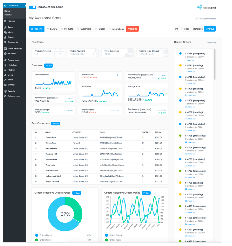
HelloSales Better WooCommerce reporting by iThemes:
 DevinWalker
All 4 comments
Note: The "Donors" report as it stands now is basically a less data-rich "report" than our donor's list view:
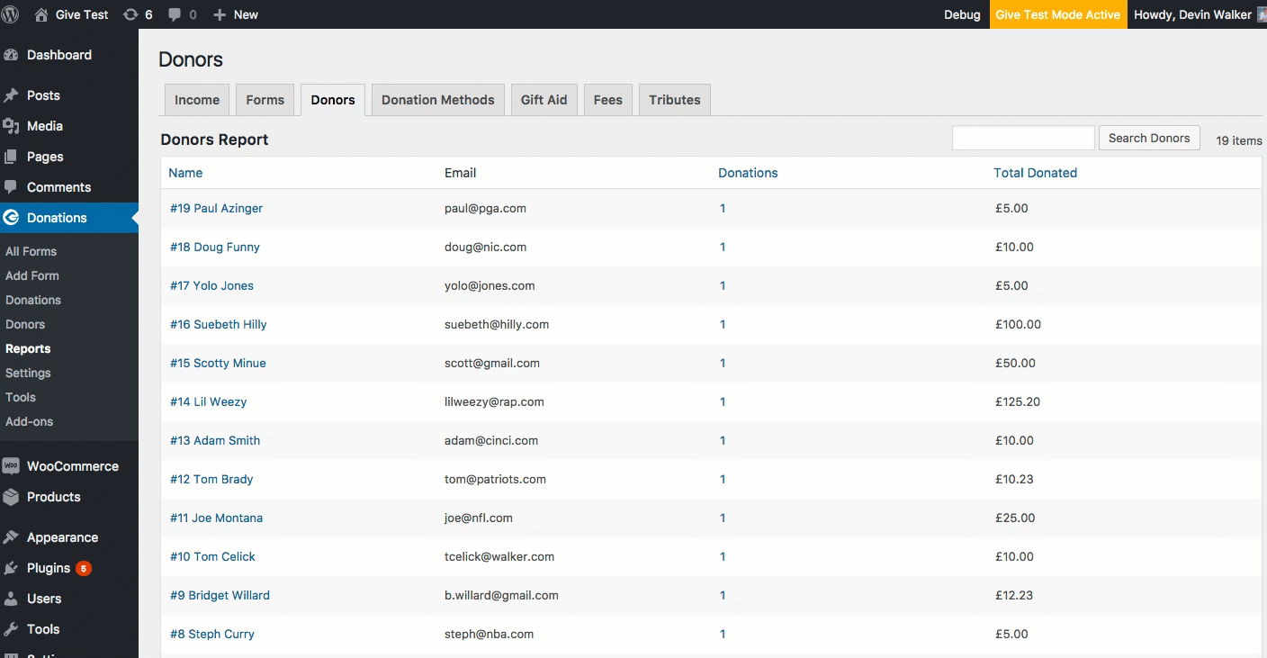
We should probably just remove this until we can get around to the revamp since it's just taking up unnecessary space.
DevinWalker
on 14 Sep 2017
We should include a way to view stats/reports on recurring Donations. Should be able to see the total income made out of recurring donations.
 marutim
on 31 Oct 2017
marutim
on 31 Oct 2017
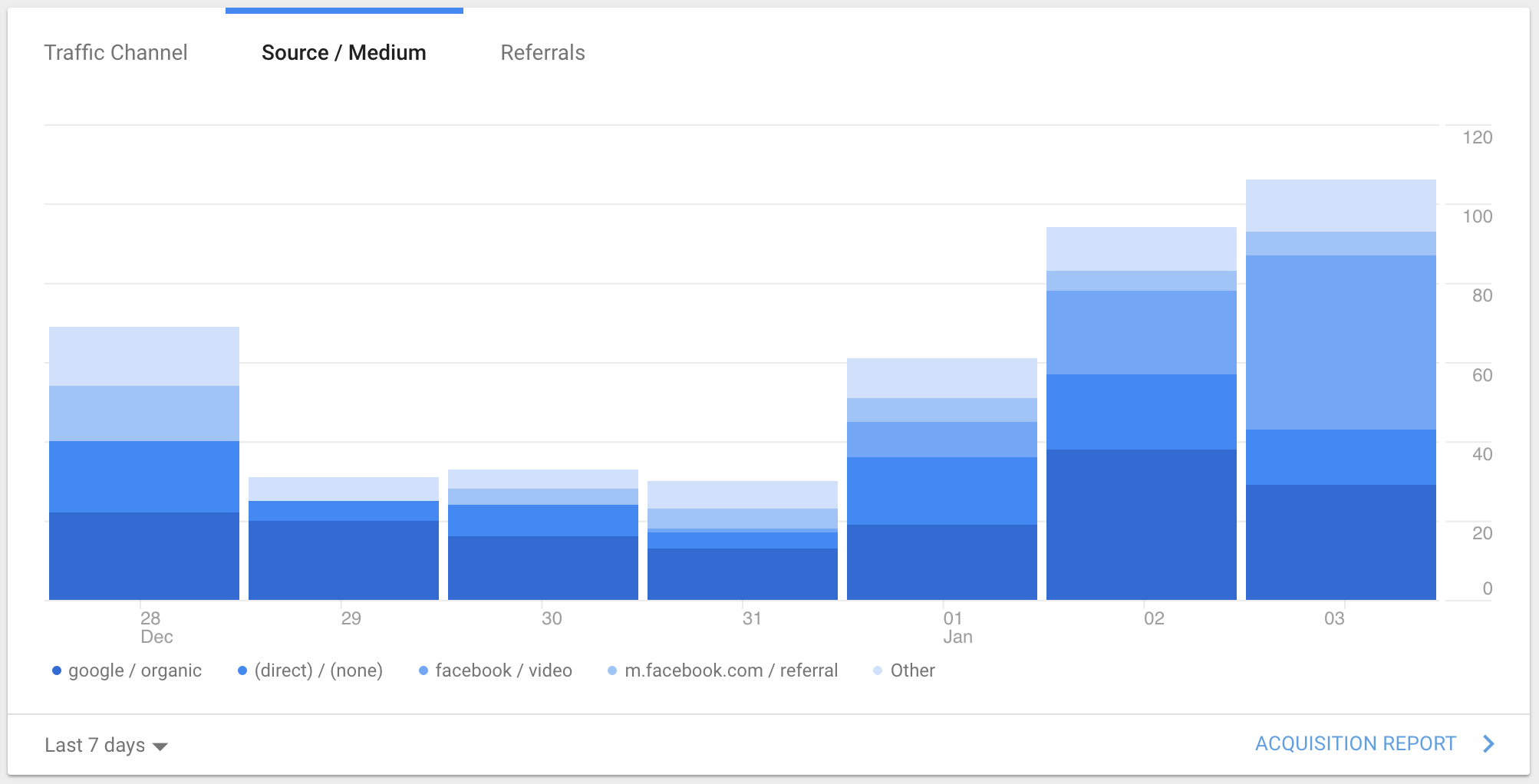
Google Analytics - I thought this was a clever way to show multiple sources contributing to a total while staying within a similar color palette. Consider this chart using Give green instead of blue.
One possibility would be Donations Per Day where each bar represents the total donations for that day broken down by donation size:
- < $10
- $10-$100
- $100-$500
- > $500
 kevinwhoffman
on 4 Jan 2018
kevinwhoffman
on 4 Jan 2018
I think we've gathered enough reports to warrant closing this issue.
DevinWalker
on 26 Jul 2018
Related issues
 Benunc
·
3Comments
Benunc
·
3Comments
 ravinderk
·
4Comments
ravinderk
·
4Comments
 raftaar1191
·
4Comments
marutim
·
4Comments
raftaar1191
·
4Comments
marutim
·
4Comments
 mathetos
·
3Comments
mathetos
·
3Comments
Most helpful comment
Google Analytics - I thought this was a clever way to show multiple sources contributing to a total while staying within a similar color palette. Consider this chart using Give green instead of blue.
One possibility would be Donations Per Day where each bar represents the total donations for that day broken down by donation size: