Gala: Replace task switcher with Catts (Calmer Alt-Tab Task Switcher)
Problem

The current task switcher in elementary OS has excessive motion and gratuitous animation and overloads the dock. It also gets stuck sometimes.
__Overloads the dock__ (the dock is transformed to include icons of windows and the icons there used to indicate which window you’re switching to). This breaks the physicality of the dock and overloads its meaning. That said, due to the amount of other animation going on, willing myself to concentrate on the dock is the only way I can use it at all.
__Has excessive motion__ (animates windows backwards or forwards while dimming them in/out every time you press alt + tab). Imagine that happening with maximized or half-screen windows on a 24" monitor. I don’t normally have issues with motion and it makes me feel seasick after a few uses.
__Gets stuck.__ Sometimes it will just get stuck in a state where no window is selected. Pressing alt + tab again gets you out of it.
alt + tab is meant to be a hidden, shortcut gesture for quickly switching between the various windows you have open.
The current implementation fails to address this need.
Proposal
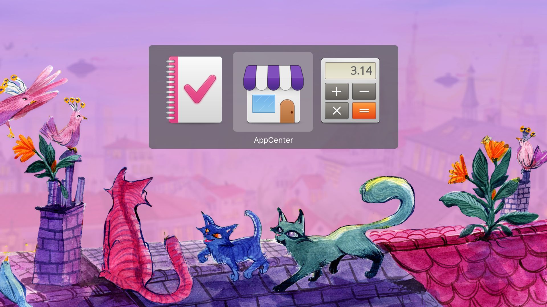
Replace it with Catts (Calmer Alt-Tab Task Switcher), an alternative task switcher for elementary OS 6 (Odin) that:
__Is calm.__ It does not animate my windows. I don’t want cognitive complexity when I’m fast switching between apps. I want to select the app I want to switch to and switch to it. That’s it.
__Uses icons.__ There is very little cognitive load to recognising an icon. There’s a reason we use icons of applications in menus, etc., instead of tiny thumbnails of them. The same principles apply here.
__Enables you to tell apart different windows of the same app__ (simply, by displaying the window title in the switcher alongside the icon).
__Uses the system colour scheme.__ Love Dark Mode? Catts does too.
Demo
Prior Art
Nearly every other major operating system implements a similar task switcher to Catts. This includes macOS, Windows, and nearly every flavour of Linux desktop.
This is not the reason to implement Catts as the default elementary OS task switcher. The first-principles reasons are outlined above.
Love and wallpapers
Please see the Catts repository for more details as well as a list of limitations in Catts that can hopefully be addressed after it is integrated into elementary OS.
Also, if you like the wallpaper in the screenshot, there are three versions that you can download and use, with love from Laura, Margo, and me at Small Technology Foundation.
Happy to answer any questions you might have and look forward to working with you to make this happen :)
💕
 aral
aral
All 16 comments
Probably would be more appropriate to open a pull request 😉
 danrabbit
on 28 Aug 2021
danrabbit
on 28 Aug 2021
Here's another "pro" for your list of pros:
This would remove one of the things that's blocking us from making Gala Wayland compatible. The current window switcher depends on Plank, which is not Wayland compatible.
 davidmhewitt
on 28 Aug 2021
davidmhewitt
on 28 Aug 2021
You make a cogent argument - the existing switcher is unnecessarily busy. Whether Catts is the solution is for the UX team to approve.
 jeremypw
on 28 Aug 2021
jeremypw
on 28 Aug 2021
Probably would be more appropriate to open a pull request 😉
Thanks, Daniel, I didn’t want to presume :)
I’ll have a look at the Gala code tomorrow and see if I feel confident preparing one without screwing anything up :)
aral
on 28 Aug 2021
Here's another "pro" for your list of pros:
This would remove one of the things that's blocking us from making Gala Wayland compatible.
Oh, that’s good to hear. Thank you. Here’s hoping this will be useful :)
aral
on 28 Aug 2021
I really don't like the stock task switcher in elementaryOS. This is a giant improvement.
 krisives
on 29 Aug 2021
krisives
on 29 Aug 2021
Seconded on the motion sickness. I love everything else about elementary but the app switcher makes me feel unwell and a little disoriented. Catts looks to be a nice solution!
 SeparateRecords
on 29 Aug 2021
SeparateRecords
on 29 Aug 2021
Love it!!!
Two questions:
The background color seems to be a little bit lighter than the dock,the Terminal or the workspace overview background. Wouldn't it look a little bit better if the color matched the other dark backgrounds?
On the Demo Gif, the padding seems to be bigger than on the proposal. Is this because of scaling? Wouldn't it be possible to reduce the padding like on the Proposal?
Thanks.
 Blast-City
on 29 Aug 2021
Blast-City
on 29 Aug 2021
@Blast-City Thanks :)
Regarding the questions:
I’m not married to the background colour/opacity; they could definitely be tweaked for better consistency if necessary.
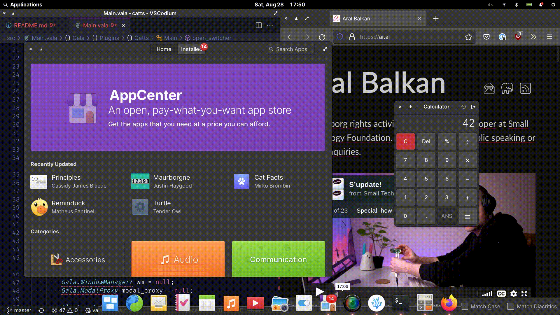
The screenshot in the proposal section is art directed to put the focus on the switcher. I actually made a branch specifically to position it (it’s also displaying the icons at 256px). And you’re right, I didn’t tweak the padding for the screenshot version and so it will appear like its less. The actual implementation is the one you see in the animated gif of the screen capture.
aral
on 29 Aug 2021
Can I suggest the Catts to display the windows as thumbnail + icon? this would be useful for when you have more than one window of the same app open, e.g two Firefox windows, I usually open more than one window of Firefox, and having just the icon can be a bit confusing.
I made an draft in Krita real quick, I don't know how much of this makes sense but it is a idea:

 Zoldyako
on 29 Aug 2021
Zoldyako
on 29 Aug 2021
This is wonderful! Thank you for this!
How complicated does making it workspace aware seem to be? Would it make sense to be able to cycle the view? For example, Alt+Tab shows apps in the current workspace; pressing Q or the up arrow key while holding Alt replaces the view with apps from the previous workspace and W/down arrow key for apps in the next workspace. This way you could achieve quick, organised navigation without adding clutter to the window
 ibrahimrahman
on 29 Aug 2021
ibrahimrahman
on 29 Aug 2021
All my support!
 AntonioBlaGra
on 30 Aug 2021
AntonioBlaGra
on 30 Aug 2021
@Zoldyako Hey José, thank you for sharing your sketch. And, good news, the feature you want already exists in elementary OS ;)
Hit ⌘ + s (or use the icon in the dock) to access Multitasking View :)

So if differentiating the contents of the windows is important, that’s what I’d use (especially since then you can see the window contents in a larger format that’s specifically designed for that purpose).
Catts serves a related but different need as a very quick productivity feature for switching between open windows. And, most of the time (80/20 rule – although for me, it’s closer to 100% in practical everyday use), you can still differentiate between different windows of the same app based on their window titles.
Of course, Catts is a hotkey-bound hidden gesture so the Multitasking View continues to serve an important and related but separate need not just by providing window previews but also by being explicit and easy to stumble onto by its prominent location in the dock. (So Catts is not a replacement for it.)
Thank you again for taking the time to create and share your sketch. It’s good to have independent validation for the need of the Multitasking View :)
aral
on 30 Aug 2021
@ibrahimrahman I’m not really sure. Please keep in mind that I am very new to the platform and what I did was basically stumble in the dark creatively to port Gala Alt-Tab Switcher to Odin, made it easier to install, and asked Margo to add a few cats to it (with the eventual goal of hopefully getting it added to elementary OS) :)
The real person to ask would be @davidmhewitt who has been improving the code base in the last two days in his draft pull request to incorporate Catts as the window switcher in Gala.
There is also an issue open for this very thing in Catts.
The way I’d like to see this implemented is to have apps from all workspaces display by default without any sort of hierarchy. When you’re task switching, you shouldn’t have to think about the spatial layout of your workspaces.
Compare the cognitive load of:
“I want to switch to my web browser.”
With:
“I want to switch to my web browser, which is three screens to the right of me.”
The reason not having workspace support currently in Catts is a limitation is because it imparts that requirement on you. (You must remember which workspace an app is in, switch to it, and then, if you want to, use the task switcher. At that point, the productivity gains of Catts are lost to, say, using the more explicit but slower Multitasking View.)
So a very strong “yes, please” to having apps from all workspaces display in Catts. And an equally strong suggestion to please keep Catts linear and a simple gesture without introducing a more complex mental model that requires keeping a spatial map of workspaces within your head while working :)
aral
on 30 Aug 2021
@Blast-City Thanks :)
Regarding the questions:
1. I’m not married to the background colour/opacity; they could definitely be tweaked for better consistency if necessary.

2. The screenshot in the proposal section is art directed to put the focus on the switcher. I actually made a branch specifically to position it (it’s also displaying the icons at 256px). And you’re right, I didn’t tweak the padding for the screenshot version and so it will appear like its less. The actual implementation is the one you see in the animated gif of the screen capture.
Thanks.
I think ti would look much better without the extra padding. This is how it looks on Gnome:

Blast-City
on 30 Aug 2021
Nice work @aral, this task switcher looks really great! Looking forward to seeing it integrated upstream :smile:
However, I agree with @Zoldyako , when multiple windows of the same app are open, the current task switcher allows to easily differentiate them.
I usually work with multiple instances of my IDE open, and having to read the title is not as simple as checking the thumbnail. Specially because the window title is not visible until you Alt+Tab to the icon, so you don't know at first look how many times you need to press the tab key.
For me this is a feature already present that will be lost and that'll impact my workflow.
I think that Windows 10 does a very good job in terms of functionality:

Just by pressing Alt+Tab you can see the window titles, thumbnail and even close them with the mouse... The design though...
 JoseExposito
on 30 Aug 2021
JoseExposito
on 30 Aug 2021
Related issues
 bencemozsar
·
3Comments
bencemozsar
·
3Comments
 steakscience
·
3Comments
steakscience
·
3Comments
 wout
·
3Comments
wout
·
3Comments
 Janiczek
·
4Comments
danrabbit
·
4Comments
Janiczek
·
4Comments
danrabbit
·
4Comments
Most helpful comment
Here's another "pro" for your list of pros:
This would remove one of the things that's blocking us from making Gala Wayland compatible. The current window switcher depends on Plank, which is not Wayland compatible.