Gala: SSD windows have very strong shadows
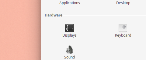
A minor issue, but it's not really pleasant on the eyes. This is the drop shadow of System Settings, which is fine:
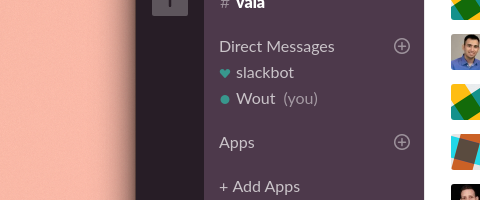
But with Slack:
Or with Gravit Designer:
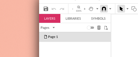
Shadows are really intense, too intense for my taste.
Want to back this issue? Post a bounty on it! We accept bounties via Bountysource.
 wout
wout
All 3 comments

It's not because of Snap, but because those apps are using legacy decorations.
Here gala (well, mutter) assumes that GTK stylesheet only specifies a border in .ssd decoration style. See this line in Adwaita: https://gitlab.gnome.org/GNOME/gtk/blob/gtk-3-24/gtk/theme/Adwaita/_common.scss#L4497
elementary stylesheet doesn't do this, so mutter draws the default shadow + full box-shadow from stylesheet, so there are 2 shadows on top of each other.
 Exalm
on 23 Oct 2019
Exalm
on 23 Oct 2019
The stylesheet fix has landed, now it needs to be fixed in Gala.
While shadow gsettings keys indeed need to be removed, they are handy for playing with the shadows right now.
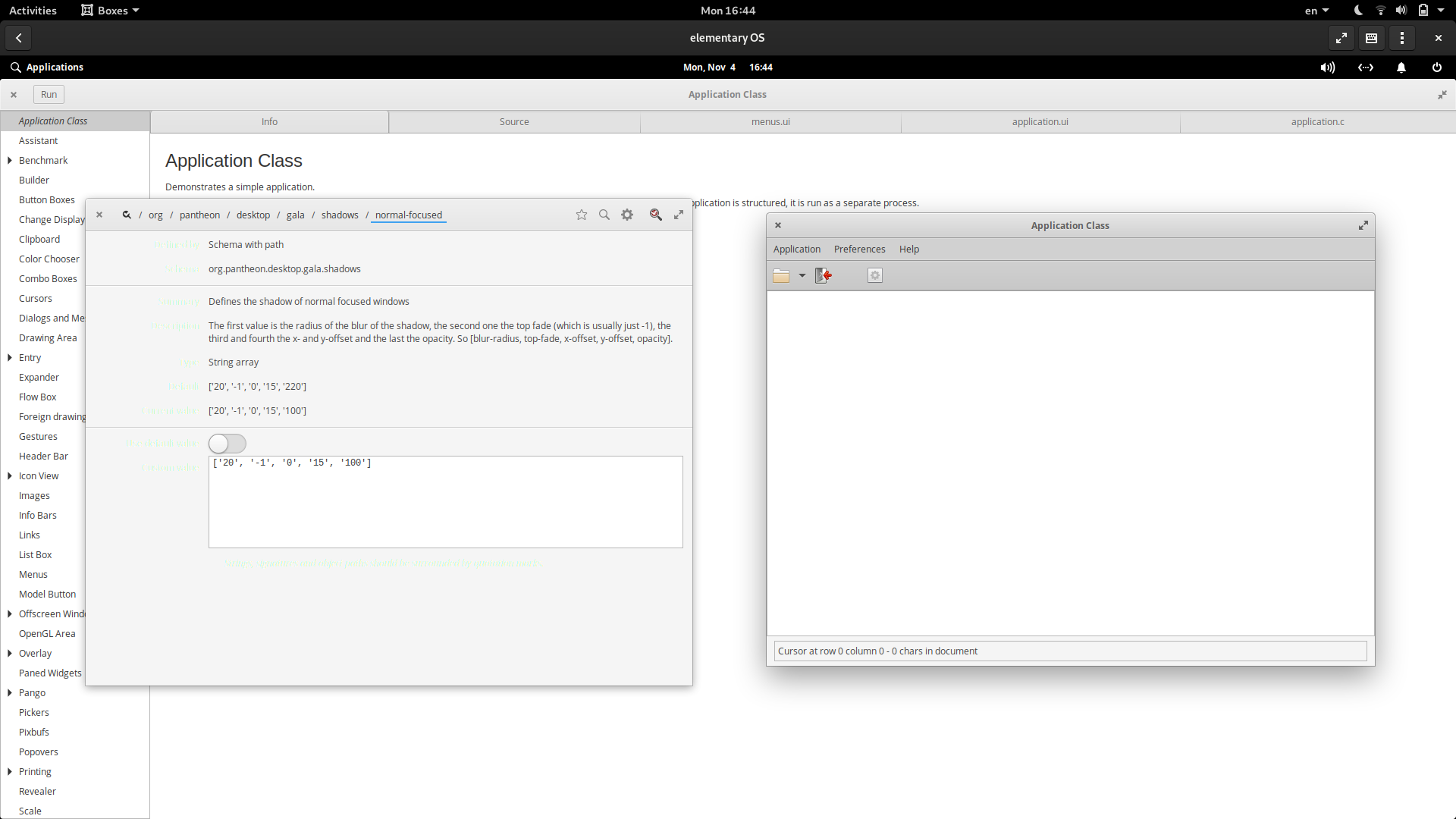
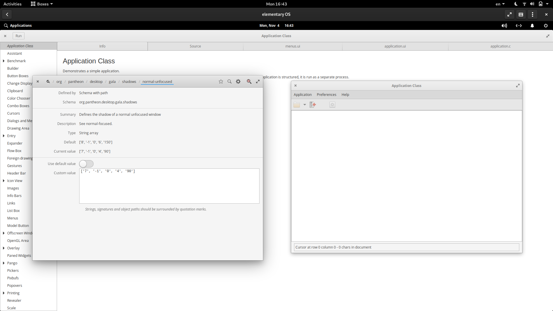
What about these vaues? It can't look 100% same because, well, the shadow is calculated differently, but it can be adjusted to look closer. The left window shows the value + the reference CSD shadow, the right one demoes the SSD shadow.
CC @danrabbit
Exalm
on 4 Nov 2019
@Exalm that's a massive improvement. Nice work! Happy to merge that
 danrabbit
on 4 Nov 2019
danrabbit
on 4 Nov 2019
Related issues
 marbetschar
·
4Comments
danrabbit
·
3Comments
marbetschar
·
4Comments
danrabbit
·
3Comments
 cassidyjames
·
4Comments
cassidyjames
·
4Comments
 hanaral
·
4Comments
hanaral
·
4Comments
 megatux
·
4Comments
megatux
·
4Comments
Most helpful comment
The stylesheet fix has landed, now it needs to be fixed in Gala.
While shadow gsettings keys indeed need to be removed, they are handy for playing with the shadows right now.
What about these vaues? It can't look 100% same because, well, the shadow is calculated differently, but it can be adjusted to look closer. The left window shows the value + the reference CSD shadow, the right one demoes the SSD shadow.
CC @danrabbit