Freshrss: Enhance the way help elements are displayed
Hello,
I already talked a bit about that on a previous PR, but I think the way the help elements are displayed need to be enhanced.
Currently (at least on Safari), they can look very bogus (not to say messy) :
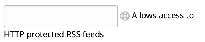
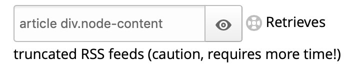
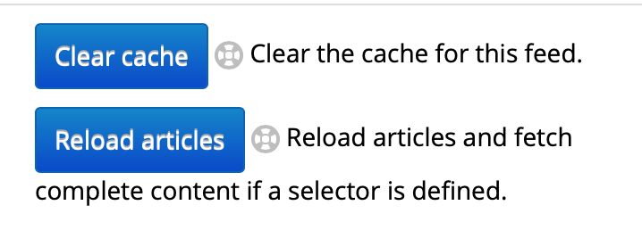
→ They are wrapped in an unexpected place.
I would suggest to just show them (in a whole) on the next "line" each time we are using them. I'm not sure it would be the best solution, but for the advantages I see :
- They wouldn't be "stuck" in the right, without any place, specially on side panel : less wrapping.
- They wouldn't wrap in an unexpected place anymore (i.e. they would wrap with alignment to the "help" icon, instead of the associated element as it's currently the case).
Or perhaps the text can just be hidden, and shown as a real tooltip, when the cursor wait a bit (or click) on the "help" icon ?
 javerous
All 5 comments
This does not bother me, but changes welcome. Maybe it could be done at the same time as making this view more mobile-friendly https://github.com/FreshRSS/FreshRSS/pull/2800
 Alkarex
on 9 Apr 2020
Alkarex
on 9 Apr 2020
Underneath would be slightly neater.
 Frenzie
on 9 Apr 2020
Frenzie
on 9 Apr 2020
@Frenzie Okay, I will try a PR this weekend, even if I promised myself I will never-ever touch CSS again :s
Would it make sense to make this a global rule (like "help elements should always be placed underneath"), or should it be something done only in this panel (because restrained in size) ?
@Alkarex Why not, but then it would be far outside my little web skills ;)
javerous
on 9 Apr 2020
@javerous Just wrapping the info icon and help text into something like <p class="help">...</p> might just do the job, even without touching CSS (much). Can you give it a try? :-)
Alkarex
on 9 Apr 2020
@Alkarex Yes, I will try something like this !
javerous
on 9 Apr 2020
Related issues
 uncovery
·
4Comments
uncovery
·
4Comments
 mbnoimi
·
4Comments
mbnoimi
·
4Comments
 Aasemoon
·
6Comments
Aasemoon
·
6Comments
 mdemoss
·
4Comments
Alkarex
·
5Comments
mdemoss
·
4Comments
Alkarex
·
5Comments