Freshrss: [Feature Request] Limit height of "Mark all read" button in the footer
Currently, the "Mark all read" footer below the article list is stretching 100% until the bottom of the page. Instead, it should be a fixed-height bar/button below the articles.
Why?
If you have only a few articles unread left in your feed, the whole page essentially becomes a "mark all read" button.
This leaves zero space to click on the page to switch between windows without clicking on the button:
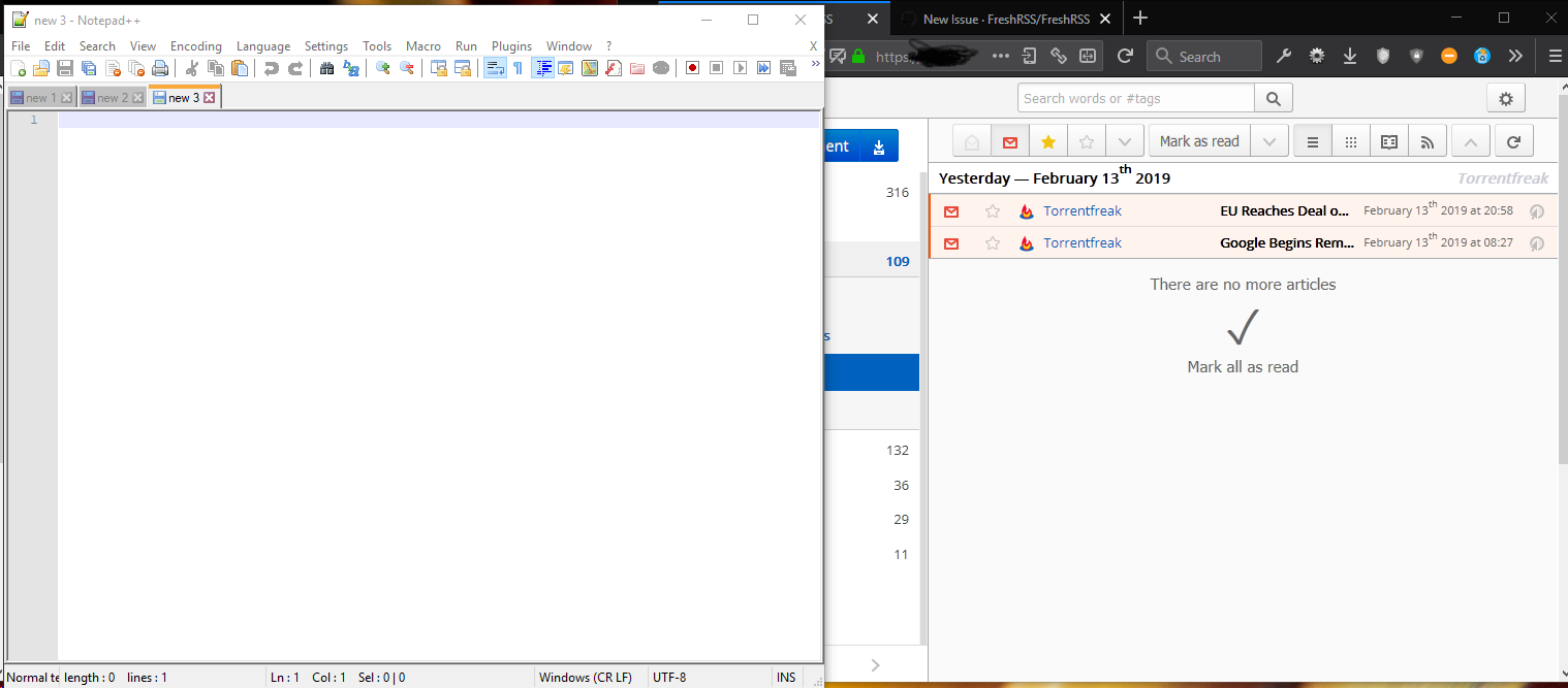
In this scenario, I would instinctively, inadvertently click on "Mark all read" when trying to switch to the browser from Notepad. The white area in a website is usually safe to click. Not in FreshRSS.
- It's poor interface design. Buttons should be easily understood as such and not be a massive white space that occupies the whole page.
 uncovery
All 4 comments
This functions like it does to give people who use scroll as read enough room to scroll to the last article to mark it read with scrolling, and not click on the giant button. It's not a design choice I personally like, but that was the rationale that was given to me while I was writing my theme. It's on my list of UI areas to take a crack at improving, when I've got time.
 pattems
on 16 Mar 2019
pattems
on 16 Mar 2019
thanks for your reply. I get your point and agree the footer should be large, but not the button. I will reword the request to make sure I don't intend to shorten the footer, rather the button size. There could of course be another footer below a button, just without the whole surface being a button.
uncovery
on 18 Mar 2019
All right. We could reduce a bit the width of the active area, to leave a bit of room on both sides for neutral clicks.
 Alkarex
on 19 Mar 2019
Alkarex
on 19 Mar 2019
Fixed by @uncovery in https://github.com/FreshRSS/FreshRSS/pull/2301
Alkarex
on 13 Jul 2019
Related issues
 Aasemoon
·
6Comments
Alkarex
·
5Comments
Aasemoon
·
6Comments
Alkarex
·
5Comments
 cwldev
·
5Comments
cwldev
·
5Comments
 Stegemueller
·
3Comments
Stegemueller
·
3Comments
 deanishe
·
4Comments
deanishe
·
4Comments