Freecodecamp: Search box in Learn's navbar is offset on retina displays
Describe the bug
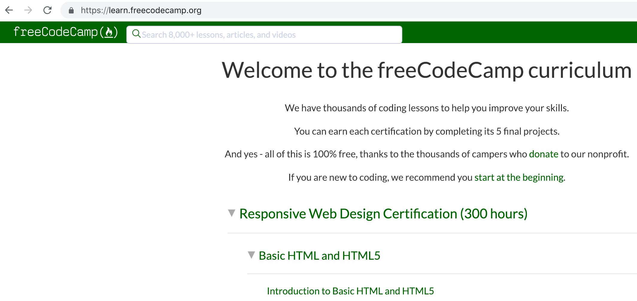
On retina displays, this is what Learn's search navbar looks like on retina displays (2012 and beyond Macbooks):
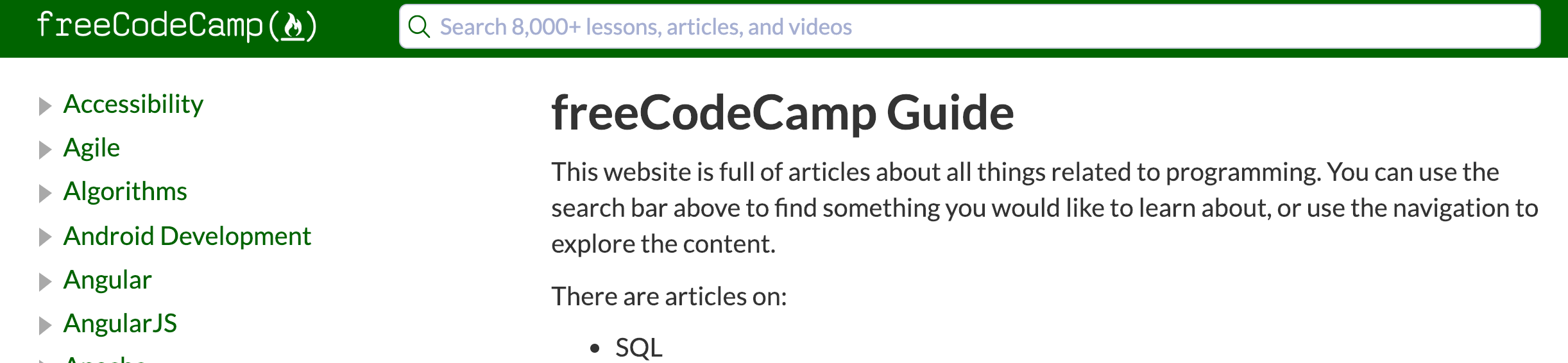
Note that the Guide's navbar looks fine on Retina displays:
To Reproduce
Steps to reproduce the behavior:
- Go to '...'
- Click on '....'
- Scroll down to '....'
- See error
Expected behavior
A clear and concise description of what you expected to happen.
Screenshots
If applicable, add screenshots to help explain your problem.
Desktop (please complete the following information):
- OS: [e.g. iOS]
- Browser [e.g. chrome, safari]
- Version [e.g. 22]
Smartphone (please complete the following information):
- Device: [e.g. iPhone6]
- OS: [e.g. iOS8.1]
- Browser [e.g. stock browser, safari]
- Version [e.g. 22]
Additional context
Add any other context about the problem here.
 QuincyLarson
All 5 comments
@QuincyLarson, sorry, I believe this is due to some of the changes I made way back in https://github.com/freeCodeCamp/learn/pull/251. Fortunately, I don't think this was brought over into the monorepo. Does the navbar look like that when the site is running locally?
 scissorsneedfoodtoo
on 17 Jan 2019
scissorsneedfoodtoo
on 17 Jan 2019
@scissorsneedfoodtoo Yes - the navbar still looks slightly offset on my retina display when running locally:
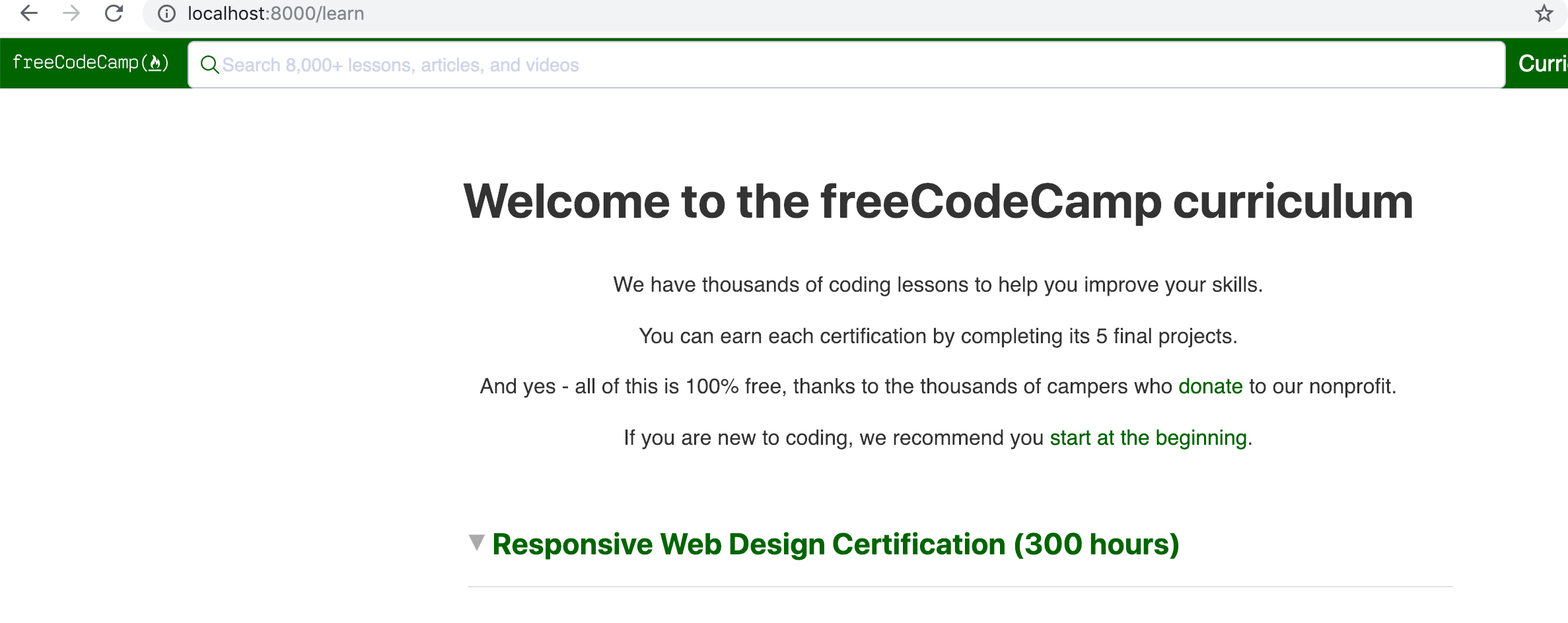
The search field is way too wide, too, though that probably deserves a separate issue 😉
QuincyLarson
on 28 Jan 2019
@QuincyLarson, sorry about that! Will take another crack at fixing the search bar soon.
scissorsneedfoodtoo
on 31 Jan 2019
Hi @scissorsneedfoodtoo, Thanks for working on this. Please let me know when you have the PR ready so we could review and merge it ASAP.
 ahmadabdolsaheb
on 5 Feb 2019
ahmadabdolsaheb
on 5 Feb 2019
@QuincyLarson, sorry for the delay with this! Been flying a bit blind since I don't have a Retina screen device of my own. Ended up using some kiosk MacBooks and playing with the CSS in the browser. Could only test with Safari, but I suspect that this is caused by the search bar having an undefined height.
I'm just about to submit a PR, so could you and @ahmadabdolsaheb check it out when you can?
scissorsneedfoodtoo
on 14 Feb 2019
Related issues
 robwelan
·
3Comments
robwelan
·
3Comments
 imhuyqn
·
3Comments
imhuyqn
·
3Comments
 itsmikewest
·
3Comments
itsmikewest
·
3Comments
 danielonodje
·
3Comments
danielonodje
·
3Comments
 raisedadead
·
3Comments
raisedadead
·
3Comments
Most helpful comment
@QuincyLarson, sorry about that! Will take another crack at fixing the search bar soon.