Is your feature request related to a problem? Please describe.
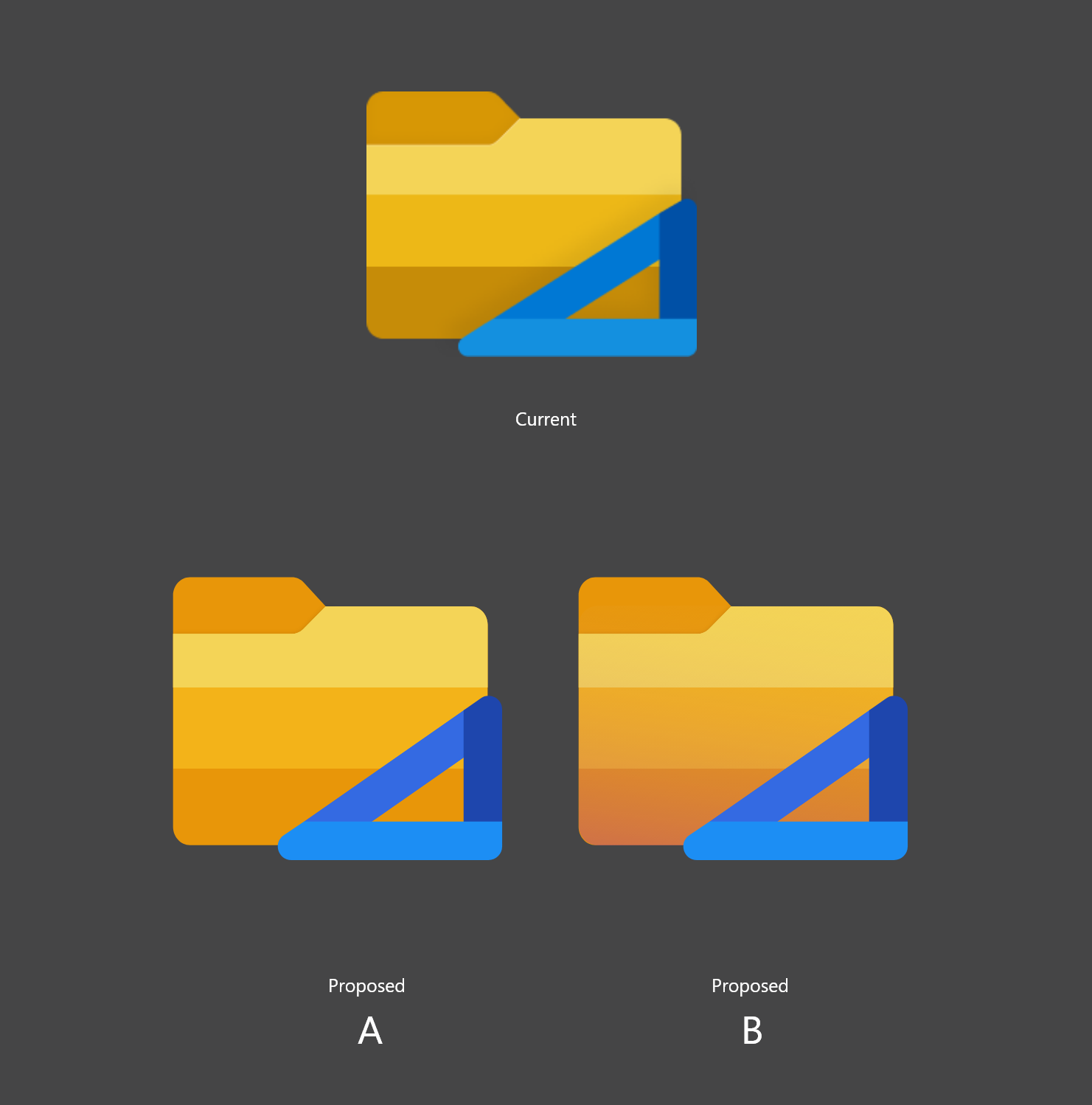
Following the new Fluent design icon redesigns, the Files UWP icon has been redesigned. Most icons have some sort of gradient rectangles.
This is the current icon and the colors range from light yellow to light ochre-ish brown. The colors vary only in their intensity and they look muddy. One of the common techniques used by illustrators in these situations is to also shift the hue of the colors to the warmer side as it gets darker.
--
Describe the solution you'd like
I propose a slight change in the icon colors following the above technique.
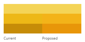
The newer gradient is much more harmonious.
The change is very subtle but the icon feels brighter than before. The difference becomes apparent when zoomed in and both versions are compared together.
My technical proposal ends here. Following are opinionated improvements:
One more issue I have is that the lines between colors are too strong. A transparent overlay smoothens out the color and provides some character to the icon.
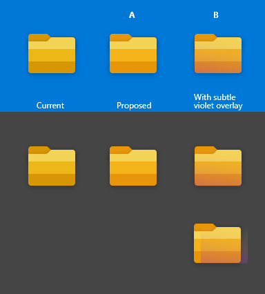
Icon B is opinionated and I hope some discussion happens.
--

Proposed Icon A

Proposed Icon B
Also, these are approximate versions of the icon. If required I can make the final icons, if someone could point me to the original file. :)
 jayasio
All 14 comments
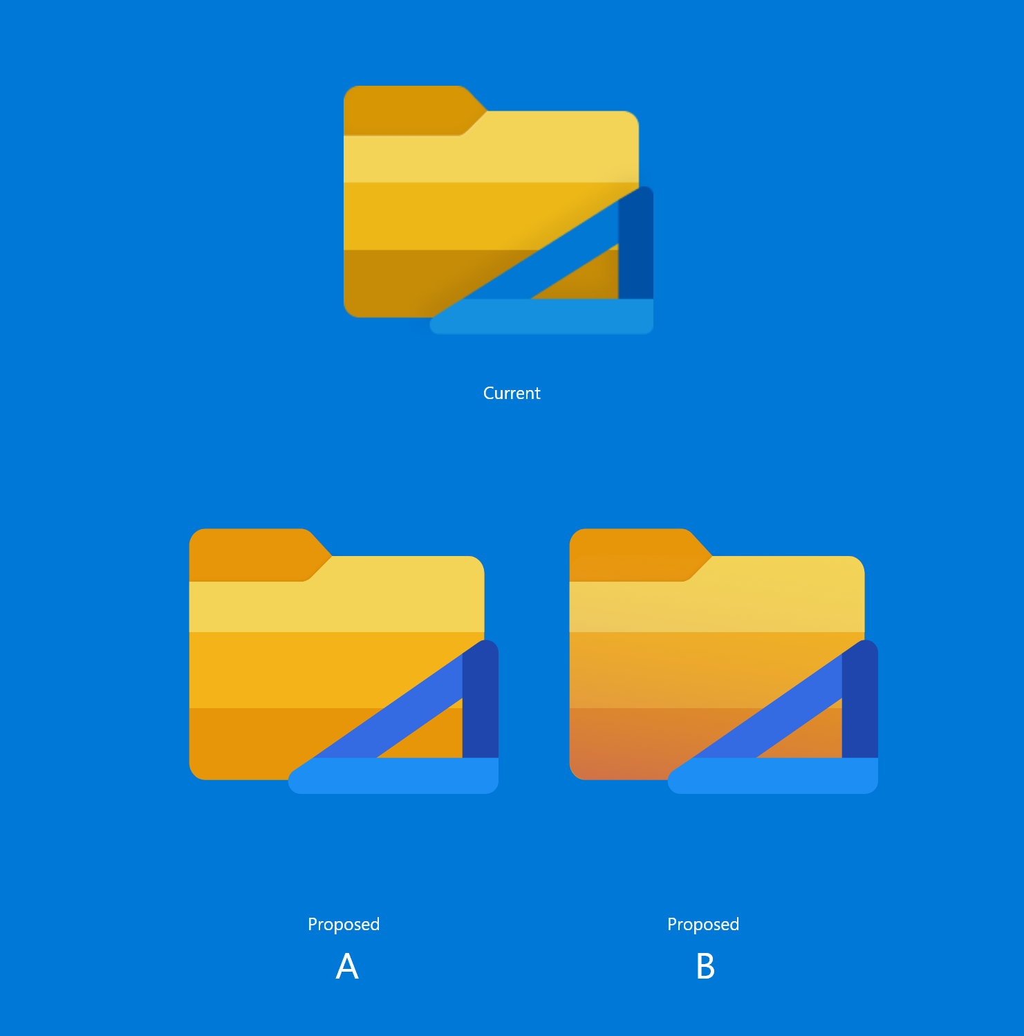
1101 is a related issue. :) The icon will stand out from the shadow more if the color in that region is somewhat brighter (Proposed icons A and B)
jayasio
on 21 Jun 2020
This is great feedback, I will share it with a designer for some feedback before updating this issue.
 yaichenbaum
on 21 Jun 2020
yaichenbaum
on 21 Jun 2020
@jayasio Do you have any concepts that include the blue holder like the current icon has? https://github.com/files-community/files-uwp/blob/master/Files.Package/Assets/Files%20UWP%20Icon.png
yaichenbaum
on 21 Jun 2020
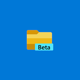
@yaichenbaum I didn't know the blue holder version existed; I'm using the beta version.
I've added the blue holder in the proposed icons. I just shifted the colors subtly so that the blues are less "greener".

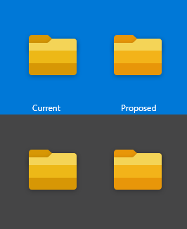
The above three are in the current icon and below three are proposed.
I've also rounded the corners a bit more to match the corners of the folder part of the icon.

With shadows
On blue background
With shadows
Also, I find the blue holder to be a bit much in small sizes; but that's another issue (can be addressed when someone proposes a redesign).
jayasio
on 22 Jun 2020
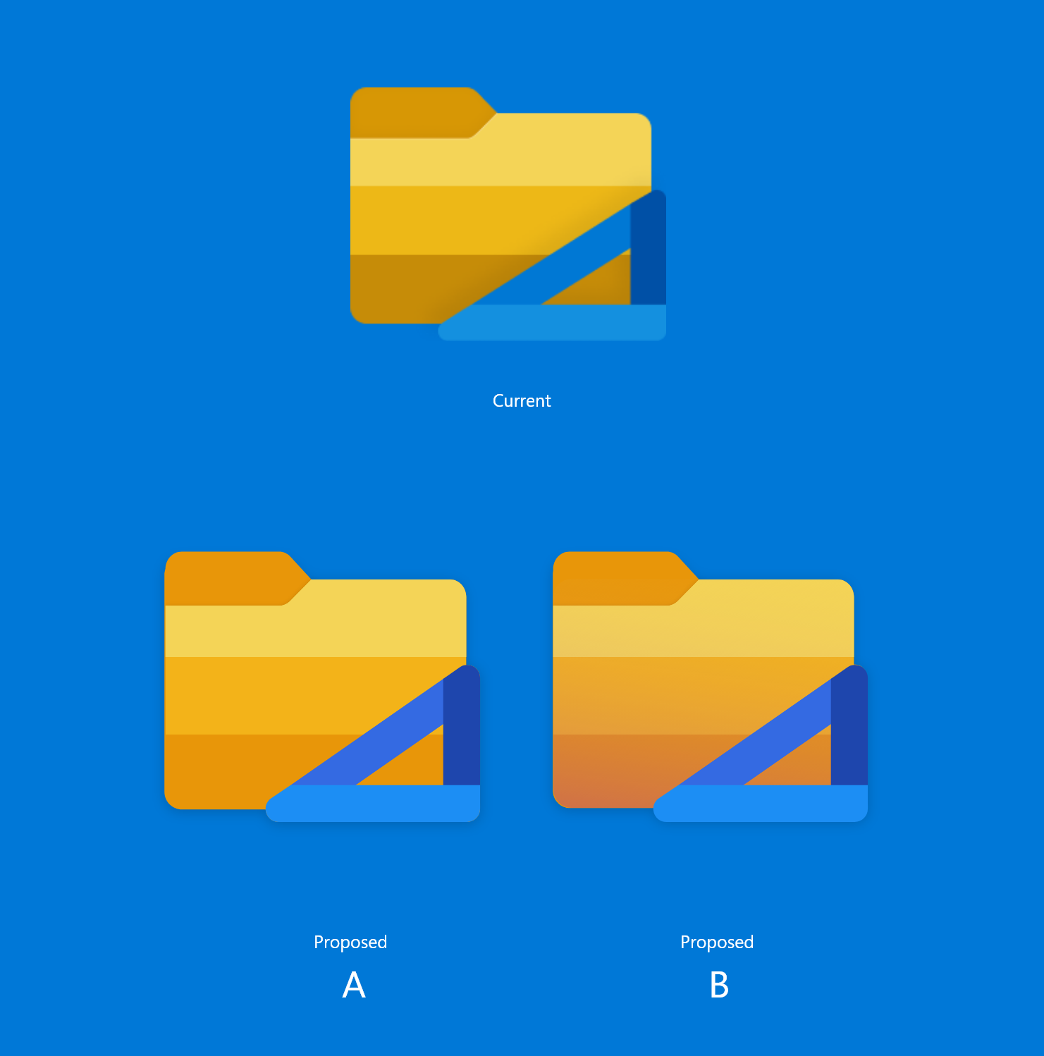
@jayasio Great work! It looks like the round corners on the right of the tab is missing, was the on purpose?
yaichenbaum
on 22 Jun 2020
Oh right, no. The above icons were made roughly, the proportions are also a bit different from the previous design. I was hoping someone could point me to the original file so that changes could be made right there.
I'll change it in the above design nonetheless.
I've added rounded corners to designs in the previous comment.
jayasio
on 22 Jun 2020
@yaichenbaum what do you think? A or B? Maybe people could vote?
Also, are specifications available for app icons so that I could contribute?
jayasio
on 22 Jun 2020
@jayasio We are definitely going for something closer to A. Reviewing these icons and making sure they are pixel perfect will take some time.
yaichenbaum
on 22 Jun 2020

 XPoppyX
on 25 Jun 2020
XPoppyX
on 25 Jun 2020
@XPoppyX Unfortunately we can't use that icon as it's too close to the File Explorer icon.
yaichenbaum
on 25 Jun 2020
@jayasio We really like the work you did with proposal A, do you have a Figma file with the icon that you can share?
yaichenbaum
on 25 Jun 2020
The Figma file is in this .zip folder :)
jayasio
on 26 Jun 2020
@jayasio Thank you! We are looking forward to using the new icon when the app leaves beta and becomes generally available.
yaichenbaum
on 26 Jun 2020
@yaichenbaum This is complete now in our active development branch, right?
 duke7553
on 1 Jul 2020
duke7553
on 1 Jul 2020
Related issues
 tsvietOK
·
30Comments
tsvietOK
·
30Comments
 calloncampbell
·
28Comments
calloncampbell
·
28Comments
 Jaiganeshkumaran
·
24Comments
Jaiganeshkumaran
·
24Comments
 ghost
·
50Comments
XPoppyX
·
36Comments
ghost
·
50Comments
XPoppyX
·
36Comments
Most helpful comment
@jayasio Thank you! We are looking forward to using the new icon when the app leaves beta and becomes generally available.