Enterprise: Need an indication of when a column has editable fields
In the older UIs there was a pencil icon on the column heading to indicate that the fields in that column were editable. Currently there is no distinction between read-only columns and editable columns; users are confused. This has been an issue for a while, but it's now bubbling up in feedback.
As a workaround, LPL developers will be tempted to use color on the data to indicate something different about it; using blue for example. That's problematic for many reasons.
Is your feature request related to a problem? Please describe.
Some small indicator or different border around the fields in the columns will go a long way.
 jamie-norman
All 55 comments
@tmcconechy do you have anything in the works for this already?
jamie-norman
on 6 Nov 2019
The idea was originally that you would make non editable columsn "readonly". So you do the opposite. Example:
http://master-enterprise.demo.design.infor.com/components/datagrid/example-editable.html
Although perhaps this doesnt work as good if the majority of them is NOT editable.
cc @kentonquatman @kevinwhitedesign @elizabethhartley ? Any suggestions?
 tmcconechy
on 6 Nov 2019
tmcconechy
on 6 Nov 2019
I think while that's good in theory, it's still not apparent to the user that they can edit info. Plus the grayed out read-only columns everywhere would not be met with much enthusiasm. :P
jamie-norman
on 6 Nov 2019
yea, this could get very ugly on our screens. We'd need something more subtle
 pwpatton
on 6 Nov 2019
pwpatton
on 6 Nov 2019
I think some column indicator could be a good idea It is general feedback on it i've heard. Considering the fact also that a totally non editable grid might look the same as an editable one.
tmcconechy
on 6 Nov 2019
In our old canvas rich client we'd put a pencil icon in the column header (did the trick but wasn't great)
pwpatton
on 6 Nov 2019
Quick mock
jamie-norman
on 6 Nov 2019
that's fairly subtle but different enough, perhaps?
jamie-norman
on 6 Nov 2019
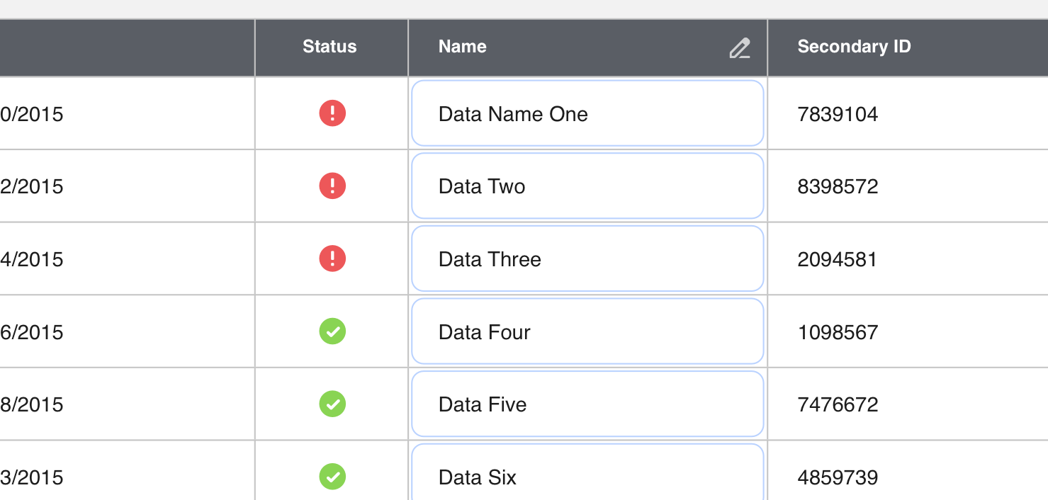
Well only one cell is actually editable. So the icon is just an indicator right? So Would be something like this but with the "pen"?

Also consider placement with the sort indicator and required indicator we already have.
tmcconechy
on 6 Nov 2019
This is interesting: https://www.everyinteraction.com/wp-content/uploads/2017/05/9-Sy9hS1AMycj5Uzo4VvckmQ.gif
jamie-norman
on 6 Nov 2019
@jamie-norman that's kinda cool, wondering how actionable that is in our apps though
pwpatton
on 6 Nov 2019
Seemed like it had the appropriate subtleness to it. Another thought would be that when the page loads it could kind of show the same effect, like a pulse animation highlighting the editable cells?
jamie-norman
on 6 Nov 2019
Hmm what about mobile? Or individual cells if some are and some arent.
tmcconechy
on 6 Nov 2019
I think it's tough with the grid lines being there
pwpatton
on 6 Nov 2019
That's one reason why I wanted to explore having a faint rounded edit box in those cells
jamie-norman
on 6 Nov 2019
I'd like to get Kathy's real-world example that brought this to the forefront. Then I think we can start from that instead of anything contrived. I've asked here for access to the screen or a high res scrshot but haven't heard back yet.
pwpatton
on 6 Nov 2019
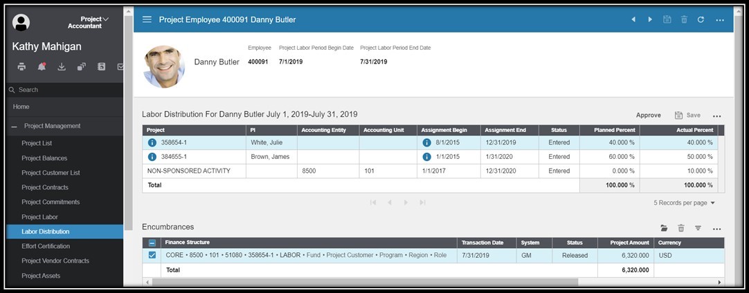
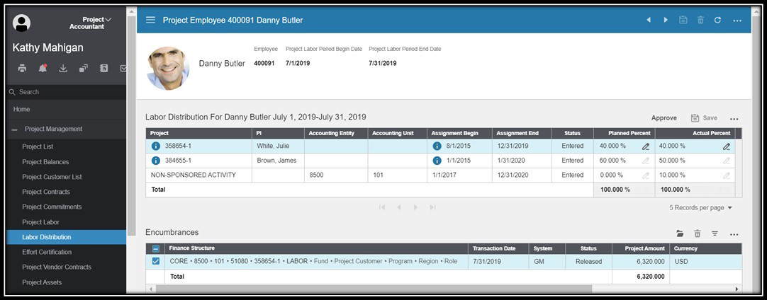
Pretty sure her example was for effort certification where a user would enter a percentage in a couple of columns
jamie-norman
on 6 Nov 2019
Right, here's the crappy resolution screen shot she had. The last 2 columns in the top list are the ones she wants a visual indication for them being editable.
pwpatton
on 6 Nov 2019
I don't think we'll have a one-size-fits-all solution for editable cells in a table; it's going to vary depending on the context. For this scenario, a simple fix could be to use this table treatment instead:
It highlights the editable content without getting too boxy-boxy.
 kentonquatman
on 6 Nov 2019
kentonquatman
on 6 Nov 2019
I suspect we won't be changing the grid nature here, so I don't think that's going to work for power users.
jamie-norman
on 6 Nov 2019
The problem with that one @kentonquatman is it really only works for a few inputs in a simple list. They will have maybe 100s of columns in a tabular grid here plus all the other complex grid features like sorting and filtering and grouping with totals, frozen columns ect.
tmcconechy
on 6 Nov 2019
It looks like they're only showing three rows at a time with pagination and only two columns have editable fields.
kentonquatman
on 6 Nov 2019
Hoping there are not hundreds of columns but dozens is certainly something we've seen. For example in our compensation awarding screen there are maybe 9 - 12 grouped columns where there's a couple read only columns followed by 3 or so editable columns.
pwpatton
on 6 Nov 2019
The app developer can set this, so it's not always 3 records. Additionally, the user will have control over that too
jamie-norman
on 6 Nov 2019
True, the example above is a small set but there could be way more records there. This set doesn't even have the 5 records the paging size chooser is set to.
pwpatton
on 6 Nov 2019
I think we will need a Teams discussion where we can share screens and discuss the variations we see and what is possible with the LPL.
pwpatton
on 6 Nov 2019
Would this be a good use case for inline iconography?

kentonquatman
on 6 Nov 2019
That looks nice. I like that
pwpatton
on 6 Nov 2019
that would certainly work here. It would start to look funny on a screen where virtually every column is editable.
pwpatton
on 6 Nov 2019
What if every cell in the grid was editable? Would get a bit busy perhaps.
tmcconechy
on 6 Nov 2019
Definitely a possibility. I'm sure we could make it even more subtle
jamie-norman
on 6 Nov 2019
I think you are right that there may not be a one size fits all solution.
pwpatton
on 6 Nov 2019
Maybe we need some optionality? Like, if there are only a couple editable columns handle one way. If all are editable we would want something else.
jamie-norman
on 6 Nov 2019
Right, we'll never have a one-size-fits-all solution. We'll need to offer a few options and serve the one that best fits the context. I still think this solution is great when most fields are editable:
http://master-enterprise.demo.design.infor.com/components/datagrid/example-editable.html?theme=uplift&variant=light&colors=0563C2
kentonquatman
on 6 Nov 2019
Only issue there is that now your read-only grids—of which most in the application will be—are predominantly gray. And it's still not clear to the user that those cells are editable because they're conditioned to see them as read-only, that's the way they've always been presented.
jamie-norman
on 6 Nov 2019
Yes your right i guess we would have three available solutions:
- Normal with some readonly cells -> When majority all are editable
- With the input border showing -> when only a couple are editable and its a simple list
- WIth an new indicator -> When only a few are editable and a) cant be used
We have the required indicator in the header as shown above but the dirty indicator is in the cell? So we could either have this in the cell or header or maybe something similar to the dirty indicator if we wanted to make it more subtle.
tmcconechy
on 6 Nov 2019
That's what I'm talking about.
kentonquatman
on 6 Nov 2019
I agree there must be more than a single one size fits all solution. I'd like to compile some examples from Financials and GHR and see how we can apply any set of solutions to them. Now, how to get at those example!?
pwpatton
on 6 Nov 2019
@inforandy here is another one. We were discussing on MS teams. And @jamie-norman suggested the possibility of just a cursor change but not sure if there is an edit cursor? Or might need a custom icon like a pen?
I think that could work and not introduce any extra UI stuff. What do you think from a design side?
tmcconechy
on 18 Mar 2020

Might just repurpose one of our icons minus the little horizontal line (I removed it)
jamie-norman
on 18 Mar 2020
@jamie-norman interesting! I dig that. If mobile is a consideration here, the fields will have to have edit icons or some other way.
Here's an example I found from M3 app builder, not saying it's the best but evidence that other teams are taking on this same icon-solution.
https://www.dropbox.com/s/k964n28sap2qpu9/Screen%20Shot%202020-01-21%20at%207.16.21%20PM.png?dl=0
 kevinwhitedesign
on 31 Mar 2020
kevinwhitedesign
on 31 Mar 2020
The only difference is in m3 that is a button on the line to edit the row. The difference in this case is clicking the cell will edit. So we need something to show the cell itself is editable. Jamie is proposing the pen icon on hover? Or should we do something on the cells or columns?
tmcconechy
on 1 Apr 2020
I think the M3 version is a bit awkward, with a larger icon. Definitely have to come up with a way to handle my suggestion in mobile, which would probably have to be dependent on a device media query and would do something more obvious. But I do like the subtlety of the hover (on desktop). Open to ideas on this, if you want to riff a litle @kevinwhitedesign
jamie-norman
on 1 Apr 2020
Yea! I have to go back on some previous explorations on this one. Quite the challenge.
kevinwhitedesign
on 3 Apr 2020
Anyone come up with any ideas we would want to implement for this?
tmcconechy
on 29 Apr 2020
@inforandy do we need a jira for this?
tmcconechy
on 30 Apr 2020
probably need to pick up this discussion again. Not sure we've landed on a definite direction
jamie-norman
on 30 Apr 2020
@jamie-norman exactly that; resurfacing this one because we need to make sure we land on a durable solution for you.
 inforandy
on 30 Apr 2020
inforandy
on 30 Apr 2020
Yep. Need one that works across IDS
jamie-norman
on 30 Apr 2020
I know we were looking at some other options like a cursor, an icon but unfortunately that leaves the problem of mobile, non-standard patterns, technical implementation issues, and non-consistent datagrid/list component usage via Infor teams.
The good thing is that we have a lot here to lean on. The editable nature of paper > early spreadsheet product cells gives users the affordance to know that they are editable, if not ‘greyed’ out or disabled in appearance.
It’s important that a user clearly knows what’s editable OVER having “ugly” grey backgrounds. If choosing that leads to less confusion, it could mean more productivity & value across products. However, we can explore a lighter grey background for readonly cells, but what we’re borrowing from is our familiar readonly/disabled states from fields and buttons.
One thing we're removing is our use of white cells for situations where everything is readonly, we should change to slate cells for this. It’s very important that we offer usability consistency around data grid cells.
What you may be onto, and I think we’ve actually been exploring is the need for more simplified, targeted, and thoughtful list and form usage. We can recommend using simple lists for more basic workflows & forms for those Landmark 1 row list situations. There are opportunities we’re tracking to improve those components as well.
I’ve seen applications adopting a more casual-standards first approach as seen in some of the HCM work to date. There’s an interesting opportunity for a hybrid of enterprise workflow + consumer inspired designs that we’re more & more accustomed to. Simple lists, information display & form usage could attribute to more of theses familiar experiences. Sorry for the longish read, happy to be a part of these discussions peeps.
kevinwhitedesign
on 18 May 2020
Hey @kevinwhitedesign, Very well thought out and articulated. I think your point about user-expectation/mental models of white signifying editable cells is fair. But historically that hasn't been true in our software. So what is the user's—particularly the power user's—mental model now?
I would be hesitant to change the look of all datagrid backgrounds to slate as the rule when editable cells may fall more along the exception. That's a lot of gray cells. There would need to be appropriate contrast between edit/read-only. Unfortunately, we also have to weigh the impact of a disruptive change like this universally applied to lists.
It's true that there's a sort of Occam's razor thing here, where the simplest solution (white cells are editable, grey are not) is the right solution. It's worth considering, but might need some testing.
jamie-norman
on 18 May 2020
@inforandy cc
tmcconechy
on 1 Jun 2020
thanks @tmcconechy tracking here https://jira.infor.com/browse/HLPE-397
inforandy
on 4 Jun 2020
Comment copied from Jira.
There probably won't be overlap in that mtg. But who knows, it may come up.
Here's what may have to happen:Datagrids that are completely view or read only have slate cells.
Editable cells are white
Show regular lists as well, as alternative to readonly datagrids
Possible user testing so confirm that readonly + editable cells are perceived as different and that they perform well
Not sure if we can action on this yet?
tmcconechy
on 7 Jul 2020
I suggest we close this for now. As we dont have any viable solution other than what we have.
tmcconechy
on 11 Feb 2021
Related issues
 jbrcna
·
3Comments
jbrcna
·
3Comments
 SofiK
·
3Comments
SofiK
·
3Comments
 brianjuan
·
3Comments
jbrcna
·
3Comments
brianjuan
·
3Comments
jbrcna
·
3Comments
 CindyMercadoReyes
·
3Comments
CindyMercadoReyes
·
3Comments
Most helpful comment
I'd like to get Kathy's real-world example that brought this to the forefront. Then I think we can start from that instead of anything contrived. I've asked here for access to the screen or a high res scrshot but haven't heard back yet.