Enterprise: FlexToolbar: Less padding on toolbar buttons
Is your feature request related to a problem? Please describe.
Our legacy product has a fairly dense toolbar with many actions users are familiar with and have come to expect in certain positions. The buttons have increased in size and padding relative to the 3.x controls. Unfortunately, many of our users are using resolutions below 1080p and don't have enough space to render our full toolbars without overflow. It seems that the padding on buttons and separators is fairly generous if not excessive, and with some brief testing it seems a few pixels less can be afforded and then offer space for one or two more buttons on low res screens without looking cluttered.
Describe the solution you'd like
Any of these options would work for us:
- Tweak the specs to include less padding by default.
- Allow an option while initializing toolbars controls to use less padding.
- Offer a class similar to field-short for toolbar buttons that uses less padding.
Describe alternatives you've considered
None. While we could manually override the CSS, we'd like to avoid that path as much as possible.
Additional context
If you need pictures for reference, let me know. Thank you!
 duncsully
All 8 comments
A screen shot would be nice for reference. @nickwynja @clepore Maybe this is a design issue/question?
 tmcconechy
on 12 Apr 2019
tmcconechy
on 12 Apr 2019
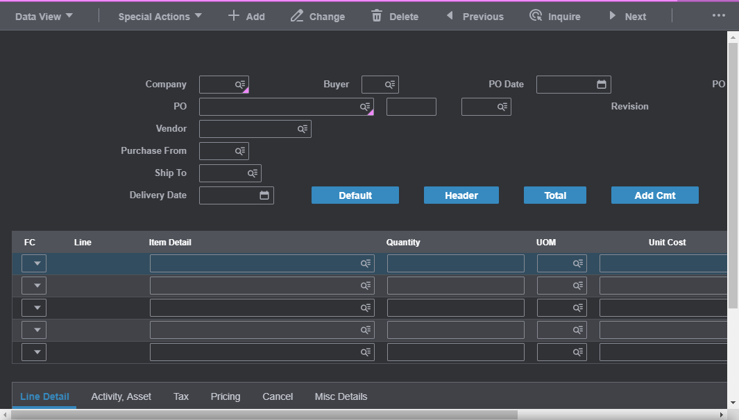
Here's what one of our forms looks like, for example, on a 1377x768 monitor (a lower end HD laptop screen) with the menu expanded (which many users like to leave that way so they have immediate access to other links):
Here's what it looks like with the same conditions but with 5 pixel margin instead of 16 on separators and with 10 pixel padding on buttons instead of 15:
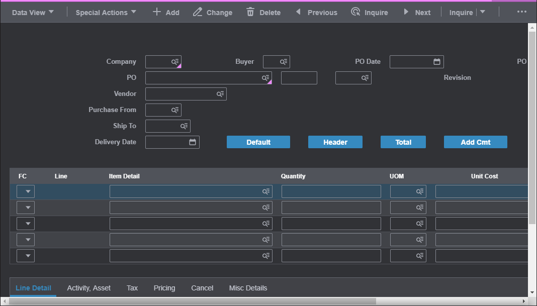
I'm not saying those are the exact changes I recommend, that was just me toying around to fit in the whole split button, and maybe with some more tweaks I could get the last button in there instead of having the overflow menu, such as reducing space between icons and text. Just in my opinion, I don't think that looks too cluttered yet.
duncsully
on 12 Apr 2019
Something like a .toolbar.compact class which tightens the padding between everything would be the best option here, I think. In this case, we should work something up in development first and then review with design.
 nickwynja
on 15 Apr 2019
nickwynja
on 15 Apr 2019
Is this still needed @duncsully ?
tmcconechy
on 24 Feb 2020
@tmcconechy I'm not working at Infor anymore, so I'd check with Andy (I don't have his handle on Github unfortunately).
duncsully
on 25 Feb 2020
cc @inforandy
tmcconechy
on 25 Feb 2020
Consider this for future
tmcconechy
on 13 Apr 2020
Decoping this for now as too tricky - cant design traction
tmcconechy
on 30 Sep 2020
Related issues
 CindyMercadoReyes
·
3Comments
CindyMercadoReyes
·
3Comments
 SasiPalanati
·
3Comments
SasiPalanati
·
3Comments
 janahintal
·
3Comments
janahintal
·
3Comments
 awbuboltz
·
3Comments
awbuboltz
·
3Comments
 brianjuan
·
3Comments
brianjuan
·
3Comments