Enterprise: Application Menu: Truncating of Text / Long Language Text Handling
Older Details
Original Discussion can be seen here: https://jira.infor.com/browse/SOHO-5332
The function panel list on the left hand side has a fixed width, which can't be adjusted, and ellipses are added if the text extends beyond the width of the panel. This causes truncation issues when the function names are translated into different languages. Many translations are longer than the English text and often the crucial bit of information regarding the function you want to select comes at the end and gets therefore cut off.
The function names are held in the SunSystems Data Dictionary (DOMN HIERARCHY NODES) which allow for a maximum length of 50 characters, but the panel is not wide enough to accommodate this. In the pervious SunSystems version the old menu catered for this by displaying the menu panel based on text width, so this a regression of sorts introduced by UX4.
I have added some example screenshot for German, Italian, French, Spanish and Russian. Portuguese is similarly affected. Chinese and Japanese not as much, as the translations tend to be shorter. A particularly bad example is the list of the different version of Corporate Allocation in German. The function name starts with the German equivalent of ‘Corporate Allocations’ and the latter part denominates the type of the function you want to select. In the screenshot attached you can’t actually read much further than ‘Corporate Allocations’, and it is ‘hit and miss’ as to which function you select. This is just one example. There are many others, for groups of functions and for single function names, where it is not possible to read the translated name sufficiently to make the correct function selection.
 clepore
All 5 comments
We probably need to make some decisions as some approaches have been discussed.
1) have three widths (normal, lg, xl set to 300, 400, 500 ect)
2) add a splitter/resize so the pane can be resized
3) just allow for wrapping
4) find the max text width and size to the correct width from 1) or a custom width
One issue is the width for mobile devices on the popup, this was the original reason it was sized to 300px
 tmcconechy
on 22 Oct 2018
tmcconechy
on 22 Oct 2018
Potentially look at how Windows Explorer handles this situation, with a tool-tip type treatment.
 lipetzan
on 4 Dec 2018
lipetzan
on 4 Dec 2018
We probably need to make some decisions as some approaches have been discussed.
- have three widths (normal, lg, xl set to 300, 400, 500 ect)
- add a splitter/resize so the pane can be resized
- just allow for wrapping
- find the max text width and size to the correct width from 1) or a custom width
One issue is the width for mobile devices on the popup, this was the original reason it was sized to 300px
Have these decisions been made yet? I was looking into wrapping the text but wouldn't want to move forward if that wasn't the preferred solution.
 davidcarlsonberg
on 8 Feb 2019
davidcarlsonberg
on 8 Feb 2019
@davidcarlsonberg
Proposed Solution
We decided (Landmark and H&L decided in meetings ) for the "windows" style popup behavior. General logic would be:
- if the text is cut off and showing ellipsis
- then if you hover a small popup will appear
- probably using
popover()http://master-enterprise.demo.design.infor.com/components/popover/example-index.html - or might just be able to use
tooltip()and add aextraClassoption to style it to remove the arrows and bring padding down - but style it with a specialClass option
- will be using popover styles (white depending on theme) and no arrow with 5px padding around the text on all sides
- popover disappears like a tooltip when leaving
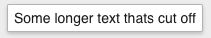
- see windows file explorer - was unenable to make a screen shot on windows VM. But here is a mockup of the popup styles that would appear on hover.
tmcconechy
on 8 Feb 2019
This issue is now resolved.
 CindyMercadoReyes
on 25 Feb 2019
CindyMercadoReyes
on 25 Feb 2019
Related issues
 SofiK
·
3Comments
SofiK
·
3Comments
 fitzorama
·
3Comments
fitzorama
·
3Comments
 jbrcna
·
3Comments
jbrcna
·
3Comments
 pwpatton
·
3Comments
pwpatton
·
3Comments
 SasiPalanati
·
3Comments
SasiPalanati
·
3Comments
Most helpful comment
Have these decisions been made yet? I was looking into wrapping the text but wouldn't want to move forward if that wasn't the preferred solution.