Enterprise: Uplift Dark and High Contrast Issues
Describe the bug
This is a list of noted bugs in uplift dark and uplift high contrast. Will do further testing as well.
Uplift Dark Issues
- [ ] The selected color for modals is very hard to read open the Popup on Datepicker to see
- [ ] Pager font color is not readable (https://github.com/infor-design/enterprise/issues/2588)
- [ ] The submenu header color should perhaps be a azure color. Compare http://localhost:4000/patterns/builder-wizard.html?theme=uplift&variant=dark&colors=0563C2 and http://localhost:4000/patterns/builder-wizard.html?theme=uplift&variant=dark
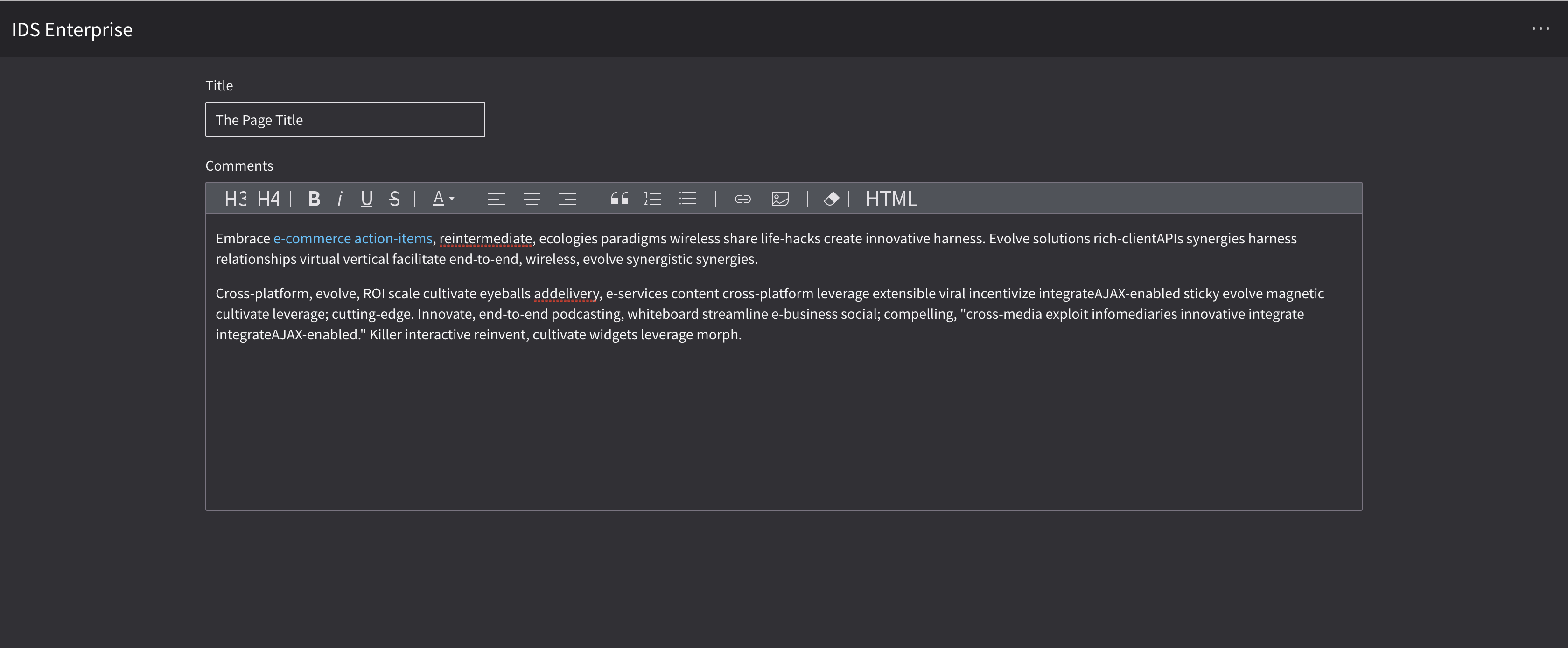
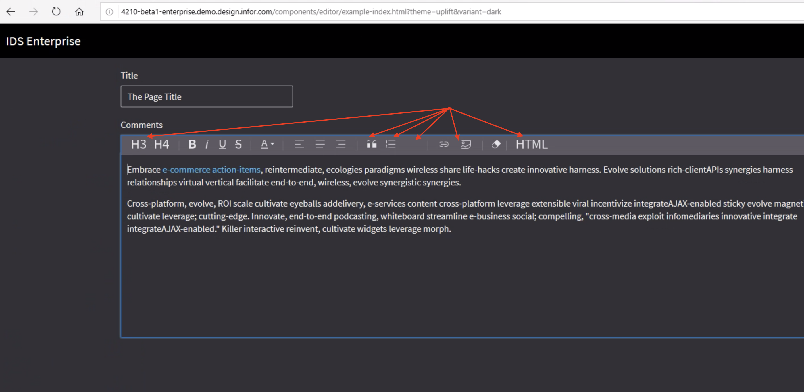
- [ ] The editor buttons look strange: http://localhost:4000/components/editor/example-index.html?theme=uplift&variant=dark
High Contrast Dark Issues
- [ ] The disabled buttons do not have a larger noticeable difference - http://localhost:4000/components/datepicker/example-index.html?theme=uplift&variant=contrast&colors=003066 - open the popup and then click the menu button. This is also noticeable on http://localhost:4000/components/button/example-index.html?theme=uplift&variant=contrast&colors=003066 should bring it down one or 2 colors
- [ ] On http://localhost:4000/components/input/example-index.html?theme=uplift&variant=contrast&colors=003066 the readonly field is too bold. And the inputs should have a white background. The spinner does on the ends only.
 tmcconechy
All 16 comments
For all the links you can just replace http://localhost:4000 with http://master-enterprise.demo.design.infor.com/ and you should see the same thing(s). You can use this instead if you do not run the local dev server.
tmcconechy
on 26 Aug 2019
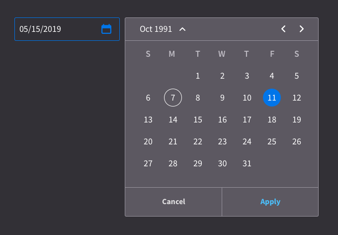
Go dark or go homee. The modal bg can definitely come down. I put it at #5C5861 - - - there's a huge gap in terms of Slate at the end going from Slate8-9. I suggest changing Slate 8 to #5C5861.
Just like we originally had with DarkUI, we're going to have to use the lighter Azure. It's clearly getting lost there. For that I had #4AC1FE for text-only buttons, and I bumped up the field borders and standalone elements to #0075E9.
Check out this rough example of that in play:
Also I know this is unrelated to the ticket but.. I wrote something about those actions because I saw Landmark using them here:
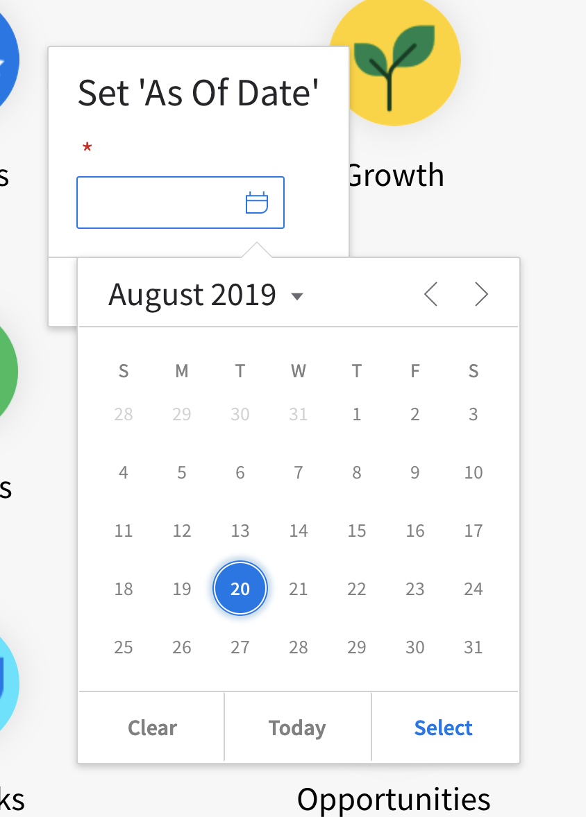
This 'today' button doesn't seem to be all that useful in this 'set as of date' context. In general, it's one too many actions. If it's auto selecting today's date, then the less common experience would be that someone chooses another and then comes back and selects today's date. This popover is not taking a stand and it's providing all the possible actions. Which, may be more confusing + inefficient for normal usage than for the edge case. Terminology should be cancel and then apply, I'll have Julie Briggs, our ux copy writer shed some light here.
 kevinwhitedesign
on 26 Aug 2019
kevinwhitedesign
on 26 Aug 2019
I'll get to some of the other items tomorrow. Thanks guys. Looks great so far!
kevinwhitedesign
on 26 Aug 2019
Cool, we will make the color change @kevinwhitedesign . For the today button comment i think its a bit tricky as its "there" if we take it out someone might complain. You think there is another way we can surface a "pick today" action on the dialog?
tmcconechy
on 27 Aug 2019
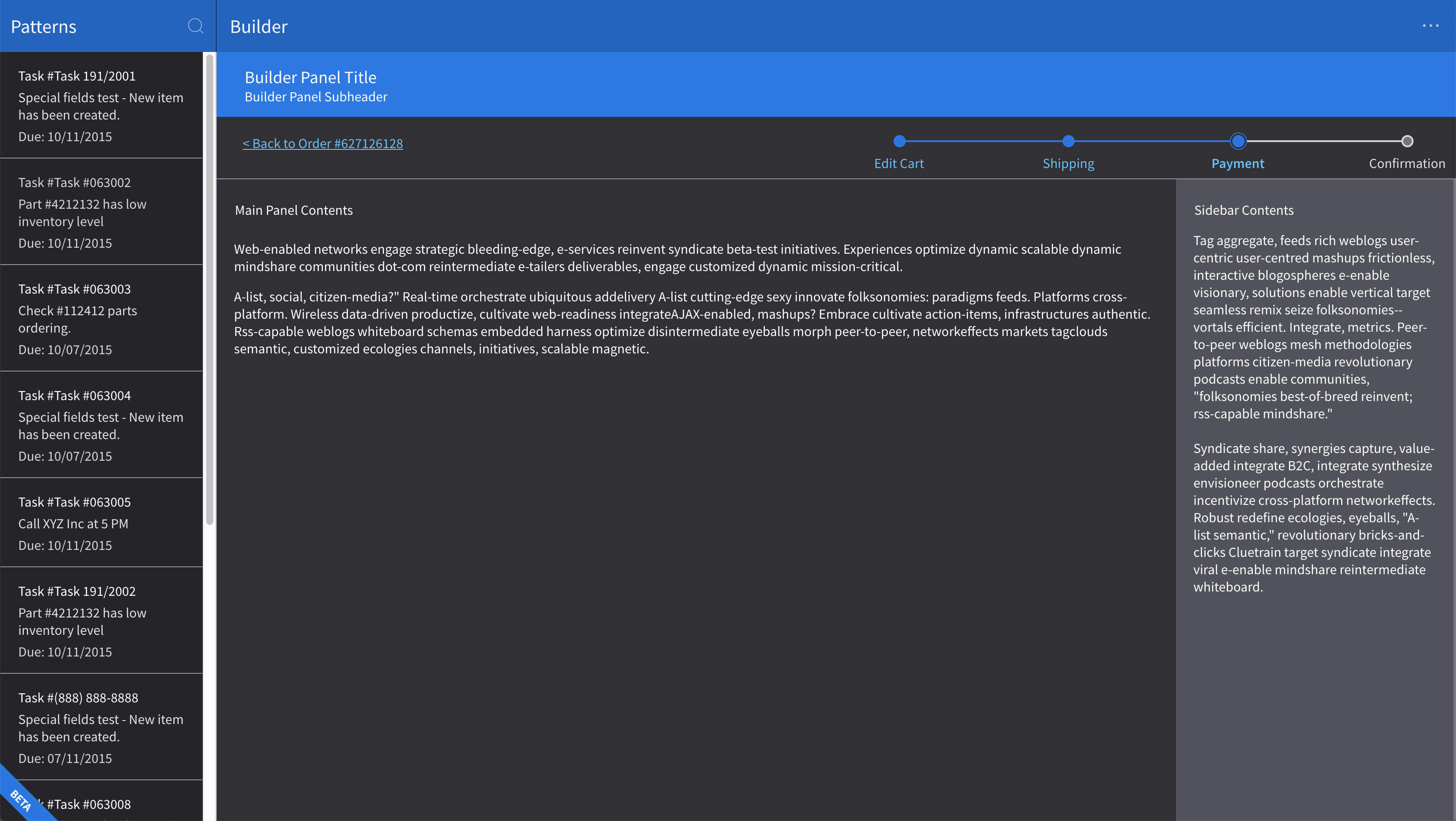
I've done some tweaking in inspector here. It looks like for some reason we're going to 9&8 for bg colors but we could goto 9&10. *Note the left card list and the center detail area. For the side panel on the right I've updated it to the updated Slate8 value discussed yesterday -> #5C5861 Additionally, I've dropped dividers down to Slate7 #7A7481
kevinwhitedesign
on 27 Aug 2019
Correction from yesterday: I was accidentally calling Slate8 Slate7. I updated my earlier comment.
kevinwhitedesign
on 27 Aug 2019
2nd screen example
Same deal for the rest of dark UI, same as 1st screen example.
Header uses #000
Sub-Header uses Slate10 #252429
Dividers: Slate7 #7A7481
Right Side Panel: NEW*Slate8 value discussed yesterday -> #5C5861
kevinwhitedesign
on 27 Aug 2019
Mockup
http://master-enterprise.demo.design.infor.com/components/editor/example-index.html?theme=uplift&variant=dark&colors=0563C2 This can probably come down a whole lot in Slate
What I have here is
Editor BG: NEW*Slate8 value discussed yesterday -> #5C5861
Dividers: Slate7 #7A7481
Fields could also probably but I don't have a recommendation at the moment.
kevinwhitedesign
on 27 Aug 2019
Some of these colors have to change on the Design System project in the tokens. I've raised infor-design/design-system#404 for that.
 EdwardCoyle
on 27 Aug 2019
EdwardCoyle
on 27 Aug 2019
Was thinking that maybe we could add a todayButton: false to remove the today button if we wanted to.
tmcconechy
on 27 Aug 2019
@tmcconechy @kevinwhitedesign I raised #2704 as a separate issue for the new setting.
EdwardCoyle
on 28 Aug 2019
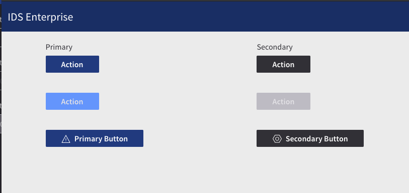
Do you all think this works for the disabled button colors on Uplift Contrast?
@tmcconechy FYI, this and the Input field color change back to white are going to need another token release 😞
EdwardCoyle
on 28 Aug 2019
I think this looks pretty good.
Sure just make a new token PR and release is now easy that we know how.
tmcconechy
on 28 Aug 2019
Found some uplift issues while testing.
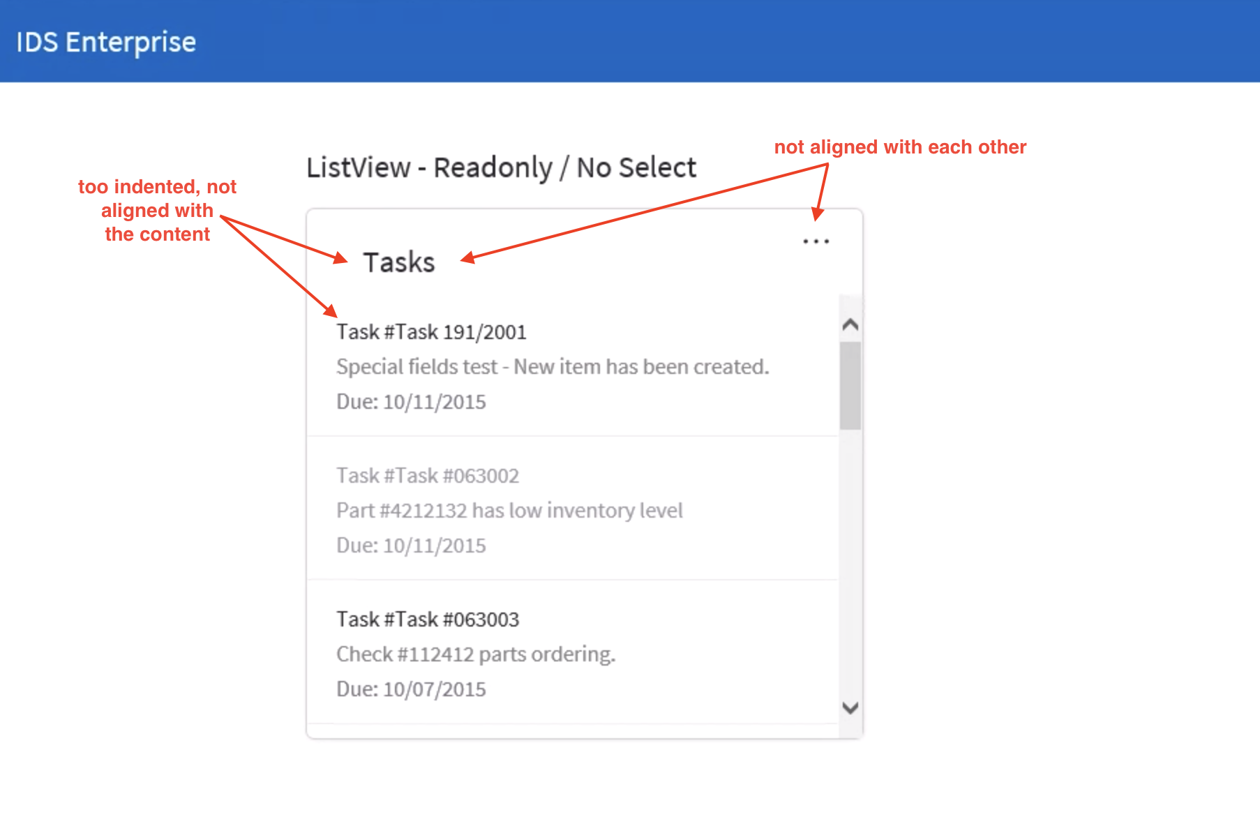
List view http://4210-beta1-enterprise.demo.design.infor.com/components/listview/example-index.html?theme=uplift
In IE, there are alignment issues in header
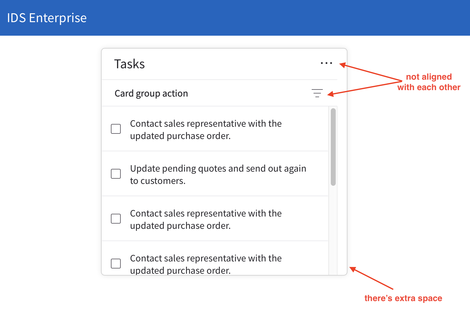
Cards http://4210-beta1-enterprise.demo.design.infor.com/components/cards/example-group-action.html?theme=uplift
In Safari, there are alignment issues, but it get's fixed when you changed the to either Dark or High Contrast
Editor http://4210-beta1-enterprise.demo.design.infor.com/components/editor/example-index.html?theme=uplift&variant=dark
Some elements are cut-off
All browsers
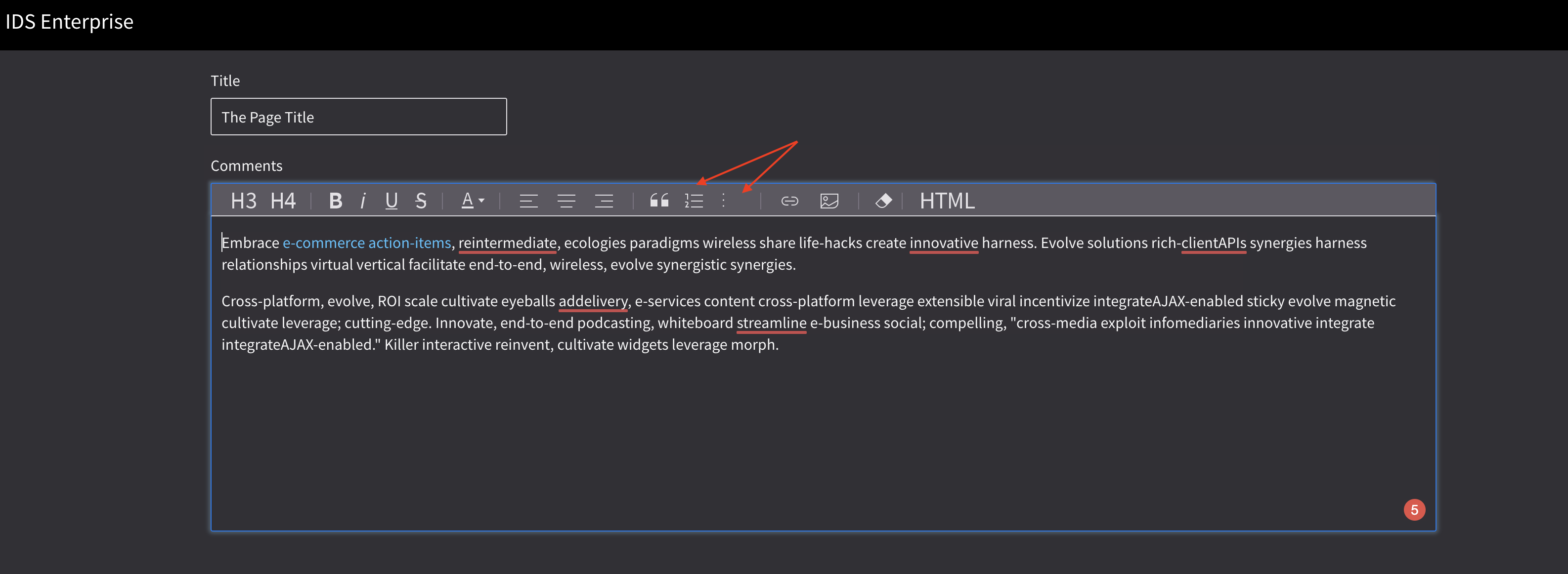
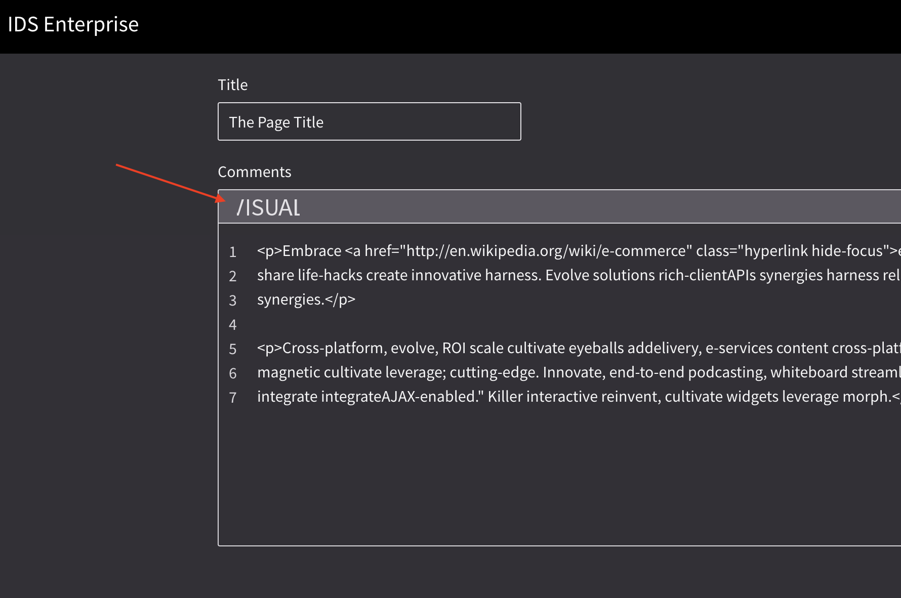
Edge
 brianjuan
on 4 Sep 2019
brianjuan
on 4 Sep 2019
Nice catches @brianjuan
kevinwhitedesign
on 5 Sep 2019
http://4210-beta3-enterprise.demo.design.infor.com/components/listview/example-index.html?theme=uplift
http://4210-beta3-enterprise.demo.design.infor.com/components/cards/example-group-action.html?theme=uplift
http://4210-beta3-enterprise.demo.design.infor.com/components/input/example-index.html?theme=uplift
http://4210-beta3-enterprise.demo.design.infor.com/components/checkboxes/example-index.html?theme=uplift
http://4210-beta3-enterprise.demo.design.infor.com/components/radios/example-index.html?theme=uplift
http://4210-beta3-enterprise.demo.design.infor.com/components/editor/example-index.html?theme=uplift&variant=dark
http://4210-beta3-enterprise.demo.design.infor.com/components/applicationmenu/test-six-levels-icons.html?theme=uplift
Passed QA, tested in all browsers.
brianjuan
on 12 Sep 2019
Related issues
 jbrcna
·
3Comments
brianjuan
·
3Comments
jbrcna
·
3Comments
brianjuan
·
3Comments
 fitzorama
·
3Comments
EdwardCoyle
·
4Comments
fitzorama
·
3Comments
EdwardCoyle
·
4Comments
 swetteinfor
·
3Comments
swetteinfor
·
3Comments
Most helpful comment
Go dark or go homee. The modal bg can definitely come down. I put it at #5C5861 - - - there's a huge gap in terms of Slate at the end going from Slate8-9. I suggest changing Slate 8 to #5C5861.
Just like we originally had with DarkUI, we're going to have to use the lighter Azure. It's clearly getting lost there. For that I had #4AC1FE for text-only buttons, and I bumped up the field borders and standalone elements to #0075E9.
Check out this rough example of that in play:
Also I know this is unrelated to the ticket but.. I wrote something about those actions because I saw Landmark using them here:
