Electricitymap-contrib: Toggle "residual load" view and "baseload view"
An inspiration from the Japanese transpaency website isep-energychart.com:
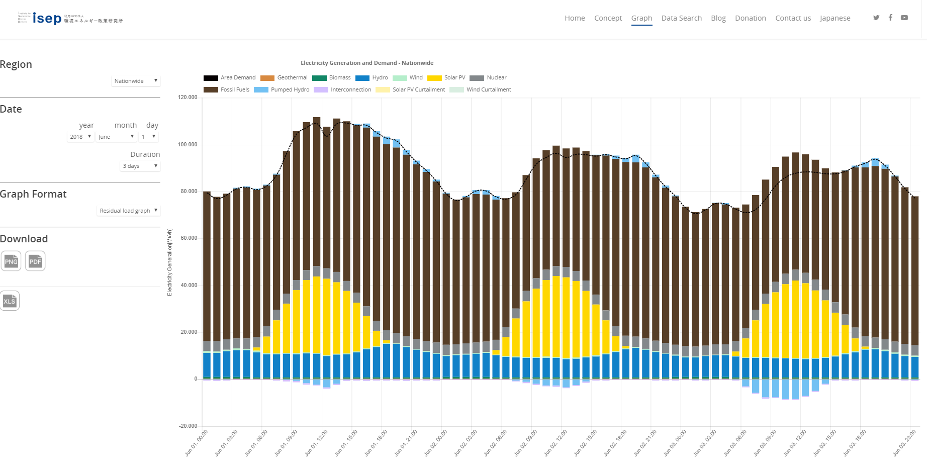
"Residual load" view: all renewable sources are on the bottom of the diagram, nuclear, fossil and pumped hydro are used to fill the residual load:
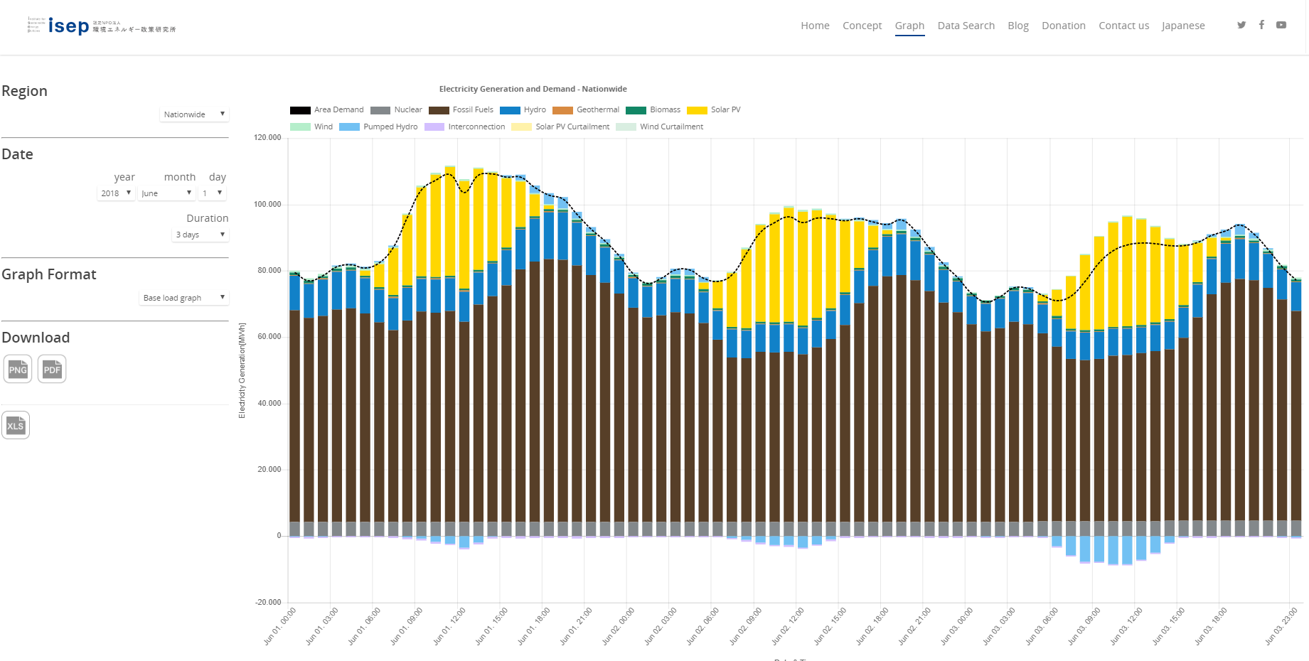
"Base load" view: all renewable sources are on top of the conventional sources.
I like the idea of toggling between these diagrams, it is kind of a "new world" vs. "old world" .
The electricityMap currently shows a similar verstion of the base load diagram, which could remain as default third option. So a toggle could be implemented in the top right corner of the map.
What do you think?
 alixunderplatz
All 2 comments
I (personally) prefer the new world view :)
Let's vote here 👍 for the top graph (residual load, new world view) and 👎 for the bottom graph (baseload, old world view)
 brunolajoie
on 14 Jan 2019
brunolajoie
on 14 Jan 2019
Closing due to inactivity
 corradio
on 22 Dec 2020
corradio
on 22 Dec 2020
Related issues
 jzlcdh
·
5Comments
jzlcdh
·
5Comments
 jiwidi
·
4Comments
jiwidi
·
4Comments
 systemcatch
·
4Comments
systemcatch
·
4Comments
 wojciej
·
3Comments
corradio
·
4Comments
wojciej
·
3Comments
corradio
·
4Comments
Most helpful comment
I (personally) prefer the new world view :)
Let's vote here 👍 for the top graph (residual load, new world view) and 👎 for the bottom graph (baseload, old world view)