Easy-digital-downloads: 3.0 - Orders - Create Separate Refund UI
Enhancement Request
Explain your enhancement (please be detailed)
Hide the Refunds order type UI.
Justification or use case
Exposing the refund order type UI causes confusion between partially refunded orders, fully refunded orders (via refunding all line items), and the actual refund record itself without adding any additional information that cannot be easily found on the main order. As it stands almost everything in the UI is irrelevant to the record itself (logs, details, attributes, adjustments, etc).
Instead, just the date of refund could be added to the line item on the original order:
Perhaps there were other intentions for the separate record UI but as far as I can tell it's not needed currently. cc @JJJ @cklosowski maybe you have more insight?
 spencerfinnell
All 23 comments
I think this might be a good opportunity to ask.... what's our target _user base country_? United States?
The reason I ask is because different countries have different ways that refunds should be handled and it would help to know what we're using as our guideline. (And if we're not using a guideline then we should be aware of what countries we might be excluding due to our choices.)
Just for comparison, a good example of a European refund UI/flow is Stripe's implementation of Invoices + Credit Notes. That would be an argument for having a separate "refund UI" and not showing the refunded item inline. (And frankly not even having a "refunded" order status.)
 ashleyfae
on 23 Jan 2020
ashleyfae
on 23 Jan 2020
Good thinking @nosegraze
I'm certainly coming at this purely through a UX lens and am unfamiliar with a lot of the initial decision making regarding the UI (I understand the need to have separate data records).
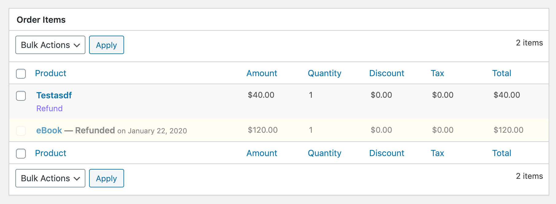
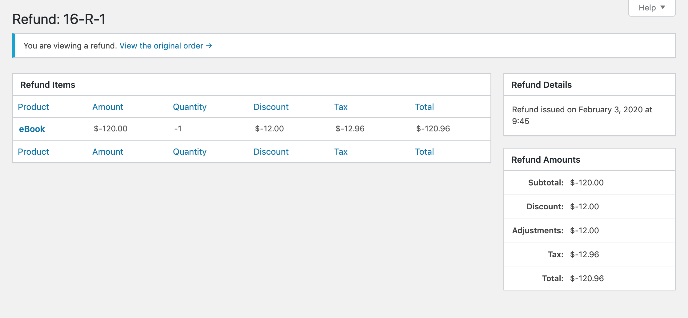
The main confusion comes when viewing the separate Refund record and everything is still says "Order". The ID is incorrect/different than what is shown on the previous list table (if sequential ordering is off), all box titles refer to "Order", the option to change the status of the record is still presented, adjustments that don't apply to the actual Refund are still displayed, links to File Download logs for the "order" are still displayed...
I think if a UI is going to be presented for these separate records a separate UI needs to be created for it. I do like the idea of the separate UI for the ability to make it clear what the Refund record is, and also really like the idea of being able to add separate Notes to the Refund.
spencerfinnell
on 23 Jan 2020
Semi-related to some confusion around overarching terminology of "Sales" in #7527
spencerfinnell
on 23 Jan 2020
I completely agree that if we decide to keep a separate page it needs to not look like a complete duplicate of the order. Other than noting the different ID, it looks like the exact same page and it's confusing.
ashleyfae
on 23 Jan 2020
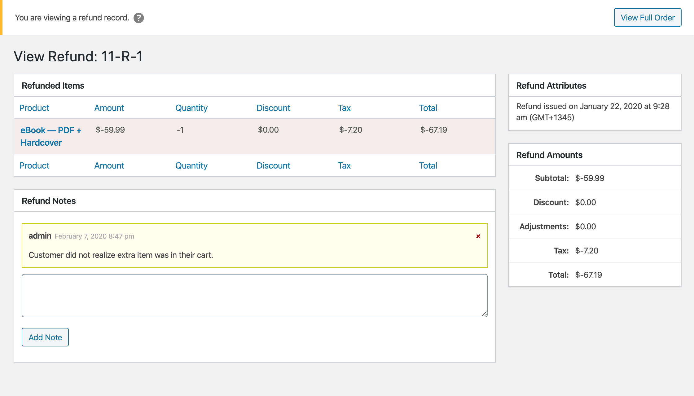
I'm going to work on a a separate view for Refund records so we have something to compare against when making a final decision.
spencerfinnell
on 29 Jan 2020
I quite like what Stripe does with invoices/credit notes.
The invoice shows almost a timeline of what happened. It doesn't remove the original line item, but shows further down where it was removed/adjusted.
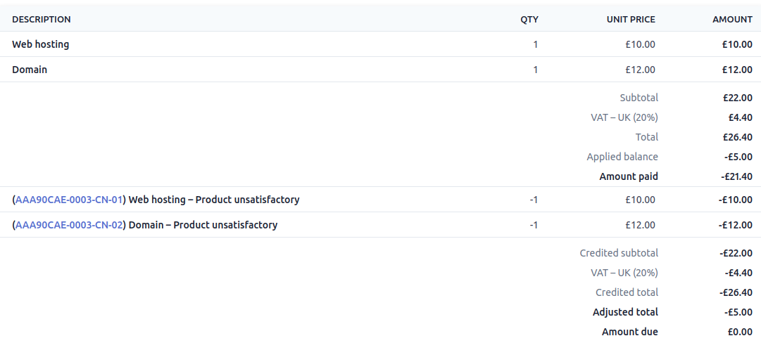
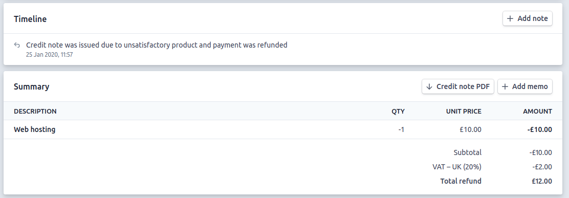
Then the credit note (using that as a "refund" equivalent here) does have a separate UI where you can see the refunded items on their own along with internal notes about why the refund/"credit note" was issued, etc.
(I did two separate credit notes in this instance, which is why both line items are not visible in the above screenshot.)
Just one thought.
ashleyfae
on 29 Jan 2020
@nosegraze How Stripe shows the adjustment (discount) inline is similar to what I mentioned in https://github.com/easydigitaldownloads/easy-digital-downloads/issues/7341#issuecomment-577824016 -- combining order items and adjustments and moving totals underneath.
It might seem a bit verbose but I think more detail here is warranted.
spencerfinnell
on 29 Jan 2020
@spencerfinnell I agree. I think it's useful from an accounting perspective where you can see the entire history of how the order was adjusted and where those adjustments came from (discount / credit / tax / refunds).
ashleyfae
on 29 Jan 2020
@nosegraze Agreed.
I think having them separate on the Order Addition/Creation screen works well though.
spencerfinnell
on 29 Jan 2020
To avoid a lot of conditional checks throughout the views and item tables I think creating completely separate views and WP_List_Table implementations might be the way to go. It might seem a bit verbose but I think will help further show the difference between an Order/Sale and a Refund.
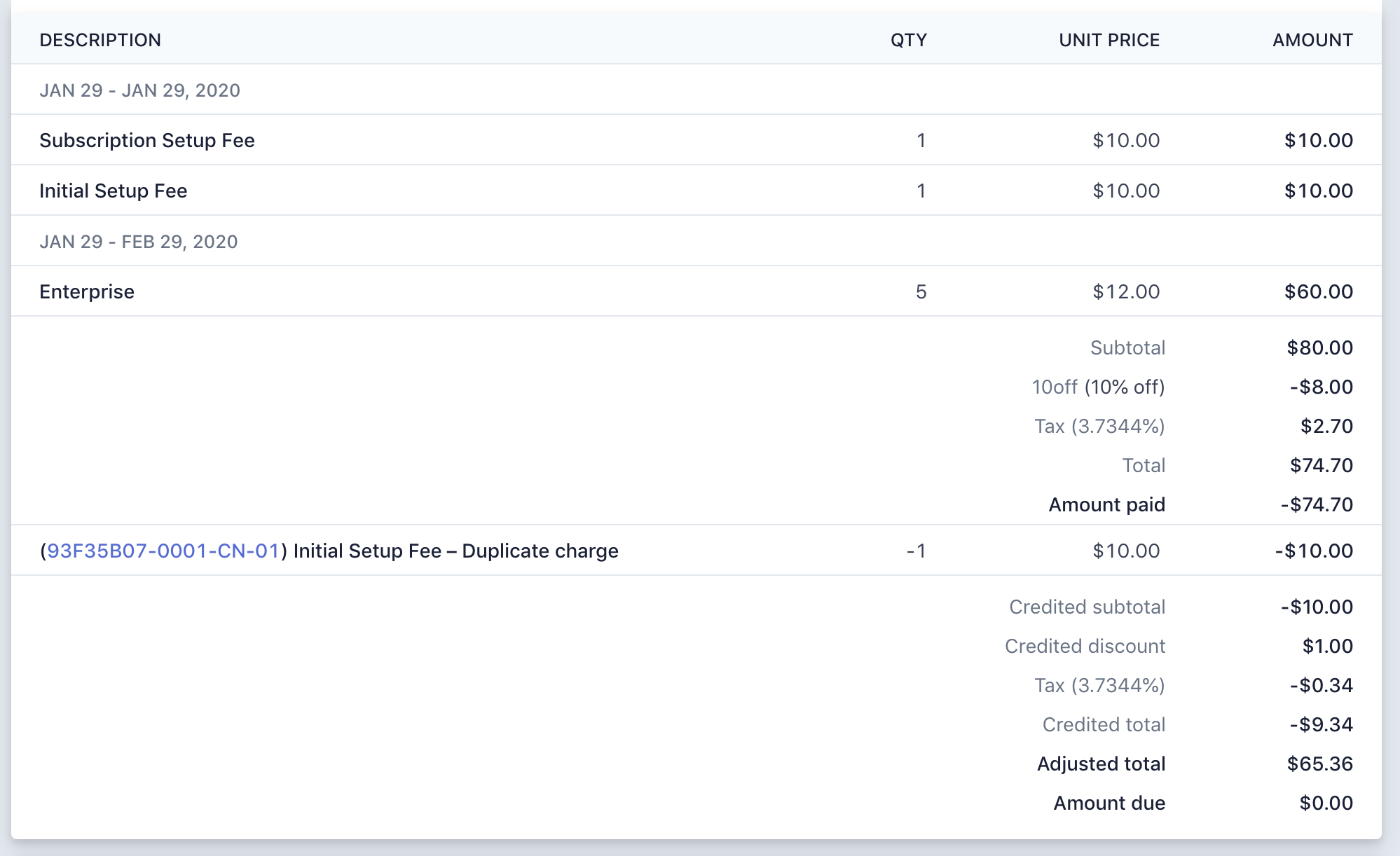
With any actionable items removed, the view will end up looking something like:
spencerfinnell
on 3 Feb 2020
Awesome, I like that.
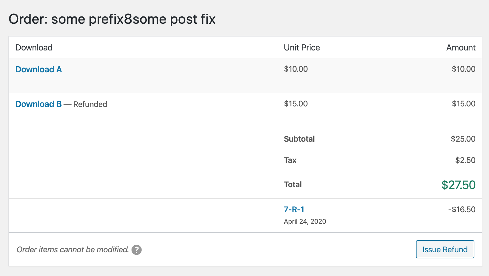
One thought: is having the _negative_ values there the way to go? If this were in the context of an order screen, I'd say yes. But if this is a dedicated refund page, then would positive values make more sense? Just thinking that you'd write or speak it like _"A refund of $120"_ rather than _"A refund of -$120"_.
Also, in the "Refund Items" table, perhaps the Amount heading would make more sense as Subtotal? That would help it better line up with what's on the right under "Refund Amounts".
ashleyfae
on 3 Feb 2020
"A refund of $120" rather than "A refund of -$120".
@nosegraze I agree, the negative values are strange in this context. Good call!
Also, in the "Refund Items" table, perhaps the Amount heading would make more sense as Subtotal?
What about changing "Total" to "Subtotal" in the Order Item table? The "Amount" value doesn't account for quantity, which I think "Subtotal" implies.
spencerfinnell
on 3 Feb 2020
Realizing the above screenshot does not include "Notes", which we should support. On the Order screen "Notes" is in the tabbed box but will need to act as standard box content here.
spencerfinnell
on 3 Feb 2020
"A refund of $120" rather than "A refund of -$120".
@nosegraze I agree, the negative values are strange in this context. Good call!
Also, in the "Refund Items" table, perhaps the Amount heading would make more sense as Subtotal?
What about changing "Total" to "Subtotal" in the Order Item table? The "Amount" value doesn't account for quantity, which I think "Subtotal" implies.
Presumably the "Total" includes tax though, so I like Total for that. Subtotal to me implies before tax.
What about changing "Amount" to "Unit Price"? If I'm understanding correctly, that's what it is?
ashleyfae
on 4 Feb 2020
Few UI changes I'm wiring up:
I think I might do a separate follow up to address the refund negative values and column header nomenclature since it affects multiple screens.
spencerfinnell
on 6 Feb 2020
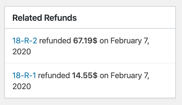
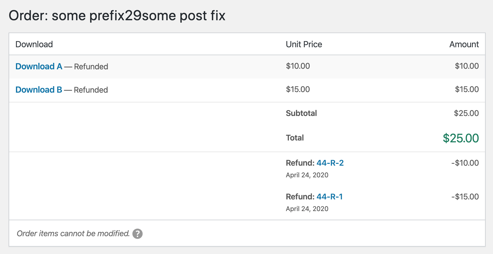
PR #7559 implements the above screenshot along with an update to the "Related Refunds" UI:
spencerfinnell
on 6 Feb 2020
Some notes about the separate UI here: https://github.com/easydigitaldownloads/easy-digital-downloads/pull/7599#issuecomment-591555849
spencerfinnell
on 26 Feb 2020
PR #7559 has been updated to the following:
spencerfinnell
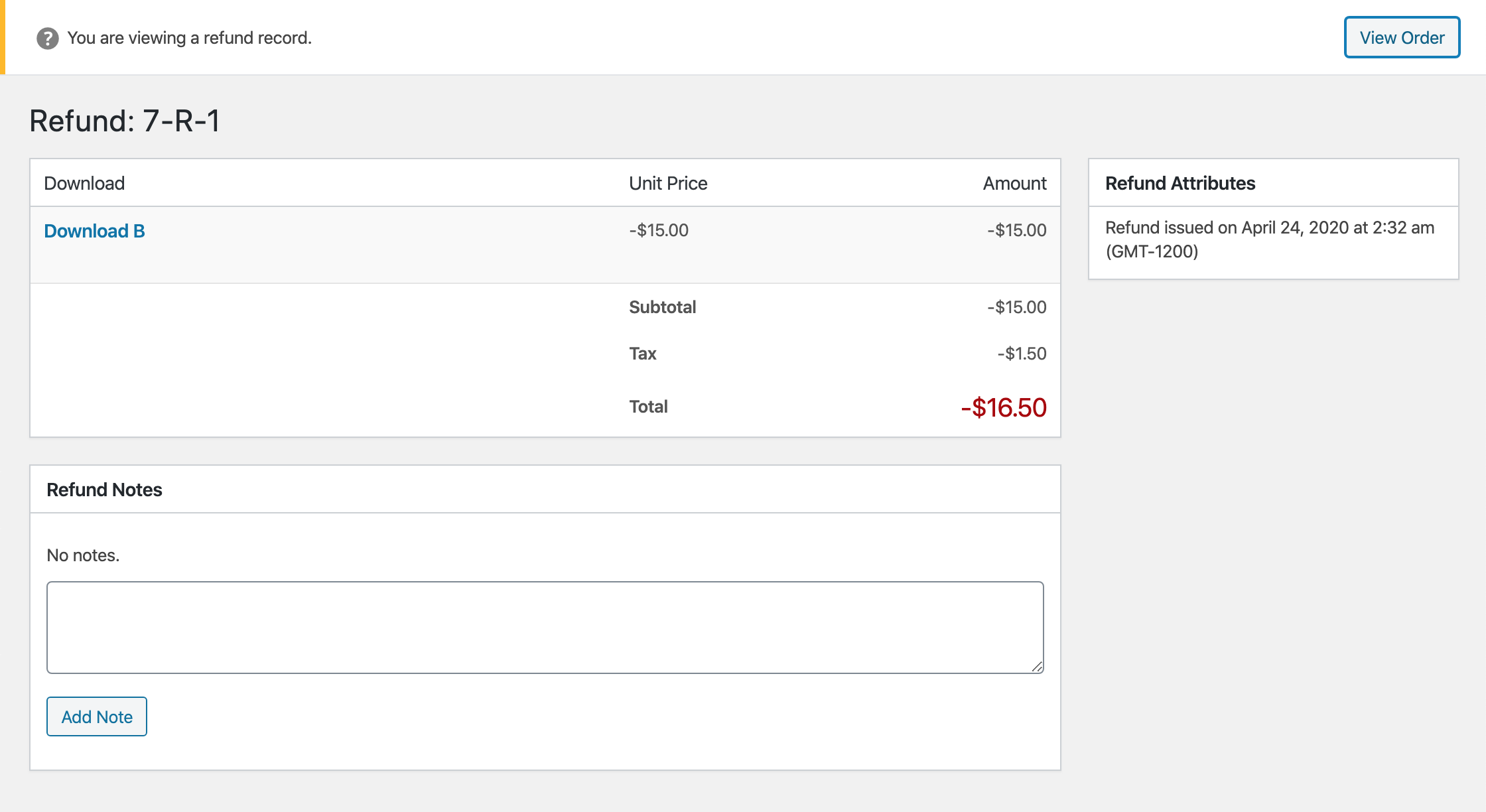
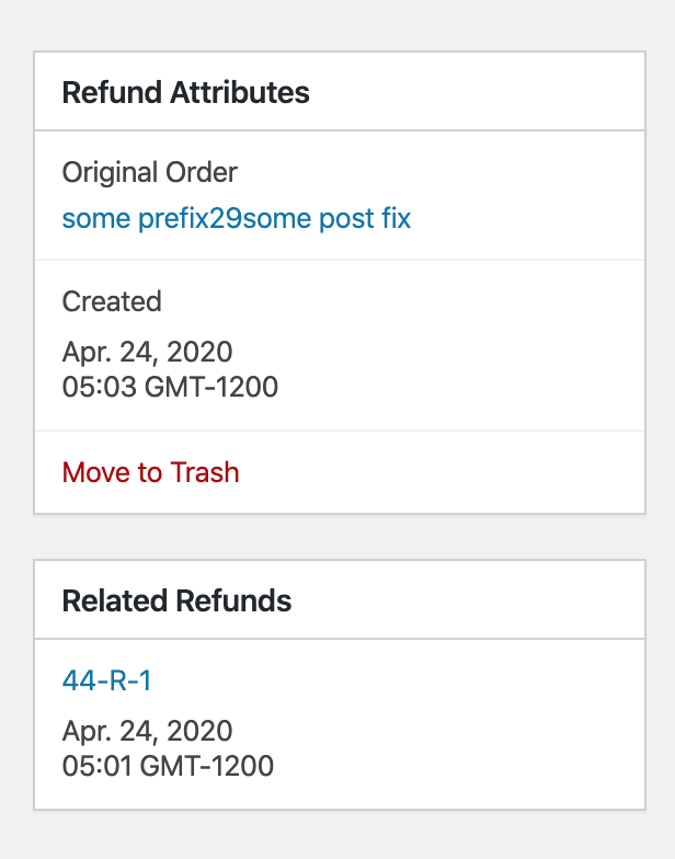
on 24 Apr 2020
PR #7559 updated to
- Prefix Refund list on the Order screen with "Refund: "
- Expand "Refund Attributes" box on Refund screen
- Add "Related Refunds" box on Refund screen
I decided not to have the left/right aligned text for the read-only items because the string lengths can be pretty long.
7559 contains some discussion about what the Download names should link to, but I'm not sure we need to update that here.
spencerfinnell
on 28 Apr 2020
@spencerfinnell Not sure if this got missed or if you changed your mind: https://github.com/easydigitaldownloads/easy-digital-downloads/issues/7528#issuecomment-581515866
UI itself is looking really nice - the above is my only comment.
ashleyfae
on 29 Apr 2020
@ashleyfae Thank you for the reminder. To confirm, you are referring to just the separate Refund page, correct? Not the ones shown below on the original Order record?
spencerfinnell
on 29 Apr 2020
@spencerfinnell Yes that's correct. Just the separate refund page.
ashleyfae
on 29 Apr 2020
@ashleyfae Updated #7559
spencerfinnell
on 29 Apr 2020
Related issues
 nabeghe
·
5Comments
nabeghe
·
5Comments
 Ismail-elkorchi
·
3Comments
Ismail-elkorchi
·
3Comments
 DevinWalker
·
6Comments
DevinWalker
·
6Comments
 JJJ
·
5Comments
JJJ
·
5Comments
 mihaijoldis
·
5Comments
mihaijoldis
·
5Comments