Easy-digital-downloads: Refresh the EDD Admin Menu Items
Originally we were thinking of 2 menu items, much like WooCommerce does for products and store management. After some discussion below, we're all kind of in the idea that there might be some backwards compatibility issues, so we'll stick with 1 menu, but come up with a way to better organize these items within our one menu.
Orignial proposal:
~As we grow the plugin, we're creating a monolith of an admin menu area. We should break this down into a more intuitive management experience for our users, proposed in #2548 originally:
I'm not opposed to having two top level menu items. What about:
 cklosowski
All 41 comments
:+1:
 sunnyratilal
on 20 Dec 2014
sunnyratilal
on 20 Dec 2014
Initial changes in #2885 look good but we have to be very careful with these changes before we merge them in. There are a lot of considerations for potential break points with extensions that are loading scripts or styles on post_type=download. Also we need to be aware of how this will affect extensions that register new submenus under the existing Downloads menu.
 pippinsplugins
on 21 Dec 2014
pippinsplugins
on 21 Dec 2014
All of our scripts/styles are loading based on edd_is_admin, which recognizes both. Most extensions SHOULD be following a similar model. New submenus registered under the existing menu will still work... they might look out of place, but there's not a lot that we can do other than give extension devs warning that most will want to move their items to the new store menu.
 evertiro
on 22 Dec 2014
evertiro
on 22 Dec 2014
I guarantee there are a lot of extensions that don't use edd_is_admin(). Whether they should be or not isn't really important here (they should be). We just need to do it in a way that will not break anything. If that simple means giving several months of warning, that's fine.
pippinsplugins
on 22 Dec 2014
Maybe this should be done in conjunction with our proposed review of all active plugins. Then we could actually contact the specific devs who need to update their products to work with the new model.
evertiro
on 22 Dec 2014
Probably yes
On Sunday, December 21, 2014, Ghost1227 [email protected] wrote:
Maybe this should be done in conjunction with our proposed review of all
active plugins. Then we could actually contact the specific devs who need
to update their products to work with the new model.—
Reply to this email directly or view it on GitHub
https://github.com/easydigitaldownloads/Easy-Digital-Downloads/issues/2880#issuecomment-67792180
.
pippinsplugins
on 22 Dec 2014
Here's what I've found:
Pages that give You do not have sufficient permissions to access this page.
- [x] Viewing Payment Details - I'd assume saving will be the same thing.
- [ ] Searching for payments on the Payments List Table
- [ ] Bulk Actions on the Payments List Table
- [ ] Applying a Date Ranges in the Payments List Table
- [ ] Searching Discounts
- [x] Editing/Adding a Discount
- [x] Saving Banned Emails in Tools -> General
- [x] Generating new API Keys for a user in Tools -> API Keys
- [x] Clicking
Download System Infoon Tools -> System Info - [x] Clicking
Importon the Tools -> Import/Export - [ ] Filtering Earnings of Time
Also, choosing a 'Report Type' from the drop down on Reports and clicking Show is giving Cannot load edd-reports.
Those are the broken ones I found now. Once the reports dropdown is fixed, you'll need to make sure each one of those work if they if they have any filter controls.
cklosowski
on 12 Feb 2015
Ok... why can't I find where I need to update for searches??
evertiro
on 24 Feb 2015
It's in admin/payments/
pippinsplugins
on 24 Feb 2015
2.4 is too close without enough movement on this. Punting to 2.6.
pippinsplugins
on 13 Jun 2015
@easydigitaldownloads/core-team Do we still want to do this?
cklosowski
on 19 Mar 2018
How about we keep 1 top level menu item (to maintain backwards compatibility) but break our sub-menus up into sections?
We could use horizontal lines, or sub-headings, or maybe something else? I haven’t seen anyone do this yet, but it wouldn’t be hard to do.
 JJJ
on 19 Mar 2018
JJJ
on 19 Mar 2018
For separators, we could just use CSS or JS to cludge them in, or link’less sub-items and CSS to style them appropriately.
Similar to how top-level menus have separators, I’m imagining we’d have sub-menu separators.
JJJ
on 19 Mar 2018
Personally I'm a fan of a single top-level button on the sidebar. If I could, I would change the button from saying "Downloads" to "Easy Digital Downloads" - but that might not be possible or the best in all scenarios.
I like @JJJ's idea with adding some sort of visual separation within the submenu.
 mintplugins
on 20 Mar 2018
mintplugins
on 20 Mar 2018
I'd love to change the top menu label; it's a huge pain when you have EDD and Download Monitor installed and have two Downloads menus.
 ashleyfae
on 20 Mar 2018
ashleyfae
on 20 Mar 2018
Half-serious, extremely rough mockup proposal?
mintplugins
on 20 Mar 2018
If at all possible, I'd love to come up with a silhouetted version of Edd that we could use instead to eliminate the need for shading. I love icons that are consistent with what's in core (totally flat, one colour, no shading). If we could cut out his mouth/eyes in a way that still makes him recognizable, that would be awesome. 👍
ashleyfae
on 20 Mar 2018
Yeah I rather like the idea of better 'organization' of the single menu item.
I'm not sure I'm crazy about EDD as the icon. I have mixed feelings on using non-dashicons for those since it requires loading an entire font just for it. I could be convinced otherwise if it was done the way @nosegraze explains it. But at that point I would think that our logo on our homepage would be more fitting since it already is designed for a silhouette approach.
I'll update the title to reflect an organization change, but not breaking into 2 menus.
cklosowski
on 20 Mar 2018
Top Level Menu Links
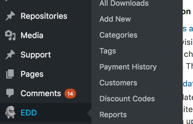
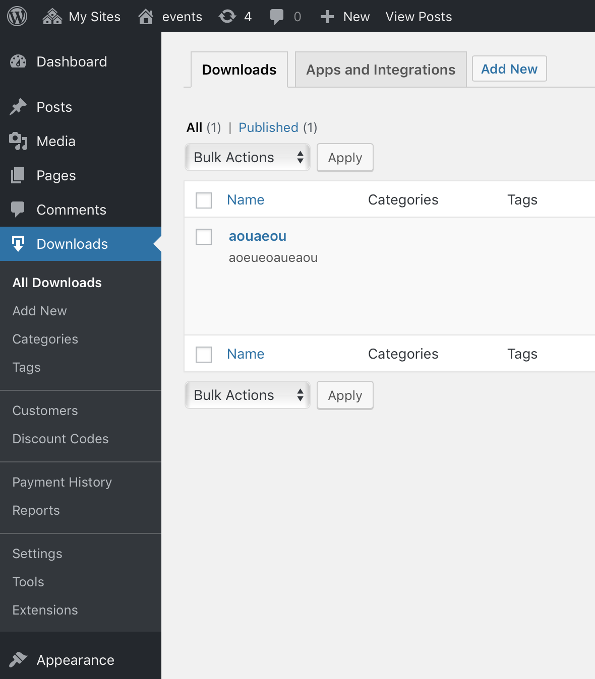
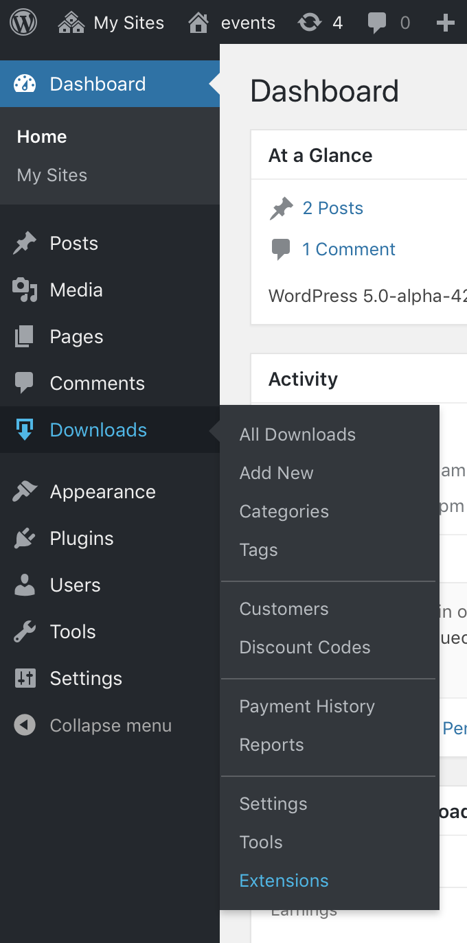
I would prefer two top level menu items. That submenu gets really, really long sometimes and often contains links which don't _obviously_ belong there. We have 21 submenu links under Downloads on easydigitaldownloads.com. It's a little unwieldy. If we added separators between related groups it would become even more so, though somewhat easier to navigate.
Given the choice between one top level menu item with twelve submenu links vs. two top level menu items with six each, I'd choose the latter. Especially if it separated the items in a way that was more intuitive. Some items nested there now are a bit of a stretch.
Decoupling store management from product management makes so much sense to me. I think about our custom user roles and how those relate to the items available in the menu.
Menu Label
I really don't like using "EDD" (and for that matter I hate using "EDD FES" which we already do). I dislike it because it must be learned and isn't what new users will be looking for. I'm absolutely in favor of labeling menu items based on function and not branding.
Menu Icon
I agree with Chris and don't love loading Edd for the menu icon. Maaaaaybe if we had two menu items though where one related to management of the products and the other related to management of the store. It might make sense to bring in Edd for that.
 brashrebel
on 20 Mar 2018
brashrebel
on 20 Mar 2018
FWIW, you don't have to load an entire font to use your own icon. There are other ways. I agree it should match the dashicons in style for sure though. (That's why I said my mockup was extremely rough.)
mintplugins
on 20 Mar 2018
Also just to clarify, didn't we previously come to the conclusion that 2 separate buttons wasn't possible because of backwards compatibility?
mintplugins
on 20 Mar 2018
Having 2 top-level menu-items is probably not ideal, due to both back-compat and general real-estate concerns with a menu area that grows increasingly more crowded with each plugin that adds things to it.
This is why so many plugins have a single menu, and sub-screens with horizontal tabs (like our settings page.)
This is one of those conversations that’s really more about what WE want than what’s “right” according to standards. The “right” thing to do is to split EVERYTHING up across the various other top level menus:
- Customers under Users
- Settings under Settings
- Tools under Tools
- Discounts under Products (or top level)
- Add-ima under Plugins
The reality, though, is nobody seems to actually want THAT deep of admin integration, even though that’s what’s “right.”
So, if we are going to reconsider our admin-menu strategy, let’s really try hard to do what’s best for users, and what makes EDD better, rather than compromise our vision to fit inside of the limitations imposed by WordPress.
This is me calling out designers to think outside of the box to give EDD a 1-top-level-menu solution to our increasingly complex application situation.
I _think_ users don’t want “EDD” as a top level menu item, mostly because it’s an unclear abbreviation. Maybe someday a “Sandhills” menu makes sense as a catch-all, but I see that as years away.
I also think “Downloads” or “Store” or “Products” is OK but maybe not perfect. It’s also _unlikely_ that users are running EDD at the same time as other eCommerce plugins, so I think we are free to experiment with the word a bit.
As users activate add-ons, what does the menu start to look like? Let’s say someone buys an all-access pass; so they end up with 50 sub-menu items? If so, let’s code a solution for routing those items, and use that to find the natural divisions. That _should_ reveal what, if any, new top menu items or deeper hierarchy is necessary.
JJJ
on 20 Mar 2018
I'm over the moon for the idea of progressively moving things out of the Downloads submenu and into logically grouped admin pages with tabs and subsections. That's a direction I can get behind.
Here's what our admin menu looks like on the EDD site:
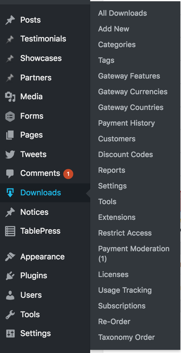
I routinely encounter sites with a comparable number of submenu items under Downloads. I think we're on the high end but not an outlier.
So maybe we throw out fun ideas now for admin pages which bring together related items and separate them by tabs?
Offhand, here's a few ideas:
- Bring all taxonomies together?
- Move "Payments Moderation" to "Payments" or somewhere in "Tools"?
- Move "Restrict Access" to an extensions setting section
- Move everything under "EDD FES" to more appropriate locations
- Make a "Payments" (or something like that) page which brings together "Payment History", "Subscriptions", "Commissions"...maybe other stuff like that?
- Move a ton of things under "Reports" as tabs like "Payment History", "Commissions", "Licenses", "Subscriptions", "Reviews", etc. Basically anything that's a list table of transaction related records.
Some of these are a little crazy I know. But I think they're really fun. I'm throwing my weight behind the idea of moving towards more tabs and subsections on grouped admin pages instead of new WP admin menu links.
brashrebel
on 21 Mar 2018
Why can't EDD upgrade to something that actually looks good? Are we really stuck with the crappy Wordpress UI forever? Why not only have basic things in the sidebar and drop everything else into the Wordpress window? Previous ideas above for grouping items into other categories make it work even better with the way I'm proposing. This is generally the way it's done these days, it's better UI/UX than simply dumping everything into a giant sidebar.
I'm proposing adding only the things in the sidebar you absolutely need, and the rest be added into a new UI for EDD into the main wordpress window.
I did this mockup in just a few minutes to kick the idea around. Keep in mind, I'm not a developer. I don't know what all this would entail. I'm a web designer, and I'd just like to throw in something that may help. We did redesign the credit card logos for you guys previously, not sure if that matters. Graphic design issues almost never come up here because let's face it...there isn't any design in EDD.
Obviously it's a super quick mockup, and if this is seriously considered as an alternative, something will have to be really thought out and designed to make it work well.
 lalunecreative
on 29 Mar 2018
lalunecreative
on 29 Mar 2018
@lalunecreative To be honest, I've frankly never seen a major departure from WordPress admin styles like you're proposing actually look and work well in the context of a plugin admin screen. It almost always looks like exactly what it is: somebody mashing a completely unfamiliar and opinionated UI into a WordPress page. In my experience, users gravitate toward the familiar, and even if the UX is not the most awesome, at least there's utility in the familiarity in trying to find what you're looking for.
If you consider something like Jetpack, they're _still_ constantly rewriting their custom UI. It seems like every time I upgrade, I have to relearn where they're putting or straight up hiding things – it's maddening. At least in screens that look like WordPress, I know what I'm looking at.
That said, I think there are a few incremental improvements that could simultaneously address the inevitable wave of backward-compatibility concerns for extensions and improving UX. These might include things like
- Moving toward using vertical tabs to reduce that top-heavy feeling you get from tabs of tabs (we already do this in the Customer screen and the new Reports UI coming in 3.0 also does it)
- Paring down the sidebar to _only the things you absolutely need_ as you and others suggested
- Further integrating the admin color scheme to add a splash of color
- Adding a live-search to find specific settings
- Improving microcopy to make the intent and utility of settings clearer
- and a ton of other little things that could ultimately add up to a solid list of improvements
 DrewAPicture
on 29 Mar 2018
DrewAPicture
on 29 Mar 2018
Some months ago (or more than a year) I proposed a design concept to use same style as used for customer screen on settings tabs:
https://github.com/easydigitaldownloads/easy-digital-downloads/issues/5705
The most important from this concept is the ability to access to subsections directly
 rubengc
on 29 Mar 2018
rubengc
on 29 Mar 2018
@DrewAPicture If Jetpack is having to keep redesigning it then they didn't design it right in the first place. That's why you spend a good deal of time getting it right the first time so that it's solid for years. There's also not much relearning with my concept. You're looking at just an updated screenshot of what we already have. It just _looks_ better.
It would also go well with an overall dashboard like in this proposal - #4714
I agree that dropdowns from menu items is probably something that would happen with it since there's obviously way more extensions than can fit it in tabs, etc.
lalunecreative
on 29 Mar 2018
Solve the usability and organization problems first, worry about design later.
 mindctrl
on 29 Mar 2018
mindctrl
on 29 Mar 2018
That's why you spend a good deal of time getting it right the first time so that it's solid for years.
I think @DrewAPicture's point is that, knowing the Jetpack team rather intimately, they HAVE spent a good deal of time getting it right over the years. Everyone thinks everything they do is right, or else they wouldn't spend time doing it.
The proposal in #4714 has no screenshots. That makes it hard to know what's being proposed.
It just looks better.
Subjectively.
Personally, I am not in love with the concept you've proposed, yet. I agree with @DrewAPicture that this looks too much like its own thing, abandoning the style-guide put forth by WordPress admin.
I'm fine if we use a similarly designed and intentional organizational layout, without the majority of the individual design elements. Maybe we slowly iterate and things and work towards something similar over a bit of time, but I'm reluctant to hit users with a completely brand new set of interface elements to run their online business without a considerable investment in user testing.
JJJ
on 29 Mar 2018
The scope of this issue, is _just_ the admin menu, not redesigning or imaging the rest of the UI. I would like to stay focused on thinking of ways we can improve the left side menu only.
On the point of a fully redesigned Admin menu, and to discuss some of the above comments:
Graphic design issues almost never come up here because let's face it...there isn't any design in EDD.
I would argue there is quite a bit of design decisions that go into EDD. The contrast is though, that we choose to remain looking like WordPress in order to not have to retrain users to a new UI.
In the future we can look at what a new UI looks like for the admin, which was mentioned by @rubengc for #5705, but that's not the scope of this.
cklosowski
on 29 Mar 2018
Here's a bit of CSS I wrote to add dividers between some submenus.
/* Menu Styles
-------------------------------------------------------------- */

/* Secondary Separators */
#adminmenu ul > li:not(:last-child) a[href^="edit.php?post_type=download&page=edd-discounts"]:after,
#adminmenu ul > li:not(:last-child) a[href^="edit-tags.php?taxonomy=download_tag&post_type=download"]:after,
#adminmenu ul > li:not(:last-child) a[href^="edit.php?post_type=download&page=edd-reports"]:after
{
    display: block;
    border-bottom: 1px solid rgba(255,255,255,0.2);
    height: 14px;
    margin: 0 -13px;
    content: '';
}
It ends up looking like:
JJJ
on 8 May 2018
Another holiday evening experiment: what if we move the taxonomies into tabs?
This would eliminate at least 2 sub-menu items, or more if additional taxonomies are registered.
JJJ
on 29 May 2018
I think I like that a lot. I'm sure quite a few people wouldn't notice we moved them and then will ask support where they are, but that's a pretty simple re-education issue.
pippinsplugins
on 29 May 2018
I think I could get used to this as well. Only thing that throws me now is the "Add New" at the very end of the list -- it loses its context being so far away from the Downloads tab.
Also if the taxonomies are removed from the sidebar should the "Extensions" link be removed as well since it lives in a tab too? But obviously I understand wanting to keep that more noticeable.
 spencerfinnell
on 29 May 2018
spencerfinnell
on 29 May 2018
@spencerfinnell those are all good points, and I agree with all of them.
- Do not like that "Add New" is only for Downloads, and Discounts/Customers do not have them
- Do not want to remove "Extensions"
- I think Categories & Tags are ancillary, so it might be _more_ OK to remove them than other menus
- Agree strongly that the "Add New" H2 button does lose its context, especially if the
downloadpost type has other taxonomies than what EDD comes with
All of that said, it doesn't _feel_ wrong to me for some reason.
JJJ
on 29 May 2018
We will not remove nor move Extensions.
pippinsplugins
on 29 May 2018
I'm not sure how I feel about moving the taxonomies. Just moving ours is fine, but I wouldn't like the UI split between ours and a user's custom taxonomies.
 SDavisMedia
on 29 May 2018
SDavisMedia
on 29 May 2018
I just merged #6609 in per a convo with @pippinsplugins and @mintplugins.
If negative feedback comes in, it's easy to unplug/revert.
I'm also going to put the horizontal dividers in next, while I'm poking around at this.
JJJ
on 30 May 2018
How about using vertical tabs here to keep the page header more straightforward?
DrewAPicture
on 30 May 2018
How about using vertical tabs here to keep the page header more straightforward?
I'm having a hard time imagining how that would look or work. The width of our vertical tabs would take about 120px away from each of the screens in the tab-content area.
What I can imagine, looks like a lot of empty vertical space, at least in my mind.
JJJ
on 31 May 2018
With the split design above, I will note we've had bad experiences with horizontal menu bars before when they run out of space. EDD uses both vertical and horizontal menus, for example the card items (like custom cards) go vertical for this reason, while the settings menu technically is a double horizontal). I think in this case it's reasonable to expect that no one should be adding more horizontal items, however if we want to re-use this pattern in another major tab, that's certaintly something to consider.
Irregardless of that, I think this new design feels better but it also focuses on the menu naming being weird.
To make it more consistent, and easier to understand where the things have gone, it might make sense with this design to have the menus reflect the fact they are "areas" and not singular items.
For example, "All downloads" doesn't sound like I'm going to find taxonomies under it, and it's very different from "Payment history" which is very different from "discount codes"
Maybe the menus should be
Downloads  -> downloads, categories, tags, integrations
Payments   ->
Customers  ->
Reports    ->
Settings   ->
Discounts  ->
Tools      ->
Extensions ->
This makes the menu names more consistent, and orders them (with the exception of downloads) in order that I think makes more sense.
I removed Add New, because it's becoming less clear imo what we're adding, and if we want people to discover the Downloads area, its an easy way to do that + make for a less cluttered menu.
Ideally I'd like to also remove tools + discounts, since I don't think the average EDD store usecase uses them.
If we re-use this pattern, tools are for the most part used with context to settings, and discounts could easily be construed as a setting. If you reuse the above patter on settings you could have settings | discounts | tools as the top
and then the menu becomes:
Downloads  -> downloads, categories, tags, integrations
Payments   ->
Customers  ->
Reports    ->
Settings   -> settings, discounts, tools
Extensions ->
 chriscct7
on 7 Jun 2018
chriscct7
on 7 Jun 2018
Related issues
 amdrew
·
5Comments
amdrew
·
5Comments
 colomet
·
4Comments
colomet
·
4Comments
 mihaijoldis
·
5Comments
mihaijoldis
·
5Comments
 nabeghe
·
5Comments
nabeghe
·
5Comments
 zackkatz
·
5Comments
zackkatz
·
5Comments
Most helpful comment
@lalunecreative To be honest, I've frankly never seen a major departure from WordPress admin styles like you're proposing actually look and work well in the context of a plugin admin screen. It almost always looks like exactly what it is: somebody mashing a completely unfamiliar and opinionated UI into a WordPress page. In my experience, users gravitate toward the familiar, and even if the UX is not the most awesome, at least there's utility in the familiarity in trying to find what you're looking for.
If you consider something like Jetpack, they're _still_ constantly rewriting their custom UI. It seems like every time I upgrade, I have to relearn where they're putting or straight up hiding things – it's maddening. At least in screens that look like WordPress, I know what I'm looking at.
That said, I think there are a few incremental improvements that could simultaneously address the inevitable wave of backward-compatibility concerns for extensions and improving UX. These might include things like