Dashboard: Triggers resource tables have different style than other Dashboard tables
Expected Behavior
I expect everything in the Dashboard to have a consistent style. In particular, I expect the tables used in the Triggers views to match the visual style of the tables in the other Dashboard views.
Actual Behavior
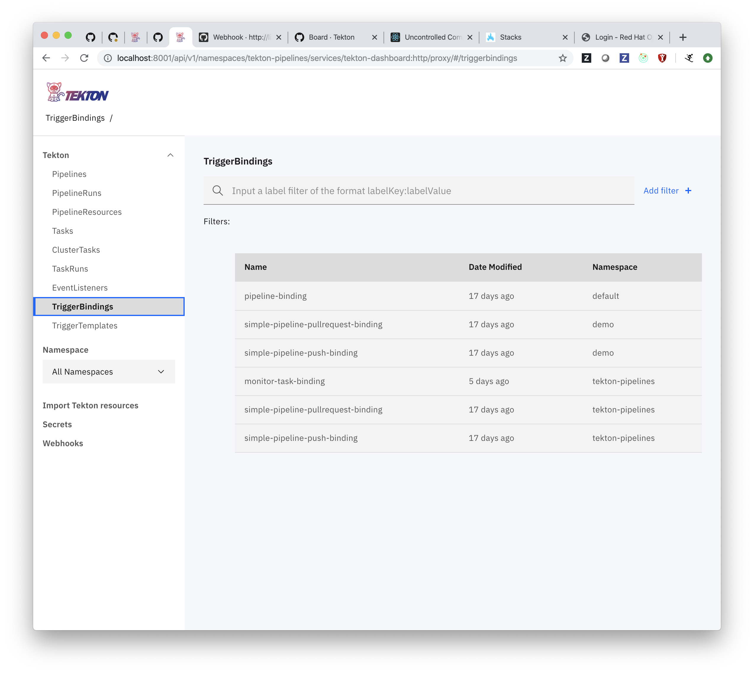
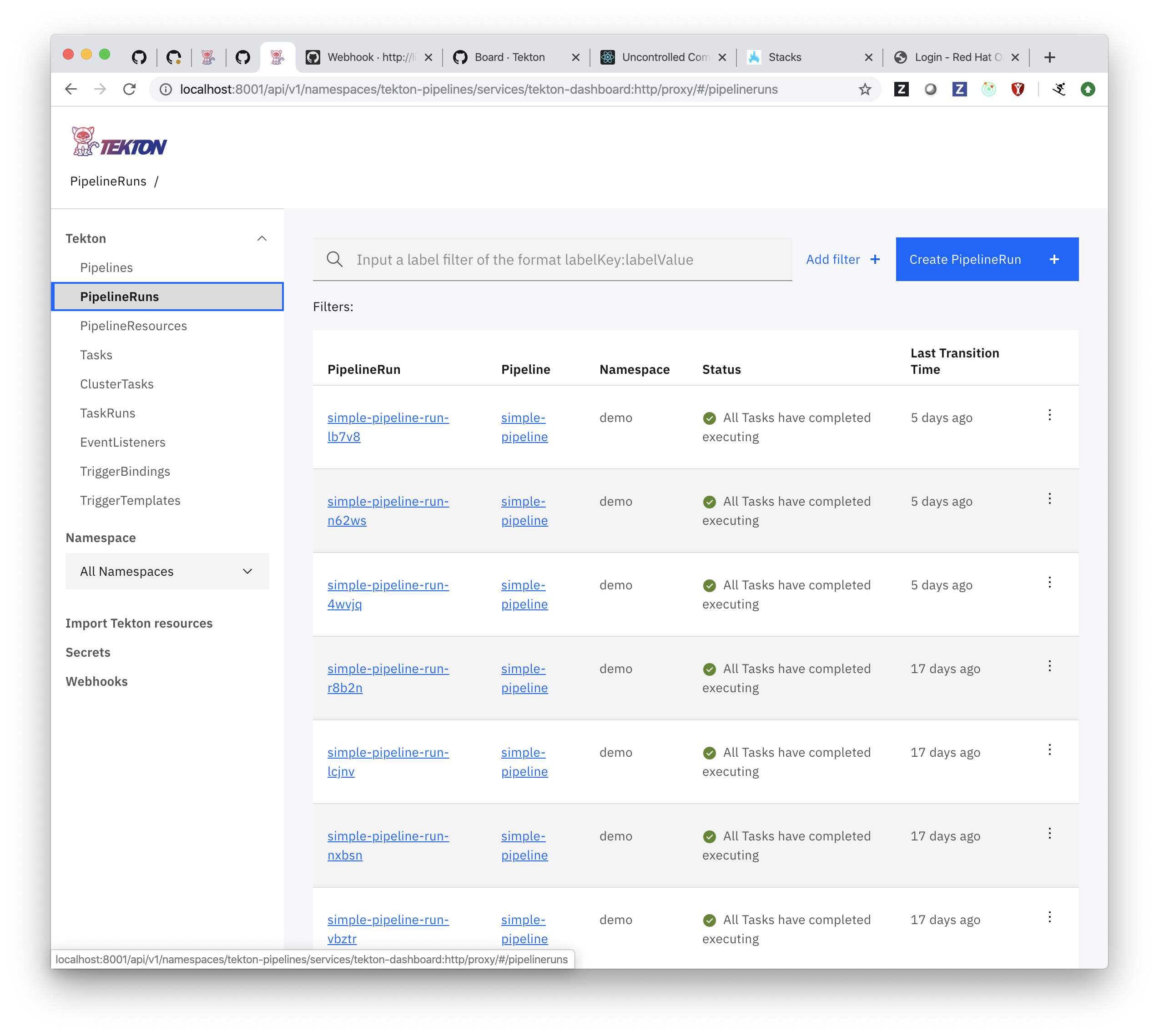
The Triggers tables have a style inconsistent with the rest of the Dashboard.
Here is a comparison showing the inconsistencies between the TriggerBindings table and the PipelineRuns table:
 ncskier
All 7 comments
All list views should be updated to use Carbon DataTable (currently used by Secrets and Triggers views) for consistency and to make use of the action toolbar and other DataTable features. This will eliminate most of the style inconsistencies between the list views as we'll no longer be using the StructuredList styles.
We have a common Table component now (thanks @carlos-logro) that should make this easier.
We also need to ensure the zebra stripe style is enabled (not seeing it in the screenshot above for TriggerBindings).
 AlanGreene
on 25 Nov 2019
AlanGreene
on 25 Nov 2019
Also see https://github.com/tektoncd/dashboard/issues/775 for updated designs of the Pipeline(Run)s and Task(Run)s pages.
AlanGreene
on 25 Nov 2019
/assign
 Megan-Wright
on 27 Nov 2019
Megan-Wright
on 27 Nov 2019
@Megan-Wright during the surfacing of the TriggerBindings details page I stumbled upon some nits that should be taken care of in this issue:
1) Table title has too many padding
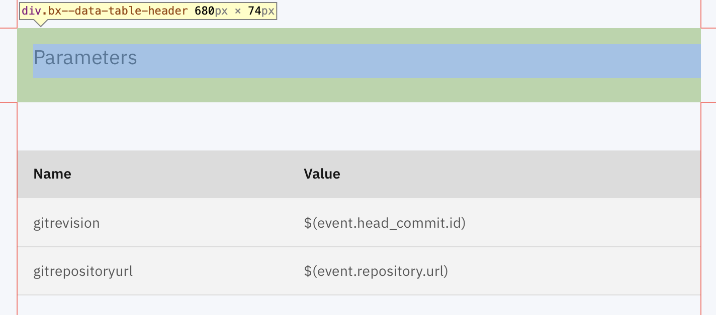
2) even when no batchActions or toolbar buttons are passed as props, the space for the element still shows up.
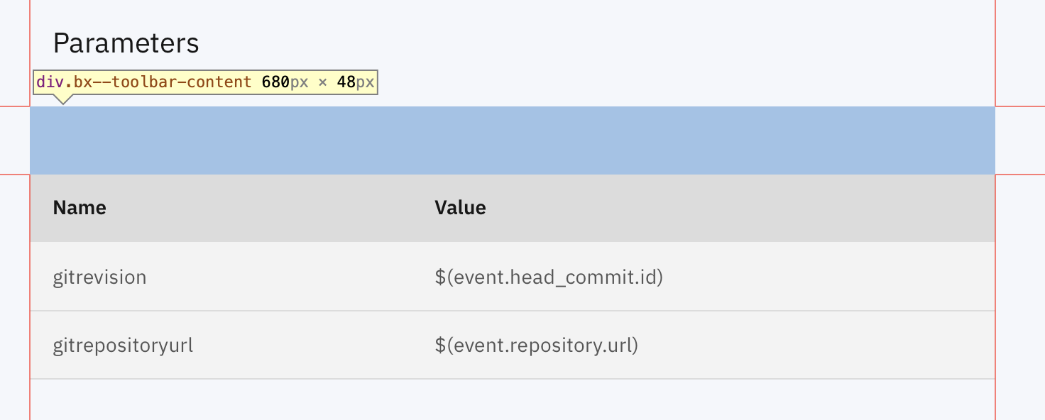
How it should look:
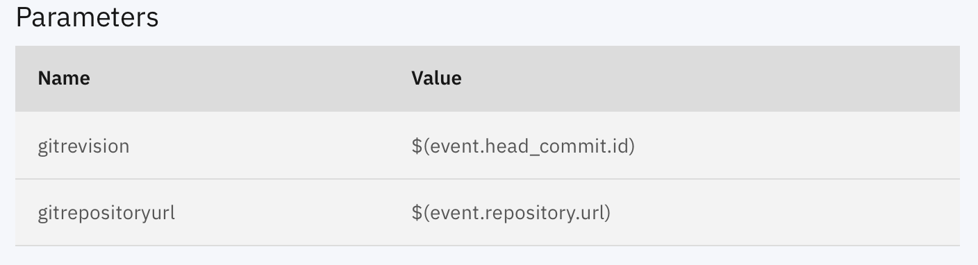
Changes I did on my side:
- in Table SCSS file:
  .bx--data-table-header{
    padding-left: 0;
    padding-bottom: 0;
  }

  .bx--data-table-container{
    margin-top: 0;
  }
- in Table.js
{(toolbarButtons.length !== 0 || batchActionButtons.length !== 0) && (
  <TableToolbar>  [...]  </TableToolbar>
)}
cc: @a-roberts & @AlanGreene
 carlos-logro
on 2 Dec 2019
carlos-logro
on 2 Dec 2019
we should be using the Carbon styles as much as possible, and when overriding them ensuring we're doing so consistently across the whole dashboard, i.e. avoiding too many page-specific styles. I suspect that after removing the toolbar placeholder (see 2) it will look much better, as in the Carbon storybook.
@kimholmes should we be following the Carbon guidelines for aligning the content based on the text (so the heading and the table content would be left aligned as in the first screenshot) or are we left-aligning the surrounding boxes instead?
the suggested change to skip rendering the toolbar components when the buttons arrays are empty looks good :+1:
AlanGreene
on 2 Dec 2019
/close
Megan-Wright
on 17 Dec 2019
@Megan-Wright: Closing this issue.
In response to this:
/close
Instructions for interacting with me using PR comments are available here. If you have questions or suggestions related to my behavior, please file an issue against the kubernetes/test-infra repository.
 tekton-robot
on 17 Dec 2019
tekton-robot
on 17 Dec 2019
Related issues
 Fabian-K
·
4Comments
Fabian-K
·
4Comments
 a-roberts
·
4Comments
a-roberts
·
4Comments
 bconey
·
6Comments
a-roberts
·
9Comments
ncskier
·
3Comments
bconey
·
6Comments
a-roberts
·
9Comments
ncskier
·
3Comments
Most helpful comment
we should be using the Carbon styles as much as possible, and when overriding them ensuring we're doing so consistently across the whole dashboard, i.e. avoiding too many page-specific styles. I suspect that after removing the toolbar placeholder (see 2) it will look much better, as in the Carbon storybook.
@kimholmes should we be following the Carbon guidelines for aligning the content based on the text (so the heading and the table content would be left aligned as in the first screenshot) or are we left-aligning the surrounding boxes instead?
the suggested change to skip rendering the toolbar components when the buttons arrays are empty looks good :+1: